
What sets excellent direct mail design apart is its ability to blend personalized messaging with a clear visual hierarchy. You guides the recipient’s eye through strategic use of size, color, and placement, making key elements stand out. The layout remains clutter-free with ample white space, ensuring easy comprehension. By understanding your audience deeply, you craft messages that feel personal and relevant. Keep exploring to discover how mastering these techniques can elevate your campaigns even further.
Key Takeaways
- Excellent designs leverage strong personalization to create a meaningful connection with the recipient.
- They employ strategic visual hierarchy to guide the viewer’s attention effectively.
- Clear, clutter-free layouts with ample white space enhance readability and message comprehension.
- Successful designs combine personalized content with compelling visuals for maximum impact.
- They focus on prompting specific actions, ensuring the mail stands out and drives engagement.
Have you ever wondered what makes a direct mail piece stand out in a crowded mailbox? The secret lies in the way it’s designed—specifically, how well it captures attention and elicits action. To achieve this, you need to master personalization strategies and create a strong visual hierarchy. Personalization isn’t just about inserting someone’s name into a letter; it’s about tailoring the entire message to resonate with the recipient’s preferences, needs, and behaviors. When your mail feels relevant, it encourages recipients to engage. Use data to segment your audience, and craft messages that speak directly to their interests. This approach increases open rates and builds a sense of connection, making your mail more than just another piece of clutter.
Personalize your mail to connect deeply, boost engagement, and stand out in a busy mailbox.
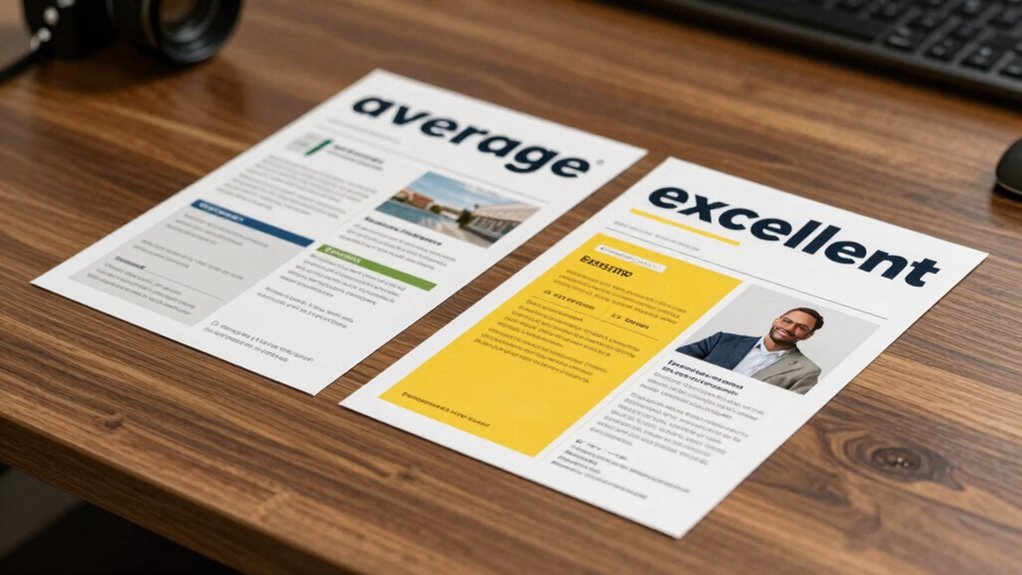
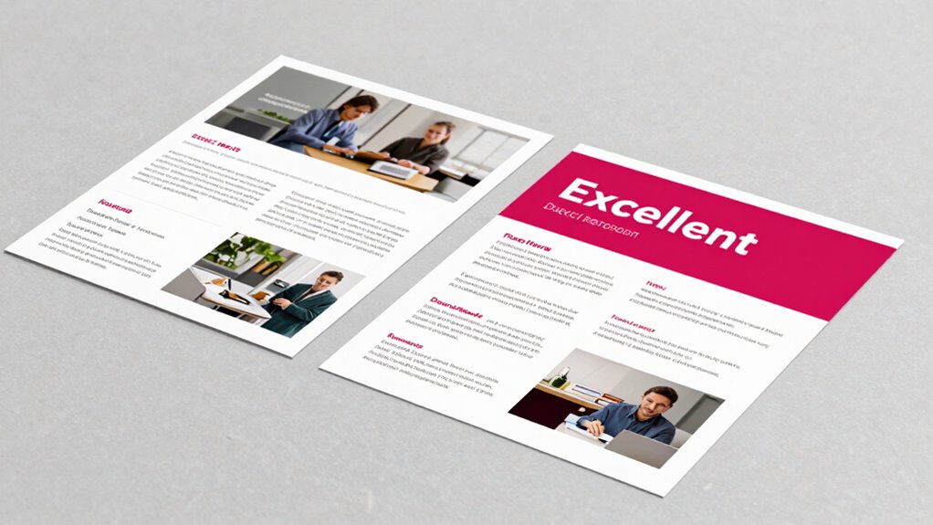
Equally important is establishing a clear visual hierarchy. Your goal is to guide the recipient’s eye from the most critical element to the least. You do this by strategically using size, color, contrast, and placement. The headline should be bold and prominent, instantly communicating the value or offer. Supporting images and copy should complement this focal point without overwhelming it. If your design is cluttered or confusing, your message gets lost, and your piece ends up ignored. A clean layout, with ample white space and well-organized content, helps recipients process information quickly and effortlessly. This clarity is what separates an average mail piece from an excellent one. Additionally, integrating landscaping elements or outdoor-themed visuals can make your mailing more memorable and appealing. Incorporating principles of visual hierarchy ensures that your message is communicated effectively and efficiently.
Combining personalization strategies with a compelling visual hierarchy makes your direct mail more impactful. When you personalize the message, the recipient feels seen and understood. When you craft the design with a clear visual path, they’re more likely to follow that path and act on your call to action. The most successful campaigns don’t just throw together a design—they carefully plan every element to work harmoniously. You want your mail to stand out amidst the clutter, prompting curiosity and response. By focusing on these core principles, you guarantee your direct mail isn’t just seen but remembered and acted upon.
In the end, excellent direct mail design is about making a connection—one that feels personal and visually engaging. It’s about understanding your audience deeply enough to personalize your message and designing with intention to lead their eyes toward your goal. When you strike this balance, your mail becomes a powerful tool that drives results rather than just occupying space in the mailbox.

Trimming Shop Shipping Mail PiP Template Postal Large & Small Letter Size Pricing in Proportion Charge Guide with Ruler for Post Office Postage, 2 Size Measurement, White
MULTIPLE SIZES: This template can be used for two-letter types set by the shipping mail. Total size of…
As an affiliate, we earn on qualifying purchases.
As an affiliate, we earn on qualifying purchases.
Frequently Asked Questions
How Do I Choose the Right Target Audience for My Direct Mail?
You choose the right target audience by starting with audience segmentation, dividing your prospects into specific groups based on demographics, behaviors, or interests. Then, apply personalization strategies to tailor your message to each segment’s needs and preferences. This approach guarantees your direct mail resonates deeply, increasing engagement. Focus on accurate data collection and analysis to refine your segments continually, making your campaigns more effective and boosting your chances of success.
What Is the Ideal Size for a Direct Mail Piece?
The ideal size for your direct mail piece balances size optimization and design consistency. Typically, a 6×9 inch or 5×7 inch format works well, ensuring it’s large enough to showcase your message without overwhelming recipients. Keep the design consistent with your brand, and avoid excessive clutter. This size allows for impactful visuals and clear calls-to-action, making your mail more engaging and effective in capturing attention.
How Can I Measure the Success of My Direct Mail Campaign?
You can measure your direct mail campaign’s success by tracking response rates, conversions, and ROI. Use personalization strategies to tailor your message, then run creative testing to see what resonates best with your audience. Monitor how recipients engage with your mail, and analyze data to identify trends. This approach helps you refine future campaigns, ensuring you consistently improve your results and turn your mailing efforts into measurable success.
What Are Common Mistakes to Avoid in Direct Mail Design?
You should avoid cluttered layouts and neglecting personalization strategies, which can make your mail less engaging. Keep your creative layout clear and focused, emphasizing a strong call-to-action. Don’t forget to tailor content to your audience, making it relevant and compelling. Overloading the design with too much information or weak visuals can dilute your message. Instead, use strategic spacing and eye-catching elements to guide recipients naturally toward your offer.
How Often Should I Send Out Direct Mail to Maximize Response?
You should send out direct mail campaigns every 3 to 4 weeks to maximize response, balancing consistency with avoiding fatigue. Incorporate personalization tactics like tailored messages and creative formats such as interactive or dimensional mailers to keep your audience engaged. Regularly testing different frequencies helps identify what resonates best. Stay consistent but flexible, and always analyze response data to refine your approach for peak results.

Design for Developers
As an affiliate, we earn on qualifying purchases.
As an affiliate, we earn on qualifying purchases.
Conclusion
Remember, the devil’s in the details. By paying attention to your design’s layout, crafting compelling messaging, and making it personal, you can turn an average mailer into an excellent one. Don’t settle for just getting noticed—aim to make a lasting impression. As the saying goes, “You never get a second chance to make a first impression.” Put in the effort, and you’ll see your direct mail stand out in the crowd.

White Space Is Not Your Enemy: A Beginner's Guide to Communicating Visually Through Graphic, Web & Multimedia Design
As an affiliate, we earn on qualifying purchases.
As an affiliate, we earn on qualifying purchases.

Rite in the Rain All-Weather Combat Card, Call for Fire, 6" x 5", 50 Weatherproof Cards (No. CFF991T)
WEATHERPROOF: Rite in the Rain heavyweight paper endures splashes and stains to guarantee readiness at all times.
As an affiliate, we earn on qualifying purchases.
As an affiliate, we earn on qualifying purchases.