

Building and maintaining a design system helps you guarantee consistency, streamline collaboration, and create scalable user experiences across all your products. Start by establishing a well-structured foundation that includes clear guidelines on colors, components, and branding. Use shared repositories and automation tools to keep everything updated and uniform. Regularly refine your system to adapt to new needs and maintain quality. Keep going, and you’ll discover how to build a seamless, cohesive brand experience that stands out.
Key Takeaways
- Establish a clear, comprehensive style guide that includes color palettes, typography, and component standards.
- Use centralized documentation and design tokens to ensure consistency and facilitate updates across teams.
- Regularly review and update the design system to adapt to new needs, technologies, and user feedback.
- Promote collaboration between designers, developers, and stakeholders to maintain alignment and shared ownership.
- Leverage automation tools and shared repositories to streamline maintenance, enforce guidelines, and support scalability.

Have you ever wondered how successful brands guarantee consistency across all their products and platforms? It all comes down to a well-structured design system that serves as the foundation for every touchpoint. Central to this process is confirming color consistency, which helps reinforce brand identity and create a seamless user experience. When colors are consistent, users instantly recognize your brand, whether they’re browsing a website, using an app, or interacting with marketing materials. To achieve this, you need clear guidelines on the exact shades to use and how to apply them across different mediums. This includes specifying color codes, contrasts, and accessibility considerations. But maintaining color consistency isn’t just about choosing the right palette; it’s also about documenting how colors should be used in different contexts. That’s where component documentation comes into play. It acts as a detailed manual that outlines the purpose and usage of every UI element, from buttons to icons, ensuring everyone on your team follows the same standards.
Component documentation serves as the backbone of your design system, offering detailed descriptions, code snippets, and visual examples for each component. When you document components thoroughly, it becomes easier to keep your designs uniform and scalable. This documentation helps new team members get up to speed quickly and reduces the chances of deviations from the established standards. It also provides a single source of truth, so designers, developers, and marketers can all refer to the same guidelines, minimizing miscommunication. Consistent application of colors and components builds trust with your users, who come to expect a cohesive experience every time they interact with your brand. Additionally, component documentation supports iterative improvements; as your product evolves, you can update the documentation to reflect new patterns or design changes, ensuring consistency remains intact.
In practical terms, maintaining this documentation requires discipline and regular updates. You might set up a shared repository or a digital style guide that everyone can access and contribute to. Using tools like design tokens can automate some aspects of color management, making it easier to enforce consistency across platforms. Over time, these practices create a reliable framework that holds your brand’s visual and functional identity steady, regardless of how many team members work on your project or how often updates occur. Ultimately, focusing on color consistency and detailed component documentation ensures your design system not only looks polished but also functions smoothly, providing a unified experience that strengthens your brand’s presence.

STEM Craft Kit - 25 Engineering Projects, 400+ Components, Ages 8+
- Number of Projects: 25 engineering projects included
- Component Quantity: Over 400 building components
- Ideal for: Classrooms, after-school, at-home use
As an affiliate, we earn on qualifying purchases.
Frequently Asked Questions
How Do I Convince Stakeholders to Invest in a Design System?
You can convince stakeholders to invest in a design system by highlighting how it boosts efficiency, consistency, and brand integrity. Engage them early through stakeholder engagement, showing real examples of time savings and improved user experiences. Justify the investment by presenting data on long-term cost reductions and faster development cycles. Emphasize that a well-maintained design system aligns teams, reduces redundancies, and ultimately delivers a stronger, cohesive user experience, making it a smart strategic move.
What Tools Are Best for Managing and Documenting Design Systems?
Imagine stumbling upon the perfect tools for managing your design system. You’ll want to use collaborative platforms like Figma or Abstract, which streamline teamwork and keep everyone on the same page. Pair those with version control features to track changes effortlessly. These tools help you document components clearly, maintain consistency, and make certain your design system evolves smoothly without confusion or duplication. They’re essential for efficient, scalable design management.
How Often Should a Design System Be Reviewed and Updated?
You should review and update your design system regularly, ideally every few months, to keep it relevant and effective. Incorporate version updates to track changes and improvements, and gather user feedback to identify areas needing refinement. Staying proactive guarantees your design system evolves with user needs and industry trends, maintaining consistency across your products. Consistent updates foster better collaboration and help prevent outdated components from causing confusion.
How Do I Ensure Accessibility in My Design System Components?
An ounce of prevention is worth a pound of cure. To guarantee accessibility in your design system components, you handle it proactively. Focus on color contrast to meet accessibility standards, making sure text is easily readable for everyone. Also, prioritize keyboard navigation, so users can seamlessly access all features without a mouse. Regularly test your components with real users, and update them based on feedback to keep accessibility at the forefront.
What Are Common Challenges Faced When Scaling a Design System?
When scaling your design system, you’ll face consistency challenges as more teams adopt it, risking style and component mismatches. Managing version control becomes tricky as updates need to be synchronized across projects to avoid confusion. To succeed, establish clear governance, document changes meticulously, and implement centralized version management. This way, you uphold coherence, reduce errors, and guarantee everyone works with the latest, most reliable design assets.

Stem Projects Toys for Boys age 8-12 12-14 Science Kit Building Own Bluetooth Speaker & FM Radio DIY Electronics Kit Science Experiments Kid 9-12 Boy Toys Birthday Gift 8 9 10 11 13 Year Old Teen Girl
- Includes Bluetooth Speaker and FM Radio Projects: Build your own stereo and radio
- Suitable for Ages 8-14: Perfect STEM toy for kids and teens
- Easy Assembly with Instructions: Requires only a screwdriver to build
As an affiliate, we earn on qualifying purchases.
Conclusion
Building and maintaining a design system is an ongoing journey that boosts consistency and efficiency. Did you know teams with well-established design systems see a 48% faster design process? Keep refining your components, stay adaptable, and involve your team. Remember, a strong design system isn’t just about visuals—it’s about creating a seamless experience that resonates. Stay committed, and you’ll see not just better products, but happier, more productive teams.

Soulchen 16 Pcs Robot Building Kits for Kids, STEM DIY Robotics Toys
- Complete DIY Robot Kit: 16 robot components for group activities
- Ideal Size and Quality: Lightweight, durable, non-toxic plastic
- Educational and Fun: Enhances problem-solving and STEM skills
As an affiliate, we earn on qualifying purchases.
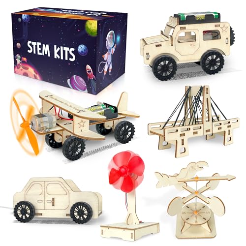
kortes 24Pack STEM Kits for Kids Classroom, Science Building Project Craft for Ages 8 9 10 11 12, 3D Wooden Model Kit, STEM Toys for Boys Girls Birthday Gifts Party Favors School Exchange Gifts
- Variety of STEM Projects: Includes 6 different project designs
- Complete Kit Contents: Contains electric jeeps, trolleys, gliders, bridges, fans, windsocks
- Safe and Durable Materials: Made of non-toxic, sturdy, and precisely cut wood
As an affiliate, we earn on qualifying purchases.