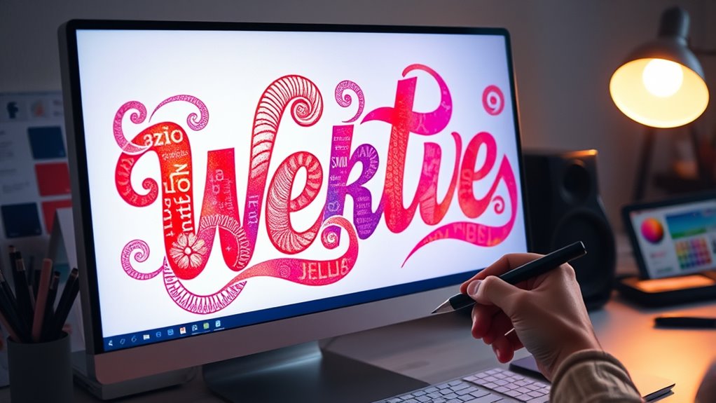
To make your website stand out, embrace expressive typography by choosing fonts that convey mood and personality beyond default options. Use thoughtful font pairing and adjust scale, spacing, and color to add visual interest and emotional depth. Combining contrasting styles creates a clear hierarchy and a cohesive look that guides viewers naturally through your content. Keep experimenting with typography aesthetics—if you stay curious, you’ll discover even more ways to craft a mesmerizing visual language.
Key Takeaways
- Choose expressive, custom fonts that match the mood and personality of your message.
- Pair fonts with contrasting styles and weights to create visual interest and hierarchy.
- Use thoughtful layout, scale, and color to enhance the emotional impact of typography.
- Avoid default fonts; explore unique typefaces to establish a distinctive voice.
- Incorporate dynamic typography techniques like variable fonts and animated text for added expressiveness.

Typography has the power to communicate mood, personality, and emphasis, especially when it’s expressive. When you step beyond default fonts, you access a world of visual storytelling that can deeply resonate with your audience. The key lies in understanding typography aesthetics—the art of choosing typefaces that convey a specific tone or feeling. Whether you want your website to feel elegant, playful, or bold, selecting the right fonts can set the entire mood. But it’s not just about picking one typeface; it’s about combining them effectively through font pairing techniques. These techniques help you create harmony and contrast, giving your design a polished, intentional look.
Expressive typography communicates mood and personality, transforming your design through thoughtful font pairing and visual storytelling.
To master typography aesthetics, you need to contemplate the personality each font projects. For example, a serif font might evoke tradition and reliability, while a sans-serif can feel modern and clean. Script fonts add a touch of elegance or whimsy, depending on how they’re used. When you match fonts thoughtfully, you enhance readability and reinforce your message’s emotional impact. The goal is to avoid chaos and instead craft a visual hierarchy that guides your viewer’s eye naturally. This is where font pairing techniques shine—they teach you how to combine typefaces that complement each other rather than clash.
Start by choosing a primary font that establishes your tone. If you’re designing a professional website, a sturdy serif or minimalist sans-serif might work best. Then, find a secondary font to add contrast—perhaps a script for headings or an accent font for highlights. Pairing fonts involves balancing their differences and similarities, such as stroke width, letter spacing, or style. For instance, combining a bold display font with a lighter, more subdued body type creates visual interest without overwhelming the viewer. It’s about creating a rhythm that feels both dynamic and cohesive.
You should also pay attention to scale, line spacing, and color to enhance your typography aesthetics further. These elements, combined with strategic font pairing, allow you to craft expressive typography that feels intentional and compelling. When you go beyond defaults, you give your website a unique voice. By mastering font pairing techniques, you guarantee your typography isn’t just visually appealing but also emotionally resonant. This approach transforms your design from ordinary to captivating, making your message more memorable. Ultimately, expressive typography on the web isn’t just about style; it’s about creating a visual language that speaks directly to your audience’s feelings and perceptions. Additionally, understanding typography aesthetics can help you communicate more effectively and create a cohesive visual identity.
Frequently Asked Questions
How Can I Ensure Cross-Browser Compatibility With Expressive Fonts?
To guarantee cross-browser compatibility with expressive fonts, you should first check font licensing to confirm you have the rights to use them across all browsers. Use a font-face declaration with multiple font formats for browser fallback, ensuring that if one format isn’t supported, others will display correctly. Test your site in various browsers regularly, and keep your font files optimized for faster load times and consistent appearance.
What Are Best Practices for Responsive Typography Design?
Think of your typography hierarchy as a musical score, guiding the eye smoothly through your content. Use flexible units like rem and %, and employ media queries to adapt font sizes across devices. Pair fonts thoughtfully to create contrast and harmony. This approach guarantees your responsive typography stays clear and engaging, regardless of screen size, turning your design into a visual symphony that resonates with every user.
How Do I Optimize Load Times for Custom Expressive Fonts?
To optimize load times for custom expressive fonts, start by choosing efficient font file formats like WOFF2 and WOFF, which offer smaller sizes and faster load speeds. Implement font loading strategies such as font-display: swap to guarantee text remains visible during loading. Additionally, only include necessary font weights and styles, and consider hosting fonts locally to reduce external requests, speeding up your website’s overall performance.
What Accessibility Considerations Are Important for Expressive Typography?
Think of accessibility as a bridge connecting everyone to your expressive typography. You need to guarantee good color contrast so text remains readable for all, and make sure your fonts are navigable via keyboard. Use semantic HTML and ARIA labels to guide users who rely on assistive tech. By prioritizing these, you create an inclusive experience where expressive fonts enhance, not hinder, accessibility for every visitor.
How Can I Combine Expressive Typography With Other Design Elements Effectively?
You can combine expressive typography with other design elements by experimenting with creative pairings like bold images or subtle animations that complement your text. Focus on establishing a clear visual hierarchy so your message remains understandable while the typography adds personality. Use contrast and spacing strategically, ensuring each element supports the overall aesthetic and accessibility, creating a cohesive, engaging experience that guides viewers effortlessly through your content.
Conclusion
By embracing expressive typography, you open a world where words breathe and stories resonate beyond plain text. Don’t settle for defaults—dare to experiment and craft visuals that truly captivate. Think of typography as a painter’s brush, turning simple strokes into vibrant expressions. So, take the leap, let your creativity flow, and watch your website transform from ordinary to unforgettable. After all, isn’t it time your words truly spoke for themselves?


