To design delightful empty states, focus on creating visuals that reinforce your message and make the experience inviting. Use friendly, clear copy that guides users gently toward next steps, and add interactive elements like buttons or prompts to encourage exploration. Incorporate motivational messages or subtle animations to keep users engaged. Testing and refining your design guarantees it truly resonates. Keep these strategies in mind, and you’ll craft empty states that turn a blank screen into an engaging opportunity.
Key Takeaways
- Incorporate friendly, clear copy that guides users and sets positive expectations during empty states.
- Use engaging visuals, icons, or illustrations that align with your brand and evoke an inviting atmosphere.
- Include actionable elements like buttons or links to encourage exploration and reduce frustration.
- Add animations or playful elements to make empty states lively, memorable, and uplifting.
- Test and refine your designs based on user feedback to ensure clarity, accessibility, and delightful experiences.
Top picks for "design empty stat"
Open Amazon search results for this keyword.
As an affiliate, we earn on qualifying purchases.
Understanding the Purpose of Empty States

Have you ever wondered why empty states appear in your app or website? They serve a crucial purpose by providing contextual relevance, guiding users when there’s no content to display. Empty states help set clear expectations, reducing confusion and frustration. They anticipate user needs by offering actions or tips, encouraging engagement instead of leaving users staring at a blank screen. When designed thoughtfully, empty states can transform a potentially negative experience into an opportunity for discovery and interaction. They communicate that your app understands the user’s journey and is there to support them at every step. Incorporating visual cues into empty states can further enhance user understanding and engagement. Recognizing the purpose of empty states is key to creating effective, user-centered empty states. Additionally, integrating contextually relevant information can make these states more helpful and engaging for users, especially in complex areas like AI security, where user guidance is essential.
Incorporating Visual Elements for Engagement

Incorporating visual elements into empty states considerably boosts user engagement by making the message more appealing and easier to understand. To achieve this, focus on these key strategies:
- Use iconography consistency to reinforce your message and create a cohesive look across your interface.
- Choose a color palette that aligns with your brand, evokes the right emotions, and guides users’ attention.
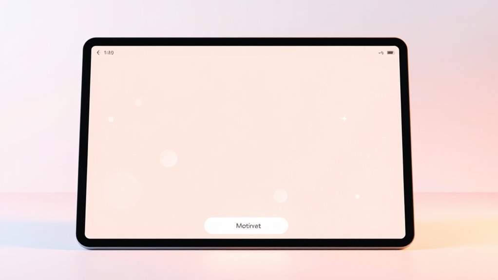
- Add simple illustrations or animations to make the empty state feel lively and inviting.
- Guarantee visual elements complement the copy, enhancing clarity without overwhelming the user.
- Incorporate market trend insights to better tailor your visual cues to current user interests and behaviors.
- Leverage insights from retirement planning to ensure your visual elements resonate with user goals and expectations.
- Consider best anime movies and animated films that touch hearts to inspire emotionally engaging visuals that resonate with diverse audiences.
- Ensure that your brand identity is reflected consistently across all visual elements to build trust and recognition.
Crafting Clear and Friendly Copy

Clear and friendly copy transforms empty states from frustrating dead ends into helpful, welcoming messages. Your microcopy tone should feel approachable and empathetic, guiding users without sounding stern or technical. Use simple language that clearly explains what’s happening and what they can do next. Focus on user guidance by providing concise instructions or suggestions, making the next steps obvious. Avoid jargon or complex phrases that might confuse or intimidate users. Instead, aim for warmth and clarity, so users feel supported rather than lost. Well-crafted copy reassures users, reduces frustration, and encourages continued engagement. Remember, your words are the bridge between confusion and confidence. When you craft clear, friendly copy, you create an inviting space where users feel understood and motivated to move forward. Incorporating user feedback can help tailor your messaging to better meet user needs and expectations. Additionally, emphasizing sustainable habits can foster ongoing user trust and engagement. Paying attention to user experience principles ensures your messages remain helpful and positive, even in less-than-ideal situations. Highlighting electric bike features can also help users better understand options like horsepower, speed, and pricing, reducing uncertainty during their journey. Understanding AI-powered virtual reality in e-learning can further enhance how you design engaging and supportive empty states for digital platforms.
Adding Interactive and Motivational Components
Adding interactive and motivational components to your empty states can turn a potential dead-end into an engaging experience. Incorporate elements that invite user involvement and inspire action. For example:
Transform empty screens into engaging opportunities with interactive features and motivational messages that inspire action and curiosity.
- Use interactive elements like buttons or links that encourage users to explore or add content.
- Include motivational messaging that reassures users, such as “Start creating your first project!”
- Add gamification features like progress bars or badges to boost engagement.
- Incorporate subtle animations or visuals that make the empty state feel lively and welcoming.
- Highlight the importance of relationship awareness by prompting users to reflect on their current experiences and encouraging them to take meaningful steps forward.
These features not only guide users but also make the experience enjoyable, transforming a blank screen into an opportunity for connection and motivation. Well-placed interactive elements and motivational messaging turn inactivity into curiosity and action.
Testing and Refining Your Empty State Designs

Once you’ve implemented interactive and motivational elements in your empty states, it’s time to see how they perform in real-world use. Gather user feedback through surveys, usability tests, or direct observations to identify what’s working and what needs improvement. Pay close attention to accessibility considerations, ensuring your design is inclusive for all users, including those with disabilities. Look for patterns in how users interact with your empty states—are they engaging with prompts? Do they easily understand the messaging? Use this data to refine your design, making adjustments to improve clarity, engagement, and accessibility. Incorporating data-driven strategies can further optimize performance and ensure measurable results. Additionally, analyzing user behavior patterns can reveal which elements resonate most effectively with your audience. Conducting regular usability testing helps maintain high standards and adapt to evolving user needs. Emphasizing emotional support in your design can foster trust and positive feelings from users. Continuous iterative design ensures your empty states remain effective and user-centric. Continuous testing and iteration help you create empty states that not only inform but also delight every user, fostering a positive experience from the very first interaction.
Frequently Asked Questions
How Do Empty States Vary Across Different Industries?
You notice that empty states differ across industries because of industry-specific patterns and cultural considerations. For example, in e-commerce, they might be playful to encourage shopping, while in finance, they’re more professional and reassuring. You should tailor your design to fit the industry’s tone and audience expectations, respecting cultural nuances. By doing so, you create more engaging, relevant empty states that guide users effectively without feeling out of place.
What Are Common Mistakes to Avoid in Empty State Design?
When designing empty states, avoid common mistakes like neglecting clear call to action strategies and poor visual hierarchy. You might clutter the space or make the call to action hard to find, which confuses users. Instead, focus on guiding users with simple, prominent prompts and use visual elements to prioritize information. This approach helps users understand what to do next and improves overall engagement, making your design more effective.
How Can Accessibility Be Prioritized in Empty States?
Think of accessibility as the bridge that connects everyone to your design. You should guarantee your empty states are screen reader friendly by using clear alt texts and semantic HTML. Make keyboard navigation seamless, so users can move effortlessly without a mouse. Focus on high contrast colors and readable fonts. When you prioritize these, you create a space where all users feel welcomed, turning silent gaps into open doors.
What Tools or Software Assist in Designing Engaging Empty States?
You can use tools like Figma, Adobe XD, and Sketch to design engaging empty states that boost visual design and tap into user psychology. These platforms offer templates, interactive features, and collaboration options, making it easier to craft compelling visuals and messages. By experimenting with colors, icons, and copy, you create empty states that guide users smoothly, ensuring an engaging experience that aligns with psychological triggers and enhances overall usability.
How Do User Behaviors Influence Empty State Effectiveness?
Think of user behavior as the wind guiding a sailboat; it shapes how your empty states perform. When you understand user motivation and emotional impact, you create empty states that resonate deeply. By observing what drives users and their feelings when they encounter empty states, you can craft messages that inspire action. This awareness guarantees your design connects emotionally, turning a simple blank screen into an engaging, motivating experience that encourages users to explore further.
Conclusion
By thoughtfully designing your empty states, you paint a welcoming scene that invites users to explore further. Imagine a clean, inviting canvas with friendly words guiding them, accompanied by engaging visuals and subtle interactions that spark curiosity. When you test and refine these moments, they become vibrant gateways, turning silence into stories and blank space into opportunity. With each detail, you create a space where users feel motivated, understood, and enthusiastic to take the next step.