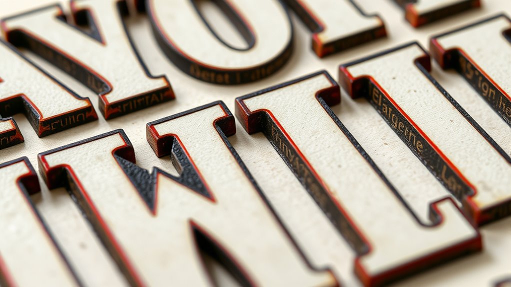
Typography anatomy includes key elements like terminals, which are the finishing strokes at letter ends, and stems, the main vertical or diagonal strokes that form the backbone of letterforms. Crossbars connect parts of letters, while serifs add decorative or functional strokes. Understanding how curves, ascenders, and ligatures shape characters helps you choose and craft type that communicates your message effectively. Keep exploring these components to master how each detail influences overall style and readability.
Key Takeaways
- Terminals are finishing strokes at letter ends, with styles like rounded, flat, tapering, and beaked affecting tone.
- Stems are the main vertical or diagonal strokes that form the backbone of letterforms, influencing structure and balance.
- Crossbars connect parts of letters horizontally or diagonally, contributing to overall visual harmony and legibility.
- Serifs are small strokes added to letter ends, with styles such as slab, wedge, or bracket, shaping personality and style.
- Understanding these elements enhances font selection, design cohesion, and the expressive qualities of typography.

The Anatomy of Type: A Graphic Guide to 100 Typefaces
Used Book in Good Condition
As an affiliate, we earn on qualifying purchases.
As an affiliate, we earn on qualifying purchases.
Understanding the Basic Elements of Letterforms
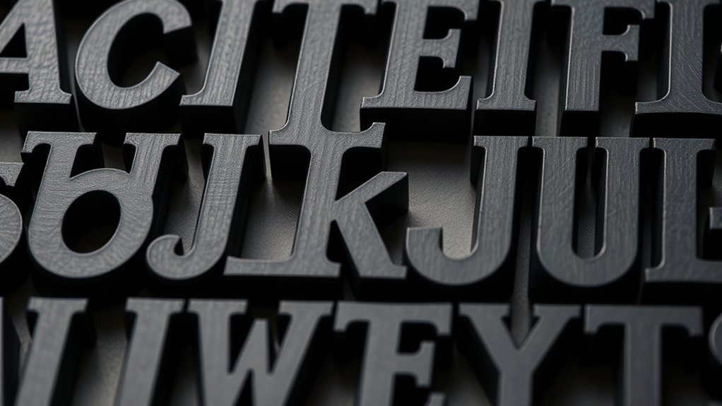
To understand letterforms fully, you need to recognize their basic elements. These include parts like the stem, bowl, and ascender, which shape the letter’s overall structure. Pay attention to letterform symmetry, as it influences how balanced and harmonious a letter appears. Symmetry can be vertical, horizontal, or radial, affecting the visual stability of the type. Additionally, consider typographic color—the overall density and visual weight created by the arrangement of strokes and negative space. This color impacts legibility and aesthetic appeal. Recognizing these elements helps you analyze how letters communicate tone and style. By understanding how symmetry and typographic color function within letterforms, you gain a foundation for manipulating type effectively and creating visually compelling designs.

Custom Font Number and Letter Stamping Tool Case (36 Lowercase Stamps/Alphabet 0-9#, ") 1/8 inch (3mm) Letters, Numbers, Symbols – Hard Carbon Steel Tools – Stamp/Punch Metal, Jewelry, Leather, Wood
✔ 36 DURABLE HARDENED STEEL 3mm Stamps – Full 26 Lowercase Letter Alphabet (b MULTIFUNCTIONAL for q, d…
As an affiliate, we earn on qualifying purchases.
As an affiliate, we earn on qualifying purchases.
What Are Terminals and Their Variations

Terminals are the finishing strokes at the ends of a letter’s main strokes, and they play an essential role in defining a typeface’s character. Different terminal styles create distinct letterform variations, influencing the overall aesthetic. Some common terminal styles include rounded, tapering, and flat ends, each contributing unique visual qualities. Rounded terminals give a softer, more approachable feel, while tapering terminals add elegance. Flat terminals often create a clean, modern look. Here’s a quick overview:
| Terminal Style | Description | Example Usage |
|---|---|---|
| Rounded | Smooth, curved endings | Script fonts |
| Tapering | Narrow, pointed ends | Serif fonts |
| Flat | Straight, abrupt endings | Sans-serif fonts |
| Beaked | Sharp, beak-like points | Display typefaces |
Understanding these variations helps you recognize and choose appropriate letterforms for your design. Recognizing typography anatomy can also aid in creating cohesive visual identities. Additionally, awareness of letterform features can improve your ability to select fonts that match the desired tone and style. Exploring the design principles behind letterform construction can further enhance your typographic skills. Being familiar with terminal variations allows designers to fine-tune the visual impact of their typefaces. Recognizing how terminal styles influence readability is also important for effective communication.

Faux Calligraphy for Beginners: A Step-by-Step Guide to Creating Beautiful Hand-Lettered Designs with Any Pen – Master Faux Calligraphy Techniques, … Stunning Typography (Calligraphy Workbooks)
As an affiliate, we earn on qualifying purchases.
As an affiliate, we earn on qualifying purchases.
The Role of Stems in Typeface Structure
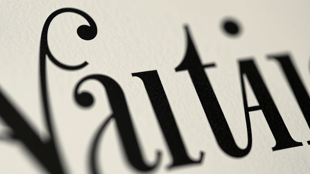
Have you ever noticed how the vertical and diagonal strokes in a typeface define its overall stability and readability? These are the stems, the main vertical or diagonal lines that form the backbone of letterforms. Stems contribute markedly to letterform symmetry, shaping how balanced and harmonious a character appears. They also influence stroke contrast, the difference between thick and thin parts of a letter, which affects legibility and style. Strong, consistent stems provide structure, guiding your eye smoothly across words. Variations in stem weight and length can make a typeface feel more formal or casual. Additionally, understanding the importance of stems can help in typography design principles that vary by design context. Recognizing the role of stems in visual hierarchy enables designers to create more effective and aesthetically pleasing compositions. By understanding the role of stems, you better appreciate how they establish the foundation of a typeface’s personality and readability, supporting both aesthetic appeal and functional clarity. Moreover, stems are integral to the overall typeface architecture, ensuring that individual characters work together cohesively within a font family.

Palace Learning Muscular & Skeletal System Anatomical Poster Set – LAMINATED 2 Chart Set – Human Skeleton & Muscle Anatomy – (18" x 24")
Muscular & Skeletal System Anatomical Chart Set – LAMINATED
As an affiliate, we earn on qualifying purchases.
As an affiliate, we earn on qualifying purchases.
Exploring Crossbars and Their Function
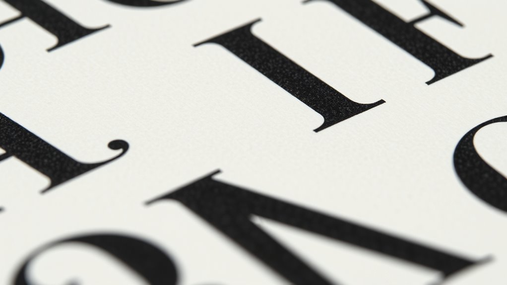
Crossbars are horizontal or diagonal strokes that connect different parts of a letter, playing a crucial role in shaping a character’s identity. They help define the letterform’s structure and contribute to the overall letterform balance. The crossbar function varies across typefaces; in some fonts, it emphasizes clarity, while in others, it creates visual harmony. For example, in a lowercase ‘A’ or ‘H,’ the crossbar stabilizes the shape and guides the eye. Design principles also influence how crossbars are styled to achieve different visual effects. Additionally, understanding typography anatomy can help in selecting the appropriate font styles for specific design needs. Using font variations effectively can alter the visual impact of a typeface’s crossbars and overall readability. The way crossbars are styled can also reflect different visual effects that influence the overall tone of a design. Recognizing how these elements interact enhances overall comprehension of letterform structure and improves design consistency.
The Significance of Serifs and Their Styles
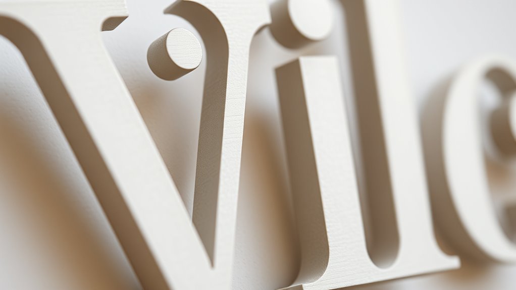
Serifs are the small lines or strokes regularly added to the ends of letterforms, serving both functional and decorative purposes. They influence how your text appears and feels, shaping its overall style. Different serif styles, like slab, wedge, or bracket, communicate distinct font personalities—formal, traditional, or modern. Choosing the right serif style helps you match your message’s tone. Incorporating curiosity-driven design can enhance visual interest and engagement.
Bowl and Loop: Curves That Define Letters

The curves formed by bowls and loops are essential elements that give letterforms their distinctive character. Calligraphic curves flow smoothly, adding elegance and rhythm to the typeface. These bowls, often rounded and symmetrical, define the shape of letters like ‘o,’ ‘d,’ and ‘b,’ creating a sense of unity. Decorative loops, a more ornate form of curves, add flair and personality, especially in script or display fonts. They can be subtle or elaborate, emphasizing the artistic aspect of typography. When you observe these shapes, you notice how they contribute to readability and style, shaping the overall aesthetic. Understanding design principles can help you master the craft of typography. By mastering the design of bowls and loops, you can influence the tone and personality of your lettering. Additionally, studying typographic anatomy provides insights into how these elements function within various typefaces, enhancing your ability to create visually appealing designs. Recognizing the curvilinear forms in letterforms allows designers to craft more harmonious and expressive typefaces, bridging the gap between form and function. Incorporating knowledge of letterform structure ensures that each curve contributes meaningfully to the overall design. Moreover, understanding the scale of curves helps in maintaining consistency across different type styles and sizes.
Ascenders, Descenders, and Their Impact on Legibility
Have you ever noticed how some letters seem to reach higher or dip lower within a line? Those are ascenders and descenders, and they profoundly impact legibility. They influence your overall letter spacing and how easily readers navigate text. Here’s what you should consider:
- Proper spacing ensures ascenders and descenders don’t clash, maintaining clarity.
- They help establish a clear typographic hierarchy, guiding the reader’s eye smoothly.
- Excessive height differences can disrupt reading flow, making text harder to scan.
- Balancing ascenders and descenders creates a cohesive, readable text block.
The Anatomy of Ligatures and Special Characters
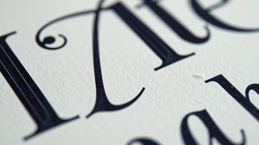
Ever wondered how certain letter combinations create seamless connections or add stylistic flair to your text? That’s where ligature design comes into play. Ligatures are specially crafted characters that merge two or more letters, improving flow and readability. They’re often used in elegant typography to prevent awkward gaps or collisions between characters. You’ll also find special character usage in various fonts, such as ampersands, diacritical marks, or currency symbols, which add nuance and clarity. Understanding the anatomy of ligatures helps you appreciate their role in type design and how they enhance visual harmony. Whether for decorative purposes or functional clarity, ligatures and special characters are essential tools for creating polished, professional typography.
How Typeface Anatomy Influences Design Choices
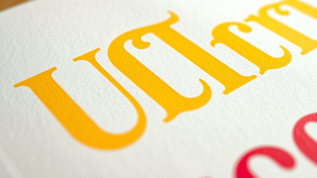
The anatomy of a typeface directly affects how easily your audience reads and understands your message. It also helps you choose styles that match the aesthetic tone and personality you’re aiming for. Plus, specific features can strengthen your brand identity and make your design more memorable.
Impact on Readability
Because the anatomy of a typeface directly affects how easily text can be read, you need to consider features like stroke width, x-height, and letter spacing to boost readability. Proper kerning adjustments ensure letters are well-spaced, preventing confusion or strain. When choosing fonts, font pairing strategies help create visual harmony and clarity. To improve readability, focus on:
- Adjusting stroke contrast for consistent weight.
- Optimizing x-height for better character recognition.
- Fine-tuning letter and word spacing for smooth flow.
- Using kerning adjustments to prevent awkward gaps.
Additionally, understanding how AI’s role in cybersecurity influences digital safety can help inform design choices that enhance user trust and security in digital interfaces.
These choices make your text easier to scan and understand, guiding the reader effortlessly through your message. Clear anatomy decisions directly impact how effectively your design communicates.
Aesthetic Style Variations
Typeface anatomy plays an essential role in shaping the overall aesthetic style of a design. By understanding how different letterforms are constructed, you can choose typefaces that evoke specific moods or artistic directions. Calligraphic techniques influence the flow and elegance of letter shapes, adding a handcrafted or sophisticated feel. Decorative flourishes, like swashes and ornate terminals, can enhance a typeface’s visual appeal, making it suitable for branding or invitations. Variations in stem thickness, terminal styles, and the presence of embellishments allow you to tailor a typeface’s personality—whether sleek, playful, or classical. Recognizing these anatomy details helps you select fonts that align perfectly with your design’s emotional tone, ensuring your message is not only readable but also visually compelling. Additionally, understanding the diverse designs available in typeface anatomy enables designers to match fonts with specific themes or interior aesthetics, much like selecting the right indoor planter to complement a space. The study of historical influences in font design can also inform choices, connecting modern typography with traditional craftsmanship and architectural styles. Being aware of drift in design trends can further refine your ability to choose typefaces that remain timeless and relevant, while also considering how modern digital tools impact font customization and use in contemporary projects. Furthermore, exploring how typography styles have evolved over time can provide deeper insight into current design preferences and innovations.
Brand Identity Significance
Understanding the anatomy of a typeface reveals how its design elements shape a brand’s identity. Your choice of fonts communicates personality and values, directly impacting perception. Over typography history, designers have refined features like terminals, stems, and counters to evoke specific emotions. Advances in font technology now allow for more precise adjustments, ensuring consistency across platforms.
- The shape of terminals can convey friendliness or professionalism.
- Stems influence the perceived strength or elegance of a brand.
- Counters affect readability and clarity in messaging.
- The overall style aligns with brand personality, from modern to classic.
Frequently Asked Questions
How Do Letterform Elements Affect Readability in Different Languages?
You should consider how letterform elements influence language-specific readability, as different scripts have unique characteristics that impact comprehension. For example, certain terminals or stems may enhance clarity in Latin alphabets but hinder understanding in East Asian or Arabic scripts. By respecting cultural typographic conventions, you guarantee your design communicates effectively across languages, making your text more accessible and comfortable for diverse audiences.
What Are the Historical Origins of Specific Typographic Terminations?
You might wonder about the origins of specific typographic terminations. Historically, calligraphic traditions and medieval manuscript styles influenced these designs, shaping how letter endings evolved. Scribes emphasized decorative terminals to enhance beauty and clarity, which later influenced print typography. Over time, these stylistic choices became standardized, allowing modern type designers to draw from a rich history rooted in artistic calligraphy and manuscript craftsmanship, giving each terminal its unique character.
How Do Digital Fonts Differ in Anatomy From Printed Typefaces?
Think of digital fonts as a lively river compared to a still pond. In screen display, digital rendering influences how typefaces appear, often causing differences in thickness, sharpness, or clarity compared to printed typefaces. You’ll notice that digital fonts may lack some fine details or have altered stems and terminals due to pixel limitations. These variations happen because digital fonts are designed for screens, making their anatomy adaptable to display technology.
Can Anatomy Features Predict a Typeface’s Emotional Tone?
You might wonder if anatomy features can predict a typeface’s emotional tone. They definitely influence emotional perception and design impact. For example, rounded terminals often evoke friendliness, while sharp stems suggest professionalism or aggression. Recognizing these features helps you choose fonts that align with your message. By understanding anatomy, you can craft designs that effectively communicate emotion and enhance your overall visual storytelling.
How Does Anatomy Influence the Scalability of Typefaces Across Media?
Anatomy substantially influences a typeface’s scalability across media by affecting its font adaptation and media versatility. When the design features clear terminals and stems, the font stays legible and consistent whether scaled up for posters or down for mobile screens. You should consider how these features maintain clarity at various sizes, ensuring your typeface remains effective and visually appealing across all media formats.
Conclusion
Think of typeface anatomy as the blueprint of a grand city, where each element—terminals, stems, and curves—guides your journey. By understanding these parts, you become the architect of your design, shaping messages that stand tall and resonate. Just as a city’s beauty lies in its details, your mastery of letterforms elevates your work from ordinary to extraordinary, turning every word into a carefully crafted monument of communication.
