
Understanding the anatomy of type involves knowing about x-height, ascenders, and descenders. X-height is the height of the lowercase letters, affecting how easy a font is to read at small sizes. Ascenders rise above the x-height, adding vertical movement, while descenders go below the baseline, impacting spacing and balance. These features influence a font’s look and functionality; exploring them more will help you choose the best fonts for any project.
Key Takeaways
- X-height is the vertical measurement of lowercase letters, excluding ascenders and descenders, influencing font readability and appearance.
- Ascenders are the upward strokes that extend above the x-height, adding vertical emphasis to letters.
- Descenders are the downward strokes that go below the baseline, affecting spacing and overall text balance.
- Understanding these elements helps in selecting fonts suited for specific design purposes and readability needs.
- The proportions of x-height, ascenders, and descenders vary across typefaces, shaping their style and legibility.
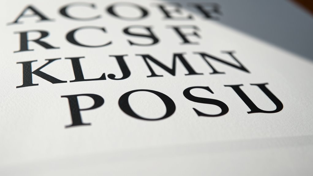
Ever wondered what makes a typeface visually appealing and functional? It all comes down to understanding the anatomy of type, especially elements like X-height, ascenders, and descenders. These features directly influence how readable and balanced a typeface appears. When you look closely at different fonts, you’ll notice that letter proportions vary greatly across typeface classifications, affecting both aesthetics and usability. Recognizing these distinctions helps you choose the right font for your project, whether you’re designing a poster, creating a website, or working on printed materials.
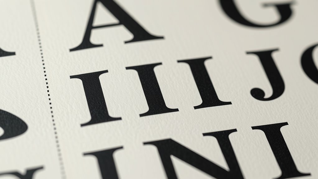
Letter proportions are fundamental to understanding how typefaces work. They define the size relationships between different parts of a letter, such as the height of lowercase letters relative to uppercase ones. For example, in a typeface with a high x-height, the body of the lowercase letters is larger, making the text more legible at small sizes. Conversely, a lower x-height often results in a more elegant, traditional appearance but can be harder to read in smaller text. These proportions also influence the overall tone of the typeface, with some styles feeling more modern and others more classic. Typeface classifications—serif, sans-serif, script, display—each have unique letter proportions that suit different contexts. Serif fonts, for instance, typically have more varied letter shapes with pronounced strokes and distinct proportions, while sans-serif fonts tend to have more uniform and simplified letterforms, often with larger x-heights for clarity.
X-height, ascenders, and descenders are critical in shaping the visual harmony of a typeface. The X-height refers to the height of lowercase letters, excluding ascenders and descenders. A taller x-height makes lowercase letters more prominent, which boosts readability, especially at small sizes. It impacts how quickly your eyes can recognize words and parse text. Ascenders are the parts of letters like ‘b,’ ‘d,’ ‘f,’ and ‘h’ that extend above the x-height, adding vertical movement and rhythm to text. Descenders, on the other hand, are the portions of letters like ‘g,’ ‘j,’ ‘p,’ and ‘q’ that go below the baseline. Both ascenders and descenders influence the overall spacing and visual balance of a typeface, affecting how tightly or loosely the text appears. Understanding letter proportions and how they vary across fonts can help you select a typeface that enhances readability and visual appeal. Different classifications emphasize these features differently; for example, a display font might have exaggerated ascenders and descenders for decorative effect, while a body text font prioritizes balanced proportions for comfort during extended reading.
In essence, the anatomy of type—particularly letter proportions, x-height, ascenders, and descenders—plays a crucial role in making a typeface both attractive and functional. By paying attention to these details, you can select fonts that not only look good but also serve their purpose effectively. Recognizing how different typeface classifications handle these elements enables you to make more informed design choices, ensuring your message is communicated clearly and beautifully.

D.A.R.E Detectives: The Mystery on Lovett Lane (Dyslexia Font) (Dyslexia Reading Books for Kids Age 8-12)
As an affiliate, we earn on qualifying purchases.
As an affiliate, we earn on qualifying purchases.
Frequently Asked Questions
How Does X-Height Influence Font Readability?
Your x-height substantially impacts font readability by affecting how easily you can distinguish words. A larger x-height makes letters more visible, improving letter spacing and making text clearer, especially at smaller sizes. It also influences font weight perception, as taller lowercase letters can appear bolder and more legible. When choosing fonts, consider x-height to enhance readability, ensuring your text remains comfortable to read across various contexts.
What Are the Historical Origins of Ascenders and Descenders?
Tracing the timeless traces of lettering, you see that ascenders and descenders originate from medieval scribes who sought to maximize space and clarity. These early artisans elongated certain strokes, creating the towering ascenders and dipping descenders that distinguish letters today. Their inventive improvisations laid the foundation for modern typography, shaping how we read and recognize words. You can still see their influence in the intricate, inspiring shapes of contemporary typefaces.
How Do Different Typefaces Vary in X-Height?
You’ll notice that different typefaces vary in x-height, affecting readability and overall appearance. Some fonts have a larger x-height, making lowercase letters more prominent and improving legibility at smaller font sizes. Others feature a smaller x-height for a more elegant or traditional look. These design variations influence how text feels and functions, so choosing the right font size and style depends on your specific design goals and the message you want to convey.
Can Adjusting X-Height Improve Legibility in Small Text?
Yes, adjusting x-height can improve legibility in small text. Increasing x-height makes lowercase letters taller, helping you read more easily at tiny sizes. When working with small type, you should also make kerning adjustments to prevent letter collisions, and consider type size variations to optimize clarity. These tweaks guarantee your text remains clear and comfortable to read, especially when space is limited or the font is particularly small.
How Do Ascenders and Descenders Affect Line Spacing?
Ascenders and descenders influence line spacing by affecting the space needed between lines for clarity. When they’re tall, you may need to increase letter spacing or adjust paragraph alignment to prevent overlap and guarantee readability. If you disregard these features, lines can look crowded or uneven, making your text harder to read. Properly balancing ascenders, descenders, and spacing creates a clean, professional appearance that guides the reader smoothly through your content.
Dritz Styling Design Ruler with How-to Illustrations
Easy-to-see markings for light and dark fabrics
As an affiliate, we earn on qualifying purchases.
As an affiliate, we earn on qualifying purchases.
Conclusion
By understanding the anatomy of type, you gain better control over readability and style. Did you know that type with taller x-heights is 20% easier to read, especially in small sizes? Recognizing the roles of ascenders and descenders helps you choose fonts that enhance your message. So, next time you’re selecting a typeface, remember these elements—they’re the secret to making your text both attractive and effective.

Pickett Letter and Number Guide, Modern Light Font, 1/8, 3/16 and 1/4 Inch Sizes (36VI)
Includes vertical letters and numbers
As an affiliate, we earn on qualifying purchases.
As an affiliate, we earn on qualifying purchases.
typeface comparison chart
As an affiliate, we earn on qualifying purchases.
As an affiliate, we earn on qualifying purchases.