Creative uses of typography in editorial design go beyond just conveying information; they turn type into a visual storytelling tool. You can experiment with oversized, expressive letterforms or intricate custom lettering to evoke emotion and personality. Mastering font pairing and manipulating size, spacing, and alignment helps craft engaging visual narratives. Bold, innovative treatments can make your layouts more dynamic and memorable. Keep exploring these techniques, and you’ll discover even more ways to elevate your editorial work.
Key Takeaways
- Incorporate oversized, expressive letterforms to transform layouts into visual art.
- Use contrasting font pairings to create hierarchy and visual interest.
- Manipulate size, spacing, and alignment to evoke emotion and guide reader focus.
- Integrate typography with imagery for cohesive, immersive storytelling.
- Break traditional grid structures to produce innovative, unexpected editorial designs.
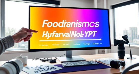
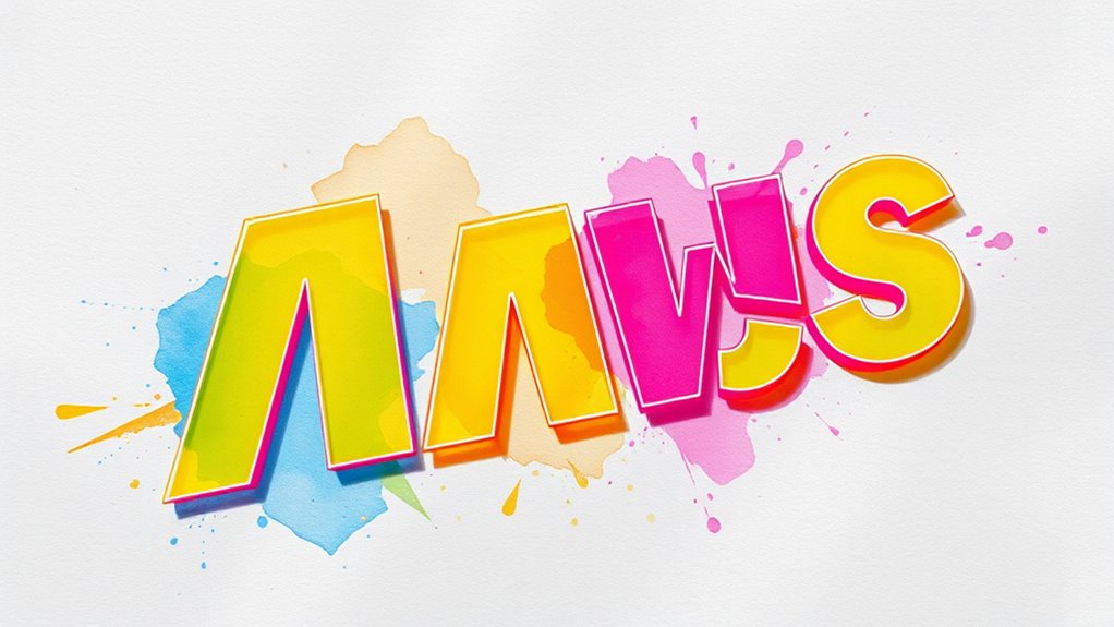
Typography isn’t just about making text readable; it’s a powerful tool that can shape the entire mood and message of an editorial design. When you treat typography as art, you’re elevating it beyond mere functionality, transforming it into a visual language that communicates emotion, personality, and style. This approach allows you to craft layouts where type becomes a central visual element, not just an afterthought. You might experiment with oversized, expressive letterforms that capture attention or incorporate intricate custom lettering that adds a unique character to your pages. By viewing typography as art, you’re free to push boundaries and create designs that are both visually mesmerizing and deeply meaningful.
Typography transcends readability; it becomes a visual language that shapes emotion, personality, and style in editorial design.
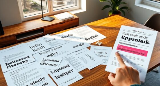
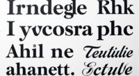
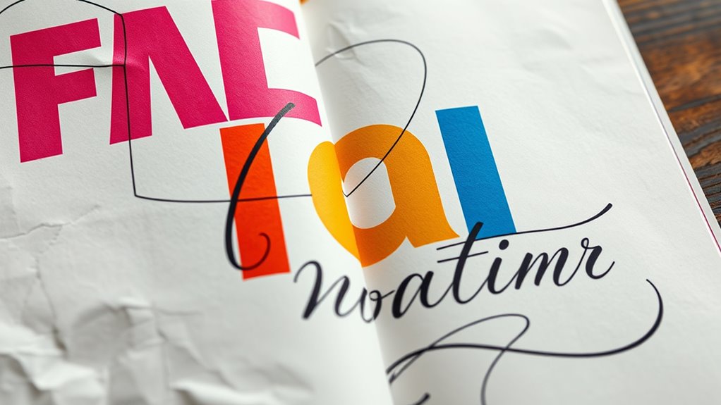
One of the key techniques in achieving this is mastering font pairing techniques. Combining different typefaces thoughtfully can enhance the overall aesthetic impact and reinforce the intended message. For example, pairing a bold, modern sans-serif with a delicate serif can create a dynamic contrast that draws the reader’s eye and establishes a clear hierarchy. You might also blend a handwritten script with a clean, geometric font to evoke a sense of personality and professionalism simultaneously. The trick is to balance these choices carefully—consider how the different fonts interact, their mood, and how they complement each other within the layout. When you effectively use font pairing techniques, you not only improve readability but also add layers of meaning and visual interest to your editorial design.
Using typography creatively involves more than just selecting appealing fonts; it’s about understanding how size, weight, spacing, and alignment influence perception. You can experiment with scale, making headlines dominant and body text subdued, or vice versa, to guide the reader’s focus. Playing with kerning and leading can evoke a particular rhythm or emotion, whether it’s smooth and flowing or sharp and jarring. Additionally, integrating typographic elements into imagery or breaking traditional grid structures can produce unexpected, engaging designs. These choices demonstrate your ability to manipulate typography as an expressive medium, transforming standard pages into captivating visual stories. Incorporating typography as art allows for innovative visual storytelling that captures attention and communicates mood effectively.
Ultimately, creative typography in editorial design is about intentionality. When you approach it as both an art form and a strategic tool, you craft layouts that communicate more than words—they convey mood, personality, and message. Whether through innovative font pairings or artistic typographic treatments, you have the power to shape how your audience perceives and interacts with your content. Embrace the possibilities, experiment boldly, and let typography become a core element of your visual storytelling.

Logos that Last: How to Create Iconic Visual Branding
As an affiliate, we earn on qualifying purchases.
As an affiliate, we earn on qualifying purchases.
Frequently Asked Questions
How Does Typography Influence Reader Emotion and Perception?
Typography directly impacts your reader engagement and emotional resonance by setting the tone and mood of the content. Bold, sharp fonts evoke excitement or urgency, while soft, flowing typefaces create calmness and intimacy. When you choose the right typography, you influence how readers perceive the message, making it more compelling and memorable. This emotional connection encourages them to stay engaged and absorb the content more deeply.
What Are the Latest Trends in Editorial Typographic Experimentation?
You’re noticing bold breakthroughs in editorial typography, blending beautiful, brave experimentation with innovative ideas. Experimenting with expressive, exaggerated letterforms and dynamic typefaces, designers embrace playful, provocative approaches. These latest trends push boundaries, blending art and communication seamlessly. You’ll see a shift toward immersive, interactive layouts that captivate readers, making every page a personal, powerful experience. Stay inspired by this exciting evolution, where typography transforms from mere text to a visual voyage.
How Can Typography Improve Accessibility in Editorial Design?
To improve accessibility in editorial design, you should choose accessible fonts that are easy to read, like sans-serif options, and guarantee sufficient color contrast between text and background. This makes content more legible for everyone, including those with visual impairments. Additionally, avoid overly decorative fonts and small font sizes. Prioritizing clear typography helps your audience engage with the content comfortably and inclusively.
What Software Tools Are Best for Creative Typography Layouts?
You should consider using Adobe InDesign or Affinity Publisher for creative typography layouts, as they offer robust tools for font pairing and grid systems. These programs let you experiment with different typefaces and organize your content seamlessly. With features like style sets and precise alignment options, you can craft visually engaging layouts that enhance readability and aesthetic appeal, making your editorial design both creative and well-structured.
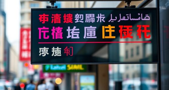
How Do Cultural Differences Affect Typographic Choices in Design?
You might think cultural differences don’t influence your typography choices, but they do—ironically, ignoring cultural symbolism and linguistic nuances can make your design seem clueless. Different cultures interpret fonts and symbols uniquely, so what feels modern in one country might offend or confuse in another. To truly connect, you must understand these subtle cues, tailoring typography to respect and reflect diverse cultural contexts, or risk alienating your audience.
OWDEN Professional 36Pcs. Steel Metal Stamping Tool Set,(1/8”) 3mm,Steel Number and Letter Punch Set,Alloy Steel Made HRC 58-62 for Jewelry Craft Stamping.
Owden Professional 36Pcs. Steel metal stamping set,number and letter punch set (1/8”) 3mm (Pls check if the dimensions…
As an affiliate, we earn on qualifying purchases.
As an affiliate, we earn on qualifying purchases.
Conclusion
As you embrace creative typography, imagine your pages transforming into vibrant cityscapes, where each letter is a glowing light guiding the reader’s eye. Your words become bridges connecting ideas, and bold fonts carve out pathways through busy layouts. With every design choice, you’re painting a lively mural that invites exploration. Let your typography breathe life into your editorial, turning static text into a dynamic landscape that sparks curiosity and leaves a lasting impression.

The Font Menu: A Pragmatic Guide to Font Pairings
As an affiliate, we earn on qualifying purchases.
As an affiliate, we earn on qualifying purchases.

Basics of Design: Layout & Typography for Beginners (Design Concepts)
Used Book in Good Condition
As an affiliate, we earn on qualifying purchases.
As an affiliate, we earn on qualifying purchases.