Typography plays a key role in shaping your brand’s personality and forging emotional bonds with your audience. Your font choices can quickly communicate traits like strength, elegance, friendliness, or innovation without using words. By selecting deliberate styles—bold for confidence, script for sophistication—you create a visual identity that stands out. When you understand how typography influences perception, you’ll craft a compelling, memorable brand image. Keep exploring to discover how to leverage font psychology for your brand’s success.
Key Takeaways
- Typography shapes brand personality by using font styles that evoke traits like professionalism, friendliness, or innovation.
- Strategic font choices enhance brand recognition and communicate identity without relying on images or words.
- Letterform styles, such as rounded or angular fonts, visually express the brand’s tone and emotional appeal.
- Consistent typography across media reinforces brand personality and fosters long-term audience associations.
- Proper font selection improves readability and user experience, strengthening overall brand perception.
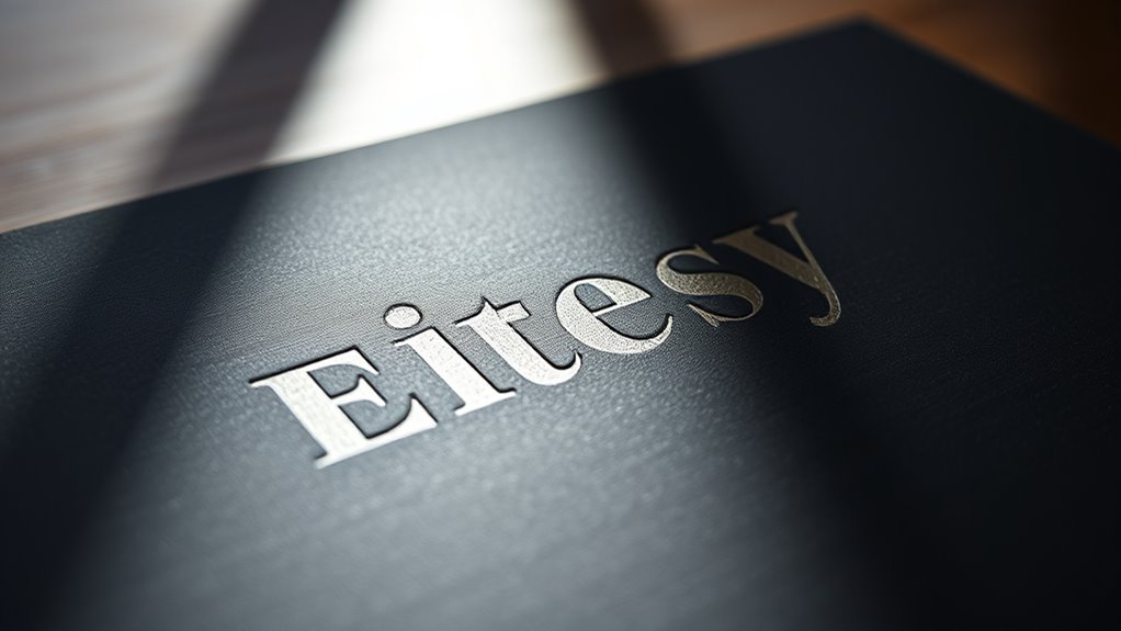
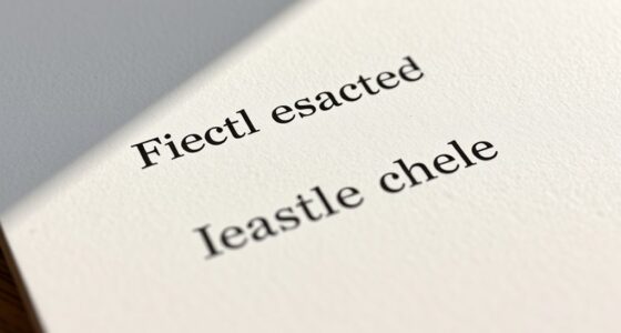
Have you ever wondered how some brands instantly capture your attention? It’s often due to their clever use of typography, which plays a pivotal role in shaping how you perceive their personality. When you look at a logo or a brand name, the font psychology behind it influences your emotional response and association. The letterform style—whether it’s sleek and modern or classic and ornate—tells a story before you even read a single word. That’s the power of typography in branding: it communicates personality without uttering a single sound.
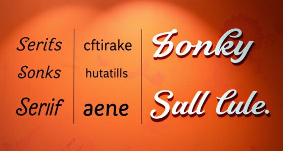
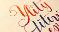
The choice of font isn’t random; it’s a strategic decision rooted in font psychology. For example, a bold, sans-serif typeface might evoke strength, confidence, and modernity, making it ideal for tech companies or sports brands. On the other hand, a delicate script font suggests elegance, sophistication, or tradition, which works well for luxury brands or boutique shops. When you see a font, you’re subconsciously assigning characteristics to it based on your past experiences and cultural associations. That’s why understanding font psychology is vital—because it helps you craft a visual identity that resonates with your target audience and communicates your brand’s core values.
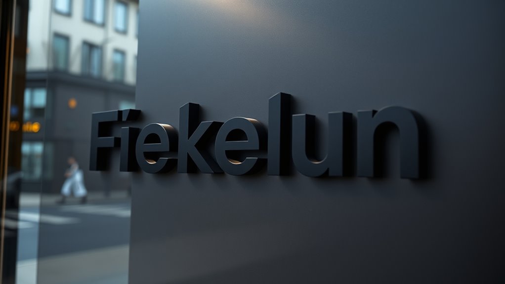
Letterform style also plays a central role in defining your brand’s voice. Rounded letterforms tend to feel friendly and approachable, while sharp, angular styles convey a sense of professionalism or edginess. If you’re designing a logo, consider how these styles reflect your brand personality. Do you want to appear trustworthy and warm? Then choose a softer, more rounded font. Want to project authority and innovation? Opt for a clean, geometric letterform style. The way each letter curves, angles, or maintains consistent thickness influences how viewers interpret your brand’s message.
It’s not just about aesthetics, either. The legibility and versatility of the font matter as well, especially in digital environments where readability impacts user experience. An effective typography choice aligns with your brand’s tone and helps you stand out in a crowded marketplace. When you combine font psychology with the appropriate letterform style, you’re creating a visual language that speaks directly to your audience’s subconscious. This deliberate use of typography ensures that your brand’s personality shines through clearly and memorably, making it easier for people to connect and remember you long after their initial encounter. Additionally, understanding the font psychology behind your choices ensures your branding remains consistent across various media and applications.
Top picks for "typography brand express"
Open Amazon search results for this keyword.
As an affiliate, we earn on qualifying purchases.
Frequently Asked Questions
How Does Typography Influence Consumer Trust?
Typography directly influences consumer trust by leveraging font psychology and readability impact. When you choose clear, consistent fonts, it signals professionalism and reliability, making consumers feel more confident in your brand. A well-considered typography style enhances readability, ensuring your message is easily understood. This combination helps build trust, as consumers perceive your brand as credible and approachable, encouraging loyalty and positive engagement.
What Are Common Mistakes in Brand Typography?
You often make mistakes in brand typography by neglecting font consistency and kerning accuracy. Using multiple fonts or inconsistent styles can confuse your audience, while poor kerning makes your text look unprofessional and harder to read. To prevent these issues, stick to a cohesive font palette and double-check your kerning. This ensures your branding appears polished, trustworthy, and visually appealing, strengthening your overall brand identity.
Can Typography Change Over a Brand’s Evolution?
Yes, typography can change over a brand’s evolution. You might update fonts to reflect shifts in brand identity or target audiences, but you should maintain visual consistency to keep recognition intact. As your brand grows, adjusting typography helps communicate new values or personality traits, ensuring your visual identity stays relevant while still feeling familiar. This balance keeps your branding fresh without losing its core essence.
How Do Cultural Differences Affect Typography Choices?
You might think typography is universal, but cultural differences profoundly influence your choices. Ironically, what looks modern in one culture could seem outdated or even offensive in another. You need to take into account cultural symbolism and language adaptation, ensuring your font respects local meanings and traditions. This awareness helps your brand resonate globally, avoiding missteps and making your message clear across diverse audiences.
What Tools Are Best for Customizing Brand Fonts?
You should consider tools like Adobe Fonts, Google Fonts, and Fontself for customizing brand fonts. These platforms let you explore font pairing options to create cohesive designs. Make certain to check font licensing to guarantee legal use, especially if you’re customizing or pairing fonts for commercial purposes. These tools help you craft unique, professional typography that expresses your brand’s personality effectively.
Conclusion
Your choice of typography can make or break your brand’s personality. When done right, it creates a memorable impression and builds trust. Did you know that 90% of information transmitted to the brain is visual? That’s why typography matters — it’s your brand’s silent voice. By selecting fonts that reflect your personality, you connect emotionally with your audience and stand out in a crowded market. So, choose wisely and let your type tell your story.