
When deciding whether to use skeuomorphism or flat design, consider your user’s needs. Skeuomorphism works best when familiarity and intuition are key, helping users recognize functions instantly with realistic visuals. Flat design suits projects aiming for speed, simplicity, and responsiveness across devices. Balancing these styles depends on your goals—if you want detailed engagement or clean efficiency. To uncover more about how to choose the right style for your project, keep exploring these concepts further.
Key Takeaways
- Skeuomorphism works best when users need immediate recognition of functions through familiar, real-world visuals.
- Flat design excels in applications prioritizing speed, responsiveness, and minimalism, especially on mobile and web interfaces.
- Use skeuomorphism for onboarding, tutorials, or tools where intuitive understanding benefits user experience.
- Flat design is preferred for scalable, clean interfaces where simplicity enhances usability and performance.
- Combining both styles strategically can leverage realism for engagement and flat design for efficiency.
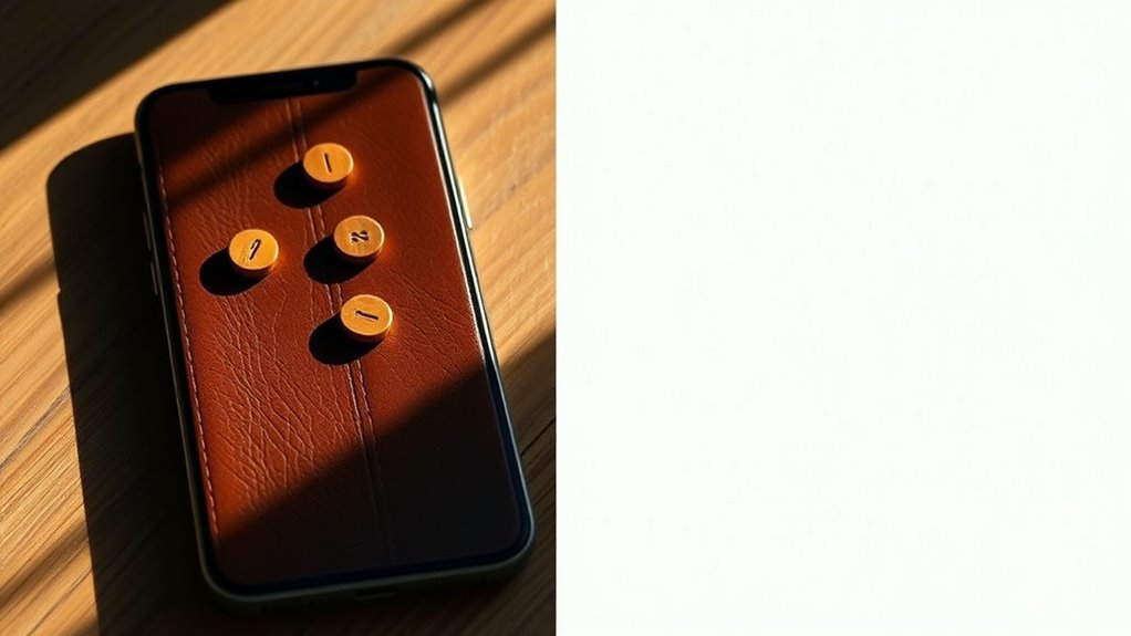
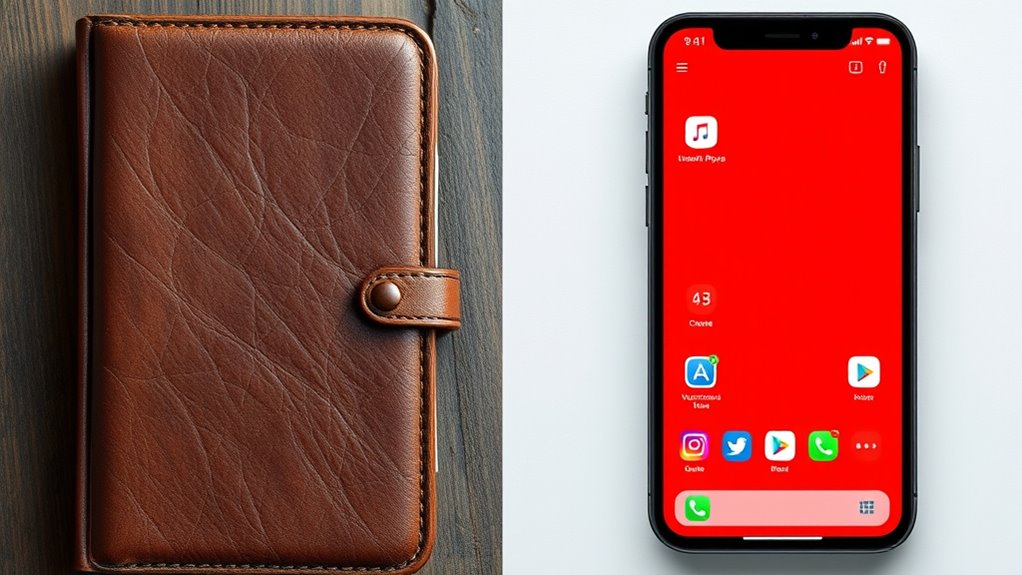
In the evolving world of user interface design, two prominent styles—skeuomorphism and flat design—offer contrasting approaches to creating visually engaging and functional digital experiences. As you navigate these styles, you’ll notice that each has its strengths and challenges, especially when it comes to usability concerns and maintaining visual consistency. Skeuomorphism aims to mimic real-world objects with detailed textures, shadows, and depth, which helps users instantly recognize functions based on familiar visuals. This approach can make interfaces feel intuitive because users see familiar cues—like a leather-bound notebook icon resembling a real book. However, this realism can also lead to usability concerns. Overly detailed or complex skeuomorphic elements might clutter the interface, distracting users or slowing down interactions. When visual cues are too elaborate, users may struggle to find what they need quickly, especially on smaller screens or less powerful devices. Additionally, maintaining visual consistency becomes challenging with skeuomorphism, as designers must ensure that all elements adhere to a realistic style without becoming inconsistent or overly decorative. Moreover, advances in generative AI can assist in creating more cohesive and adaptable skeuomorphic designs, addressing some of these challenges. Flat design, on the other hand, strips away unnecessary details, favoring simplicity, clean lines, and solid colors. This style often results in interfaces that are faster to load and easier to adapt across various devices and screen sizes. Because flat design emphasizes clarity and minimalism, it naturally enhances usability concerns—users can focus on core functions without distraction. The lack of shadows and textures reduces visual noise, making buttons, icons, and navigation elements more straightforward to identify and interact with. However, this simplicity can sometimes cause issues with visual consistency if designers don’t establish clear visual hierarchies. Without subtle cues like shadows or gradients, users might find it harder to distinguish clickable elements from static content, especially if all icons and buttons look similar. Ensuring consistency across the interface requires deliberate use of color, spacing, and typography to guide users seamlessly through the experience. Ultimately, your choice between skeuomorphism and flat design hinges on your project’s goals and target audience. If you prioritize familiarity and intuitive recognition, skeuomorphism’s realism can be beneficial—though you must be mindful of usability concerns and *aspire* for visual harmony. Conversely, if your focus is on speed, clarity, and broad device compatibility, flat design’s minimalism supports those aims but *endeavor* for careful attention to visual consistency. Both styles have their place, and understanding their nuances helps you craft interfaces that are not only attractive but also highly functional and user-friendly.
Frequently Asked Questions
How Does User Familiarity Influence Design Choice?
Your user familiarity considerably influences your design choice because it enhances user comfort and leverages visual familiarity. When users recognize familiar elements, they navigate interfaces more easily and confidently. You should incorporate familiar visual cues that align with user expectations, making interactions intuitive. This approach reduces learning curves and increases satisfaction, especially for complex tasks or early-stage products, ensuring a smoother user experience rooted in what users already know.
Are There Specific Industries Better Suited for Skeuomorphism?
Imagine holding a vintage camera; its textured grip invites touch—luxury branding often benefits from skeuomorphism, creating tactile interfaces that evoke elegance. Industries like high-end retail, automotive, and hospitality are better suited for skeuomorphic designs because they emphasize realism and sophistication. By mimicking real-world objects, you enhance user familiarity, making interfaces feel intuitive and premium, much like the craftsmanship behind a finely-made watch or leather-bound journal.
Can Hybrid Designs Combine Both Skeuomorphism and Flat Elements Effectively?
Yes, hybrid designs can effectively combine skeuomorphism and flat elements by focusing on visual harmony and design integration. You should carefully blend realistic textures and shadows with clean, simple layouts to create a seamless user experience. This approach allows you to highlight important features while maintaining modern aesthetics, making interfaces more engaging and intuitive without overwhelming users. Proper balance ensures both styles complement each other, enhancing overall usability.
How Do Accessibility Considerations Differ Between the Two Styles?
You should know that accessibility differs between skeuomorphism and flat design. With skeuomorphism, you need to guarantee good color contrast so users with visual impairments can distinguish elements, and make sure screen reader compatibility is seamless by providing descriptive labels. Flat design often relies on simple visuals, but still requires high contrast and clear icons for screen readers. Prioritize these factors to make your interface accessible to all users.
What Future Trends Might Influence Skeuomorphic or Flat Design Popularity?
You’ll likely see augmented reality and haptic feedback shape future design trends. Skeuomorphic elements may thrive in AR experiences, offering realistic, tactile interfaces that enhance immersion. Meanwhile, flat design could evolve with subtle textures or motion to incorporate depth without sacrificing simplicity. As technology advances, expect a blend of styles that leverage these innovations, making interfaces more intuitive, engaging, and responsive to user needs.
Conclusion
Ultimately, choosing between skeuomorphism and flat design is like picking the right paintbrush for your masterpiece. Skeuomorphism adds rich textures and depth, turning interfaces into familiar, tactile worlds. Flat design, on the other hand, offers a sleek, modern canvas that feels light and effortless. Both styles act as your artistic tools—use them wisely to craft digital experiences that resonate. After all, when realism works, it’s like painting with the colors of human intuition.