Accessibility Accessible Color Contrast and Readability Guidelines Learn essential accessible color contrast and readability guidelines to ensure your designs are inclusive and easy to read for all users. This Design Girl GirlDecember 23, 2025 View Post
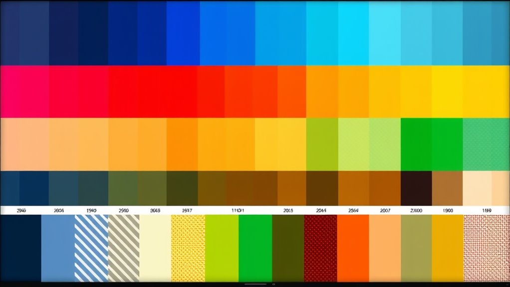
Accessibility Designing for Color Blindness: Palette Selection and Patterns Creating accessible designs for color blindness requires careful palette choices and pattern use to ensure clarity and inclusivity. This Design Girl GirlDecember 19, 2025 View Post
Accessibility Ensuring Color Contrast Accessibility Ineffective color contrast can hinder accessibility—discover essential tips to ensure your design is inclusive and easy to read for all users. This Design Girl GirlJuly 8, 2025 View Post