
Colors can evoke powerful emotions by tapping into cultural meanings, personal experiences, and contextual cues. For example, red might symbolize passion or urgency depending on your background, while blue can promote calmness or trust. Your perception of these colors is shaped by societal messages and environments. Understanding these influences allows you to intentionally select palettes that trigger desired feelings. If you want to explore how to use color psychology effectively, there’s more to uncover.
Key Takeaways
- Colors evoke specific emotional responses influenced by cultural associations and personal experiences.
- Context and environment significantly affect how colors are perceived and their emotional impact.
- Strategic color choices in design can influence mood, behavior, and perceptions effectively.
- Understanding cultural differences ensures appropriate use of colors to evoke desired emotions globally.
- Recognizing the layered meanings of colors enhances their psychological power in shaping environments and interactions.
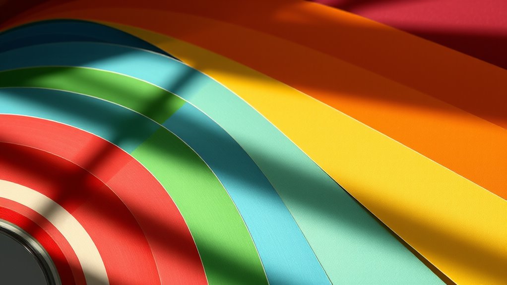
Have you ever wondered how colors influence your mood and behavior? The answer lies in the fascinating domain of the psychology of color, where your perceptions and cultural associations shape how you respond to different hues. Color perception isn’t just about noticing a shade; it’s about how your brain interprets that shade and links it to past experiences, emotions, or societal messages. For example, you might see red and immediately associate it with excitement, passion, or even danger, depending on your personal history and cultural background. These associations aren’t universal—they vary widely across cultures, influencing how you respond emotionally to certain colors. In Western societies, white often symbolizes purity and peace, whereas in some Eastern cultures, it’s linked to mourning. Recognizing these cultural associations helps you understand why a color evokes specific feelings in different contexts.
When you encounter colors, your mind doesn’t process them in isolation. Instead, it connects them to a web of cultural meanings, making your emotional response deeply rooted in your background. For instance, in many Asian cultures, red is a symbol of luck and prosperity, which can enhance feelings of optimism and celebration when used in design or attire. Conversely, in Western cultures, red might evoke urgency or warning, influencing your reactions in marketing or safety signs. These cultural associations are powerful because they embed colors with layered meanings, deepening their impact on your moods and behaviors. Additionally, the horsepower of electric dirt bikes demonstrates how certain colors and designs can evoke feelings of power and performance, similar to how specific hues influence emotional responses. When designing spaces or choosing clothing, understanding this connection helps you make choices that align with the emotional atmosphere you want to create or experience.
Your perception of colors is also influenced by context. A calm blue in a healthcare setting can promote relaxation, while the same blue in a corporate logo might convey trust and professionalism. The cultural associations you’ve learned over time guide your interpretation, ensuring that the emotional effect of a color is consistent with societal expectations. This is why a color’s impact can be so nuanced—what feels soothing in one culture might feel dull or even hostile in another. By being aware of these differences, you can consciously use color to evoke specific emotions or behaviors, whether in personal style, interior design, or branding efforts. Ultimately, understanding how your color perception intertwines with cultural associations empowers you to harness the psychological power of color more effectively, influencing your environment and interactions in subtle yet profound ways.
Top picks for "psychology color evok"
Open Amazon search results for this keyword.
As an affiliate, we earn on qualifying purchases.
Frequently Asked Questions
How Do Cultural Differences Influence Color Perception?
You should recognize that cultural differences greatly influence your perception of color. Cultural symbolism shapes your color interpretation, meaning that a color representing luck in one culture might signify mourning in another. These perceptions are deeply rooted in your cultural background, affecting how you respond emotionally to colors. Understanding this helps you appreciate diverse perspectives and avoid miscommunication, especially in global branding or design projects.
Can Color Psychology Improve Workplace Productivity?
Yes, color psychology can boost workplace productivity by leveraging color consistency and its emotional impact. When you choose calming hues like blue or green, you create a serene environment that reduces stress and enhances focus. Bright colors like yellow invigorate creativity, while consistent color schemes foster a cohesive atmosphere. By intentionally applying these principles, you help employees feel motivated and engaged, ultimately improving overall efficiency and job satisfaction.
What Colors Are Most Effective for Marketing Strategies?
You should focus on bold reds and energetic oranges to grab attention and evoke excitement, boosting your marketing impact. Incorporate color harmony to create visually appealing campaigns that align with your brand identity. Use calming blues for trust and reliability, especially in tech or finance sectors. Green indicates growth and health, perfect for eco-friendly products. Balancing these colors enhances message clarity and strengthens your overall marketing strategy.
How Do Individual Experiences Affect Emotional Responses to Colors?
Your personal memories and emotional conditioning shape how you respond to colors. For example, a certain shade might evoke happiness because it reminds you of a joyful moment, or it might trigger sadness if it’s linked to a negative experience. These individual experiences influence your emotional reactions, making colors feel unique to each person. Understanding this helps marketers create more personalized and impactful color strategies.
Are There Universal Color Associations Across All Cultures?
You’ll find that some color symbolism, like red for passion or danger, tends to be understood across many cultures, but cultural color norms vary widely. While certain colors evoke similar emotions globally, many associations are culturally specific. For example, white symbolizes purity in Western cultures but mourning in some Asian societies. Recognizing these differences helps you better understand how cultural context influences emotional responses to colors.
Conclusion
Ultimately, the idea that colors can directly evoke specific emotions holds some truth, but it’s not absolute. Your personal experiences, culture, and context influence how you respond to a palette. While certain hues tend to trigger common feelings—like blue calming or red energizing—it’s essential to recognize individual differences. Trust your reactions and consider your audience’s backgrounds when using color to evoke emotion, rather than relying solely on general theories.