
When pairing fonts for print, focus on creating a visual balance that’s both readable and striking. Choose contrasting styles, like a modern sans-serif with a classic serif, to establish clear hierarchy and guide your audience’s attention. Pay attention to spacing, contrast, and personality to enhance clarity and add flair. Consistent use of fonts guarantees a cohesive look. To master effective font combinations and elevate your designs, keep exploring the principles behind typography in print.
Key Takeaways
- Choose complementary fonts that contrast in style, such as pairing a serif with a sans-serif, to create visual interest and hierarchy.
- Ensure font personalities align with the message tone, balancing professionalism with creativity for effective communication.
- Use spacing, size, and contrast thoughtfully to enhance readability and guide the reader through different sections.
- Maintain consistency in font usage across the design to create a cohesive and polished appearance.
- Match the font style and pairing to the purpose of the print material, whether formal, playful, or creative, for maximum impact.

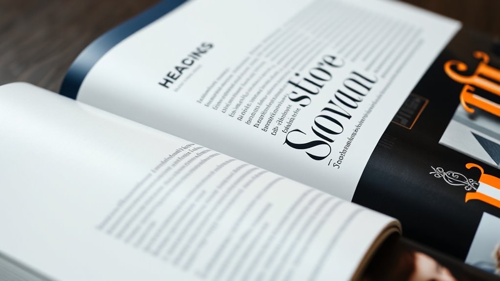
Have you ever noticed how the choice of fonts and layout can dramatically influence a printed page? It’s not just about making things look pretty; it’s about guiding your reader’s eye and ensuring the message gets across effortlessly. One of the most effective ways to do this is through thoughtful font pairing. When you select the right combination of fonts, you create visual harmony that draws attention to key information without overwhelming the reader. Proper font pairing enhances readability by establishing contrast and hierarchy, making it easier for your audience to navigate the content. For example, pairing a bold serif font for headings with a clean, sans-serif for body text offers clear differentiation, helping readers distinguish sections at a glance. This deliberate contrast not only adds flair but also improves the overall readability of your printed material. To achieve effective font pairing, you should regard the personality and style of each typeface. Combining a modern sans-serif with a traditional serif can create a balanced look that feels both fresh and grounded. It’s important to keep in mind that the fonts you choose should complement each other rather than compete. When fonts clash, it causes confusion and hampers readability. To enhance readability further, pay attention to font size, line spacing, and letter spacing. These subtle adjustments can make a significant difference in how easily your audience can read and comprehend your content. A well-paired font set, with appropriate spacing, reduces eye strain and encourages longer engagement with your print piece. Additionally, understanding font personality helps in selecting typefaces that align with your message’s tone, creating a more cohesive and impactful design. Another aspect to ponder is the purpose of your printed material. If you’re designing a formal document or a brochure, you might lean toward classic, professional fonts that convey trust and authority. For a more casual or creative project, you might experiment with playful or unique typefaces. Regardless of your style, consistency in font usage throughout the document maintains a cohesive look that reinforces your message. Remember, font pairing isn’t just about aesthetics; it’s a practical tool for readability enhancement. By carefully selecting and combining fonts, you ensure your message is not only attractive but also accessible. The right font choices can elevate your print design from good to great, making your message resonate with clarity and impact.
Top picks for "typography print pair"
Open Amazon search results for this keyword.
As an affiliate, we earn on qualifying purchases.
Frequently Asked Questions
How Do Cultural Differences Affect Font Pairing Choices?
You should consider cultural symbolism and regional preferences when pairing fonts, as these influence how your audience perceives your message. Different cultures associate specific fonts with certain ideas or traditions, so choose typefaces that resonate positively. For example, a serif font may evoke tradition in some regions, while a modern sans-serif might appeal more elsewhere. Aligning font choices with cultural context guarantees your design communicates effectively and respectfully.
What Are Common Mistakes When Combining Multiple Fonts?
You should avoid clashing styles that don’t complement each other and creating inconsistent hierarchies that confuse readers. Mixing too many fonts or choosing similar styles can make your design look chaotic. Also, neglecting contrast can diminish readability. To prevent these mistakes, pick fonts with clear differences and establish a visual hierarchy. This ensures your print remains both attractive and easy to read, enhancing overall effectiveness.
How Can Font Pairing Be Optimized for Digital Versus Print Media?
When optimizing font pairing for digital and print media, you’re really hitting two birds with one stone. For digital readability, choose fonts with clear, legible characters and good contrast, ensuring screens don’t strain eyes. For print legibility, pick typefaces that maintain clarity at various sizes and avoid overly decorative styles. Adjust spacing and size accordingly, so your message stays sharp across both mediums without sacrificing style or clarity.
Are There Specific Fonts Best Suited for Small Print Sizes?
For small print sizes, you should choose fonts with clear, simple letterforms that adapt well to size reduction. Fonts like Georgia, Verdana, and Arial are ideal because they prioritize legibility considerations at smaller font sizes. Always guarantee your font size adaptation maintains readability without clutter. Avoid overly decorative or thin fonts, as they can become illegible when scaled down, making your content easier to read and more visually appealing.
How Does Font Pairing Influence Reader Emotion and Perception?
Like a dance guiding your steps, font pairing shapes how readers perceive your message. It influences their emotional impact, making content feel warm, serious, playful, or professional. When you choose complementary fonts, you evoke specific feelings and enhance understanding. Your font choices can subtly steer reader perception, making your message resonate more deeply and feel more engaging—turning ordinary text into an emotional experience that captures attention and leaves a lasting impression.
Conclusion
Just like a skilled chef combines ingredients to create a delicious dish, pairing fonts requires balance and harmony. When you choose fonts that complement each other, your print becomes a well-orchestrated symphony, guiding the reader smoothly through your message. Remember, the right typography is your secret ingredient—adding clarity, flair, and personality. With thoughtful pairing, you’ll craft designs that not only communicate but also captivate, turning every page into a memorable experience.