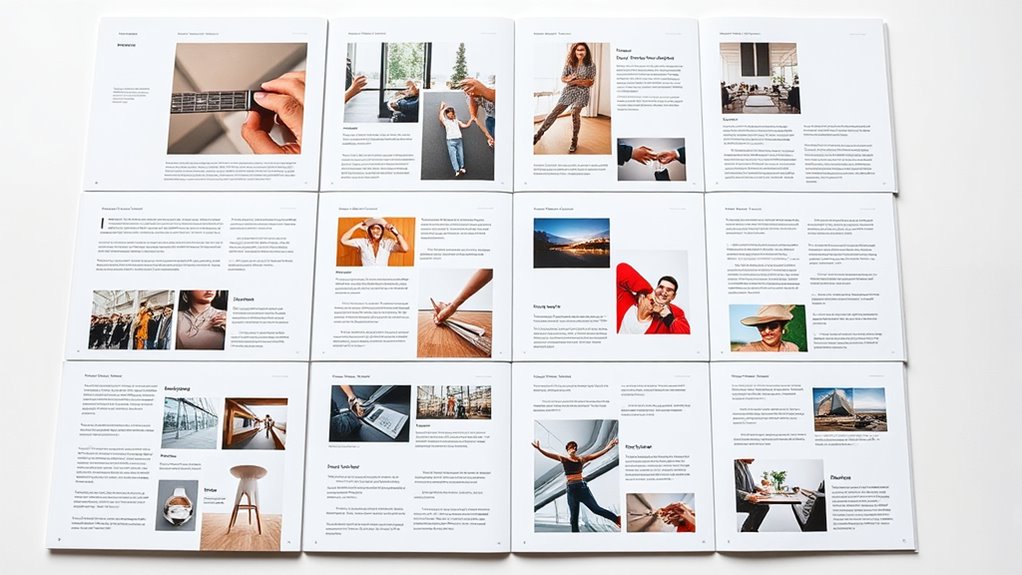

To create effective layouts for multi-page publications, focus on strategic grid systems that organize content consistently and guide the eye smoothly across each page. Pacing your elements—balancing text, visuals, and white space—ensures a harmonious flow that keeps readers engaged. Use clear visual hierarchy with typography and color to direct attention naturally. Mastering these techniques helps your project feel cohesive and dynamic, and if you stay tuned, you’ll discover ways to refine your layout skills even further.
Key Takeaways
- Use grid systems (e.g., modular, column, baseline grids) to create consistent structure and alignment across pages.
- Vary pacing by adjusting white space, image placement, and text flow to guide reader engagement smoothly.
- Employ hierarchical grid layouts to emphasize key content and establish visual rhythm throughout the publication.
- Balance visual elements and typography within grids to maintain harmony and prevent clutter.
- Plan pacing with strategic breaks, section dividers, and visual pauses to enhance readability and storytelling.
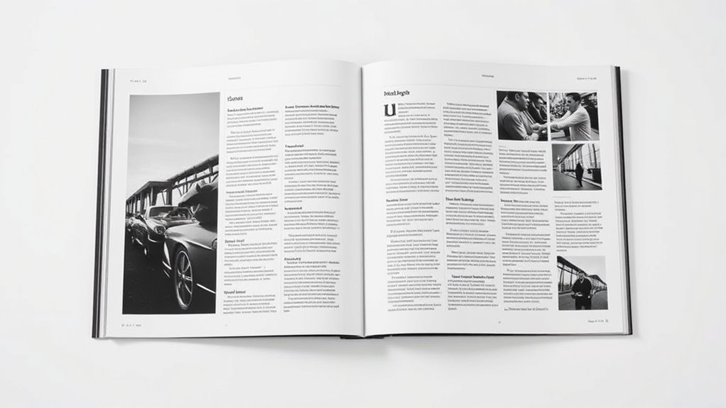
Have you ever wondered how the right layout can transform a multi-page publication from ordinary to engaging? The secret lies in thoughtful design choices that guide the reader’s eye smoothly across the pages. Two key elements that profoundly impact layout effectiveness are typography choices and color schemes. These elements, when carefully selected and balanced, create visual harmony and enhance readability, making your publication stand out.
Typography choices aren’t just about picking a font that looks nice; they shape the tone and readability of your entire publication. You want fonts that complement the content and are easy to read at various sizes. For headlines, bold and distinctive typefaces grab attention, while body text benefits from clean, legible fonts that don’t tire the reader. Consistency is essential—using a limited set of typefaces throughout helps establish a cohesive visual identity. But don’t forget about hierarchy. Vary font sizes, weights, and styles to guide the reader through the story, highlighting important sections without overwhelming the layout. Proper line spacing and paragraph breaks also play a key role, ensuring your text remains inviting and easy to digest. Additionally, understanding how visual elements influence overall composition can further elevate your design.
Choosing consistent, legible fonts and effective hierarchy enhances readability and visual harmony.
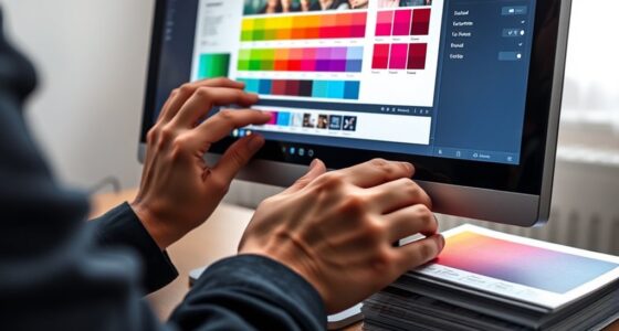
Color schemes serve as the visual backbone that unites your pages. They influence mood, emphasize key points, and create a pleasing rhythm as the reader moves from one page to the next. When choosing colors, consider the emotional impact and the message you want to convey. A harmonious palette of complementary or analogous colors can evoke calmness or excitement, depending on your intent. Use color to highlight headings, pull quotes, or important details, but avoid overloading pages with too many hues. Consistency in your color scheme helps establish a recognizable identity and guides the reader’s eye naturally from one element to another. Additionally, contrasting colors can improve legibility, especially for text against backgrounds, ensuring your message is clear and accessible.
When you combine thoughtful typography choices with an intentional color scheme, you create a layout that’s not only attractive but also highly functional. These elements work together to establish a rhythm and flow that keep your audience engaged throughout the publication. Remember, the goal isn’t just to look good—it’s to communicate effectively. Clear, consistent typography and well-chosen colors set the stage for a seamless reading experience, turning your multi-page publication into a compelling visual journey that captures attention and keeps it from start to finish.
Top picks for "layout multi page"
Open Amazon search results for this keyword.
As an affiliate, we earn on qualifying purchases.
Frequently Asked Questions
How Do You Choose the Best Grid System for a Publication?
You choose the best grid system by considering your publication’s structure and content flow. Think about how the grid supports readability and visual hierarchy, aligning with your pacing needs. Opt for a flexible grid selection that can accommodate images, text, and other elements seamlessly. Experiment with different grid layouts to see which one enhances the overall design, ensuring your publication feels cohesive and engaging for your audience.
What Are Common Pacing Techniques for Multi-Page Narratives?
You can enhance storytelling rhythm and boost reader engagement by varying pacing techniques. Use larger images or white space for quiet moments, creating contrast with fast-paced sections filled with dense text or dynamic visuals. Incorporate page turns strategically, build suspense through gradual reveals, and alternate between moments of action and reflection. These techniques keep readers hooked, maintain interest, and guarantee your narrative flows smoothly across multiple pages.
How Can Layouts Adapt for Different Print and Digital Formats?
You can adapt layouts for print and digital formats by incorporating responsive design that adjusts to different screen sizes and devices. Use flexible grids and allocate space for interactive elements like clickable links, videos, or animations in digital formats. For print, focus on clear hierarchies and balanced pacing. By considering these factors, your publication remains engaging and functional across all formats, ensuring a seamless user experience.
What Role Does Typography Play in Multi-Page Pacing?
Typography shapes your multi-page pacing by guiding the reader’s eye through the content. You should establish a clear font hierarchy, making headings, subheadings, and body text distinct, which helps maintain a smooth reading flow. When you use contrasting fonts and sizes strategically, you control the rhythm and emphasis, preventing reader fatigue and ensuring they stay engaged throughout the publication. Good typography makes your layout intuitive and easy to navigate.
How to Balance Visual Elements Across Diverse Page Spreads?
You can balance visual elements across page spreads by carefully managing image alignment and color consistency. Start by aligning images to create harmony and guide the reader’s eye smoothly from one page to the next. Use consistent color schemes to maintain cohesion, ensuring that diverse elements don’t clash. This approach helps create a unified flow, making your publication visually appealing and engaging, regardless of varying content or design complexity.
Conclusion
Just as a well-structured grid guides your eye smoothly across pages, it symbolizes clarity and purpose in your design. Pacing acts as the heartbeat, keeping your reader engaged and enthusiastic for more. When you thoughtfully balance these elements, your publication becomes a journey—each page a step forward. Remember, your layout isn’t just a pattern; it’s the compass that leads your audience through your story with intention and grace.