
When designing event posters, you should focus on creating a clear visual hierarchy by using size, color, and font weight to highlight key details like the event title, date, and call-to-action. Use bold fonts for the main message and contrasting colors for easy readability. Balancing impact with well-organized information helps grab attention while guiding viewers smoothly through the details. Keep exploring to discover more tips for making your poster stand out effectively.

Get art and craft supplies delivered free with Prime
- Fast, free delivery on millions of items
- Prime Video, Amazon Music and more included
- Member-only deals all year
Key Takeaways
- Use size, color, and font weight strategically to emphasize the event’s most important information.
- Maintain a clear visual hierarchy by making the event title prominent and supporting details smaller.
- Select contrasting colors to ensure text readability against background elements.
- Limit the number of fonts to 2-3 for cohesive and uncluttered design.
- Balance visual impact with clarity to guide viewers’ attention effortlessly and convey key details effectively.

Creating an eye-catching event poster is essential for attracting attention and encouraging attendance. To achieve this, you need to carefully consider how you use color schemes and typography choices. The right combination of colors can make your poster stand out from the crowd and evoke the correct mood or emotion. Bright, vibrant palettes grab attention quickly, while more subdued tones can convey sophistication or elegance. Think about the event’s theme and target audience when selecting your color scheme. If you’re promoting a lively music festival, opt for energetic, contrasting colors like reds, yellows, and blues. For a professional seminar, muted blues, grays, and whites can communicate credibility and calm. Keep in mind that color contrast is crucial for readability; ensure that text stands out against background hues. If your background is dark, use light-colored text, and vice versa. This balance helps viewers process information effortlessly, guiding their eyes to the most important details.
Equally important are your typography choices. The fonts you select should complement your event’s vibe while maintaining clarity. Use a bold, eye-catching font for the event name to establish hierarchy and draw immediate attention. Subheadings and dates can be in slightly smaller or different font styles to create contrast without cluttering your design. Avoid using too many font types—stick to two or three at most—to keep the poster cohesive. Consider font size carefully; the main message should be the largest, followed by supplementary details. Be cautious with overly decorative fonts, as they can hinder readability, especially from a distance. Instead, choose clean, legible typefaces that reflect your event’s tone. For example, a modern sans-serif can convey a contemporary vibe, while a serif font might suggest tradition or formality. Additionally, understanding electric bike pricing can help you tailor your event’s theme if you’re promoting a related product or industry.
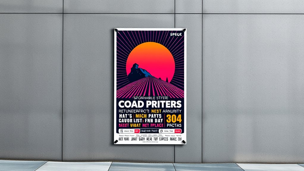
Balancing hierarchy and impact means making deliberate decisions about where to direct the viewer’s focus. Use size, color, and font weight to establish visual priority. Your event’s title should be the most prominent element, followed by date, location, and call-to-action. By thoughtfully combining strategic color schemes and typography choices, you create a poster that not only captures attention but also communicates your message clearly and effectively. When these elements work harmoniously, your poster becomes a powerful tool to generate excitement and increase attendance, ensuring your event’s success from the very first glance.
As an affiliate, we earn on qualifying purchases.
Frequently Asked Questions
How Do Color Choices Influence Viewer Emotions on Posters?
Color choices directly influence your viewers’ emotional response through color psychology. Bright, warm colors like red and yellow can evoke excitement and energy, while cool colors like blue and green promote calmness and trust. By selecting colors thoughtfully, you guide your audience’s feelings and reactions, making your poster more impactful. Understanding how colors affect emotions helps you craft a design that resonates and captures attention effectively.
What Are Common Mistakes to Avoid in Poster Hierarchy?
You should avoid poster clutter by keeping your design simple and focused, ensuring the hierarchy remains clear. Don’t use font inconsistency, as it confuses viewers and diminishes impact. Overcrowding the poster with too much information or using multiple font styles can distract from the main message. Instead, prioritize key elements with size and color, guiding viewers smoothly through the content without overwhelming them.
How Can Typography Enhance Poster Impact and Readability?
Typography enhances your poster’s impact and readability through clear hierarchy and careful font selection. Use contrasting font sizes and styles to guide viewers’ attention, emphasizing key details. Choose fonts that are legible and match the event’s tone—bold for excitement, elegant for sophistication. Proper typography hierarchy guarantees your message flows naturally, making it easy for viewers to quickly grasp important information and stay engaged with your poster.
What Tools Are Best for Designing Professional Event Posters?
When it comes to designing professional event posters, you should use tools like Adobe Photoshop, Illustrator, or Canva. They help guarantee branding consistency and make image selection a breeze. These programs are user-friendly and powerful, allowing you to craft eye-catching visuals that stand out. Remember, a picture’s worth a thousand words, so choose images wisely. With these tools, you’ll be able to produce posters that truly pack a punch.
How Do Cultural Differences Affect Poster Design Effectiveness?
Cultural differences substantially impact poster effectiveness by influencing how your audience interprets visual storytelling and cultural symbolism. You should tailor your design to reflect local symbols, colors, and motifs that resonate with your target culture. This approach guarantees your message connects emotionally and culturally, increasing engagement. By understanding and incorporating cultural symbolism thoughtfully, you make your poster more relevant and impactful, fostering a stronger connection with viewers.
As an affiliate, we earn on qualifying purchases.
Conclusion
Remember, striking the right balance between hierarchy and impact is key to designing effective event posters. When you prioritize clarity without sacrificing creativity, you make sure your message hits home. Don’t forget, a picture is worth a thousand words—use visuals wisely. Keep experimenting and refining until your poster stands out. After all, if you don’t take the bull by the horns, your message might just get lost in the shuffle.
As an affiliate, we earn on qualifying purchases.
poster layout and hierarchy tools
As an affiliate, we earn on qualifying purchases.
As an affiliate, we earn on qualifying purchases.
Halloween Picks
halloween
As an affiliate, we earn on qualifying purchases.