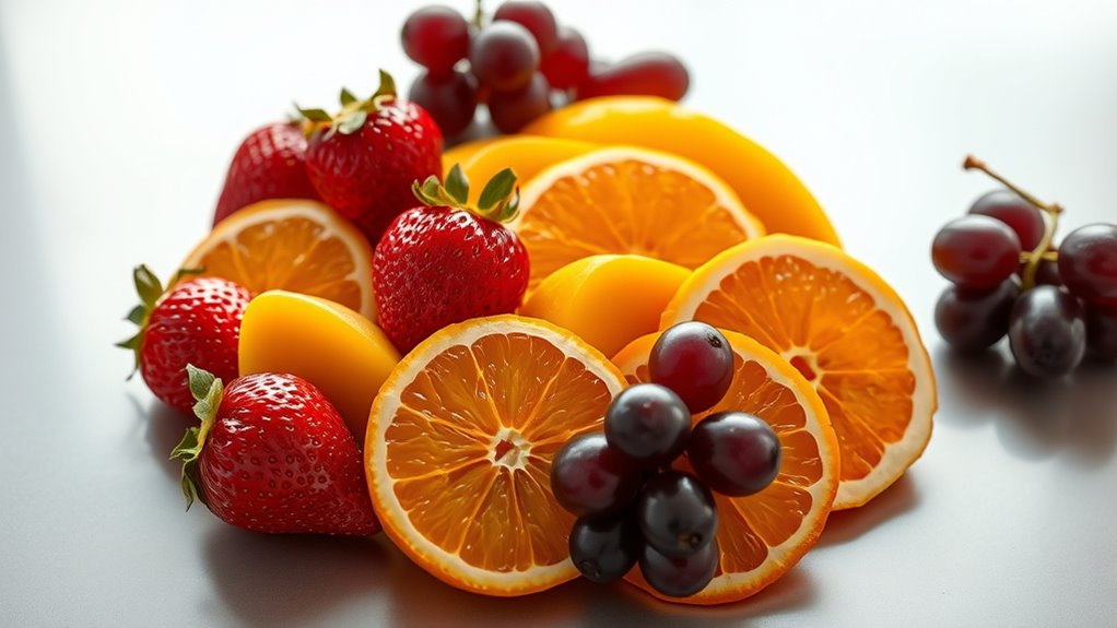

Fruity hues create vibrant, eye-catching palettes perfect for food and beverage packaging. Bright colors like crimson, sunny yellow, and juicy green evoke freshness, natural ingredients, and flavor, helping your product stand out on crowded shelves. These hues also tap into emotional triggers such as appetite stimulation and happiness. By choosing fruit-inspired tones, you craft a visual story that connects with consumers’ senses and desires. Continue exploring to discover how to perfectly harness these juicy color palettes.
Key Takeaways
- Use vibrant, saturated hues like crimson, yellow, and green to evoke freshness, energy, and natural ingredients in packaging.
- Incorporate fruit-inspired colors such as strawberry red or banana yellow to enhance emotional appeal and brand storytelling.
- Apply color psychology to communicate product qualities—reds for passion, greens for health, purples for richness—aligning with fruit symbolism.
- Leverage bright, juicy palettes to attract attention and stand out on crowded shelves, increasing product desirability.
- Combine visual fruit symbolism with strategic color choices to craft compelling brand messages and emotional connections.

Have you ever noticed how vibrant fruits can inspire a palette of lively colors? Their natural hues evoke feelings, associations, and moods that can be harnessed effectively in food and beverage packaging. When choosing colors inspired by fruit, you’re tapping into a rich language of fruit symbolism—each fruit carrying its own meaning and cultural significance. For example, red strawberries often symbolize love and passion, while bright yellow bananas evoke happiness and optimism. These symbolic meanings influence how consumers perceive your product before they even taste it, making color a powerful communicator.
Color psychology plays a pivotal role in this process as well. Bright, saturated hues like crimson or sunny yellow can stimulate appetite and convey freshness, energy, or sweetness. Cooler tones, such as green or purple, might suggest natural ingredients, health benefits, or a sense of calm and sophistication. By understanding the emotional responses associated with specific colors, you can craft packaging that resonates with your target audience. For instance, a berry-flavored drink in deep purple packaging immediately signals richness and indulgence, while a citrus-flavored snack wrapped in vibrant orange communicates zest and vitality.
The beauty of using fruity hues in packaging lies in their universal appeal and instant recognition. Consumers are often drawn to bold, vibrant colors because they evoke the fresh, juicy qualities of fruits, making the product seem more appealing and tempting. These colors can also help your product stand out on a crowded shelf, catching the eye with their lively energy. When you align your color choices with the fruit’s symbolism and the psychological responses you want to evoke, you create a visual language that enhances your brand’s story. A package that features a bright green hue can suggest freshness and health, ideal for organic or natural products, while a fiery red can evoke passion and excitement, perfect for indulgent treats.
In essence, selecting the right fruity hues involves more than just picking colors that look good together. It’s about understanding the deeper meanings and emotional triggers behind each shade. When you leverage fruit symbolism and color psychology thoughtfully, your packaging not only captures attention but also communicates the essence of your product. This strategic use of color can influence customer perception, increase desirability, and ultimately drive sales—all by harnessing the vibrant, juicy palette of nature’s own artwork.
Top picks for "fruity hues juicy"
Open Amazon search results for this keyword.
As an affiliate, we earn on qualifying purchases.
Frequently Asked Questions
How Do Fruity Hues Influence Consumer Purchasing Decisions?
Fruity hues influence your purchasing decisions by evoking fruit symbolism, making products feel fresh and appealing. Bright, juicy colors catch your eye and suggest flavor, while seasonal color trends reinforce feelings of freshness and relevance. When packaging features vibrant, fruit-inspired palettes, you’re more likely to associate the product with natural goodness and quality, prompting you to choose it over less colorful options.
What Are the Latest Trends in Fruity Color Palettes?
When it comes to fruity color palettes, the latest trend is to keep things new and vibrant. You should lean into fruit-themed branding with bold, eye-catching hues that evoke summer and vitality. Seasonal color schemes are also in, shifting colors to match holidays and harvests. Think bright oranges, juicy reds, and invigorating greens—these shades make your packaging pop and resonate with consumers craving natural, lively vibes.
How Can Color Psychology Enhance Food Packaging Appeal?
You can harness color psychology to boost your food packaging’s appeal by understanding color association and emotional impact. Bright, warm hues like red and orange evoke appetite and energy, making them perfect for snacks. Cool colors like green suggest freshness, ideal for health-focused products. By strategically choosing colors that resonate emotionally, you create a compelling visual cue that attracts customers and influences their purchasing decisions.
What Are Common Mistakes in Using Fruity Hues?
You should avoid clashing fruity hues that disrupt harmony and confuse your audience. Overusing bright, intense colors can overwhelm packaging and diminish fruit color symbolism. Also, ignoring the balance of fruity hue harmony may make your design feel unappealing. Be mindful of color combinations that reflect the natural vibrancy of the fruit, ensuring your palette attracts attention while conveying freshness and flavor effectively.
How Do Cultural Differences Affect Color Perception?
Imagine your colorful packaging as a globe-trotting fruit basket—what’s vibrant in one country might be offensive in another. You need to contemplate cultural symbolism and regional color preferences, or risk turning a juicy peach into a diplomatic faux pas. Different cultures interpret colors differently—red might symbolize luck in China, but danger in some Western countries. So, tailor your fruity hues to respect these diverse perceptions, or risk your brand’s message going sour.
Conclusion
Imagine your packaging bursting with vibrant, fruity hues that catch the eye like a basket of fresh, ripe fruit. These juicy color palettes can turn your food and beverage branding into a visual feast that invites customers in. By choosing lively, appetizing colors, you create an irresistible allure that makes your products stand out on the shelf. Let your packaging be the juicy centerpiece that leaves a lasting impression, inviting everyone to taste the vivid possibilities.