To design accessible charts and graphs, focus on high color contrast and avoid relying solely on color to differentiate data. Incorporate patterns, textures, and clear labels alongside color coding to help users with color blindness and those using screen readers. Add descriptive alt text and summaries to guarantee visual content is understandable through assistive technology. Paying attention to these details will allow all viewers to interpret your visuals effectively; learning more will further improve your inclusive design skills.
Key Takeaways
- Use high-contrast color combinations like black/white or dark blue/yellow to ensure visibility for color-blind users.
- Incorporate patterns, textures, or labels alongside colors to differentiate data series effectively.
- Provide descriptive alt text and detailed labels for charts to support screen reader accessibility.
- Avoid relying solely on color; combine multiple cues for inclusive data interpretation.
- Consider tactile graphics or alternative formats for users with visual impairments beyond screen readers.

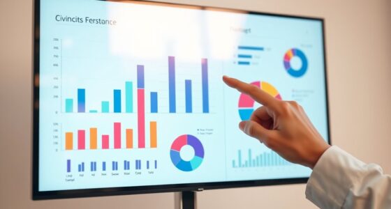
Have you ever struggled to interpret a chart or graph because of poor design? If so, you’re not alone. Many people face barriers when visual elements aren’t created with accessibility in mind. One of the most critical aspects of accessible design is ensuring good color contrast. When colors blend too closely, especially for individuals with color blindness, it becomes nearly impossible to distinguish different data points or categories. Using high-contrast color combinations, like black and white or dark blue and yellow, helps everyone see the information clearly. But relying solely on color can still leave some users in the dark. That’s where tactile graphics come into play. Tactile graphics transform visual data into raised, textured representations, allowing people with visual impairments to feel the differences and interpret the data through touch. Incorporating tactile graphics into your charts and graphs enhances accessibility by providing an alternative way to understand complex information.
Good color contrast and tactile graphics make charts accessible for everyone.
When designing accessible charts, you should consider how color contrast impacts visibility. Avoid pastel or muted colors that can be hard to distinguish, especially for users with color vision deficiencies. Instead, choose bold, distinct colors with enough contrast to stand out from the background. This simple step makes a significant difference in readability. Additionally, supplement color-coded data with labels, patterns, or textures. For example, use dotted or striped fills to differentiate data series, which can be perceived through both color contrast and tactile means. This dual approach ensures that the information remains accessible regardless of how someone interacts with your visuals. Color contrast is a key factor in creating inclusive visualizations.
Screen readers are another essential consideration. These tools don’t interpret images or colors but rely on descriptive text. Always include clear, concise alt text and data labels that explain what each part of the chart represents. Consider providing detailed descriptions or summaries of your data in accompanying text formats, so users who depend on screen readers can grasp the full context without relying on visual cues alone. Combining these methods—high color contrast, tactile graphics, descriptive text—creates a more inclusive experience for all users.
Ultimately, designing accessible charts and graphs requires thoughtful planning and an understanding of diverse needs. By prioritizing color contrast, integrating tactile graphics, and supporting screen reader compatibility, you ensure your data reaches everyone, no matter their visual abilities. It’s about making your visuals not just eye-catching but genuinely inclusive, empowering all users to interpret and engage with your information confidently.

Laffunz Giant Magnetic Grid Paper Dry Erase Large Graph Chart Paper for Whiteboard, Graphic Sheets Elementary Middle School Math Teacher Classroom Must Haves Teacher Essentials Homeschool Supplies
Oversized Magnetic Grid Paper: Measuring 21.2" x 16.5" across two panels, this large-format chart paper offers plenty of…
As an affiliate, we earn on qualifying purchases.
As an affiliate, we earn on qualifying purchases.
Frequently Asked Questions
How Can I Test Charts for Color Blindness Accessibility Effectively?
You can test charts for color blindness accessibility by using tools like Coblis or Color Oracle to simulate color vision deficiencies, ensuring good color contrast and visual simplification. Check that your chart’s color combinations are distinguishable for those with color blindness, and verify that information isn’t solely conveyed by color. Additionally, review your charts with screen readers to confirm they’re accessible, and ask for feedback from users with visual impairments.
What Tools Are Recommended for Creating Accessible Charts?
You should use tools like Adobe Color, Color Oracle, and Stark to create accessible charts. These help you guarantee good color contrast and label clarity, making your visuals easier for everyone to interpret. Additionally, try using screen readers and contrast checkers to verify your charts’ accessibility. Prioritizing high contrast and clear labels ensures your charts are inclusive and understandable, regardless of visual impairments.
Are There Specific Guidelines for Accessible Data Labels?
You might think data labels are just decorative, but following data label best practices and accessible annotation techniques makes a world of difference. Use clear, concise language, avoid jargon, and make sure labels are easily distinguishable with sufficient contrast. Position labels thoughtfully to prevent clutter, and provide alternative text where possible. These guidelines ensure your data remains understandable to all users, proving accessibility isn’t just a trend but a necessity.
How Do Screen Readers Interpret Complex Chart Visuals?
Screen readers interpret complex chart visuals by translating data points into descriptive audio, relying on alt text and detailed labels. To improve your visual storytelling, use contrast enhancement to make key elements stand out, and provide clear, concise descriptions of chart components. This way, screen readers can effectively convey the information, ensuring your data remains accessible and understandable for users relying on auditory descriptions.
Can Accessible Charts Be Visually Appealing to All Users?
Yes, accessible charts can be visually appealing to all users. You can achieve this by balancing strong color contrast with visual simplicity, ensuring clarity without clutter. When you focus on clean lines, bold contrasts, and minimal distractions, your charts become both attractive and inclusive. This approach not only enhances readability for those with visual impairments but also creates a sleek, professional look that appeals universally.

BLEWAY Bump Dots for Visually Impaired 165 Pcs Combo Pack(Red,Yellow,Black,White) – Low Vision Aids Braille Stickers Raised Tactile Dots for Elderly, Blind
TACTILE IDENTIFICATION:A boon for individuals with visual impairments such as low vision, glaucoma, blindness, and macular degeneration! This…
As an affiliate, we earn on qualifying purchases.
As an affiliate, we earn on qualifying purchases.
Conclusion
By designing accessible charts and graphs, you’re not just improving readability—you’re transforming the way everyone experiences data. Imagine a world where no one is left behind, where color blindness and screen readers fade into oblivion, and information flows effortlessly for all. Your effort can break down barriers so massive, they seem insurmountable. So, get creative, stay inclusive, and make every chart a beacon of accessibility—because the future of data belongs to everyone.
high contrast color palettes for data visualization
As an affiliate, we earn on qualifying purchases.
As an affiliate, we earn on qualifying purchases.

200 Pieces Binder Spine Stickers Patient Chart Binder 5.37 * 1inch Patient Id Adhesive Medical Chart Labels for Medical Chart Labels Storage Bins(Room No. / Patient/Doctor)
WHY TO USE:Binder Spine Stickers , provide a convenient way to organize the record tracking required for patient…
As an affiliate, we earn on qualifying purchases.
As an affiliate, we earn on qualifying purchases.