To create smooth gradient progressions, focus on using the right gradient type—linear, radial, or conic—depending on your project. Adjust gradient stops closer together for sharper transitions or farther apart for seamless blending. Experiment with gradient angles and color choices to enhance flow and depth. Fine-tuning opacity and blending modes can add layers of nuance. Keep practicing these techniques to master natural, visually appealing shifts—if you keep exploring, you’ll discover more ways to perfect your gradients.
Key Takeaways
- Use multiple gradient stops spaced closely to create seamless color transitions.
- Choose the appropriate gradient type (linear, radial, conic) based on desired visual flow.
- Adjust gradient angle and direction to enhance smoothness and visual harmony.
- Experiment with opacity and blending modes for layered, subtle transition effects.
- Fine-tune color stops and blending points to achieve natural, gradual color shifts.

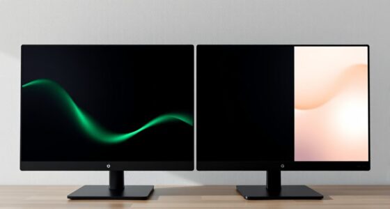
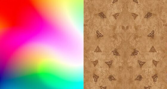
Have you ever wondered how to create smooth color shifts in your designs? Mastering gradient transitions is key to achieving visually appealing artwork, and understanding color blending plays a crucial role in this. When working with gradients, you’re essentially creating a seamless transition between two or more colors, which can add depth, dimension, and visual interest to your projects. To do this effectively, you need to familiarize yourself with different gradient types, as each serves a unique purpose and offers distinct visual effects. Linear gradients, for example, transition colors along a straight line, making them perfect for backgrounds or highlighting specific areas. Radial gradients, on the other hand, radiate from a central point outward, creating a soft, circular color blend that’s excellent for focal points or to simulate light and shadow. There are also conic or angular gradients, which rotate colors around a central point, ideal for circular patterns or artistic effects. Knowing which gradient type to use depends on the visual outcome you want to achieve.
As you work with gradients, focus on how you blend your colors. Effective color blending ensures smooth transitions, avoiding harsh lines or abrupt color changes that can detract from your design. To improve your color blending, pay attention to the gradient stops—these are the points where colors change. Placing stops closer together results in a more abrupt transition, while spacing them farther apart creates a more gradual shift. Many design tools allow you to manipulate these stops easily, giving you control over the transition’s softness or sharpness. Experimenting with different color combinations and stop placements will help you find the perfect blend for your project. Additionally, adjusting the opacity and blending modes can add complexity and richness to your gradients, allowing for subtle variations and layered effects that enhance the overall composition.
Another aspect to consider is the direction and angle of your gradient. By changing the angle, you influence how colors flow across your design, which can dramatically alter the visual impact. For example, a diagonal gradient can create a dynamic sense of movement, while a vertical or horizontal gradient can be more subdued and balanced. Many software programs give you the flexibility to rotate or adjust the gradient’s angle precisely, enabling you to match the style and mood you’re after. Remember, the goal of working with gradients is to create smooth, natural transitions that guide the viewer’s eye and add harmony to your design. Practice experimenting with different gradient types, color blending techniques, and directional settings to develop a keen eye for what makes a seamless and impactful transition. With patience and practice, you’ll master the art of working with gradients to elevate your creative projects. Additionally, understanding how to optimize your projector settings can help display these gradients with the best clarity and color accuracy, especially when projecting detailed artwork or digital designs.
Top picks for "work gradient creat"
Open Amazon search results for this keyword.
As an affiliate, we earn on qualifying purchases.
Frequently Asked Questions
How Do I Choose the Best Color Combinations for Gradients?
To select the best color combinations for gradients, focus on color harmony by choosing colors that complement or match well. Use contrast strategies to guarantee your gradient stands out without clashing. Experiment with analogous colors for a smooth changeover or contrasting hues for more impact. Trust your eye, test different combinations, and consider the mood you want to evoke. This approach helps create visually appealing, balanced gradients that enhance your design.
Can Gradients Be Used Effectively in Print Design?
Yes, gradients can be highly effective in print design by enhancing color blending and adding depth. Use subtle gradient patterns to create smooth shifts that catch the eye without overwhelming the layout. Be mindful of color choices to guarantee they print accurately, especially with vibrant hues. Incorporate gradients thoughtfully to emphasize key elements, making your design more dynamic and engaging while maintaining clarity and quality in the final print.
What Are Common Mistakes to Avoid When Creating Gradients?
You should avoid creating gradients with harsh color banding by using smooth color shifts and high-quality color stops. Steer clear of overly complex gradients that can confuse viewers or make your design look cluttered. Keep your gradients simple and consistent to guarantee a professional look. Also, test your gradients in different formats and resolutions to prevent unexpected issues like banding or color shifts, especially in print.
How Do Gradients Impact Website Loading Speed?
Gradients can impact your website’s loading speed because complex color blending and detailed shifts require more data to render. When you use high-resolution gradient images or multiple layered gradients, it slows down page load times. To improve visual flow without sacrificing speed, opt for CSS gradients instead of image files, and keep your color blending simple. This way, you maintain smooth visual transitions without compromising quick loading.
Are There Accessibility Considerations When Using Gradients?
Yes, there are accessibility considerations when using gradients. You need to guarantee sufficient contrast accessibility between gradient colors and text or UI elements. Low contrast can make content hard to read for users with visual impairments. Test your gradients with accessibility tools, and consider adding solid backgrounds or overlays if contrast levels fall short. Prioritizing contrast accessibility helps create an inclusive experience for all users.
Conclusion
Now that you know how to work with gradients, you can create stunning shifts that captivate your audience. Did you know that websites using smooth gradient backgrounds see up to a 30% increase in user engagement? By mastering gradients, you bring depth and vibrancy to your designs, making them more appealing and professional. So go ahead—experiment with different colors and styles. Your creative potential is endless, and the impact on your projects will be truly impressive.