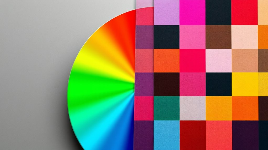

Understanding RGB, CMYK, and other color models helps you create accurate digital images and print materials. RGB is an additive model that mixes red, green, and blue light, making it ideal for screens. CMYK is subtractive, used in printing, mixing cyan, magenta, yellow, and black inks. Other models like Lab and Pantone serve specialized purposes like color matching and consistency. Exploring these will give you a clearer picture of how colors translate across media.
Key Takeaways
- RGB is an additive color model used for digital screens, combining red, green, and blue light to produce a wide color spectrum.
- CMYK is a subtractive color model used in printing, combining cyan, magenta, yellow, and black inks to create colors by absorbing light.
- RGB has a wider color gamut than CMYK, making digital colors appear more vibrant than printed ones.
- Converting from RGB to CMYK can cause color shifts due to differences in color gamuts and models.
- Other models like Lab and Pantone serve specific purposes such as color matching and maintaining consistency across media.
Have you ever wondered how digital screens display such vibrant and accurate colors? The secret lies in understanding the digital color space, which is the foundation for how screens produce a broad spectrum of hues. Digital devices like monitors and smartphones use color models such as RGB to create images that are both vivid and precise. The RGB model combines red, green, and blue light in varying intensities, allowing screens to generate millions of colors seamlessly. Because these devices operate within a digital color space, the colors you see are carefully calibrated to guarantee consistency across different screens. This calibration helps maintain print color accuracy when digital images are transferred for printing, but it’s essential to recognize that digital color spaces often have a wider gamut than what’s achievable in print. That’s why colors can sometimes appear more vibrant on screens than they do on paper. When preparing images for print, understanding how color models differ becomes vital. CMYK, which stands for cyan, magenta, yellow, and black, is the primary color model used in printing. Unlike RGB, which is additive (adding light to create colors), CMYK is subtractive, meaning it works by absorbing certain wavelengths of light. This difference impacts how colors are reproduced; some bright RGB colors cannot be perfectly replicated in print, leading to discrepancies known as color shifts. To achieve the best print color accuracy, designers must convert images from RGB to CMYK carefully, paying attention to the limitations of the print color space. This conversion process involves soft proofing and color management techniques to predict how colors will appear once printed, minimizing surprises and guaranteeing fidelity to the original design. Beyond RGB and CMYK, other models like Lab and Pantone exist to serve specific purposes, such as matching colors precisely across different media or maintaining consistency for branding. Each model has its strengths and limitations, but understanding the core differences is key to effective color management. Recognizing the digital color space and how it influences what you see on your screen and how it translates to print helps guarantee your visuals are true to your intent. Whether you’re designing for digital platforms or printing materials, grasping these concepts allows you to better control color accuracy and create more compelling, consistent visuals. Ultimately, knowing how different color models work empowers you to make informed choices, bridging the gap between digital displays and physical prints, and guaranteeing your colors look just as intended no matter the medium.

Calibrite Display 123 Monitor Calibration Colorimeter for Photo Editing and Color Accurate Viewing, Easy 1 2 3 Software Workflow, USB C Connection, and Before and After Check, Supports 2 Displays
SPECIFICATIONS: Monitor calibration colorimeter with Easy 1 2 3 software workflow, USB C connection, compact body approx. 34mm…
As an affiliate, we earn on qualifying purchases.
As an affiliate, we earn on qualifying purchases.
Frequently Asked Questions
How Do Color Models Impact Digital Versus Print Media?
Color models influence digital and print media through color space differences and device calibration. You’ll notice that screens use RGB, which combines red, green, and blue light, while printers rely on CMYK, mixing cyan, magenta, yellow, and black inks. Proper device calibration guarantees colors appear consistent across devices. If you don’t account for these factors, your digital images may look different when printed, affecting your final output’s quality and accuracy.
Can Color Models Be Converted Without Losing Quality?
Converting color models can be tricky, but you can preserve color fidelity if you master meticulous gamut mapping. When you convert from RGB to CMYK or vice versa, you should be aware that some colors might shift or soften. Using advanced software with precise color management tools helps minimize quality loss, ensuring your images stay vibrant and accurate. So, yes, proper conversion techniques keep your colors consistent and engaging.
Which Color Model Is Best for Web Design?
You should use RGB for web design because it offers the best color consistency across screens. RGB’s wider color gamut guarantees vibrant, accurate colors that display well on digital devices. Unlike CMYK, which is optimized for printing, RGB keeps your designs looking sharp and lively online. This choice helps maintain color fidelity, giving your website a professional and visually appealing look that catches visitors’ attention and enhances user experience.
How Do Color Models Affect Color Accuracy Across Devices?
Think of color models as different languages your devices speak. They directly impact color accuracy and consistency across screens. If your devices aren’t properly calibrated, colors may look mismatched or faded, like hearing a song in a different key. To guarantee true color representation, you need consistent color management and proper calibration. This keeps your visuals vibrant and uniform, no matter the device, so your audience always sees your intended palette.
Are There Any Emerging Color Models Beyond RGB and CMYK?
Yes, emerging color models like spectral color and quantum color are gaining attention. Spectral color models aim to replicate the full range of visible wavelengths, improving color accuracy and realism. Quantum color uses quantum dot technology to produce more vibrant and precise hues. These models could revolutionize how devices reproduce colors, offering richer, more consistent visuals across screens and printing. You’re likely to see more of these innovative approaches in the future.

HP 923 Black, Cyan, Magenta, Yellow Ink Cartridges (4-Pack) | Works with Printer Series: OfficeJet 8120, OfficeJet Pro 8130 | Eligible for Instant Ink | 6C3Y6LN
HP Ink Cartridges are engineered to work with HP printers to provide consistent quality, reliability and value
As an affiliate, we earn on qualifying purchases.
As an affiliate, we earn on qualifying purchases.
Conclusion
Now that you understand RGB and CMYK, you see how colors transform from screen to print. Just as digital images shine brightly on your device, printed materials rely on different color mixes to come alive. It’s fascinating how these models work together—one’s vibrant glow contrasts with the other’s subtle hues. By mastering both, you’re equipped to create visuals that truly stand out, whether on a screen or in print, bringing your creative vision to vivid life.

Pantone Formula Guide – Coated & Uncoated | Professional PMS Color Matching System for Print, Packaging & Graphic Design | GP1601B
INDUSTRY-STANDARD PANTONE COLOR BOOK The essential Pantone color book for accurate color communication—trusted by designers, agencies, and print…
As an affiliate, we earn on qualifying purchases.
As an affiliate, we earn on qualifying purchases.

Real World Color Management: Industrial-Strength Production Techniques
As an affiliate, we earn on qualifying purchases.
As an affiliate, we earn on qualifying purchases.