
When choosing a color palette for your brand, focus on the emotional responses colors evoke and how they align with your message. For example, use red to boost excitement or blue to build trust, but always consider cultural differences to avoid miscommunication. Consistent use of your chosen colors creates recognition and trust over time. To craft a palette that truly resonates, it’s essential to understand these psychological and cultural aspects—keep exploring to learn more.
Key Takeaways
- Use warm colors like red to evoke excitement or cool colors like blue for trust, aligning with brand emotional goals.
- Consider cultural meanings of colors to ensure your palette resonates appropriately across diverse audiences.
- Apply colors consistently across branding elements to build recognition and reinforce emotional connections.
- Incorporate accents like gold to convey luxury or prestige, enhancing the brand’s perceived value.
- Match your color choices with your brand story to create a cohesive visual identity that resonates emotionally.
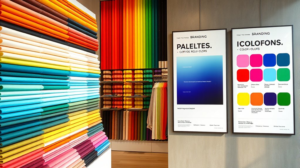
Color psychology plays a pivotal role in branding because the colors you choose can influence how your audience perceives your brand’s identity and values. When selecting a color palette, you need to consider the emotional responses that different colors evoke. For example, red often stimulates excitement and passion, making it a popular choice for brands that want to convey energy and urgency. Blue, on the other hand, tends to evoke feelings of trust and calmness, which is why many financial institutions and tech companies favor it. By understanding how specific colors trigger emotional responses, you can craft a visual identity that resonates deeply with your target audience.
Colors influence perception and emotional response, shaping your brand’s identity and connection with your audience.
However, it’s not just about individual colors; cultural influences substantially shape how people interpret colors. In some cultures, white symbolizes purity and peace, while in others, it’s associated with mourning. Similarly, green might represent growth and prosperity in Western societies but can also be linked to Islam and spirituality in Middle Eastern cultures. When designing your branding palette, you need to be aware of these cultural nuances to avoid miscommunication or alienation. What works well in one region could have an unintended negative connotation elsewhere. Conducting cultural research and understanding your audience’s background ensures your color choices reinforce your brand’s message rather than undermine it.
Additionally, the context in which colors are used can alter their impact. A bright yellow might evoke optimism and cheerfulness but could also seem overwhelming if overused. A subtle use of gold accents, however, can convey luxury and prestige effectively. You should think about how colors interact with your overall brand story and the emotional tone you want to set. Consistency is key; once you identify a palette that aligns with your brand personality, stick with it. This consistency helps build recognition and trust over time as your audience associates specific hues with your brand’s core values.
Furthermore, considering the dog names that resonate with your brand personality can help create a memorable and engaging identity. Ultimately, your goal is to select colors that trigger positive emotional responses aligned with your brand’s mission. Recognizing cultural influences and understanding the psychological effects of colors will guide you in creating a palette that not only looks appealing but also communicates your brand’s essence clearly. By thoughtfully combining these elements, you can craft a visual identity that captures attention, fosters engagement, and builds lasting emotional connections with your audience.

ColorWise: A Data Storyteller's Guide to the Intentional Use of Color
As an affiliate, we earn on qualifying purchases.
As an affiliate, we earn on qualifying purchases.
Frequently Asked Questions
How Do Cultural Differences Influence Color Perception in Branding?
You should consider that cultural differences greatly influence color perception in branding. Cross-cultural color symbolism varies, meaning a color that evokes positive feelings in one culture might have negative connotations in another. To appeal to global audiences, you need to understand diverse color preferences and adapt your palette accordingly. This approach guarantees your branding resonates universally, avoiding misunderstandings and strengthening your brand’s connection with diverse customers.
Can Color Choices Impact Consumer Trust and Loyalty?
Sure, tossing a splash of blue on your logo might make customers trust you more—if they’re into cold, corporate vibes. Color choices do impact consumer trust and loyalty by shaping brand perception and forging emotional connections. Skip the right palette, and your brand risks appearing untrustworthy or forgettable. So, choose your colors wisely; it’s your secret weapon to build lasting loyalty and a positive emotional bond with your audience.
What Are Common Color Mistakes to Avoid in Branding?
You should avoid misusing color schemes and neglecting your brand personality. Using inconsistent or inappropriate colors can confuse your audience and weaken your brand identity. Don’t pick colors solely because they look good; consider how they reflect your brand’s values and message. Stay true to your brand personality to create a cohesive, memorable palette that resonates with your target audience and builds trust.
How Do Color Trends Affect Long-Term Brand Identity?
You should consider how trends versus timelessness impact your brand’s evolving palette. Trends can make your brand feel current, but they might also date quickly, risking your long-term identity. Focus on creating a palette that balances modern trends with timeless colors to guarantee your brand stays relevant while maintaining consistency. Regularly update your palette thoughtfully, so it adapts without losing the core essence that defines your brand’s unique personality.
Are There Specific Colors Recommended for Digital Versus Print Branding?
You should choose digital screen colors that are vibrant and optimized for various devices, ensuring they look consistent across screens. For print, prioritize print color accuracy by selecting colors with specific CMYK values and using high-quality inks. This approach helps your branding stay true to your intended palette in both formats, making your brand recognizable whether viewed on a digital device or in print.

Light Spring Palette Swatch/Color Fan Book by Color Craft, Perfect Guide for Smart Shopping, Outfit & Wardrobe Planning; Primavera Clara
FOUND YOUR COLOR IDENTITY — NOW WHAT? With it, you’ll make confident decisions.
As an affiliate, we earn on qualifying purchases.
As an affiliate, we earn on qualifying purchases.
Conclusion
Ultimately, your color choices can evoke deep emotions and build trust, shaping how your audience perceives your brand. While a bold red can ignite passion, a calm blue can foster loyalty. It’s a delicate balance—like walking a tightrope between excitement and reassurance. By understanding color psychology, you hold the power to craft a palette that not only stands out but also resonates on a subconscious level. Your brand’s true strength lies in these subtle, impactful choices.
luxury gold accent branding elements
As an affiliate, we earn on qualifying purchases.
As an affiliate, we earn on qualifying purchases.
trust building blue branding products
As an affiliate, we earn on qualifying purchases.
As an affiliate, we earn on qualifying purchases.