
When designing for color blindness, focus on choosing palettes with high contrast and distinguishable hues, brightness, and saturation. Use tools that simulate how visuals appear to color-blind users to spot potential issues. Incorporate patterns or textures, like stripes or dots, alongside colors to differentiate elements effectively. Prioritize clear contrast ratios and avoid relying solely on color cues. To create truly accessible designs, explore key strategies that make your work universally understandable and inclusive.
Key Takeaways
- Choose color palettes with high contrast and distinguishable hues, avoiding red-green combinations common in color blindness.
- Use simulation tools to preview how designs appear to color-blind users and identify problematic areas.
- Incorporate patterns, textures, or icons alongside colors to differentiate data points and interface elements.
- Prioritize contrast ratios that meet accessibility standards to ensure readability for all users.
- Combine color cues with labels, symbols, or patterns to convey information effectively beyond color alone.

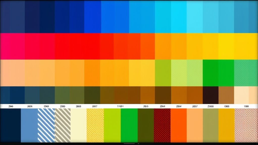
Designing for color blindness is vital to guarantee your visuals are accessible to everyone. When selecting your color palette, you must consider how users with different types of color vision deficiencies perceive your design. People with color blindness often struggle to distinguish certain color combinations, which can hinder their ability to interpret information quickly and accurately. To address this, you should prioritize contrast sensitivity—ensuring there’s enough difference between foreground and background colors to make content readable. Accessibility guidelines recommend avoiding color pairings like red and green, which are problematic for many with deuteranopia or protanopia. Instead, choose color combinations that provide high contrast and are easily distinguishable, such as blue and orange or dark gray and white. This way, your design remains effective regardless of how someone perceives color. Additionally, incorporating color contrast ratios** in your design process can further enhance visibility and accessibility for all users. Palette selection plays a vital role in making your visuals accessible. You should select colors that are distinguishable not only in hue but also in brightness and saturation. Using tools that simulate how your design appears to individuals with various types of color blindness can be invaluable. These tools help you identify problematic areas where colors may blend or appear indistinguishable. When creating your palette, incorporate patterns or textures alongside color cues to reinforce information. For example, using stripes or dotted patterns can help differentiate data points or sections, especially when color alone isn’t enough. This approach ensures that users with limited color discrimination can still interpret your visuals accurately. Adhering to accessibility guidelines extends beyond just color choices. It involves designing with contrast sensitivity in mind, ensuring text is legible and interface elements are clear. Maintain sufficient contrast ratios, especially for critical information like warnings, instructions, or data labels. Avoid relying solely on color to convey meaning; always include text labels, icons, or patterns that complement your color coding. This multi-faceted approach guarantees that your design communicates effectively to everyone, regardless of how they perceive color. Remember, designing inclusively not only benefits users with color blindness but also enhances overall usability** for all users. Clear, high-contrast visuals simplify navigation, improve readability, and create a more user-friendly experience.
Frequently Asked Questions
How Do Color Blind Users Navigate Complex Color-Coded Data?
You can help color blind users navigate complex data by ensuring high contrast sensitivity between elements, making differences more distinguishable. Incorporate clear navigation cues like icons, labels, and patterns alongside color variations, so users don’t rely solely on color. Use contrasting colors and consistent patterns to guide their eye through the data, making it easier for them to interpret information quickly and accurately, regardless of their color perception.
Are There Tools to Test Designs for All Types of Color Blindness?
Yes, there are color blindness tools available for accessibility testing. These tools help you simulate how your design appears to users with different types of color blindness, ensuring inclusivity. You can use software like Coblis, Stark, or Color Oracle to identify potential issues. By testing early, you improve your design’s usability for everyone, making sure your visuals communicate effectively across all abilities.
How Can I Incorporate Patterns Without Cluttering the Design?
Did you know that 8% of men and 0.5% of women have some form of color blindness? To incorporate patterns without cluttering your design, use subtle, consistent patterns that complement your color palette. Limit pattern variety and placement to key areas, ensuring they enhance clarity rather than distract. Focus on pattern integration that guides users smoothly, reducing clutter while maintaining visual interest. This approach keeps your design clean and accessible.
What Are Best Practices for Accessible Data Visualization?
To create accessible data visualizations, you should use sufficient contrast adjustments between elements and background, making certain all data points are distinguishable. Choose font colors that stand out and are easy to read for everyone, including those with color vision deficiencies. Avoid relying solely on color differences; incorporate patterns or labels to clarify data. Regularly test your visuals with accessibility tools to ensure clarity and inclusivity.
How Do Cultural Differences Influence Color Choices for Accessibility?
Ever think your color choices might offend someone halfway across the globe? Cultural symbolism and regional preferences heavily influence accessibility, so you should research local meanings before selecting hues. Red might symbolize luck in China but danger in the West. Ignoring these nuances risks alienating users and missing the point of inclusive design. Embrace cultural differences, and your visuals will be not only accessible but also culturally respectful and engaging.
Conclusion
By choosing accessible palettes, incorporating distinctive patterns, and testing your designs, you create visuals that everyone can understand. By prioritizing clarity, by embracing contrast, and by considering patterns, you guarantee your designs are inclusive and effective. Remember, designing for color blindness isn’t just about accessibility; it’s about empathy, understanding, and connection. So, keep learning, keep testing, and keep designing—because everyone deserves visuals they can see, interpret, and appreciate.