Making virtual and augmented reality accessible for everyone unlocks new possibilities, and exploring these innovations reveals how inclusivity is transforming immersive experiences.
Outstanding inclusive copywriting balances gender neutrality and readability, ensuring your message resonates with everyone—discover how to truly connect.
Unlock the secrets to seamless accessibility by testing your system with various screen readers and voice input devices—discover how to ensure compatibility and enhance user experience.
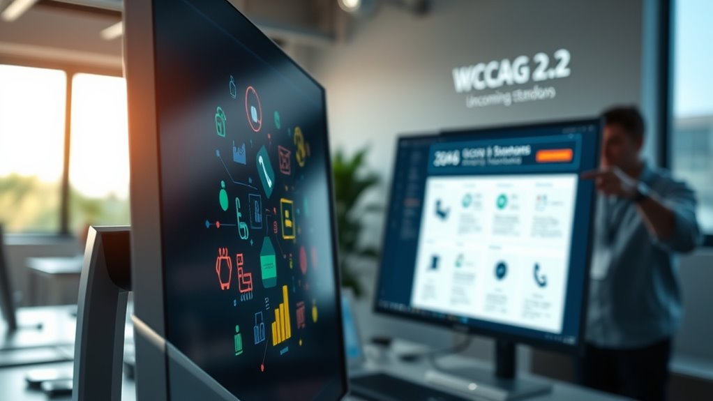
Understanding WCAG 2.2 and upcoming accessibility standards can transform your digital presence—discover the key updates and how they impact your compliance efforts.