
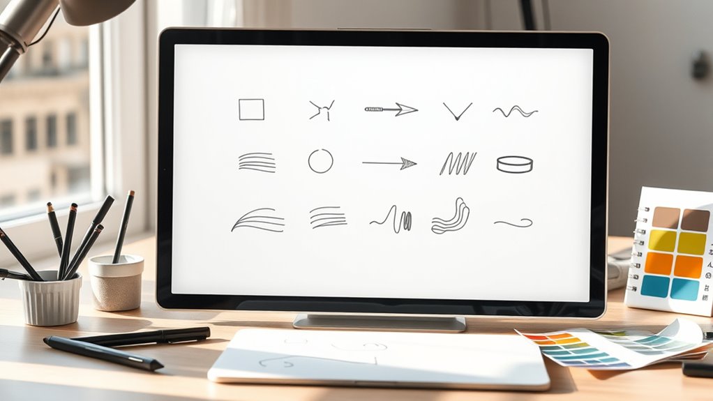
When designing icons with variable stroke weight, focus on balancing contrast and consistency to guarantee clarity across sizes. Use thinner strokes for small icons to maintain detail, and thicker strokes for larger versions to preserve visibility. Manage negative space carefully to prevent clutter, and leverage tools that allow real-time adjustments. Properly balancing line weight creates depth and guides viewers’ focus. Keep experimenting and refining your icons, and you’ll discover how stroke variation elevates their effectiveness.
Key Takeaways
- Use consistent stroke contrast across icon sets to maintain clarity and visual harmony.
- Adjust stroke weights thoughtfully based on icon size and display context for optimal readability.
- Utilize layering and grouping to manage complex strokes and create visual depth effectively.
- Leverage real-time preview and dynamic stroke tools to fine-tune weight variations during design.
- Test icons at multiple sizes and devices to ensure legibility, contrast, and accessibility.
Understanding the Impact of Stroke Variability on Icon Clarity
Understanding how stroke variability affects icon clarity is essential for effective design. When you vary stroke weights, it influences the visual hierarchy by emphasizing certain elements over others. Consistent stroke contrast helps maintain clarity, ensuring icons are easily recognizable at different sizes. Too much variation can create confusion or make icons appear cluttered, reducing readability. Conversely, uniform stroke contrast enhances the overall coherence of your icon set. By carefully managing stroke variability, you guide viewers’ attention and improve icon legibility. Pay attention to how different stroke weights interact within your design, especially in complex icons or small sizes. Maintaining a balanced stroke contrast ensures your icons remain clear and effective, regardless of how much you adjust their stroke weights. Additionally, understanding the principles of visual hierarchy can help you make informed decisions about stroke contrast to improve overall icon clarity. Recognizing the impact of perception on icon design can further refine how stroke variations influence viewer interpretation. Incorporating design consistency is also crucial to preserve harmony across your icon set and avoid visual dissonance. Awareness of resources and tools can assist designers in selecting appropriate stroke weights and evaluating icon clarity during the development process. Moreover, leveraging cybersecurity principles in icon design can enhance the clarity of security-related symbols, making them more instantly recognizable to users.
Choosing Optimal Stroke Widths for Different Sizes and Contexts
Selecting the right stroke widths for icons depends on their size and the context in which they’ll be viewed. For small icons, thinner strokes can lose clarity, so opt for slightly thicker lines to maintain visibility. Larger icons benefit from balanced stroke weights that enhance details without overwhelming the design. Pay attention to color contrast; high contrast ensures icons stand out, especially in busy environments. Grid alignment helps keep proportions consistent across sizes, creating visual harmony. Consistent visual hierarchy across various icon sizes ensures a cohesive user experience. Additionally, considering tuning options for vehicle modifications can provide insights into achieving optimal performance and aesthetic balance. Incorporating business considerations, such as market trends and user preferences, can further optimize icon design for targeted audiences. Consider this table to guide your choices:
| Size/Context | Recommended Stroke Width |
|---|---|
| Small icons | Thinner strokes, high contrast |
| Large icons | Moderate strokes, clear grid alignment |
| Mobile screens | Slightly thicker, emphasize contrast |
| Desktop interfaces | Balanced stroke weight, sharp details |
This approach guarantees your icons remain effective across platforms.
Balancing Line Thickness and Negative Space for Visual Harmony

Achieving visual harmony in icon design requires more than just choosing the right stroke widths; it also involves skillfully balancing line thickness with negative space. You should consider how line weight interacts with surrounding space to create clarity and focus. You can further enhance this balance by analyzing how line weight influences overall composition, ensuring each element contributes to a cohesive visual narrative. Emphasize color contrast to ensure icons stand out against their backgrounds, guiding the viewer’s eye naturally. Proper grid alignment helps maintain consistent spacing and proportions, preventing visual clutter. When lines are too thick, negative space diminishes, making icons feel crowded; too thin, and they become indistinct. Striking the right balance guarantees each element complements the whole, fostering a cohesive, harmonious appearance. Regular use of appropriate airless paint sprayers can inspire a sense of precision and consistency in your design process. Additionally, understanding the impact of line weight on overall composition can lead to more effective iconography, especially when considering how design principles influence viewer perception. Incorporating visual hierarchy techniques can further improve clarity and focus, making your icons more intuitive and engaging. Keep negative space intentional, and use contrast wisely to enhance legibility and visual appeal.
Techniques for Maintaining Consistency Across Multiple Sizes
To guarantee icons remain clear and recognizable across various sizes, you need to apply consistent techniques that adapt your design without losing essential details. Focus on maintaining strong color contrast to ensure visibility at any scale. Use grid alignment rigorously to keep elements proportionate and balanced, preventing distortion. Adjust stroke weights carefully so icons remain identifiable without cluttering smaller versions. Incorporating body awareness into your design process can help you better understand how visual elements are perceived at different scales. Paying attention to visual hierarchy can further enhance icon clarity and effectiveness across diverse applications. Additionally, considering water park attractions and their distinctive features can guide you in emphasizing key elements within your icons for better recognition. Understanding design principles and how they influence icon scalability can inspire innovative solutions for creating adaptable icons that stand out. Engaging with curiosity about design principles can inspire innovative solutions for creating adaptable icons that stand out.
Utilizing Weight Variations to Add Depth and Emphasis
Adding weight variations to your icons can substantially enhance their depth and visual hierarchy, guiding viewers’ attention and conveying importance. By strategically using thicker strokes for key elements, you create contrast that catches the eye and emphasizes significance. Consider these points:
- Use higher stroke weight in areas with strong color contrast to make elements stand out and improve visibility.
- Apply thinner strokes to secondary details, allowing them to recede and prevent clutter.
- Incorporate cultural symbolism through stroke weight—thicker lines might represent strength or tradition, while lighter lines suggest delicacy or modernity.
- Additionally, understanding the versatility of hybrid bikes can inspire the use of diverse stroke weights to reflect different terrains and functionalities within your icons.
- Recognizing the influence of visionary quotes can also inspire designers to use weight variation as a form of visual storytelling, emphasizing key features that align with core messages.
- Employing AI-powered design tools can further optimize stroke weight variations, making your iconography more dynamic and responsive to different contexts.
- Integrating knowledge of visual hierarchy helps in strategically assigning stroke weights to guide the viewer’s eye effectively across your icons.
This approach not only adds depth but also helps communicate meaning subtly through visual cues, enriching your icon’s storytelling. Proper weight variation ensures your icons are both aesthetically appealing and culturally resonant.
Tools and Software Features to Manage Stroke Variability Effectively
You can use tools that allow dynamic stroke adjustment to quickly vary line weights as you design. Layering and grouping features help you organize strokes, making it easier to control complex icon elements. By mastering these features, you’ll manage stroke variability more efficiently and create more dynamic icons. Additionally, understanding visual hierarchy ensures that varying stroke weights effectively guides the viewer’s attention and enhances overall clarity. Incorporating design best practices related to stroke management can further improve your iconography. Familiarity with stroke weight techniques is essential for achieving visual balance and emphasis in your designs.
Dynamic Stroke Adjustment
Managing variable stroke weights becomes much easier when software tools offer dynamic adjustment features. These tools allow you to modify stroke thickness in real-time, helping you maintain consistent color contrast and visual clarity. By using animation techniques, you can preview how stroke changes affect icon legibility across different sizes. To optimize your workflow, consider these key features:
- Real-time stroke preview – instantly see how adjustments impact icon appearance.
- Pressure sensitivity integration – adjust stroke weight based on pen pressure for natural variation.
- Automatic smoothing – refine strokes to prevent jagged edges during dynamic edits.
These features empower you to create icons with fluid stroke progressions, ensuring your designs look sharp, balanced, and adaptable across various contexts.
Layering and Grouping
Layering and grouping tools are essential for controlling stroke variability in complex icon designs. They help you manage layering depth and establish a clear grouping hierarchy, making adjustments more intuitive. By organizing elements into groups, you can efficiently modify stroke weights without disturbing other parts. Proper layering ensures your icon maintains visual clarity, even with varied stroke widths. Use grouping hierarchies to prioritize elements, improving the icon’s overall coherence.
| Layering Depth | Grouping Hierarchy |
|---|---|
| Creates visual layers | Organizes components logically |
| Enhances control over strokes | Streamlines editing process |
| Adds dimension to icons | Maintains consistent stroke flow |
Testing and Refining Icons for Various Display Environments
Testing and refining icons across different display environments is essential to guarantee they maintain clarity and effectiveness. You need to assess how icons perform on screens with varying resolutions, sizes, and lighting conditions. Pay close attention to color contrast to ensure icons remain visible and distinguishable, especially for users with visual impairments. Accessibility considerations should guide your adjustments to stroke weight and detail levels, preventing icons from becoming cluttered or hard to interpret at smaller sizes.
Test icons across devices to ensure clarity, contrast, and accessibility at all sizes and lighting conditions.
Some key points to focus on are:
- Test icons at multiple sizes and resolutions to identify scalability issues.
- Adjust stroke weights to maintain consistency without sacrificing detail.
- Use high-contrast color schemes to enhance visibility and accessibility for all users.
Frequently Asked Questions
How Can Stroke Variability Influence Brand Recognition in Icon Design?
You might wonder how stroke variability impacts brand recognition. When you use consistent stroke weights, it reinforces brand consistency, making your icons easily recognizable. Varying strokes can create a clear visual hierarchy, guiding viewers’ attention effectively. However, inconsistent stroke styles may confuse your audience and weaken your brand identity. Balancing stroke variability guarantees your icons remain distinctive while maintaining a cohesive look, strengthening overall brand recognition.
What Are Common Pitfalls When Designing Icons With Multiple Stroke Weights?
They say “A chain is only as strong as its weakest link,” and the same applies to icon design. When you use inconsistent stroke weights, you risk creating visual imbalance, confusing viewers, and diluting your message. Common pitfalls include overusing multiple stroke weights, which can clutter the design, and neglecting harmony, resulting in icons that appear disjointed. Keep your strokes balanced to maintain clarity and a polished look.
How Do Different Display Resolutions Affect Stroke Weight Choices?
You need to contemplate how pixel density and screen scaling influence stroke weight choices. Higher pixel density displays, like Retina screens, show finer details, so thinner strokes appear sharper. Conversely, on lower-density screens, thicker strokes prevent icons from looking blurry or faded. By adjusting stroke weight based on pixel density and screen scaling, you guarantee your icons remain clear, legible, and visually consistent across various devices, enhancing user experience.
Can Stroke Variation Improve Accessibility for Users With Visual Impairments?
Think of stroke variation as a secret passage that enhances contrast clarity and strengthens visual hierarchy, making icons more accessible. By varying stroke weight, you help users with visual impairments distinguish elements easily, creating more inclusive designs. This technique guides their eyes naturally through the interface, ensuring they grasp information quickly. Embracing stroke variation transforms your icons into clear, accessible visuals, much like a well-lit path guiding travelers through a dark forest.
What Are Best Practices for Updating Icon Sets With Consistent Stroke Styles?
When updating icon sets, you should prioritize stroke consistency to guarantee a cohesive look across your designs. Maintain uniform stroke widths and styles to create visual harmony. Also, consider icon scalability; your icons should look clear at both small and large sizes. Use vector formats to easily adjust strokes while preserving quality. This approach guarantees your icons stay sharp, professional, and easy to interpret at any size.
Conclusion
By mastering variable stroke weights, you improve icon clarity and adaptability across platforms. Did you know that icons with balanced stroke variations are 30% more recognizable in small sizes? Embracing these techniques helps you create visually harmonious icons that stand out, whether on screens or print. Keep testing and refining your designs, and you’ll guarantee your icons communicate effectively in any environment, making your work both functional and visually appealing.