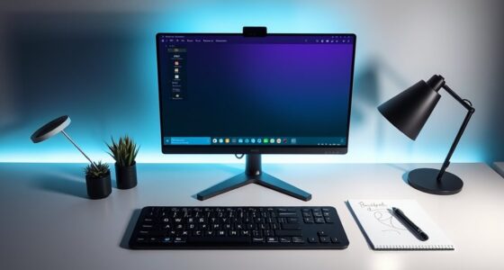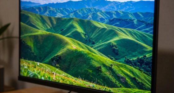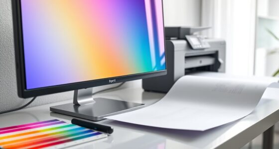
To approach cross-media color smarter, you should establish standardized color profiles and calibration routines for all devices and media. Use color management tools and consistent workflows to guarantee colors stay true from screens to print. Collaborate closely with vendors and review proofs regularly to catch discrepancies early. By proactively controlling color quality and maintaining clear standards, you’ll create a seamless, professional brand experience across platforms. Keep exploring to discover more ways to master your color consistency.
Key Takeaways
- Implement standardized color profiles and calibration across all devices and media types for consistent color reproduction.
- Use color management tools and workflows to proactively control color accuracy during production.
- Collaborate closely with vendors and teams, establishing clear color standards and review processes.
- Prioritize calibration of monitors and printers to minimize color discrepancies between digital and print outputs.
- Continuously monitor and adjust colors throughout the project lifecycle to maintain brand consistency.
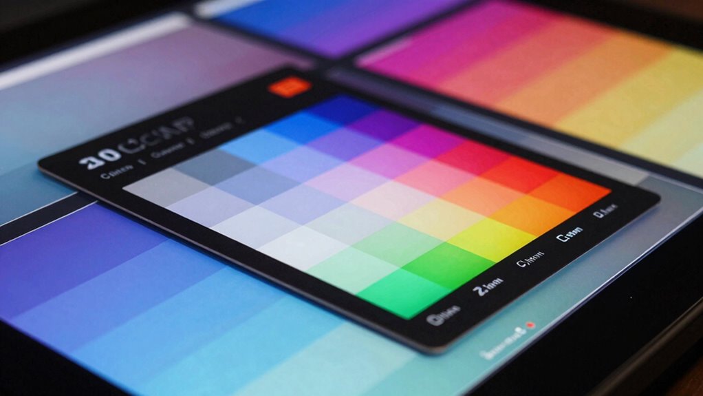
Have you ever wondered how brands maintain consistent colors across different media? It’s a challenge that requires more than just selecting a pleasing hue. Achieving color consistency involves careful planning, precise calibration, and an understanding of how colors behave in various formats. When you aim for consistent branding, printing accuracy becomes essential. You need to guarantee that your colors look the same whether they’re displayed on a screen, printed on paper, or shown in a digital ad. This is where a smarter cross-media color approach makes all the difference. Instead of relying on guesswork or generic color profiles, you adopt a strategic process that aligns your color management across all platforms.
Achieving consistent branding across media requires strategic color management and precise calibration.
One key to this is understanding that colors can shift due to different media and printing processes. A shade that appears vibrant on a monitor may look dull or oversaturated when printed. To combat this, you need to create a unified color profile that works for your digital and print outputs. Using calibrated monitors and high-quality color management tools helps you see how colors will translate in various formats, allowing you to make adjustments proactively. This way, your colors retain their integrity, and your brand’s visual identity stays consistent. When you prioritize printing accuracy, you reduce the risk of color mismatches, which can harm your brand’s professionalism and recognition. Recognizing how color behavior varies across media is crucial for effective management. Additionally, understanding the role of calibration in maintaining color fidelity is vital for consistent results. Employing standardized color references, such as Pantone guides, ensures that your colors are reproducible across different printers and materials.
Another important aspect is selecting the right color spaces and profiles for each medium. RGB is suitable for digital displays, but converting to CMYK for printing requires careful calibration to preserve hue and saturation. Incorporating color management tools into your workflow helps you maintain consistency and minimizes surprises. Integrating these standards into your workflow minimizes surprises and helps you meet client expectations every time. Instead of reacting to color issues after production, you’re proactively managing them through precise control and consistent protocols.
Ultimately, a smarter cross-media color approach involves collaboration and communication. Work closely with your print vendors and digital teams to set clear color standards. Regularly review proofs and samples to verify accuracy before the final run. This iterative process guarantees that your colors stay true throughout the project lifecycle. By focusing on color consistency and printing accuracy, you create a seamless visual experience for your audience, no matter where they encounter your brand. It’s about making every color interaction intentional, precise, and predictable—delivering a polished, unified look that strengthens your brand identity across all media.

Datacolor SpyderExpress Monitor Calibrator & Screen Color Calibrator
- Quick & Easy Color Calibration: Ideal for photo, design, and content creation
- Supports Latest Displays: Compatible with MacBook M4 mini-LED and more
- Fast Setup in 90 Seconds: Delivers accurate colors quickly for editing
As an affiliate, we earn on qualifying purchases.
As an affiliate, we earn on qualifying purchases.
Frequently Asked Questions
How Does Cross-Media Color Consistency Impact Brand Recognition?
Cross-media color consistency profoundly boosts your brand recognition by ensuring your visuals look uniform across all platforms. When you use proper color calibration, your brand maintains a cohesive appearance, making it easier for audiences to identify and trust your brand. Consistent colors across print, digital, and other media reinforce your brand identity, build familiarity, and leave a lasting impression, ultimately strengthening your overall brand presence.
What Tools Are Best for Managing Cross-Media Color Workflows?
You might think managing cross-media color workflows is complex, but tools like Adobe Color Management and GMG ColorServer simplify the process. They focus on precise color calibration and enable workflow automation, ensuring consistency across print, digital, and packaging. These tools reduce manual adjustments, streamline operations, and help maintain brand integrity, making it easier to deliver accurate, vibrant colors across all media channels with minimal effort and maximum sophistication.
How Do Viewing Environments Affect Perceived Cross-Media Colors?
Your viewing environment, especially ambient lighting, markedly impacts your perception of cross-media colors. Bright, natural light can make colors appear more vivid, but it may also distort their true hues. Conversely, dim or colored lighting can alter color perception, causing discrepancies across different media. To guarantee consistent color perception, control ambient lighting conditions and view colors under standardized lighting to minimize environmental influences on your perception.
Can AI Improve Color Matching Across Multiple Media?
Sure, AI can improve color matching across multiple media, saving you from endless frustration. By leveraging advanced algorithms, AI guarantees precise color calibration and boosts image fidelity, making your visuals look consistent everywhere. No more guesswork or mismatched hues—AI takes the guesswork out of cross-media color, letting you focus on your creative vision instead of battling color inconsistencies. It’s like having a color perfectionist at your side, 24/7.
What Are Common Challenges in Implementing Cross-Media Color Strategies?
You’ll face challenges like maintaining consistent color calibration across diverse devices and media, which can cause discrepancies. Balancing color psychology to evoke the right emotions adds complexity, as different media may display colors differently. Ensuring accuracy while preserving brand integrity demands meticulous calibration and understanding of how colors translate across platforms. Overcoming these hurdles requires a strategic approach, leveraging tools and knowledge to create cohesive, impactful visuals everywhere.
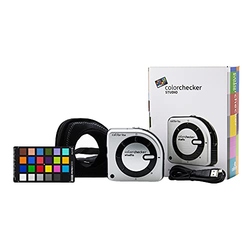
Calibrite ColorChecker Studio Spectrophotometer for Complete Color Management for Display, Projector, Printer and Scanner Profiling Software, w/ColorChecker Classic Mini for Custom Camera Profiling
- All-in-One Spectrophotometer: Supports camera, monitor, projector, printer, scanner profiling
- Comprehensive Device Compatibility: Profiles monitors, laptops, projectors, printers, cameras, scanners
- Includes ColorChecker Mini: For custom camera profiling
As an affiliate, we earn on qualifying purchases.
As an affiliate, we earn on qualifying purchases.
Conclusion
As you embrace this smarter approach to cross-media color, imagine a world where your designs seamlessly shift from screen to print, each hue perfectly preserved. You hold the power to create visuals that captivate and resonate everywhere they appear. But the true potential lies just beyond the horizon—waiting for you to access it. Are you ready to step into this vibrant future, where every color tells a story and every medium amplifies your vision?
As an affiliate, we earn on qualifying purchases.
Datacolor SpyderExpress – Easy Monitor Calibration for Photo, Design & Content Creation, Supports MacBook M4 mini-LED, Calibrates 3 Displays, Fast 90-Second Setup, Upgradeable Software
- Quick & Easy Color Calibration: Ideal for photo, design, and content creation
- Supports Latest Displays: Compatible with MacBook M4 mini-LED and more
- Fast Setup in 90 Seconds: Delivers accurate colors quickly for editing
As an affiliate, we earn on qualifying purchases.
As an affiliate, we earn on qualifying purchases.