Storytelling through data comics combines vibrant visuals with compelling narratives to transform complex information into engaging stories you can easily understand. By blending data visualization with storytelling techniques, you make dense statistics accessible and memorable, capturing attention and sparking curiosity. This approach simplifies abstract concepts and appeals emotionally, helping your audience connect deeply with the data. If you want to discover how to craft effective data stories that resonate, keep exploring these innovative methods.
Key Takeaways
- Data comics combine visual storytelling with data visualization to make complex information engaging and accessible.
- They use narrative techniques and visual elements like characters and metaphors to enhance understanding.
- Integrating charts and graphs within comics supports quick data comprehension and reinforces key messages.
- Tailoring stories for diverse audiences increases engagement and facilitates deeper connection with the data.
- Merging narrative and info in comics bridges raw data and human experience, fostering awareness and memorable learning.

Have you ever wondered how complex data can be transformed into engaging stories? That’s where visual storytelling steps in, seamlessly blending data visualization with narrative techniques to make information both accessible and compelling. Data comics are an innovative way to harness this power, turning dry statistics into vibrant, easy-to-understand narratives. By combining the visual appeal of comics with the insightful nature of data visualization, you can create stories that capture attention and enhance comprehension.
Imagine presenting a report on climate change not as a dense report filled with graphs and tables, but as a series of illustrated panels that guide your audience through the issue. With data comics, you’re not just sharing numbers—you’re crafting a story that resonates emotionally and intellectually. Visual storytelling in this format allows you to highlight key data points, show relationships, and illustrate trends in a way that feels natural and engaging. Instead of overwhelming your viewers with raw data, you give them a visual journey that simplifies complex concepts and sparks curiosity.
Using data visualization within comics isn’t just about adding eye-catching graphics; it’s about strategic placement of visuals to support your narrative. You might incorporate charts or graphs into comic panels, distilling complicated information into digestible visuals. These visuals serve as anchors, helping your audience grasp abstract ideas quickly. For example, a comic strip illustrating economic growth could feature a character planting seeds that grow into skyscrapers, with charts embedded in the background showing GDP increases over time. This interplay between story and data visualization makes abstract numbers tangible and memorable.
Furthermore, data comics allow you to tailor your storytelling to different audiences. Whether you’re explaining scientific research to students, persuading stakeholders, or raising awareness among the general public, the combination of visual storytelling and data visualization adapts well to diverse contexts. You can incorporate humor, metaphor, or relatable characters to make the data more approachable, while still maintaining accuracy and integrity. This approach not only informs but also entertains, ensuring your message sticks long after the comic is read.
In essence, data comics bridge the gap between raw information and human experience. They empower you to tell stories that are not only visually appealing but also rich in meaning. By leveraging visual storytelling and data visualization, you craft narratives that educate, inspire, and motivate action—making data not just numbers on a page, but stories that truly resonate. Incorporating educational toys and other engaging elements into presentations can further enhance understanding and retention of complex data concepts.
Amazon Product B0G473Y4JN
As an affiliate, we earn on qualifying purchases.
Frequently Asked Questions
How Can Data Comics Improve Audience Engagement?
Data comics improve your audience engagement by using visual storytelling that captures attention and makes complex data more accessible. They simplify information through engaging visuals and narratives, helping your audience retain key insights. By combining storytelling with data, you create a memorable experience that encourages viewers to stay longer and understand better. This approach boosts audience retention, making your message more impactful and ensuring your data resonates effectively.
What Tools Are Best for Creating Data Comics?
You should consider tools like Canva, Pixton, and Comic Draw, which excel in visual design and storytelling techniques. Canva offers user-friendly templates for creating engaging data comics, while Pixton lets you craft custom characters and scenes to enhance narrative flow. Comic Draw provides advanced drawing features, ideal for detailed visuals. These tools enable you to combine compelling storytelling with effective visual design, making your data comics more enthralling and accessible.
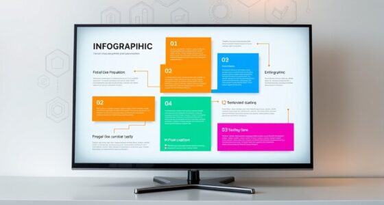
How Do Data Comics Compare to Traditional Infographics?
Data comics excel at visual storytelling by combining narrative and data visualization, making complex information more engaging and memorable. Unlike traditional infographics, which often focus on static data presentation, comics incorporate characters and stories to connect emotionally with your audience. This dynamic approach helps you communicate insights more effectively, capturing attention and fostering understanding through a seamless blend of visuals and narrative that enhances overall data storytelling.
What Are Common Mistakes in Storytelling With Data Comics?
Don’t bite off more than you can chew when creating data comics; overloading visuals or stories can confuse your audience. Common mistakes include neglecting clear visual storytelling, using complex data visualization that’s hard to follow, and losing focus on the narrative’s flow. Keep your message simple, engaging, and well-structured. When you strike the right balance, your data comics become compelling tools that communicate insights effectively without overwhelming viewers.
How Can Data Comics Be Integrated Into Educational Settings?
You can integrate data comics into educational settings by incorporating interactive visualizations that engage students and make complex concepts more accessible. Use these comics to enhance curriculum integration, aligning them with lesson plans to reinforce learning objectives. Encourage students to create their own data comics, fostering critical thinking and storytelling skills. This approach makes lessons more engaging, memorable, and helps students grasp data-driven insights more effectively.

RAYHOME Dual Row LED Open Sign, 20"x12" Colorful Huge Bright Advertising open signs for business, Programmable Electric Scrolling Display with Remote for Business Store Bar Hotel
【Bright Huge Advertising Sign】The bright huge sign makes it easy to show people the effect of advertising. The...
As an affiliate, we earn on qualifying purchases.
Conclusion
By now, you see how data comics turn dry stats into compelling stories—think of it as the Leonardo da Vinci of info design, but with a modern twist. You can captivate your audience, making complex ideas as clear as a vintage telegram. So, next time you’re stuck on data, remember: a well-crafted comic can make your message unforgettable, even if you’re traveling through time to the 21st century with your storytelling skills.

P10 Programmable LED Sign Outdoor, RGB Full Color Scrolling LED Sign with 4000CD/㎡ High Brightness, WIFI Control Open Welcome Led Digital Display for Business Advertising, Store, 40”x 8”
Day & Night Visibility: This programmable LED sign features a 10mm pixel pitch and a brightness range of...
As an affiliate, we earn on qualifying purchases.
Amazon Product B0GBWBK5SW
As an affiliate, we earn on qualifying purchases.