
To humanize statistics and effectively visualize social impact, focus on transforming raw data into compelling stories with visuals like charts, maps, and infographics. Use interactive dashboards that let stakeholders explore stories by region or timeframe, making data more engaging. Pair numbers with photos, testimonials, or videos to evoke empathy and connection. Prioritize clarity, avoid clutter, and maintain consistent design. Keep exploring to discover how these techniques can turn complex social data into inspiring narratives that truly resonate.
Key Takeaways
- Use storytelling elements like testimonials, photos, and videos alongside data to foster emotional connections.
- Design interactive dashboards that allow users to explore social impact metrics through filters and visual breakdowns.
- Prioritize clarity in visualizations by avoiding clutter, using intuitive labels, and maintaining consistent color schemes.
- Break down complex social issues into relatable stories with visual narratives that highlight real-world change.
- Combine data with human-centered visuals to build trust, motivate stakeholders, and clearly demonstrate tangible outcomes.

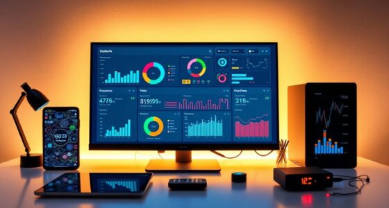
Social Impact Visualization transforms complex data into clear, compelling visuals that reveal the true effects of social initiatives. When you harness the power of data storytelling through visual tools, you’re able to communicate nuanced stories behind numbers in a way that resonates deeply. Instead of overwhelming your audience with raw data, you craft narratives that highlight real-world impacts, making the information more relatable and memorable. Interactive dashboards are essential in this process; they allow you to present data dynamically, enabling stakeholders to explore different angles and gain insights tailored to their interests. With these dashboards, you can break down large datasets into digestible visuals, such as charts, maps, and infographics, that illustrate how your initiatives are making a difference.
Transform complex data into engaging, human-centered stories with interactive dashboards that showcase social impact effectively.
As you develop these visualizations, your goal should be to humanize statistics. Numbers alone can feel impersonal, but when paired with storytelling and interactive elements, they become stories of change and hope. For example, instead of simply showing a rise in literacy rates, you can include photos, testimonials, or videos linked within your dashboards. This approach helps viewers connect emotionally with the data, fostering empathy and understanding. Interactive dashboards also empower your audience to engage directly with the data—filtering by region, time period, or demographic—so they can see firsthand where and how impact is occurring. This interactivity transforms passive viewers into active participants, encouraging deeper engagement and advocacy. Incorporating visual storytelling techniques enhances the emotional connection and clarity of your data presentation.
You should focus on clarity and precision when designing these visuals. Avoid clutter and unnecessary details that distract from your core message. Use concise labels, intuitive navigation, and consistent color schemes to guide viewers effortlessly through the story. Remember, the aim is to make complex social issues accessible without oversimplifying. By integrating data storytelling techniques into your visualizations, you can highlight the human stories behind the statistics, emphasizing the real people and communities affected by your work.
Ultimately, your ability to turn raw data into engaging stories through interactive dashboards can elevate the visibility and understanding of your social impact. It’s about more than just numbers—it’s about creating a narrative that inspires action. When your visualizations are human-centered, clear, and interactive, you foster trust, motivate stakeholders, and demonstrate the tangible outcomes of your initiatives. This approach transforms abstract data into a compelling story of progress and hope, driving your mission forward with clarity and compassion.

Soccer Cup 2026 Shirt Dress Women Soccer Season Dresses Game Day V-Neck Tshirt Dress Casual Short Sleeve Tops White
Premium Fabric: S=US(4-6), M=US(8-10), L=US(12-14), XL=US(16-18),XXL=US(20-22). Crafted from 60% cotton, 35% polyester, 5% spandex, this soccer cup 2026...
As an affiliate, we earn on qualifying purchases.
Frequently Asked Questions
How Can Visualization Improve Understanding of Complex Social Issues?
You can improve understanding of complex social issues by using visualization through interactive storytelling, which engages viewers actively. This method helps you connect emotionally, creating resonance that raw data alone can’t achieve. By humanizing statistics, visualization makes abstract concepts relatable, allowing you to see real-life impacts and understand nuances. As a result, it fosters empathy and comprehension, making complicated social issues more accessible and memorable for everyone involved.
What Are Common Pitfalls in Social Impact Data Storytelling?
You might overlook data accuracy, risking misleading your audience and undermining trust. Narrative framing can unintentionally skew perceptions, making issues seem more or less severe than they truly are. Beware of oversimplifying complex stories or cherry-picking data to fit a narrative. These pitfalls can cause your story to lose credibility. To succeed, focus on precise data and balanced storytelling, ensuring your impact message remains honest and compelling.
How Do Cultural Differences Affect Data Interpretation?
Cultural biases influence how you interpret data, making it essential to contemplate different perspectives. When you translate data across cultures, you risk misrepresenting or oversimplifying contexts, which can distort meaning. Be aware of these biases and ensure accurate data translation by involving local voices and understanding cultural nuances. This approach helps you create more accurate, respectful visualizations that genuinely reflect diverse social impacts.
What Ethical Considerations Are Involved in Social Impact Visualization?
When visualizing social impact, you must consider ethical issues like consent and bias mitigation. Always guarantee you have informed consent from data subjects, respecting their privacy and autonomy. Be vigilant about biases that can skew interpretations; actively work to mitigate them to present an accurate, fair picture. By prioritizing transparency and ethical standards, you help foster trust and ensure your visualizations responsibly reflect social realities.
How Can Visuals Foster Long-Term Social Change Engagement?
You can foster long-term social change engagement by creating visuals that evoke emotional resonance and use compelling narrative framing. When your visuals connect viewers emotionally, they’re more likely to stay engaged and motivated to act. Incorporate stories that humanize data, showing real people behind the statistics, which strengthens the emotional impact. This approach helps sustain interest and encourages ongoing support for social causes, ultimately driving meaningful, lasting change.

adidas Men's World Cup 26 Official Match Ball Graphic Long Sleeve T-Shirt, White, Medium
WORLD CUP 26 GAME BALL GRAPHIC STANDS OUT: This men's long-sleeve tee shirt features the official tournament ball...
As an affiliate, we earn on qualifying purchases.
Conclusion
As you visualize social impact, remember it’s like shining a light into a dark room—revealing stories behind the numbers. Imagine a single graph showing millions affected, yet each data point representing a person with hopes and dreams. When you humanize statistics, you turn abstract figures into relatable stories, inspiring action. Just like a small candle can illuminate a room, your understanding can spark meaningful change in countless lives.

Myswunder USA Soccer Fan Scarf - Double-Sided Team USA Supporter Scarf for 2026 International Soccer Matches & Game Day
[Double-Sided Support Design]: This USA soccer scarf is designed specifically for American supporters, featuring two distinct sides so...
As an affiliate, we earn on qualifying purchases.

GDLCETK World Cup 2026 Merchandise - Team USA Soccer Scarf - Double Sided Print Polyester 55in x 6in - Red White Blue Fan Scarf for Men Women - Perfect for Match Viewing, Fan Parties & Gifts
Authentic World Cup 2026 Merchandise: Celebrate the upcoming tournament with this officially themed World Cup 2026 Merchandise. Designed...
As an affiliate, we earn on qualifying purchases.