Working with variable fonts allows you to customize typography dynamically by adjusting axes like weight, width, and slant through CSS, reducing the need for multiple font files. You select the right font, embed it properly, and control variations using CSS properties like `font-variation-settings`. To make the most of them, focus on clear, accessible, and balanced adjustments, and troubleshoot rendering issues. Continuing will help you master techniques to create engaging, versatile typographic designs with confidence.
Key Takeaways
- Select variable fonts that support necessary axes and test their readability and style variations across devices and browsers.
- Use CSS `font-variation-settings` to dynamically control font axes like weight, width, or slant in web projects.
- Embed variable fonts efficiently using appropriate formats (WOFF2, OTF) and specify axes during embedding for optimized performance.
- Limit font variations and axes to ensure faster load times and maintain legibility in design.
- Test font rendering across browsers and devices, troubleshooting inconsistencies and optimizing for accessibility and performance.
Top picks for "work variable font"
Open Amazon search results for this keyword.
As an affiliate, we earn on qualifying purchases.
Understanding the Basics of Variable Fonts
Variable fonts are a modern advancement in typography that allows you to customize a typeface’s appearance along multiple axes, such as weight, width, and slant, within a single font file. Instead of switching between separate font files for each style, you can smoothly adjust these attributes on the fly. This flexibility means you can create precise, dynamic designs without cluttering your project with multiple fonts. Variable fonts use a technology called OpenType Font Variations, which encodes the variations mathematically. As a result, you get smaller file sizes and faster load times. Resources and Tools related to font technology can help you understand how to implement these variations effectively. Controlling these variations through CSS, design software, or code allows for precise adjustments that enhance visual storytelling and ensure your typography remains consistent across different platforms. Understanding how variable font axes interact enables designers to craft more flexible and expressive typographic compositions. Moreover, mastering design implementation techniques ensures that your use of variable fonts is both technically sound and visually compelling.
Selecting and Embedding Variable Fonts in Your Projects

When choosing a variable font, consider how its design variations will bolster your project’s readability and style. Embedding techniques can vary, so selecting the right method guarantees your font displays correctly across browsers and devices. By understanding these key points, you can seamlessly integrate variable fonts into your work for a polished, flexible result. Additionally, understanding signs of spoilage can help you ensure that any fonts or design assets you use are in optimal condition before implementation. Being aware of font compatibility across different platforms can prevent display issues and ensure a consistent visual experience, especially considering the compatibility of these fonts with various browsers and operating systems. Recognizing font names that suit your project’s aesthetic can also enhance the overall design cohesion. Moreover, understanding how environmental considerations influence digital assets can contribute to more sustainable design practices.
Choosing the Right Font
How do you choose the right font to enhance your project’s design and readability? Start by considering your audience and the message you want to convey. Look for a font that aligns with your brand’s personality—professional, playful, or modern. Think about legibility; variable fonts offer flexibility, but some styles may be harder to read at small sizes. Test different weights and widths to find a balance that makes your content clear and engaging. Also, guarantee the font complements your overall design, matching colors and layout. Keep in mind that simplicity often works best—avoid overly decorative styles that distract from your message. By selecting a font that suits your content and purpose, you’ll create a more impactful and cohesive project.
Embedding Techniques
To effectively incorporate variable fonts into your projects, you need to understand the best techniques for selecting and embedding them. First, choose the font format that suits your platform—WOFF2 for the web and OTF or TTF for desktop applications. Use a reliable font hosting service or embed fonts directly into your CSS or HTML files with @font-face rules. When embedding, specify the font axes you need to optimize load times and performance. Consider using font-display: swap; to ensure text remains visible during font loading. Test across browsers and devices to verify proper rendering. Keep the number of font variations minimal to improve load speeds. Properly embedded, variable fonts offer flexible, efficient typography that enhances your project’s design.
Using CSS to Control Variable Font Axes

CSS provides a straightforward way to control variable font axes, allowing you to dynamically adjust font properties directly in your stylesheet. You can target specific axes using the `font-variation-settings` property, which accepts a list of axis tags and their values. For example, to modify weight and width, you might write: `font-variation-settings: ‘wght’ 700, ‘wdth’ 100;`. Alternatively, modern CSS offers custom properties and the `@font-face` descriptor to set default axis values. Using media queries or hover states, you can animate or change axes for interactive effects. Keep in mind, not all browsers support all axes, so testing across environments is essential. Mastering CSS controls enables you to fine-tune typography and create adaptable, expressive designs with variable fonts.
Tips for Designing With Variable Font Variations

When designing with variable font variations, it’s important to focus on creating visual harmony and guaranteeing readability. Start by choosing variations that complement each other and match your overall style. Use subtle shifts in weight, width, or slant to add interest without overwhelming the design. Keep in mind that drastic changes can hinder readability, so test different variations at various sizes. Consistency is key; don’t overuse multiple axes or extreme settings in a single layout. Instead, select a few well-balanced variations that enhance your message. Use contrast wisely—vary font weights or widths to emphasize headings or key points, but maintain a clear hierarchy. Ultimately, preview your design across different devices and contexts to ensure your variations work well everywhere. Incorporating a mindful approach to visual harmony helps in creating cohesive and effective typographic designs. Additionally, understanding how different font variations impact user experience is essential for effective communication, especially considering that attention plays a crucial role in engaging viewers with dynamic typographic choices.
Troubleshooting Common Issues With Variable Fonts
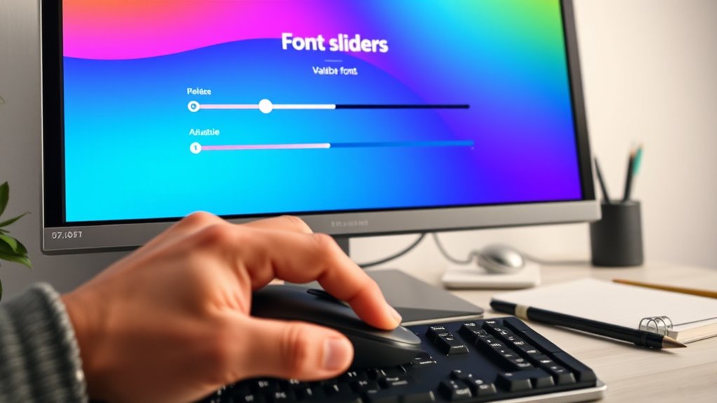
While experimenting with variable fonts can open up exciting design possibilities, it often brings about unexpected issues that can disrupt your workflow. You might encounter problems like inconsistent rendering or unexpected behavior across browsers. To troubleshoot effectively, focus on these common issues:
Experimenting with variable fonts can unlock exciting design but watch for rendering issues and browser inconsistencies.
- Font Weight and Axes Not Responding: Ensure your CSS syntax correctly targets the font axes and values. Verify that your font file supports the axes you’re trying to manipulate. Additionally, understanding font format compatibility can help you select the most reliable font files for your project. Checking browser support for variable fonts is also crucial to ensure consistent performance across different platforms.
- Rendering Discrepancies Across Browsers: Test your fonts on multiple browsers. Some browsers have limited support for variable fonts, so fallback options or static font versions might be necessary.
- Performance Issues: Large variable font files can slow down load times. Optimize by choosing only the axes you need and compressing font files before deployment.
- Understanding browser support and industry trends can help you anticipate and address compatibility issues early.
Addressing these issues helps guarantee a smoother experience.
Best Practices for Performance and Accessibility

To guarantee your variable fonts deliver peak performance and accessibility, you need to implement best practices early in your workflow. Start by limiting the number of axes and variations you include; excessive options can slow down loading times. Use font subsetting to load only the characters you need, reducing file size. Confirm text remains legible by choosing appropriate weights and sizes, and maintain sufficient contrast for readability. Incorporate semantic HTML and ARIA labels to support assistive technologies. Test your fonts across devices and browsers to identify performance issues or accessibility barriers. Optimize font delivery with efficient hosting and caching strategies. Additionally, understanding font performance factors can help you make informed decisions to enhance user experience. By proactively addressing these aspects, you ensure a smoother user experience that’s both fast and accessible for everyone.
Exploring Creative Use Cases for Variable Fonts
Variable fonts open up a world of creative possibilities that traditional static fonts can’t match, allowing you to craft dynamic and responsive typographic experiences. With them, you can seamlessly adapt font weight, width, or style to match your design needs. Here are three creative uses to inspire you:
- Responsive Headings: Change font weight or size based on screen size for a more engaging hierarchy.
- Animated Text Effects: Create smooth progressions between styles, like shifting from light to bold, for attention-grabbing animations.
- Personalized Typography: Adjust font parameters in real-time to reflect user preferences or contextual changes, enhancing user engagement.
These possibilities empower you to push boundaries and craft more expressive, versatile designs.
Frequently Asked Questions
How Do Variable Fonts Impact Website Load Times?
Your website’s load times can be affected by font choices. Variable fonts, which pack multiple styles into a single file, can actually improve load times because they reduce the number of font files your site needs to load. However, if a variable font file is large or poorly optimized, it might slow things down. Overall, using well-optimized variable fonts can help keep your site fast and flexible.
Are There Compatibility Issues With Older Browsers?
Oh, the joys of embracing the latest tech! When it comes to older browsers, compatibility can be a real party pooper. You might find your sleek variable fonts refusing to cooperate, displaying fallback fonts or breaking entirely. While some browsers like Chrome and Edge handle them smoothly, others like IE throw tantrums. So, yes, you’ll need to test thoroughly or risk your design’s integrity turning into a digital disaster.
How Can I Test Variable Font Variations Effectively?
To test font variations effectively, you should use browser developer tools to toggle different axis sliders and observe changes in real-time. Additionally, create sample pages with multiple variation settings and view them across various browsers and devices. Using online testing platforms or dedicated font testing tools can also help you identify compatibility issues and guarantee your font displays correctly for all users.
Can Variable Fonts Be Used in Print Design?
You can definitely use variable fonts in print design. They offer a wide range of style variations, allowing you to create flexible, dynamic typography without multiple font files. You simply choose the desired font axes and styles in your design software, then adjust them for the print piece. Just guarantee your printing process supports the chosen font features, and you’ll achieve high-quality, versatile results that enhance your print projects.
What Licensing Considerations Exist for Using Variable Fonts?
When using variable fonts, you need to consider licensing carefully. Some fonts are free for commercial use, while others require a license purchase. Always check the font’s license terms before incorporating it into your project to avoid legal issues. Make sure the license covers your intended use, whether print or digital. Keep documentation of your licenses, and respect any restrictions on modifications or redistribution.
Conclusion
By mastering variable fonts, you open endless creative possibilities—saving you up to 30% of file size compared to traditional fonts. This flexibility not only enhances your design’s visual appeal but also improves website performance and accessibility. Embrace these tools to craft dynamic, responsive projects that captivate and engage. As you experiment and troubleshoot, you’ll discover how variable fonts can truly transform your design approach, making your work more innovative and efficient.
