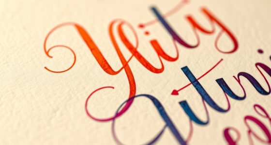

When comparing typography for web and print, you’ll find that each medium demands different approaches for clarity and impact. Web typography emphasizes simplicity, legible fonts, and responsiveness across devices, while print allows for more decorative fonts and precise control of spacing. Resolution, rendering, and viewing distance influence font choices, ensuring readability. Understanding these distinctions helps you design effective typography for both, and if you keep exploring, you’ll learn how to optimize your type for every medium.
Key Takeaways
- Web typography emphasizes simplicity, readability, and digital clarity, while print allows for detailed, decorative fonts with precise control.
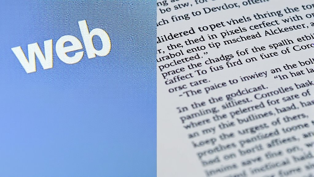
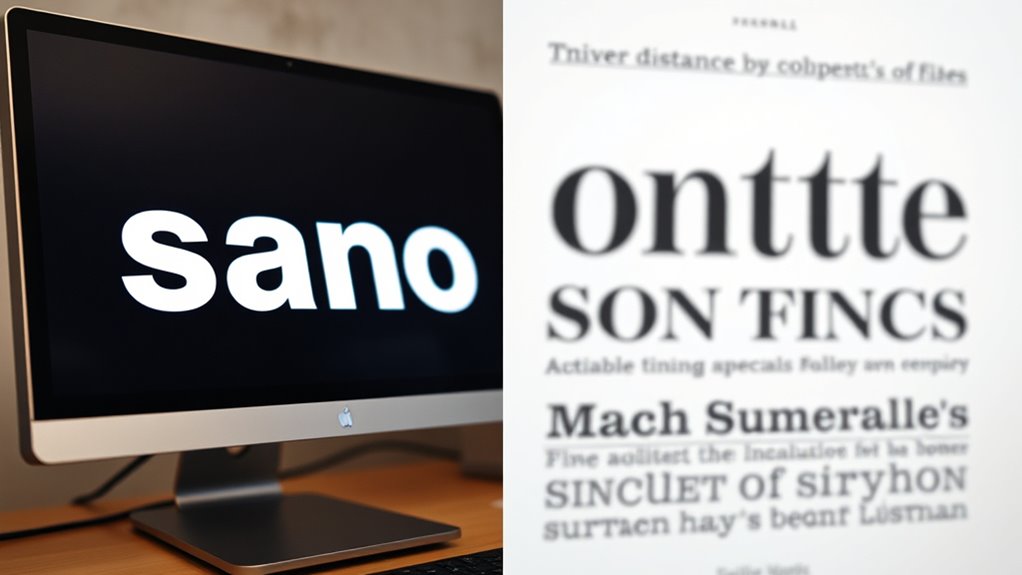
- Screen resolution (72-96 DPI) affects font sharpness online, whereas print requires high resolution (300 DPI+) for crispness.
- Web fonts are optimized for quick loading and legibility, often sans-serif; print fonts can include elaborate serif styles for aesthetic appeal.
- Readability considerations differ: web uses around 16px font size, print typically 10-12pt, with adjustments for viewing distance.
- Consistent color management and rendering techniques ensure font clarity and visual harmony across both digital and printed media.
Understanding the Fundamentals of Typography in Different Media
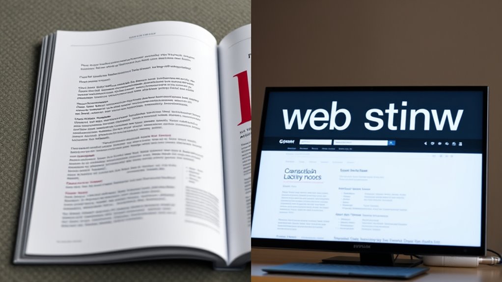
While the core principles of typography remain consistent across media, understanding how they function differently in web and print is essential. In print, clarity and readability depend on controlling spacing, font size, and line length meticulously. You can choose detailed typefaces since print allows high resolution and precise rendering. On screens, however, you must consider pixel density, screen glare, and viewing distance. Web typography relies on simpler fonts optimized for clarity at various sizes and resolutions. You need to prioritize legibility and avoid overly decorative styles that might not display well digitally. Both media demand a solid grasp of hierarchy, contrast, and consistency, but the techniques for achieving these effects differ markedly, influencing how your message is perceived and understood. Additionally, understanding the contrast ratio helps ensure that text remains legible across different devices and lighting conditions. Paying attention to responsive design techniques is also crucial for adapting typography to various screen sizes and resolutions. Moreover, staying updated on emerging typography standards ensures your designs remain accessible and effective across all platforms. Recognizing the importance of web-safe fonts can prevent display issues and improve user experience.
Key Differences in Font Selection and Styling
When selecting fonts for web and print, you need to regard their intended medium and how they will be perceived. Web fonts prioritize readability on screens, so you often choose sans-serif fonts like Arial or Helvetica for clarity at small sizes. They should be versatile and load quickly. In contrast, print fonts can include more elaborate serif fonts like Times New Roman or Garamond, which add elegance and tradition. Styling choices also differ: web designs favor simple, lightweight fonts with minimal embellishments to improve performance, while print allows for more decorative options. You might also consider font size, weight, and spacing differently, depending on whether your goal is digital engagement or printed impact. Understanding these key differences helps you create effective, appropriate typography for each medium. Additionally, knowing that font readability and style vary significantly between digital and print contexts ensures your message resonates appropriately with your audience. To optimize your typography, it’s essential to consider the intended audience and purpose, which can influence your font choices and styling decisions for maximum effectiveness. Being aware of design best practices for each medium further enhances the clarity and effectiveness of your message. Moreover, considering medium-specific constraints can help you select fonts that perform well across different platforms and materials. Recognizing the importance of AI-powered tools can also assist in choosing the right typography for your projects.
Resolution, Clarity, and Readability Considerations
Achieving ideal resolution, clarity, and readability is essential for effective typography, whether on screens or in print. When your text looks sharp and easy to read, your message resonates more deeply. To guarantee this, focus on these key factors:
Clear, sharp typography enhances readability and ensures your message makes a lasting impact.
- Choose high-resolution images and fonts to prevent pixelation and blur.
- Use appropriate font sizes that make reading effortless without strain.
- Maintain sufficient contrast between text and background to enhance visibility.
- Optimize line spacing and letter spacing for better flow and comprehension.
- Ensuring your fonts are scalable and compatible with your medium can also improve overall visual quality, which is especially important when considering different Kia Tuning modifications that impact vehicle aesthetics and performance. Additionally, selecting fonts that are optimized for digital or print environments can significantly affect the overall readability and audience engagement.
Viewing Distance and Its Impact on Typography Choices
Viewing distance plays a crucial role in determining the ideal typography for your project. When your audience will view content from afar, such as billboards or signs, larger, bolder typefaces are essential to guarantee readability. You’ll want to choose fonts with clear distinctions between characters to prevent confusion at a distance. You may also consider how contrast and simplicity can enhance legibility for distant viewers. For close-up reading, like books or websites, smaller fonts can be used, but they must still remain legible without strain. Consider the size and weight of your type, balancing aesthetics with function. Longer viewing distances often require increased contrast and simpler typefaces, while shorter distances allow for more detail and variety. Additionally, understanding visual hierarchy can help you prioritize information effectively based on viewing distance, ensuring key messages stand out. Developing a keen awareness of your creative practice can also help you experiment with different typography styles to find what works best for your audience. Incorporating user-centered design principles further ensures that your typography choices meet your audience’s needs and preferences, especially when considering different viewing contexts. To optimize readability, it is also beneficial to study how reader perception influences font selection depending on context.
Technology and Rendering Techniques for Web and Print
Your choice of technology impacts how typography appears on screens and in print. Differences in resolution, rendering engines, and color management techniques shape the clarity and vibrancy of your text. Understanding these factors helps you optimize your typography for each medium effectively.
Screen vs. Print Resolution
Understanding the differences in resolution between screens and print is essential for effective typography. Screens display images at lower resolutions, typically 72 to 96 DPI, which can make detailed fonts appear softer or pixelated if not optimized. Print, however, demands much higher resolution, usually 300 DPI or more, ensuring crisp, sharp text that captures fine details. Recognize these key points:
- Web fonts need to be designed for pixel clarity, avoiding tiny details that fade on screens.
- Print fonts should be crafted with high resolution in mind, ensuring clarity at large sizes.
- Scaling issues can cause fonts to lose precision, so resolution must match output medium.
- Design confidence grows when you understand how resolution impacts legibility and style across both mediums.
Rendering Engines and Fonts
Have you ever wondered how different rendering engines influence the appearance of fonts on screens and in print? Rendering engines interpret font files and display them based on specific algorithms and hardware capabilities. On the web, browsers like Chrome, Firefox, and Safari each have their own rendering engines—Blink, Gecko, and WebKit—that process fonts differently, affecting clarity and spacing. In print, rendering relies on high-resolution printers and typesetting software, which use advanced techniques to guarantee sharpness and consistency. Web fonts are often embedded or loaded dynamically, while print fonts are embedded during typesetting. Understanding how these engines handle anti-aliasing, hinting, and scaling helps you choose the right fonts and settings for maximum readability across mediums.
Color Management Techniques
Color management techniques are essential for ensuring consistent and accurate color reproduction across web and print media. They bridge the gap between devices, preventing colors from appearing differently on screens and printed materials. By calibrating monitors and printers, you can achieve true color fidelity. Proper color profiles, like ICC profiles, help translate colors correctly for each medium. This control fosters trust and emotional connection with your audience.
Here are key techniques to consider:
- Calibrate your devices regularly to maintain color accuracy.
- Use standardized color profiles for consistency.
- Soft-proof your designs to preview how colors will appear in print.
- Convert colors carefully when switching between RGB and CMYK to avoid surprises.
Mastering these techniques ensures your work looks vibrant, professional, and true to your vision—whether on screen or on paper.
Practical Tips for Designing Effective Type for Both Platforms
Designing effective type for both web and print requires careful consideration of readability and user experience. Choose fonts that work well across platforms, like sans-serif for digital and serif for print, but avoid mixing styles unless intentional. Keep font sizes legible; typically, 16 pixels for web and around 10-12 points for print. Use sufficient contrast between text and background to improve readability. Limit line lengths to prevent eye strain—about 50-75 characters for web and 8-12 words per line in print. Maintain consistent spacing and hierarchy to guide readers smoothly through your content. Test your design on multiple devices and print samples to ensure clarity. By paying attention to these details, you create a seamless experience that communicates your message effectively across both mediums.
Frequently Asked Questions
How Do User Experience Principles Influence Typography Choices Across Media?
User experience principles guide your typography choices by emphasizing readability, clarity, and emotional impact. You select fonts and sizes that make content easy to scan and understand, whether on screens or printed materials. You consider contrast, spacing, and hierarchy to create a seamless experience. By prioritizing accessibility and user engagement, your typography enhances overall satisfaction, helping users quickly find information and feel comfortable engaging with your content across different media.
What Role Does Accessibility Play in Web and Print Typography Design?
Accessibility plays a vital role in your typography choices, ensuring everyone can read and understand your content. On the web, you should select clear fonts, adequate contrast, and scalable sizes to accommodate users with visual impairments. For print, you need legible typefaces and proper spacing. By prioritizing accessibility, you make your message inclusive, allowing a wider audience to engage with your content comfortably across both media.
How Do Cultural Differences Affect Typographic Preferences in Print and Digital?
You notice that cultural differences influence your typographic choices in both print and digital media. You adapt your font styles, sizes, and layouts to respect local traditions, language nuances, and aesthetic preferences. You consider how different cultures read and process information, whether you’re designing for a Western audience with Latin scripts or an Asian audience with complex characters. By embracing these cultural nuances, you create more engaging, relevant, and respectful typographic experiences.
What Are Common Mistakes to Avoid When Designing for Both Platforms?
When designing for both platforms, you should avoid using overly complex fonts that reduce readability on screens and print alike. Don’t forget to verify contrast and spacing, as poor choices can make your text hard to read. Also, avoid relying on small font sizes or fixed layouts that don’t adapt well to different devices. Test your designs across platforms to ensure clarity, consistency, and accessibility for all users.
How Can Typography Adapt to Emerging Digital Technologies and Formats?
You can adapt typography to emerging digital technologies by staying flexible with font choices and formats. Use responsive design principles, guaranteeing text scales well across devices. Embrace variable fonts for customization, and optimize for accessibility. Incorporate new formats like WebP or SVG for graphics. Keep up with evolving standards, and test your typography on different screens to ensure clarity, readability, and an engaging user experience across all digital platforms.
Conclusion
Ultimately, understanding how typography adapts across web and print reveals more than just technical differences; it reflects a deeper connection between your message and its audience. When you consider resolution, viewing distance, and rendering techniques, you realize that successful design isn’t just about choices—it’s about creating an experience that feels natural and intentional, no matter the medium. In the end, your awareness shapes how your words resonate, bridging the unexpected gap between digital pixels and printed pages.