
To achieve balance with typographic grid systems, you should focus on aligning your text along a consistent baseline, which guarantees all lines sit uniformly and creates visual harmony. Using modular scaling helps determine proportional font sizes, making your layout feel organized and natural. Combining these principles guides your placement and sizing, resulting in clear, balanced designs that improve readability. Keep exploring, and you’ll discover how these strategies can elevate your entire typographic approach.
Key Takeaways
- Baseline alignment ensures all text lines sit on a consistent, invisible line for visual harmony and easier reading.
- Typographic grid systems use baseline grids to align text and elements seamlessly across layouts.
- Modular scaling creates harmonious font sizes, maintaining proportional relationships for balanced typography.
- Combining baseline alignment with modular scaling guides placement and sizing, enhancing overall design discipline.
- These systems improve readability, aesthetic appeal, and organization, resulting in balanced and polished typographic layouts.
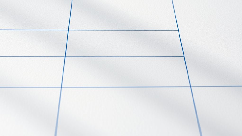
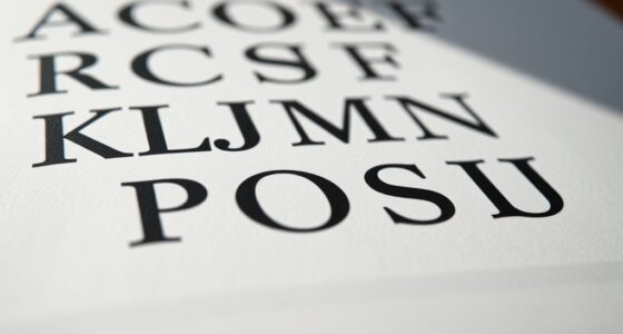
Have you ever wondered how designers create balanced and organized layouts? The secret often lies in the use of typographic grid systems, which help align text and visual elements seamlessly. One essential aspect of these systems is baseline alignment, which ensures that all lines of text sit consistently on an invisible line, creating harmony across the page. When you align your text to a common baseline, the overall appearance becomes more cohesive and easier to read, as your eye naturally follows the straight, uniform lines. This alignment is especially important when working with multiple type sizes or weights, as it prevents the layout from feeling chaotic or disjointed. By paying attention to baseline alignment, you maintain visual rhythm and order, making your design look professional and polished.
Another key component in establishing a strong typographic grid is modular scaling. This technique involves selecting a set of harmonious font sizes that work well together, based on a mathematical scale—often a ratio like the golden ratio or a simple harmonic progression. modular scaling creates a visual hierarchy that guides the reader’s eye smoothly from headlines down to body text. It ensures that your text blocks relate proportionally, avoiding awkward size jumps that can disrupt the flow. When you use modular scaling, you’re effectively setting a consistent rhythm for your typography, which simplifies decision-making and brings unity to your design. It also makes it easier to scale your layout for different devices or formats, since your sizes are based on a logical, repeatable pattern.
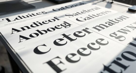
Additionally, understanding typographic consistency helps designers maintain a unified aesthetic across multiple pages or projects. Together, baseline alignment and modular scaling form the backbone of disciplined typographic grid systems. By establishing a consistent baseline grid, you create a framework that guides the placement of all text elements, ensuring that they align perfectly across columns and sections. Meanwhile, modular scaling helps you determine the appropriate font sizes, line heights, and spacing to maintain proportionality and harmony. When you combine these principles, your layout feels balanced and organized without appearing rigid or mechanical. Instead, it achieves a natural flow that guides the reader effortlessly through your content. This disciplined approach not only improves readability but also elevates the aesthetic quality of your design, making every element feel intentional and well-crafted. Ultimately, understanding and applying baseline alignment and modular scaling give you the tools to create visually compelling, easy-to-navigate typographic layouts that stand out.

Typographic Systems
Used Book in Good Condition
As an affiliate, we earn on qualifying purchases.
As an affiliate, we earn on qualifying purchases.
Frequently Asked Questions
How Do Grid Systems Enhance Reader Comprehension?
Grid systems enhance your reader’s comprehension by creating a clear visual hierarchy, guiding their eye smoothly through your content. They improve whitespace management, reducing clutter and making text easier to read. By aligning elements precisely, you guarantee consistency and balance, helping your audience focus on the message without distraction. This organized structure makes your content more accessible, engaging, and easier to understand, ultimately leading to a better reading experience.
Are Grid Systems Suitable for Digital and Print Media?
You’ll find grid systems are incredibly versatile for both digital and print media, offering unmatched flexibility. They help you establish a clear typographic hierarchy, making your design instantly understandable. Whether it’s a sleek website or a polished print piece, grids guide your layout with precision, ensuring your message hits home. Their adaptability makes them essential tools, transforming chaotic content into visually balanced, professional designs that captivate your audience every time.
What Are Common Mistakes When Implementing Grid Systems?
When implementing grid systems, you often make mistakes like column inconsistencies and improper spacing. These issues disrupt the visual flow and balance of your design. You might not align text properly across columns or overlook the importance of consistent spacing, making your layout look unprofessional. To avoid this, double-check your grid alignments regularly and maintain uniform spacing throughout to create a cohesive, balanced design.
How Do Grid Systems Adapt to Responsive Design?
You embrace fluid layouts and flexible modules to make grid systems adapt seamlessly to different screens. By using percentage-based widths and media queries, you guarantee that your design responds to device variations, maintaining alignment and balance. This approach creates a harmonious flow, making your content feel natural and engaging. As a result, your grid becomes a dynamic framework that supports user experience across all devices.
What Tools Assist in Creating Effective Typographic Grids?
You can use tools like Adobe InDesign, Sketch, or Figma to create effective typographic grids. These tools help you establish precise grid design, ensuring your text aligns seamlessly and promotes typographic harmony. They offer grid templates, guides, and snapping features, making it easier to maintain consistency across your layout. With these tools, you can craft balanced, visually appealing designs that enhance readability and overall aesthetic.

KUDOS.JP Grid Ruler Transparent
Material: PVC resin
As an affiliate, we earn on qualifying purchases.
As an affiliate, we earn on qualifying purchases.
Conclusion
Think of typographic grid systems as the heartbeat of your design—guiding your text like a steady pulse that brings balance and harmony. When you align your elements with purpose, you create a visual rhythm that resonates with your audience. Embrace these grids as your compass, shaping your message with precision and grace. By doing so, you guarantee your design stands strong, like a well-tuned instrument, inviting viewers to listen and connect deeply.

Sharp El-1750V 12-Digit Desktop Printing Calculator, White
Powered by 4 AA batteries, power adapter not included, includes starter size paper roll
As an affiliate, we earn on qualifying purchases.
As an affiliate, we earn on qualifying purchases.

2 x Grid Type Lettersize 'Freehand Designer' Sheets. Draw Perfect Straight Lines Templates. Grid Type Sheets for Scale Drawings
Enables drawing of horizontal and vertical straight lines freehand
As an affiliate, we earn on qualifying purchases.
As an affiliate, we earn on qualifying purchases.