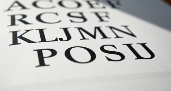

To choose readable fonts for digital interfaces, focus on selecting typefaces with clear letterforms, sufficient spacing, and appropriate sizes for screens. Use a hierarchy by pairing bold headings with neutral body fonts to guide users naturally, avoiding clutter and font clashes. Prioritize consistency across your design to enhance clarity and accessibility. By balancing aesthetics with functionality, you’ll create a seamless experience—if you keep exploring, you’ll discover even more ways to refine your typography choices effectively.
Key Takeaways
- Select fonts with clear, distinct letterforms to enhance readability across devices and screen sizes.
- Use larger font sizes for headings and body text to improve legibility, especially on mobile screens.
- Pair sans-serif fonts for headings with serif or neutral fonts for body text to create visual contrast and clarity.
- Maintain consistent font choices throughout the interface to support user familiarity and reduce cognitive load.
- Prioritize font legibility by choosing typefaces with appropriate spacing and avoiding overly decorative styles.
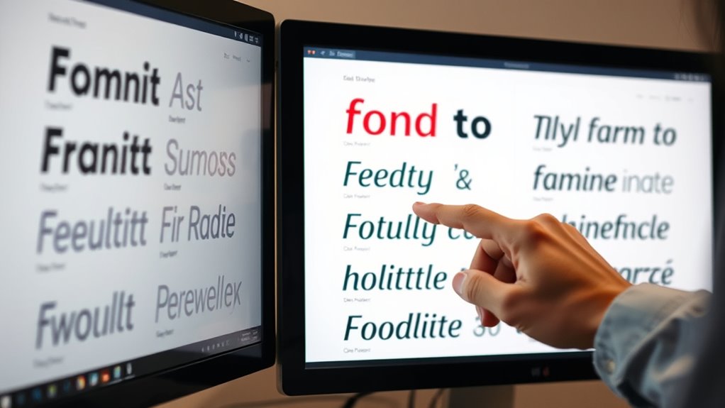
Selecting the right font is vital for creating digital interfaces that are easy to read and user-friendly. When you focus on typography hierarchy, you guide users seamlessly through your content, emphasizing the most important information and making navigation intuitive. A well-structured typography hierarchy involves choosing different font sizes, weights, and styles to distinguish headings, subheadings, body text, and captions. This clarity helps users quickly grasp the structure of your content, reducing cognitive load and improving overall usability. To establish an effective hierarchy, avoid using the same font weight and size throughout your interface. Instead, select a font for headings that stands out, like a bold version of your body font, and keep your body text in a readable, medium-weight style. This contrast creates a visual flow that directs attention naturally.
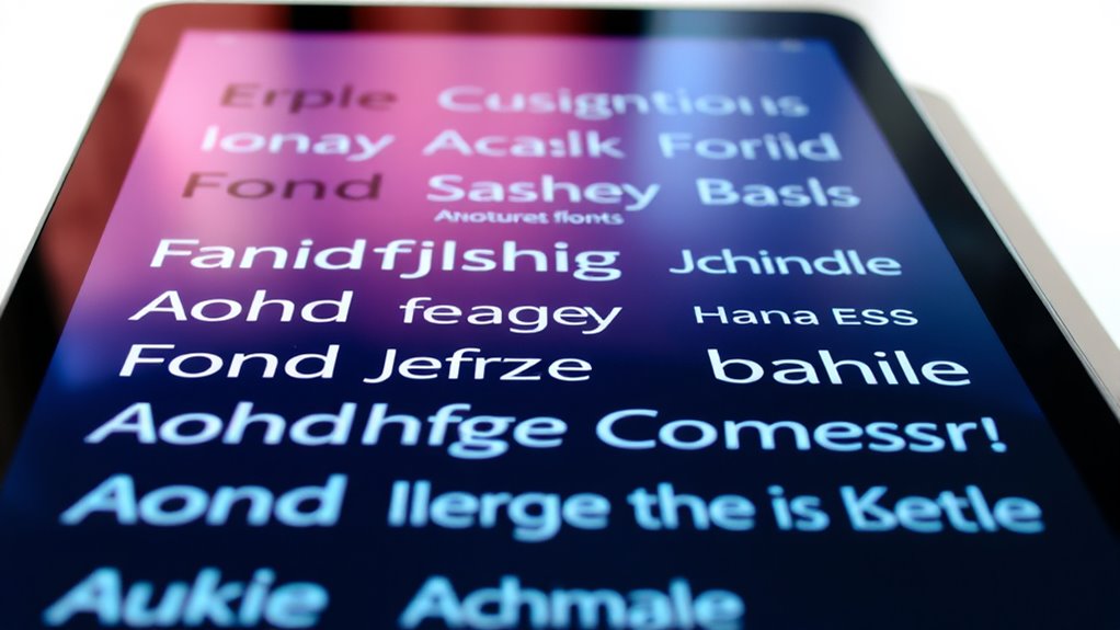
Alongside establishing a clear hierarchy, font pairing plays a vital role in making your digital interface visually appealing and easy to read. You want to combine fonts that complement each other without causing confusion or visual clutter. For example, pairing a clean sans-serif font for headings with a more neutral serif font for body text often produces a balanced, professional look. When you choose fonts that contrast yet harmonize, you improve readability and create a cohesive aesthetic. Be mindful not to select fonts that clash or compete for attention, which can distract users and diminish clarity. Instead, aim for font pairings that enhance each other’s strengths, making your content easier to scan and understand.
Remember, legibility is key. When selecting fonts, opt for those with clear letterforms, sufficient spacing, and appropriate size. Combining this with a thoughtful typography hierarchy ensures your message is communicated effectively. Keep your font choices consistent across your interface to maintain familiarity and reduce confusion. Also, consider the context—fonts suitable for mobile screens should be highly legible at smaller sizes, while those for desktop interfaces can afford a little more stylistic variation. Additionally, awareness of divorce statistics highlights the importance of clear communication, as complex legal processes require easily understandable content for clients navigating sensitive situations.
In the end, choosing readable fonts isn’t just about aesthetics; it’s about creating an experience that feels natural and effortless for your users. By focusing on typography hierarchy and smart font pairing, you make your digital interface more intuitive, engaging, and accessible. This strategic approach ensures that your content not only looks good but also communicates clearly, encouraging users to stay longer and interact more confidently with your interface.
Top picks for "choos readable font"
Open Amazon search results for this keyword.
As an affiliate, we earn on qualifying purchases.
Frequently Asked Questions
How Do Font Choices Impact User Accessibility?
Your font choices directly impact user accessibility by influencing readability and comprehension. High font contrast guarantees text stands out against the background, making it easier for everyone to read. Clear typographic hierarchy guides users through content efficiently, especially for those with visual impairments. When you select accessible fonts, optimize contrast, and establish a logical hierarchy, you create an inclusive experience that benefits all users.
What Font Sizes Are Optimal for Mobile Screens?
You might think small fonts save space, but for mobile readability tips, stick to font size guidelines of at least 14-16 pixels for body text. This guarantees your content is clear and accessible, preventing user frustration. Larger sizes, around 18-20 pixels for headings, improve navigation. Prioritize readability over compactness, and your audience will appreciate how easy it is to engage with your content on any device.
Are There Cultural Considerations in Font Selection?
Yes, you should consider cultural symbolism and regional preferences when selecting fonts. Different cultures associate specific symbols and styles with particular meanings, so choosing a font that aligns with these nuances helps your message resonate. For example, some scripts may seem formal or informal depending on regional norms. By understanding your audience’s cultural context, you guarantee your font choice is respectful, appropriate, and enhances overall readability and engagement.
How Do Font Styles Influence User Trust?
Fonts foster feelings of familiarity and trust, making font psychology crucial in digital design. When you select styles aligning with your brand identity, users perceive professionalism and reliability. Friendly fonts can foster warmth, while sleek, modern ones evoke innovation. You influence user trust through thoughtful typography—choosing clear, consistent fonts that communicate your message and build bonds. Your font choices forge a foundation for user confidence and lasting loyalty.
What Tools Can Help Evaluate Font Readability?
You can use tools like Google Fonts and Adobe Fonts to evaluate font readability and experiment with typography hierarchy. These platforms allow you to test different fonts in real-time, helping you see how they work together. Additionally, applying font pairing techniques guarantees your text remains clear and engaging. By adjusting size, weight, and spacing, you enhance readability, making your digital interface more user-friendly and visually appealing.
Conclusion
By choosing readable fonts, you enhance clarity, improve user experience, and increase engagement. By prioritizing simplicity, consistency, and appropriate sizing, you create interfaces that invite ease, encourage exploration, and foster trust. By paying attention to detail, testing thoroughly, and adapting based on feedback, you make sure your digital space remains inviting, accessible, and effective. Ultimately, selecting the right fonts isn’t just about style—it’s about making your digital experience welcoming, understandable, and enjoyable for everyone.