
To support global scripts effectively, you should choose fonts that respect each language’s cultural nuances and guarantee technical compatibility with complex characters like Chinese or Hindi. Pairing styles thoughtfully enhances clarity while maintaining visual harmony across different scripts. Prioritize legibility and proper spacing to create an inclusive experience. When you adopt these strategies, you’ll improve communication for diverse audiences. Keep exploring these techniques further, and you’ll open even more ways to make your multilingual designs truly resonate worldwide.
Key Takeaways
- Choose fonts that support multiple scripts to ensure consistent display across languages.
- Consider cultural associations and emotional responses when selecting typography for diverse audiences.
- Test font compatibility and rendering to prevent missing characters or display issues in multilingual content.
- Use appropriate font pairings to enhance readability and establish a clear visual hierarchy across languages.
- Incorporate cultural and technical considerations to create a cohesive, inclusive user experience worldwide.

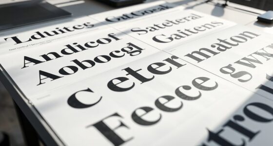
When designing for multiple languages, typography plays a critical role in ensuring your message is clear and visually appealing across diverse audiences. You need to consider how different scripts and characters communicate tone and meaning, which makes font pairing a fundamental aspect of multilingual design. Choosing the right combination of fonts isn’t just about style; it’s about creating harmony between typefaces that complement each script’s unique features. For example, pairing a clean, modern sans-serif with a traditional serif can help balance readability and aesthetic appeal across languages, but you must guarantee these fonts work well together across all scripts involved. This requires testing different combinations to see which pairs enhance clarity without creating visual discord. Engaging narratives and expert voice acting can also be used to elevate your content, making visual and auditory elements work seamlessly together to support your message.
Effective multilingual design balances font harmony and readability across diverse scripts.
Cultural considerations also influence your font choices profoundly. Every language carries its own cultural nuances, and fonts can evoke specific associations or feelings. For example, selecting a font that aligns with the cultural context of Japanese, Arabic, or Cyrillic scripts helps connect with your audience on a deeper level. Ignoring these nuances can lead to miscommunication or even offend viewers, so it’s essential to research and understand the cultural significance behind certain typefaces. For instance, ornate or traditional fonts may be appropriate for formal or historical content in some cultures, while more straightforward, modern fonts suit contemporary messaging. Recognizing these subtleties ensures your design respects cultural expectations and enhances user engagement.
When working across multiple languages, you also need to account for the technical constraints of different scripts. Some languages, like Hindi or Chinese, require complex characters that demand specific font support and rendering capabilities. This means choosing typefaces that are not only visually compatible but also technically capable of displaying all characters correctly. Many multilingual fonts now incorporate a broad range of scripts, simplifying this process, but always double-check that your chosen fonts support all the languages you plan to include. This attention to detail prevents issues like missing characters or awkward spacing, which can undermine your message’s clarity. Additionally, leveraging multilingual font support can streamline this process and improve overall consistency.
Finally, don’t forget that readability is paramount. Multilingual typography often involves balancing font pairing and cultural considerations with legibility across different devices and screen sizes. Consistency in style, clear hierarchy, and appropriate spacing help your audience smoothly navigate your content, regardless of language. By thoughtfully integrating font pairing strategies with cultural awareness, you create a cohesive and inclusive user experience. This approach guarantees your multilingual design communicates effectively, respects cultural diversity, and captures the attention of a global audience.
Top picks for "typography multilingual design"
Open Amazon search results for this keyword.
As an affiliate, we earn on qualifying purchases.
Frequently Asked Questions
How Do Different Scripts Influence Font Pairing Choices?
Different scripts influence your font pairing choices by requiring careful attention to font harmony and script integration. You should select fonts that complement each other’s visual style while respecting each script’s unique characteristics. For example, pairing a Latin typeface with a complex script like Arabic demands balance to maintain readability and aesthetic unity. By prioritizing harmony and seamless script integration, you create a cohesive, visually appealing multilingual design that effectively communicates across cultures.
What Are Common Challenges in Multilingual Typography?
You face challenges like maintaining font consistency across languages while ensuring script differentiation. Balancing readability and aesthetic harmony becomes tricky when different scripts have unique characteristics. You must choose fonts that support multiple scripts without clashing, and adapt layouts to accommodate varying text directions and sizes. Overcoming these issues requires careful font selection and design adjustments, ensuring your multilingual typography remains cohesive, legible, and visually appealing across all languages.
How Can Typography Ensure Readability Across Scripts?
Imagine you’re the captain steering a ship through diverse waters—your typography must adapt. To guarantee readability across scripts, you should make font size adjustments suited to each language’s script and optimize line height for clarity. These tweaks help users easily read and understand content, no matter the alphabet or script. With these strategies, your multilingual design becomes a seamless experience, engaging users worldwide without losing coherence or visual harmony.
What Tools Assist in Multilingual Font Development?
You can use tools like Glyphs, FontLab, and RoboFont to assist in multilingual font development, helping you navigate script complexity. These tools offer features for designing, refining, and testing fonts across multiple scripts. Be mindful of font licensing restrictions, ensuring you have the right permissions for commercial or collaborative projects. They streamline the process, making it easier to create cohesive, functional fonts that support diverse global scripts effectively.
How Does Cultural Context Impact Typographic Design?
You need to take into account cultural symbolism and historical influences because they shape how your audience perceives typography. When designing, you should reflect local traditions, colors, and symbols to create a connection. Ignoring these elements might lead to misunderstandings or offend viewers. By understanding cultural context, you ensure your fonts resonate authentically, respecting the community’s identity and values, which ultimately enhances the effectiveness of your multilingual design.
Conclusion
As you navigate multilingual design, remember that typography is the bridge connecting diverse scripts and cultures. It’s the thread weaving harmony through visual chaos, ensuring each language shines with clarity and respect. By embracing the unique nuances of global scripts, you create a design that speaks universally, like a symphony where every instrument plays its part. Keep experimenting, learning, and respecting these scripts—your work can truly become a universal language that unites us all.