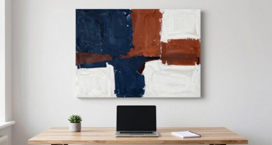
The overlooked rule behind better visual weirdness is balancing unexpected elements with intentional harmony. You need to combine unusual colors, shapes, or compositions in a way that sparks curiosity without overwhelming the viewer. Too much chaos can obscure your message, while too much sameness might feel dull. Striking this delicate balance guides the eye, creating intrigue and tension. Keep experimenting with this approach, and you’ll discover how subtle tweaks can make your visuals truly mesmerizing.
Key Takeaways
- Balancing unexpected color combinations with strategic composition maintains intrigue without overwhelming the viewer.
- Incorporating subtle hue shifts creates tension, adding depth to visual weirdness.
- Using asymmetry and off-center elements guides focus while enhancing dissonance.
- Achieving harmony between familiar and unfamiliar elements sparks curiosity effectively.
- Thoughtful placement of contrasting colors and shapes sustains cohesion amid chaos.
Have you ever wondered why some images feel intriguingly strange while others just fall flat? It’s not just about randomness or chaos; it’s about understanding how our brains process visual cues. One overlooked rule behind creating compelling, weird visuals is mastering the balance between color harmony and composition. When these elements are intentionally manipulated, you can craft images that draw viewers in with their strange allure, yet still feel cohesive and engaging.
Color harmony plays an essential role in how strange or unsettling an image appears. When you break traditional color schemes or combine unexpected hues, you generate a sense of dissonance that piques curiosity. But if the colors clash wildly without any underlying harmony, the image can become jarring or confusing. The key is to find a balance—use contrasting colors that still complement each other, or employ subtle shifts in hue that create tension without overwhelming the viewer. This delicate dance between harmony and discord keeps the viewer’s eye moving, exploring the image’s odd details without feeling lost or alienated.
Balancing unexpected hues with harmony sparks curiosity without overwhelming, guiding viewers through intriguing, strange visuals.
Equally important is composition balance. Even in bizarre or surreal visuals, a well-structured layout helps anchor the viewer’s gaze. When you deliberately place elements off-center or juxtapose familiar objects in unfamiliar contexts, you generate a sense of visual imbalance. Yet, if the composition is too chaotic, it can disrupt the viewer’s understanding and diminish the intended weirdness. Striking the right balance involves guiding the eye through the image with strategic placement—using symmetry, asymmetry, or focal points to create tension. The goal isn’t to throw everything into chaos but to introduce enough imbalance to evoke intrigue, while still maintaining a sense of overall harmony.
When you combine thoughtful color harmony with well-considered composition balance, you reveal a powerful tool for creating images that are weird in the best way. These visuals don’t just feel random; they feel intentional, crafted to evoke curiosity and unease simultaneously. You want your audience to feel a tug of familiarity mixed with unfamiliarity, and that’s where these principles shine. They allow you to push boundaries while still providing enough structure for viewers to engage meaningfully. Mastering this overlooked rule means your visuals will stand out, not just as strange but as compelling works of art that invite deeper exploration. Additionally, understanding visual processing can help you refine your approach to creating these intriguing images.

Color Harmony for Artists: How to Transform Inspiration into Beautiful Watercolor Palettes and Paintings
As an affiliate, we earn on qualifying purchases.
As an affiliate, we earn on qualifying purchases.
Frequently Asked Questions
How Does Color Choice Influence Visual Weirdness?
Your color choice greatly influences visual weirdness by tapping into color symbolism and emotional impact. Bright, unexpected colors can create a sense of surrealism or discomfort, while muted tones might evoke calmness or eeriness. When you deliberately choose colors that clash or evoke strong feelings, you heighten the weirdness factor, making your visual work more intriguing and memorable. So, pay attention to how colors can manipulate perception and amplify the strange.
Can Cultural Differences Affect Perception of Visual Weirdness?
Yes, cultural differences considerably affect how you perceive visual weirdness. Cultural symbolism shapes your interpretation of unusual visuals, making what’s strange in one culture seem normal in another. Additionally, perception biases influence your reactions, causing you to see certain imagery as weird or familiar based on your cultural background. Recognizing these factors helps you understand why visual weirdness varies across cultures, enhancing your appreciation of diverse artistic expressions.
What Role Does Context Play in Enhancing Weird Visuals?
Context plays a vital role in enhancing weird visuals by guiding your perception shift through contextual framing. When you understand the background or setting, you’re more likely to interpret strange elements as intentional rather than random. This framing helps you embrace the weirdness, making visuals more engaging and thought-provoking. Without proper context, odd visuals might just seem confusing, but with it, they become a compelling part of a bigger story, deepening your experience.
Are There Ethical Concerns With Creating Intentionally Weird Images?
Yes, there are ethical implications when creating intentionally weird images. You need to take into account how your visuals might impact viewers, especially if they evoke discomfort or offend certain groups. Pushing artistic boundaries is fine, but it’s important to respect cultural sensitivities and avoid perpetuating stereotypes. Being mindful ensures your work challenges norms without crossing ethical lines, fostering creativity that’s both provocative and responsible.
How Can Viewers Train Themselves to Appreciate Visual Weirdness?
You can train yourself to appreciate visual weirdness by embracing perception adaptation and novelty sensitivity. Imagine your brain as a curious cat, enthusiastically pawing at odd images, slowly learning they’re not threats but delightful puzzles. Practice exposing yourself to unusual art and images, letting your perception adapt. Over time, your mind becomes more receptive, transforming initial confusion into genuine fascination, so weird visuals become intriguing rather than unsettling.
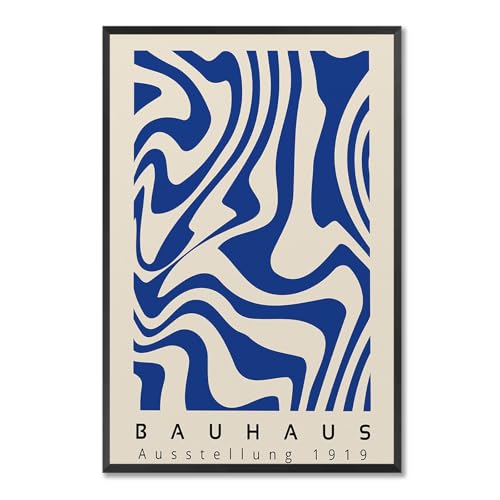
Vintage Bauhaus Exhibition Framed Poster Abstract Geometric Composition Canvas Wall Art Dynamic Asymmetrical Layout Prints Painting For Home Bedroom Dorm Wall Decor 12x16in Framed
A dynamic arrangement of fundamental shapes that symbolizes the core visual vocabulary of Bauhaus design.
As an affiliate, we earn on qualifying purchases.
As an affiliate, we earn on qualifying purchases.
Conclusion
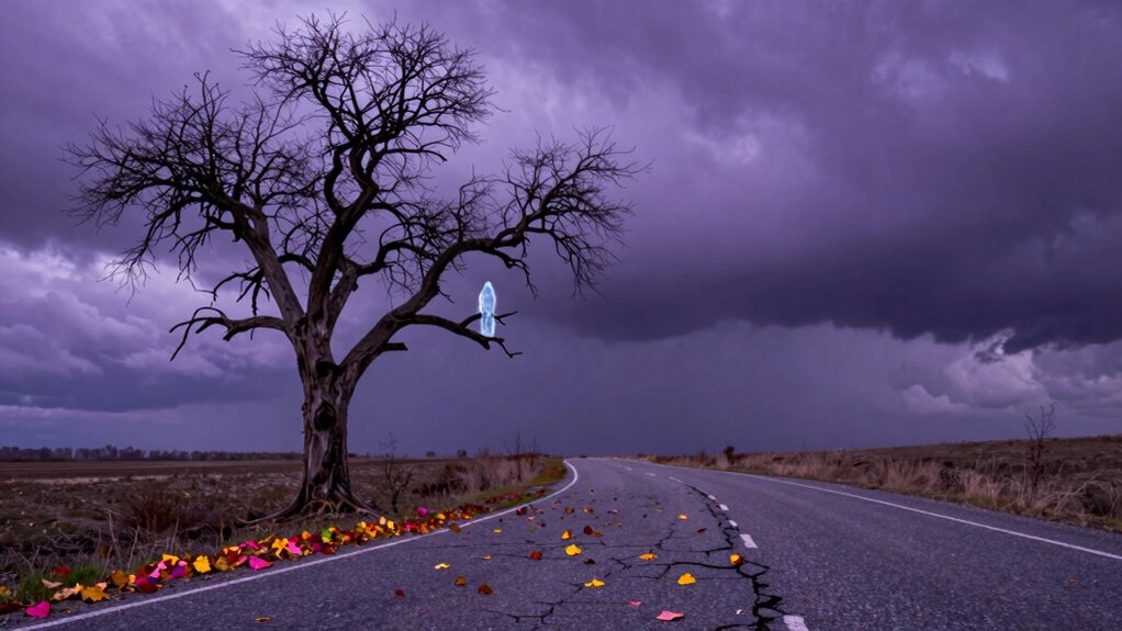
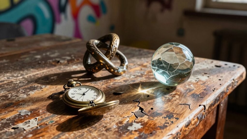
So, next time you aim for visual weirdness, remember the overlooked rule: balance that oddity with familiarity. Think of a surreal artwork that combines bizarre shapes with recognizable objects—like a melting clock in a cityscape. Your viewers should feel intrigued, not lost. When you strike that perfect balance, your visuals become memorable and engaging. Embrace the weirdness, but keep it grounded enough to invite curiosity and connection. That’s how you create truly compelling visuals.

Surreal Woman Canvas Wall Art, Cool Grid Addiction Girl Poster, Unique Feminine Art Print, Abstract Fine Art Painting, Contemporary Surrealism Picture for Living Room Bedroom 8x12in Unframed
Trippy Surreal Art Painting Collection: A captivating collection of surreal art pieces that transport you into a dreamlike…
As an affiliate, we earn on qualifying purchases.
As an affiliate, we earn on qualifying purchases.

Tamaki 2 Pack 11.8 x 7.9 Inch Acrylic Paint Palette with Thumb Hole Clear Paint Pallet, Easy Clean Non-Stick Artist Pallet for Oil Watercolor Craft DIY Art Painting Palette
Value set: 2 pack acrylic transparent palettes include 1 pack 11.8 x 7.9 inch rectangular transparent palette, 1…
As an affiliate, we earn on qualifying purchases.
As an affiliate, we earn on qualifying purchases.