

To get started with Figma components, start by designing the UI elements you need, then select parts of your design and create components using right-click or shortcuts. Organize your components with clear names and structures for easy access. Use instances to reuse elements, tweak variations with variants, and make quick global changes through overrides. Keep everything well-organized to build a consistent design system—continue exploring to master all these essential techniques.
Key Takeaways
- Create components by selecting elements, right-clicking, and choosing “Create Component” or pressing Command/Ctrl + Alt + K.
- Use clear naming conventions and organize components into pages or categories for easy identification.
- Utilize instances and overrides to reuse elements efficiently while customizing specific properties.
- Manage variations within component sets to streamline different states or sizes of a UI element.
- Share components via team libraries to ensure consistency and facilitate collaboration across projects.
Top picks for "gett start figma"
Open Amazon search results for this keyword.
As an affiliate, we earn on qualifying purchases.
Understanding What Figma Components Are

Figma components are reusable design elements that help you maintain consistency across your projects. When you create a component, you’re fundamentally making a master version of a UI element, like a button or icon, that can be used repeatedly. Any changes you make to the master component automatically update all its instances, saving you time and ensuring uniformity. Components streamline your workflow by allowing you to quickly assemble interfaces with pre-designed elements. They also make collaboration easier, as team members can use and modify components without affecting the original design. Understanding how components work is key to building efficient, scalable designs in Figma. Additionally, design systems leverage components to ensure visual coherence and improve productivity across large projects. Once you grasp their purpose, you’ll find them indispensable for managing complex projects effortlessly, especially when considering collaborative workflows that involve multiple team members and iterations. Incorporating component libraries can further enhance your ability to maintain consistency and accelerate the design process. Mastering the use of component states can also help you create more dynamic and interactive prototypes, enriching the overall user experience. Moreover, understanding the role of variations within components enables you to create flexible and adaptable UI elements tailored to different scenarios.
Creating Your First Component
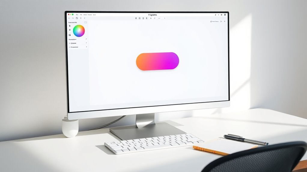
Now that you understand what components are, it’s time to create your first one. Start by designing the element you want to reuse, like a button or icon. Select all parts of your design, then right-click and choose “Create Component,” or press Command/Ctrl + Alt + K. Figma instantly turns your selection into a component, marked with a purple outline. You can now reuse this component across your project. To make changes later, double-click the component to edit it, and all instances will update automatically. Keep in mind that components help maintain consistency and save time. Experiment with creating different elements to get comfortable with the process and start building your library of reusable assets. Incorporating automation in design processes can further streamline your workflow. Additionally, understanding how components function within a design system can improve collaboration and efficiency. Recognizing the importance of design systems can also contribute to a more organized and scalable project structure.
Organizing Components in Your Files
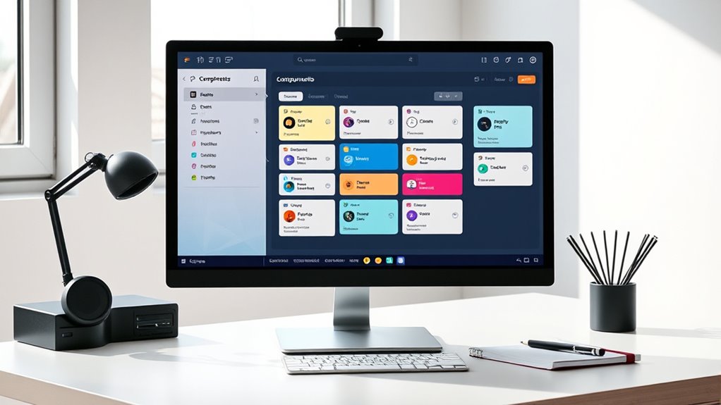
Organizing your components starts with clear naming conventions so you can find what you need quickly. Establish a logical layer hierarchy to keep your files tidy and easy to manage. When you structure and label your components consistently, your workflow becomes more efficient and less confusing. Additionally, incorporating proper storage practices ensures that your components remain fresh and accessible over time. Regular review and feedback from peers can further optimize your organization system for long-term success. Utilizing consistent techniques, such as building tension and using dynamic contrasts, in your naming and structuring can also enhance your overall system efficiency. Selecting the best soil for String of Hearts plants can also help maintain healthy components if you’re working with physical prototypes or models. Moreover, understanding Gold IRA Rollovers can inform your investment decisions and diversify your financial planning strategies.
Naming Conventions
Establishing clear naming conventions for your components is essential to keeping your Figma files organized and easy to navigate. Consistent names help you quickly find and update components as your project grows. Use descriptive, straightforward titles that reflect the component’s purpose, such as “Button/Primary/Default” or “Card/UserProfile.” Avoid generic names like “Component 1” or “Button.” Incorporate prefixes or categories to group related components, making it easier to locate them in the asset panel. Stick to a consistent format, whether it’s camelCase, kebab-case, or PascalCase, and apply it throughout. Clear naming minimizes confusion for you and your team, streamlining collaboration and updates. Well-thought-out conventions save time and keep your design system scalable.
Layer Hierarchies
Creating a clear layer hierarchy in your Figma files helps you manage complex designs efficiently. Organize your layers logically, grouping related elements together. Use frames and groups to structure your components, making them easier to locate and edit. Keep nested layers minimal to avoid confusion, but use hierarchy to show relationships clearly. Naming layers consistently complements this structure, so you know exactly what each layer contains at a glance. Regularly review and tidy your hierarchy as your project grows. This approach minimizes errors and speeds up your workflow. When you need to update or duplicate components, a well-organized layer structure lets you do so quickly without hunting through cluttered files. Ultimately, a good hierarchy keeps your design process smooth and your files manageable. Additionally, understanding the divorce process in various states can help you appreciate the importance of clear procedural organization, much like structuring your layers for optimal workflow. To further enhance your organization, consider adopting naming conventions that make identifying layers even more straightforward. Implementing consistent naming conventions can significantly improve collaboration and efficiency in managing your design files. Incorporating visual hierarchy principles can also guide users’ attention effectively within your designs, further streamlining your workflow.
Using Instances to Reuse Elements

Using instances allows you to reuse elements efficiently across your designs, saving time and maintaining consistency. You can create variations of an instance to suit different contexts, and manage overrides to customize each one without changing the original. This flexibility helps keep your design system organized and adaptable as your project evolves.
Creating Instance Variations
Once you’ve set up your main component, you can easily create variations by adjusting its instances. This allows you to reuse elements while customizing them for different contexts. To do this, select an instance on your canvas, then modify properties like size, color, or text. These changes are called overrides and help you tailor each variation without affecting the main component. For example, you might have a button component and want different labels or colors for specific screens. Creating variations saves time and keeps your design consistent. Remember, these adjustments only apply to the selected instance, leaving the master component unchanged. This flexibility enables you to quickly adapt components to various needs while maintaining a unified design system.
Managing Instance Overrides
Managing instance overrides allows you to efficiently customize individual instances of a component without altering the master design. When you add an instance, you can change properties like text, colors, or images to suit specific needs without affecting the original component. To do this, select an instance and look for overridden properties highlighted in the right-hand panel. You can quickly update text labels, swap colors, or replace images to create variety while maintaining consistency across your design. Overrides are helpful for tailoring components to different contexts, such as buttons with different labels or icons. Remember, these changes only impact the selected instance, leaving the main component unchanged. This flexibility makes your workflow faster and keeps your design system organized.
Managing Variations With Variants
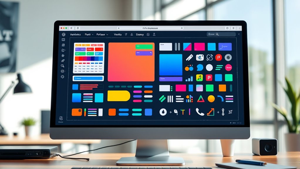
Variants in Figma allow you to efficiently manage different versions or states of a component within a single set. Instead of creating multiple separate components, you can group related variations—like button sizes, colors, or toggled states—into one variant set. This makes swapping between options simple and keeps your files organized. To create variants, select your components, then click “Combine as Variants” in the right menu. You can add properties such as “Size” or “State” to differentiate options. When using the component, you’ll see a dropdown menu to switch between variants instantly. Managing variations this way saves time, reduces clutter, and ensures consistency across your design. It’s an efficient way to handle multiple component states without duplicating assets.
Making Global Changes With Overrides

Overrides in Figma let you make global changes to component instances without altering the master component. This feature allows you to customize specific instances for different contexts while keeping the core design consistent. For example, you can change text labels, colors, or images on individual instances without affecting the main component. When you select an instance, you’ll see override indicators that highlight what’s been modified. To make a change, simply edit the element directly within the instance. Figma automatically records these overrides, giving you flexibility without breaking the link to the master component. This way, you can quickly adapt components for different screens or states while maintaining overall design consistency. Overrides streamline your workflow by enabling efficient, targeted adjustments.
Best Practices for Naming and Structuring Components
Organizing your components with clear and consistent naming and structuring practices is essential for maintaining an efficient design system. Use descriptive names that reflect each component’s purpose, like “Button/Primary/Large” instead of vague labels. Establish a naming hierarchy that groups related components logically, making it easier to find and update them later. Keep naming conventions uniform—decide on separators, capitalization, and abbreviations upfront. Structurally, organize components into pages or frames based on their function or usage context, such as “Navigation” or “Forms.” Avoid clutter by removing unused components and regularly reviewing your library. A well-structured, consistently named component library saves you time, reduces errors, and ensures your team can collaborate smoothly.
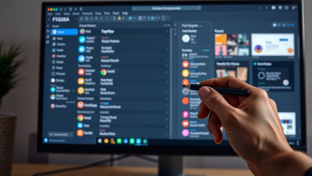
Sharing and Collaborating on Components

Sharing and collaborating on components in Figma enables your team to work efficiently and maintain consistency across designs. You can share components through team libraries, allowing everyone to access and use the same assets seamlessly. By publishing components to a shared library, your team can update elements centrally, ensuring consistency without manual updates. Collaborators can comment, provide feedback, and make edits directly within Figma, streamlining communication. You also have control over permissions, so you can decide who can view or edit components. Using version history, you can track changes and revert to previous states if needed. This collaborative environment helps prevent duplicated work and keeps your design system unified across projects.
Tips for Maintaining a Consistent Design System

To maintain a consistent design system in Figma, it’s essential to establish clear standards and adhere to them across all projects. Create detailed style guides for colors, typography, and spacing, and keep these updates centralized. Use shared libraries to ensure everyone works with the same components and styles, reducing inconsistencies. Regularly review your components and update them as needed, communicating changes clearly to your team. Implement naming conventions for layers and components to keep everything organized and easily accessible. Limit customizations that deviate from the core design standards, and encourage team members to follow the established guidelines. Staying disciplined with these practices helps guarantee your design system remains cohesive, scalable, and easy to maintain over time.
Frequently Asked Questions
How Do I Troubleshoot Component Inconsistencies Across Files?
When you notice component inconsistencies across files, start by checking if you’re using the same master components. If they differ, updates won’t sync properly. Use Figma’s Team Library to make sure all files reference the same components. You can also refresh your library or relink components. Keep your components organized in a shared library, and regularly sync to avoid discrepancies. This helps maintain consistency across your design files.
Can I Convert Existing Designs Into Components Easily?
Yes, you can easily convert existing designs into components in Figma. Select the elements you want to turn into a component, then click the “Create Component” button or press Ctrl+Alt+K (Cmd+Option+K on Mac). This way, your design elements become reusable components, making updates across your project consistent and efficient. Just make certain your selection is grouped or layered correctly for the best results.
What Are Common Mistakes to Avoid When Creating Components?
You might think creating components is straightforward, but common mistakes can trip you up. Avoid overcomplicating your components by including unnecessary elements, which can make updates harder. Don’t forget to organize your layers and naming conventions for easy navigation. Also, resist the urge to make components too specific; aim for flexibility so they work across multiple designs. These habits save time and keep your workflows smooth.
How Do Components Affect File Performance and Load Times?
Components can improve your design efficiency, but if you overuse or create overly complex ones, they might slow down your file. Large, nested components require more processing power, leading to longer load times. To keep performance smooth, optimize components by simplifying structures, avoiding unnecessary nesting, and regularly cleaning up unused elements. This way, your Figma file remains responsive, making your workflow faster and more efficient.
Are There Plugins to Enhance Component Management in Figma?
Imagine having a magic wand that instantly organizes and enhances your Figma components—well, some plugins come close! You can use tools like “Component Organizer” or “Figma Tokens” to streamline your workflow, manage variants effortlessly, and keep everything perfectly in sync. These plugins save you hours, reduce errors, and make your design process smoother than ever. Plunge into the plugin library and transform your component management today!
Conclusion
Now that you know how to create, organize, and reuse components in Figma, you’re well on your way to building efficient designs. Remember, a chain is only as strong as its weakest link—maintain consistency and clarity in your components, and your design system will stand the test of time. Keep practicing and refining your skills, and you’ll reveal even greater collaboration and creativity in your projects.