
To use Gestalt’s Law of Proximity effectively, focus on grouping related elements through strategic spacing and visual cues like color or font choices. Keep consistent gaps to signal relationships and important hierarchies, guiding viewers smoothly through your design. Avoid irregular spacing that disrupts flow. By blending proximity with other principles like similarity and continuity, you create cohesive, intuitive visuals. Continue exploring these techniques to master creating clear, engaging layouts that capture attention effortlessly.
Key Takeaways
- Maintain consistent spacing between related elements to visually group them and enhance clarity.
- Use visual cues like color contrast, shape, and font pairing to reinforce perceived relationships.
- Adjust proximity strategically to establish clear visual hierarchies and guide viewer attention effectively.
- Avoid irregular gaps that disrupt flow, ensuring related items are close to communicate their connection.
- Combine proximity with other Gestalt principles, such as similarity and continuity, for cohesive and intuitive designs.
Top picks for "gestalt proximity effectively"
Open Amazon search results for this keyword.
As an affiliate, we earn on qualifying purchases.
Understanding the Basics of the Law of Proximity
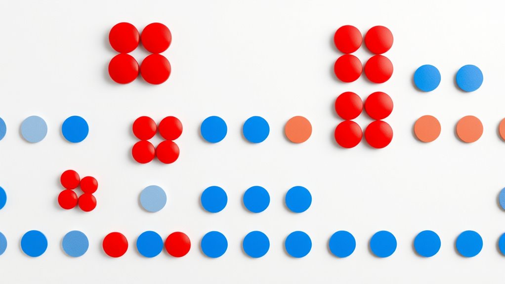
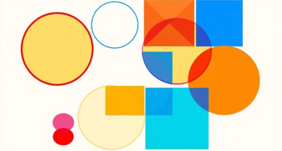
The Law of Proximity is a fundamental principle in Gestalt psychology that explains how we naturally group nearby objects or elements into a single visual unit. When objects are close together, your brain perceives them as part of a unified group through perceptual grouping. This process, called visual clustering, helps you make sense of complex visuals quickly and efficiently. For example, when you see a cluster of dots, you tend to see smaller groups rather than individual dots scattered randomly. Proximity influences your perception by emphasizing relationships between elements based on their physical closeness. Recognizing the importance of visual organization can enhance your ability to create cohesive and intuitive designs. Understanding this basic concept allows you to predict how your mind organizes visual information, making it a crucial foundation for designing clear, cohesive visuals that guide viewers’ attention effectively. Additionally, employing proximity strategically can improve spatial harmony and overall clarity in your visual layouts. Moreover, awareness of perceptual grouping techniques can help you craft designs that communicate more effectively and attract viewer focus naturally. When combined with other Gestalt principles, the law of proximity can significantly enhance the perceived unity of your compositions. Recognizing how proximity impacts visual perception can further refine your design strategies for better audience engagement.
Applying Proximity in Layout Design
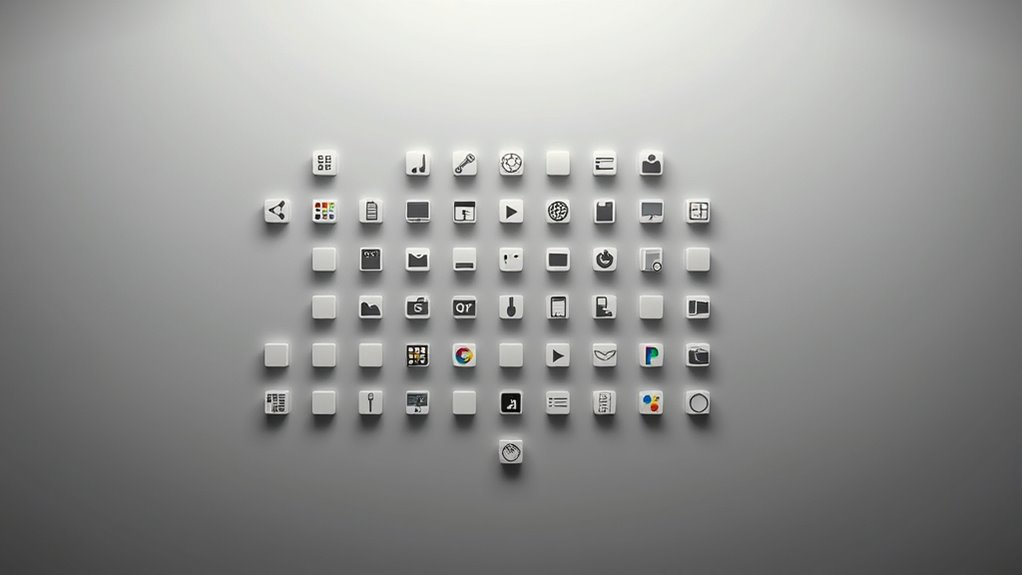
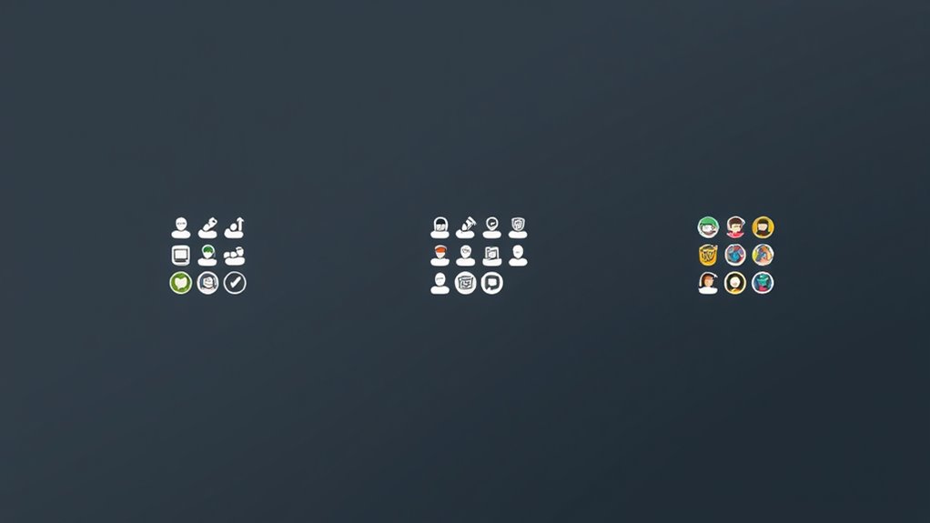
To apply proximity effectively, you should group related elements visually to guide viewers’ attention. Maintaining consistent spacing helps create a clean, organized look, making it easier to distinguish different sections. Additionally, establishing clear visual hierarchies guarantees that important information stands out and users navigate your layout effortlessly. Incorporating visual hierarchy principles ensures that your layout communicates the intended message clearly and effectively. Recognizing store hours and how they vary can help in designing layouts that accommodate different shopping times and enhance user experience. Awareness of headphone types and their compatibility with various devices can also inform your design choices for user interfaces. Understanding essential oils and their specific benefits can further optimize content organization by highlighting key information for users seeking natural remedies.
Group Related Elements Visually
Applying proximity in layout design helps you organize related elements so they appear connected and easy to understand. To do this effectively, group items by adjusting their spacing and using visual cues like color contrast and font pairing. When items are close together, your audience perceives them as related, reducing confusion. For example, pairing similar fonts and contrasting colors can emphasize groupings. Use spacing to create clear boundaries without clutter. Here’s a quick reference:
| Element 1 | Element 2 | Element 3 |
|---|---|---|
| Related text | Headline | Call-to-action |
| Close spacing | Consistent font | Bright color contrast |
| Similar style | Emphasized grouping | Clear separation |
| Visual connection | Cohesive look | Easy recognition |
| Organized layout | Better flow | Improved readability |
This approach makes your design more intuitive and engaging, especially when incorporating visual hierarchy principles to guide viewer attention effectively. Additionally, understanding how symmetry and balance influence perception can enhance the overall cohesiveness of your layout. Recognizing how astrological signs can influence perceptions of attractiveness can also inform aesthetic choices in design themes to appeal to specific audiences. Moreover, integrating these principles can help create a sense of harmony and visual rhythm that keeps viewers engaged. Incorporating spatial relationships into your design process improves clarity and user experience.
Use Consistent Spacing
Using consistent spacing throughout your layout helps create a unified and organized appearance. Spacing consistency is key to establishing clear visual grouping, making it easier for viewers to understand relationships between elements. When elements are evenly spaced, your design feels balanced and intentional, guiding the viewer’s eye smoothly across the page. Avoid irregular gaps or varying distances, as they can confuse the viewer and disrupt the flow of information. Consistent spacing also reinforces the connection between related items, emphasizing their relationship through proximity. Additionally, maintaining proper alignment ensures that your layout appears professional and cohesive. By maintaining uniform margins and gaps, you strengthen the overall coherence of your layout. This simple yet powerful technique ensures your design appears professional, clean, and easy to navigate, supporting effective communication through visual clarity. Incorporating mindfulness techniques into your layout planning can further improve clarity by visually representing the importance of focus and intentionality in design. Recognizing the influence of WWE Raw’s revenue on the entertainment market can help you appreciate the impact of visual hierarchy and spacing in communicating significance.
Create Clear Visual Hierarchies
Consistent spacing not only creates visual harmony but also helps establish a clear hierarchy of information. By carefully applying spacing consistency, you guide viewers’ eyes through your layout, emphasizing important elements through visual grouping. This strategic approach enhances clarity and directs attention where you want it. When you create a visual hierarchy with well-planned spacing and grouping, your design becomes more intuitive and engaging. Remember, effective use of proximity and spacing consistency transforms a cluttered layout into a cohesive, easy-to-navigate visual story. Incorporating design principles rooted in perceptual psychology further strengthens your layout’s effectiveness. Additionally, understanding how home decor & design elements interact can help you better apply these principles for more appealing and functional arrangements. Furthermore, considering how AI security vulnerabilities are monitored and mitigated can inspire more resilient layout strategies that anticipate user needs and potential issues. Recognizing the importance of asset division impact in legal contexts can also inform you about establishing clearer visual distinctions in complex designs.
Grouping Related Elements for Better Clarity

You can improve clarity by using visual grouping techniques to organize related elements. When you group items effectively, your audience easily understands the connections and structure of your content. This approach makes your design more intuitive and accessible. Additionally, applying principles like the Law of Proximity helps in creating effective visual groupings that enhance emotional support by reducing confusion and promoting understanding. Incorporating interior design principles can further refine the arrangement of elements for a more cohesive presentation.
Visual Grouping Techniques
To enhance clarity and make information more digestible, grouping related elements visually is essential. You can do this through techniques like adjusting color contrast to distinguish sections or using consistent typography pairing to create visual harmony. Effective grouping guides the viewer’s eye and simplifies complex layouts. Consider the following approaches:
| Technique | Purpose | Example |
|---|---|---|
| Color Contrast | Highlight related items | Dark text on light background |
| Typography Pairing | Connect similar information | Bold headings with regular body text |
| Spacing & Alignment | Separate or unify elements | Equal margins between groups |
| Shape & Borders | Enclose related elements | Boxes around related info |
| Size & Scale | Emphasize importance | Larger icons for key points |
Using these visual cues, you create a clear, cohesive layout that guides your audience effortlessly.
Enhancing Content Organization
Effective content organization hinges on grouping related elements to improve clarity and comprehension. Use color contrast to visually separate sections or groups, making it easy for viewers to identify related information at a glance. Pair fonts thoughtfully; for example, choose a header font that contrasts well with body text to create clear distinctions and guide the reader’s eye. Consistent font pairing enhances readability and reinforces the grouping of content, ensuring elements that belong together appear cohesive. When applied strategically, these techniques help users navigate your content effortlessly. By leveraging color contrast and deliberate font pairing, you make your organization intuitive, reducing cognitive load and increasing engagement. Clear grouping through visual cues ultimately leads to a more polished, accessible presentation.
Using Spacing to Create Visual Hierarchy

Using spacing strategically can substantially enhance how viewers interpret and prioritize information on a page. By maintaining consistent spacing, you create clear visual cues that guide the eye naturally, emphasizing important elements and establishing a visual hierarchy. Proper spacing helps create effective visual grouping, making related items appear connected and separate groups distinct. When spacing is too tight or inconsistent, it can cause confusion or weaken the overall structure. Conversely, well-planned spacing directs attention to key content, making your design more intuitive and readable. Remember, subtle adjustments in spacing can dramatically influence how viewers perceive relationships among elements, ensuring that your message is communicated efficiently and effectively.
Combining Proximity With Other Gestalt Principles

Combining proximity with other Gestalt principles creates more compelling and cohesive designs by reinforcing visual relationships. When you pair proximity with principles like similarity and continuity, you guide users’ eyes naturally, improving user experience. Using color harmony alongside proximity helps group related elements, making your layout more intuitive. Incorporating these principles together can emphasize key information and reduce clutter, leading to a cleaner look. For example:
- Use similarity in shape or color to strengthen groupings formed by proximity
- Apply continuity to lead the eye smoothly between close elements
- Ensure color schemes support the grouping for better visual harmony
- Combine proximity and similarity to create clear, easy-to-understand sections
These strategies make your design more engaging and easier to navigate.
Practical Examples of Effective Use in Web Design
In web design, applying the principles of proximity alongside other Gestalt concepts can considerably enhance user experience. For example, grouping related elements with close spacing helps users quickly identify connections, such as placing navigation links near each other. Using color theory, you can create visual cues that reinforce proximity, like matching colors for related items or contrasting backgrounds to separate sections clearly. Typography pairing also plays a role; pairing similar fonts for related content and varying styles for distinct groups improves clarity. When you keep related content close and use intentional color and font choices, the design feels cohesive and intuitive. These practical applications guide users effortlessly through your website, making it easier to find information and engage with your content effectively.
Common Mistakes to Avoid With the Law of Proximity

One common mistake is placing too much distance between related elements, which can confuse users about their connection. This often stems from misconceptions about how close items need to be to be perceived as related. To avoid this, steer clear of misapplied techniques that misjudge proximity’s impact. Keep related items close enough to signal their relationship clearly. Here are some common pitfalls:
- Ignoring spacing consistency across similar groups
- Overcrowding elements, making groups cluttered
- Using inconsistent proximity to differentiate groups
- Relying solely on proximity without visual cues
Understanding these common misconceptions helps you use the law effectively. Proper spacing clarifies relationships without confusing your audience or making your design appear disorganized.
Tips for Testing and Refining Your Design Composition

Testing and refining your design composition guarantees that your use of proximity effectively communicates relationships without causing confusion. To do this, evaluate your layout with fresh eyes, ensuring the grouping aligns with your message. Check color harmony to maintain visual cohesion, and test typography pairing for clarity. Adjust spacing to improve the perceived relationships between elements, balancing proximity and separation. Use user feedback or A/B testing to identify areas needing improvement. Consider the following table for refinement:
| Aspect | Tip |
|---|---|
| Color Harmony | Ensure colors complement and create visual harmony |
| Typography Pairing | Match fonts for readability and aesthetic appeal |
| Spacing | Fine-tune gaps to clarify groupings |
Refining your composition ensures the proximity communicates relationships clearly and effectively.
Frequently Asked Questions
How Does Proximity Influence User Perception and Behavior?
Proximity greatly influences your perception and behavior by guiding visual grouping and spatial organization. When elements are close together, you naturally see them as related or part of a whole, which simplifies navigation and understanding. This effect encourages you to focus on grouped items, making interfaces more intuitive. By applying proximity thoughtfully, you can create clearer layouts that direct your attention and improve overall user experience.
Can Proximity Be Overused or Lead to Confusion?
Proximity can be overused, leading to visual clutter and confusing your viewers. When too many elements are grouped tightly, it hampers the visual hierarchy, making it harder for users to prioritize information. You might unintentionally cause confusion if elements meant to be separate appear related, or vice versa. To avoid this, balance proximity with clear spacing, guiding users effortlessly without overwhelming their perception or creating unnecessary clutter.
How Do Cultural Differences Affect Proximity Perception?
Cultural interpretations greatly influence how you perceive proximity, affecting visual grouping. In some cultures, close spacing indicates intimacy or importance, while in others, it may suggest chaos or disorder. These differences shape your understanding of spatial relationships and how you interpret grouped elements. Recognizing cultural variations helps you apply proximity more effectively, ensuring your design communicates accurately across diverse audiences without causing confusion.
What Tools Can Assist in Applying Proximity Effectively?
To apply proximity effectively, you can use tools that focus on visual grouping and spacing consistency. Design software like Adobe XD or Figma helps you precisely adjust spacing, ensuring elements are close enough to be grouped while maintaining clarity. Grid systems and alignment guides also assist in creating consistent spacing, making your layout more intuitive. These tools streamline the process, helping you communicate your message clearly and visually appealingly.
How Does Proximity Interact With Color and Contrast?
Imagine your design’s a gossip session, where proximity whispers secrets. When you pair this with color harmony and contrast emphasis, it’s like giving each whisper a loudspeaker or muffling it with a velvet glove. Nearby elements with contrasting colors draw attention, while harmonious hues blend seamlessly. Proximity and color work together, making your message pop or quietly blend in, depending on the story you want your audience to hear.
Conclusion
By mastering the law of proximity, you can effortlessly guide viewers through your design, creating clarity and focus. When you group related elements thoughtfully and use spacing wisely, your layout naturally becomes intuitive. It’s about noticing how small adjustments can make a big difference—so keep experimenting, refining, and trusting your eye. With practice, you’ll find that effective proximity isn’t just a rule; it’s a powerful tool that transforms your designs into seamless experiences.