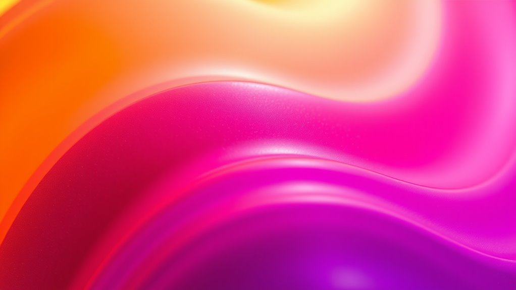

Sunset gradients in packaging use vibrant, seamless color shifts inspired by natural sunset scenes. By blending fiery oranges, pinks, and purples, you can evoke warmth, vibrancy, and calmness that immediately catch consumer attention. Mastering techniques like smooth blending and layering creates deep, eye-catching designs that communicate your message effectively. When you explore further, you’ll discover how to perfect these gradients to make your packaging stand out even more.
Key Takeaways
- Sunset gradients use vivid color transitions like oranges, pinks, and purples to create eye-catching packaging designs.
- Mastering blending techniques ensures seamless, natural color shifts that mimic the sky’s sunset hues.
- Applying linear or radial gradients enhances depth and focal points in packaging visuals.
- Smooth transition points and feathered edges prevent harsh lines, maintaining organic gradient flow.
- Well-designed sunset gradients evoke warmth, vibrancy, and serenity, making packaging more appealing and memorable.

As the sun dips below the horizon, it paints the sky with stunning gradients that shift from fiery oranges to soft pinks and deep purples. This natural spectacle offers a perfect inspiration for packaging designs that aim to evoke warmth, calm, and vibrancy. When you incorporate sunset-inspired gradients into your packaging, you’re creating a visual experience that captures attention instantly. To achieve this, mastering color blending and gradient techniques becomes essential, as they allow you to create seamless progressions between hues that mimic the sky’s natural beauty. Understanding how color interaction influences the overall effect helps refine your designs further.
Color blending is the foundation of effective sunset gradients. You start by selecting a palette that reflects the spectrum of sunset colors—bright oranges, deep reds, gentle pinks, and cool purples. The key is to guarantee these colors mesh smoothly, avoiding harsh lines or abrupt shifts. Using gradient techniques, you can carefully layer and blend colors, gradually shifting from one shade to another. Tools like digital design software or airbrushing in traditional methods help you manipulate these colors precisely, creating fluid effects that resemble the sky’s natural gradient. The goal is to make each color shift look organic, as if the hues are melting into each other.
The success of your sunset gradient in packaging hinges on understanding how colors interact and flow. For instance, starting with a bold orange at one corner and gradually fading into a soft pink or purple can evoke the warmth and tranquility of a sunset. You might employ radial or linear gradient techniques to achieve different effects—linear gradients work well for elongated surfaces like bottles or boxes, giving a sense of directionality, while radial gradients can create a focal point, mimicking the sun’s glow. The layering of multiple gradients or using transparency effects enhances depth, making the design more dynamic and eye-catching.
Furthermore, paying attention to the progression points between colors is vital. You want each hue to blend naturally, avoiding any jarring shifts that disrupt the visual flow. Soft, feathered edges or smooth gradient transitions can mimic the sky’s gentle color evolution. When you use these techniques thoughtfully, your packaging not only stands out but also communicates a sense of serenity, energy, or vibrancy—depending on the mood you want to evoke. Ultimately, mastering color blending and gradient techniques empowers you to craft engaging sunset-inspired visuals that resonate deeply with consumers, making your packaging memorable and visually appealing.

Spring Summer Press on Nails Medium Square Pink Blue Gradient with Coconut Tree Sunset Designs Glossy Acrylic Fake Nails for Summer Beach Vacation Manicure Decoration 24 pcs
Packaging includes:You will receive 24 summer beach nails, 24 jelly glue, 1 small crystal stick, alcohol bag, nail…
As an affiliate, we earn on qualifying purchases.
As an affiliate, we earn on qualifying purchases.
Frequently Asked Questions
How Do Sunset Gradients Influence Consumer Purchasing Behavior?
Sunset gradients influence your purchasing decisions by creating an emotional appeal that draws your attention and evokes feelings of warmth and serenity. They also enhance visual segmentation, making products stand out on shelves and guiding your focus toward specific items. This vibrant color shift encourages you to connect emotionally with the product, increasing the likelihood of purchase, as it taps into your subconscious desire for beauty and harmony in packaging.
What Are the Best Tools for Creating Sunset Gradient Designs?
You should use tools like Adobe Photoshop and Illustrator for creating sunset gradient designs, as they excel in gradient blending and color palette selection. These programs let you easily customize progressions, experiment with vibrant hues, and perfect the gradient flow. Additionally, apps like Procreate and Canva offer user-friendly options for designing sunset-inspired backgrounds, making it simple to craft eye-catching packaging that captures attention and enhances your brand’s aesthetic.
Can Sunset Gradients Be Customized for Different Brands?
Imagine blending vibrant sunset gradients with your brand’s unique identity—you can customize these shifts to suit your needs. You’re in control of the color palette, ensuring brand consistency while showcasing color versatility. By adjusting hues, opacity, and blending modes, you create designs that resonate with your audience and reflect your brand’s personality. This flexibility makes sunset gradients a powerful tool for tailored, eye-catching packaging that stands out.
How Do Sunset Gradients Affect Packaging Durability and Print Quality?
Sunset gradients can impact packaging durability and print quality by increasing the risk of color bleed, especially if the ink isn’t properly set. To guarantee vibrant, sharp images, you need high print resolution and precise color management. If not, gradients may appear blurry or faded, reducing overall appeal. Proper printing techniques and quality materials help maintain the durability and visual impact of your sunset gradient designs on packaging.
Are Sunset Gradients Eco-Friendly in Packaging Production?
Sunset gradients in packaging can be eco-friendly if you choose biodegradable inks and recycled materials. These inks break down naturally, reducing environmental impact, while recycled materials cut down on waste. By opting for these sustainable options, you guarantee your vibrant color transitions don’t harm the planet. So, when you incorporate sunset gradients, make certain to prioritize eco-conscious choices to keep your packaging both eye-catching and environmentally responsible.
Calibrite ColorChecker Studio Spectrophotometer for Complete Color Management for Display, Projector, Printer and Scanner Profiling Software, w/ColorChecker Classic Mini for Custom Camera Profiling
SPECIFICATIONS: All in one spectrophotometer for camera to print color control, supports monitor display and projector profiling plus…
As an affiliate, we earn on qualifying purchases.
As an affiliate, we earn on qualifying purchases.
Conclusion
As you experiment with sunset gradients, remember they’re like a painter’s brushstroke—blending vibrant colors seamlessly. I once saw a brand’s packaging transform overnight, much like a sunset fading into twilight, mesmerizing customers and boosting sales by 20%. Just like that sunset’s fleeting beauty, these gradients create a dynamic, eye-catching changeover that draws people in. Embrace the bold shift, and watch your packaging turn ordinary into extraordinary, leaving a lasting impression that lingers long after the product’s gone.
airbrushing kits for packaging
As an affiliate, we earn on qualifying purchases.
As an affiliate, we earn on qualifying purchases.

SUPWEE Gradient Painting Pat Gel Kit,12 Colors Ombre Gel Nail Polish Aura Nails French Manicure Drawing Gels Long-lasting Soak Off with 100Pcs Nail Sponges & Grabbing Pen & Palette (Pastel Colors)
Multi-Function Ombre Gel Set: SUPWEE's newly upgraded pastel gradient nail art gel set Includes 12 colors gel polish、1pcs…
As an affiliate, we earn on qualifying purchases.
As an affiliate, we earn on qualifying purchases.