
Vintage-inspired visuals from the 1940s and 1950s use bold typography and pastel colors to create modern packaging that feels both nostalgic and fresh. You’ll notice these designs combine retro charm with contemporary readability, making products stand out on crowded shelves. The soft color palettes evoke optimism and authenticity, while the vintage fonts add a handcrafted touch. Keep exploring to discover how these timeless elements elevate brand stories and appeal to today’s consumer sensibilities.
Key Takeaways
- Vintage typography with bold, rounded or script fonts evokes nostalgia while remaining legible and contemporary on packaging.
- Pastel color schemes like pinks, mint greens, and baby blues create an optimistic, approachable vintage-inspired aesthetic.
- Combining ornate fonts with soft hues balances decorative charm and modern readability for effective product labeling.
- Era-inspired decorative elements and layouts foster a cohesive design that feels both nostalgic and fresh.
- This visual approach enhances emotional connection, storytelling, and brand differentiation through authentic, handcrafted appeal.
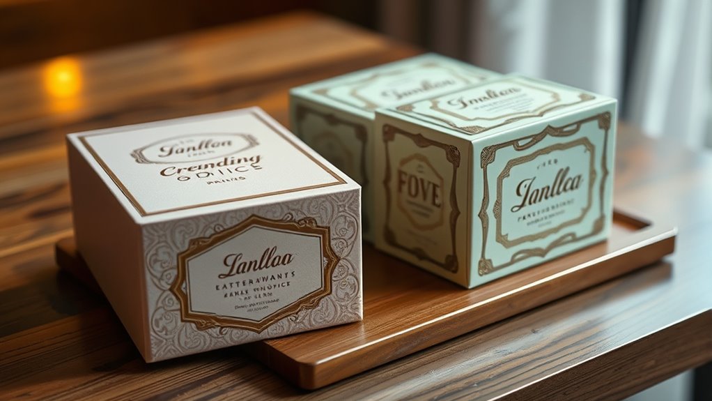
Drawing inspiration from the bold and nostalgic aesthetics of the 1940s and 1950s, modern packaging design is experiencing a vibrant revival. You notice how brands are embracing vintage typography to evoke a sense of authenticity and timeless charm. These typefaces often feature thick, rounded letterforms or elegant script fonts that immediately transport you to an era where craftsmanship and style mattered. The use of vintage typography isn’t just about nostalgia; it’s a strategic choice that helps products stand out on crowded shelves, creating a visual connection to the past while remaining fresh and relevant.
Vintage-inspired typography elevates packaging with timeless charm and strategic shelf appeal.
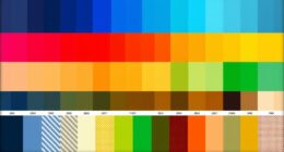
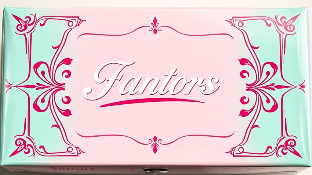
Color plays a pivotal role in this aesthetic shift, especially pastel color schemes. Soft pinks, mint greens, baby blues, and buttery yellows dominate packaging designs, giving items a gentle, inviting appeal. These pastel hues aren’t randomly chosen; they evoke the optimism and innocence associated with post-war prosperity and the early days of consumer culture. The subtle, muted tones make the packaging feel approachable and sophisticated at the same time, encouraging you to pick up the product and explore what’s inside.
You’ll observe that these pastel color schemes are often paired with vintage typography to create a harmonious balance between playfulness and elegance. The overall effect is nostalgic without feeling outdated, making products communicate a sense of care and craftsmanship. When you see a package with a carefully chosen vintage font rendered in pastel shades, it signals that the product has a story, a legacy, or a handcrafted quality worth discovering. This design approach appeals to consumers seeking authenticity in a world saturated with digital and mass-produced items.
Furthermore, the combination of vintage typography and pastel palettes lends a sense of cohesion across packaging designs. You might notice how labels on cosmetics, food items, or beverages evoke a certain era while maintaining contemporary sensibilities. The fonts are often slightly ornate or feature decorative elements that harken back to the 1940s and 1950s, but they’re cleaned up for modern readability. Meanwhile, pastel color schemes soften the overall look, making the packaging feel friendly and less intimidating.
In essence, this revival invites you to experience a tactile, emotional connection with products. It’s about more than just aesthetics; it’s about storytelling, evoking memories, and creating a visual identity that’s both nostalgic and modern. Vintage typography and pastel color schemes aren’t just design choices—they’re powerful tools that help brands forge a unique, memorable presence in today’s competitive marketplace. Interestingly, the use of vintage typography in packaging aligns with the trend of creating a sense of authenticity and craftsmanship that appeals to consumers seeking quality and tradition.
Frequently Asked Questions
How Do Vintage Visuals Influence Consumer Purchasing Behavior Today?
Vintage visuals influence your purchasing decisions by creating a nostalgic branding experience that evokes positive memories. When you see these designs, you often feel an emotional connection, making you more likely to trust and choose the product. This nostalgic appeal sets brands apart in a crowded market, encouraging loyalty and making the product memorable. Ultimately, vintage visuals tap into your feelings, guiding you toward a favorable, emotionally driven purchase.
What Are the Best Color Palettes for 1940S and 1950s-Inspired Packaging?
Ever wonder which color palettes evoke that vintage charm? For 1940s and 1950s-inspired packaging, opt for nostalgic tones like pastel pinks, mint greens, and soft yellows combined with bold reds, teals, and navy blues. Focus on color harmony by balancing vibrant accents with muted backgrounds. These palettes create a warm, inviting feel that captures the era’s essence, making your packaging both eye-catching and timeless.
How Can Modern Brands Authentically Incorporate Retro Aesthetics?
You can authentically incorporate retro aesthetics by embracing nostalgic branding and typography trends from the 1940s and 1950s. Use vintage-inspired fonts and classic color palettes to evoke a sense of history. Keep your design authentic by blending modern elements with retro details, ensuring it feels fresh yet familiar. Focus on storytelling that highlights the brand’s heritage, creating a genuine connection that resonates with consumers seeking authenticity.
Are There Any Legal Considerations When Using Vintage Imagery?
Yes, you should consider legal issues like trademark concerns and copyright clearance when using vintage imagery. You need to make certain the images or designs aren’t protected by trademarks or copyrighted, or obtain proper permission if they are. Failing to do so can lead to legal disputes or fines. Always research the origin of the imagery and consult legal experts if you’re unsure, to keep your packaging compliant and avoid potential issues.
What Sustainable Practices Can Complement Retro-Inspired Packaging Designs?
You can enhance your retro-inspired packaging by using recyclable materials and eco-friendly inks, making your designs more sustainable. Opt for biodegradable or compostable packaging options that align with vintage aesthetics. Additionally, choose inks made from vegetable or soy-based dyes to reduce environmental impact. These practices show your commitment to sustainability while preserving the nostalgic look, helping you appeal to eco-conscious consumers and minimize your ecological footprint.
Conclusion
Immerse yourself in the delightful dance of design details that draw on decades of vintage visuals. By blending bold banners with nostalgic nuances, modern packaging becomes memorable and magnetic. Embrace the elegance of eras gone by, and elevate your brand with expressive, eye-catching aesthetics. Let the lively, lively layers of the 40s and 50s inspire your innovative ideas. Incorporate irresistible, irresistible visuals that vividly vibrate with vintage energy, making your packaging perfectly poised to please and persuade.