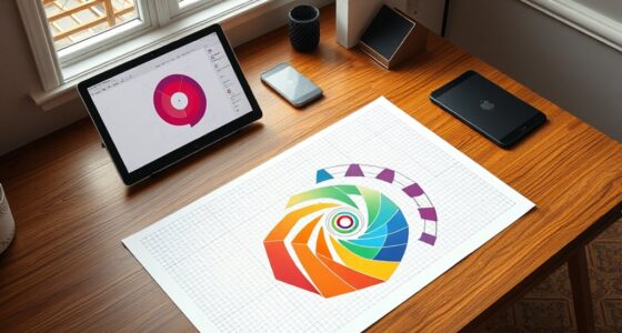

Building visual hierarchy with shape and size involves strategically using larger and distinctive shapes to draw attention and guide viewers through your design. Vary size to establish importance, making key elements stand out as focal points. Combine contrasting shapes and sizes to create emphasis and balance, while layering and placement enhance depth and clarity. If you keep exploring, you’ll discover how to craft designs that effectively communicate your message and keep viewers engaged.
Key Takeaways
- Use larger and uniquely shaped elements to create focal points and establish visual importance.
- Vary element sizes strategically to guide viewer attention and indicate hierarchy levels.
- Balance bold shapes with simpler forms to maintain clarity and prevent visual clutter.
- Layer and overlap shapes to add depth, emphasizing key components within the design.
- Position significant shapes and sizes near natural focus areas, like the top or center, to direct viewer flow.
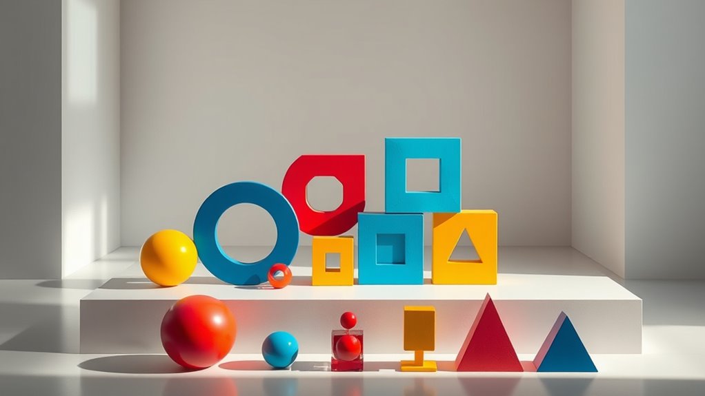
Understanding the Role of Shape in Visual Hierarchy
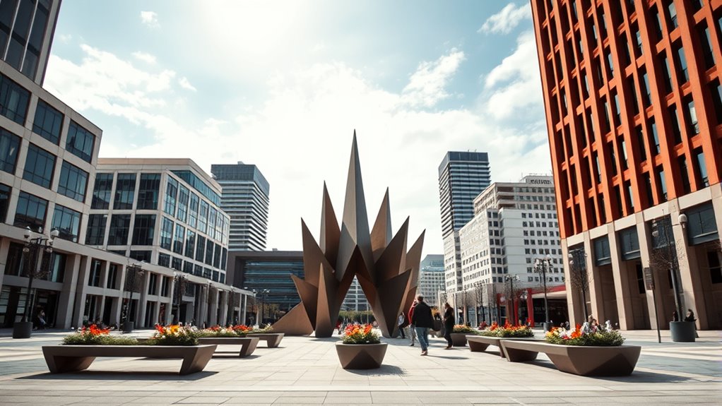
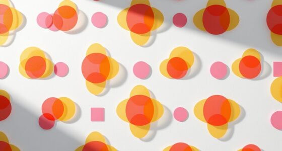
Have you ever noticed how certain shapes naturally draw your attention more than others? It’s because shape influences how your eye moves through a design. For example, sharp angles and geometric forms tend to stand out because they create a sense of stability and order. Curves and organic shapes, on the other hand, evoke softness and movement, guiding your eye smoothly across the layout. You can control what viewers focus on by choosing specific shapes. Bold, unusual shapes grab attention quickly, making them perfect for key elements. Regular, simple shapes act as visual anchors, providing balance. By understanding how different shapes evoke emotions and direct attention, you can craft a visual hierarchy that guides viewers effortlessly through your design. Additionally, considering visual clutter and how it impacts focus can help in creating more effective compositions. Incorporating shape psychology into your design process can further enhance the effectiveness of your visual hierarchy. Recognizing the contrast ratio helps in emphasizing important elements by manipulating their visual weight within the composition. Moreover, integrating insights from sound healing science can inspire innovative ways to create harmonious visual arrangements that promote viewer well-being. Being aware of environmental impacts related to design choices can lead to more sustainable and responsible visual communication.
Using Size to Create Focal Points
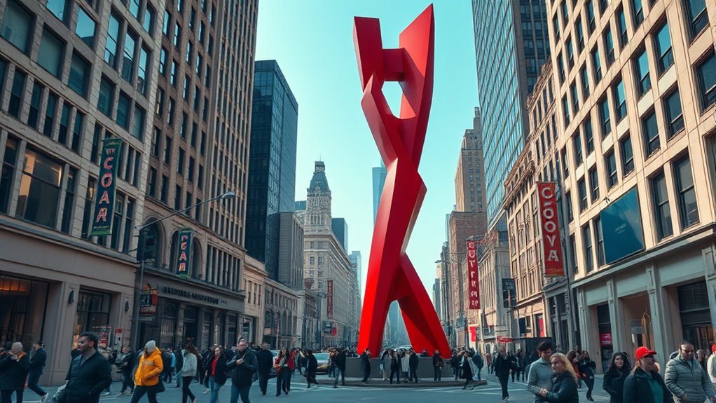
Ever wondered how some elements immediately catch your eye in a design? It’s often because of their size. Larger elements naturally draw attention and serve as focal points, guiding viewers through the visual hierarchy. By increasing the size of key components, you make them stand out from the rest, signaling their importance. Conversely, smaller elements recede into the background, supporting the main message without competing for attention. Use size strategically to highlight a call-to-action, a headline, or an important image. Be mindful not to overdo it—too many large elements can create confusion. Instead, balance size variation carefully to direct the viewer’s focus where you want it most, creating a clear and effective visual flow. Recognizing the rustic decor and their unique features can also inspire your design choices to create engaging visual narratives. Additionally, understanding the principles of visual hierarchy helps in crafting more impactful compositions that guide viewers effectively. Incorporating traditional craftsmanship and the history behind visual elements can further enhance the authenticity and emotional appeal of your design. Awareness of innovative design trends can also help you stay current and make your visuals more compelling.
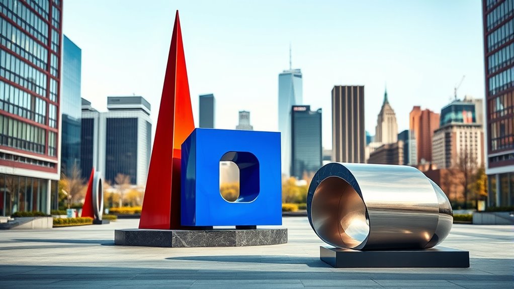
Combining Shape and Size for Emphasis
While size alone can establish a hierarchy, combining it with shape adds an extra layer of emphasis that guides your viewer’s attention more effectively. Larger shapes naturally draw the eye, but pairing size with distinctive or contrasting shapes makes certain elements stand out even more. For example, a small, irregular shape can seem more prominent when placed next to uniform, smaller shapes. Using bold or unique shapes alongside bigger sizes emphasizes importance without overwhelming the composition. This combination creates visual interest and directs focus smoothly. Remember, the key is balance—don’t overuse large, unusual shapes, or they’ll lose impact. Instead, strategically combine size and shape to highlight your most critical elements, guiding viewers effortlessly through your design. Additionally, understanding how to create a visual hierarchy helps ensure your message is communicated clearly and effectively, especially when considering elements like gold IRA investments to diversify your assets. Recognizing how shape and size work together is essential for developing a cohesive and engaging design, and paying attention to visual cues can further enhance the clarity of your message.
Hierarchical Relationships Through Geometric Forms
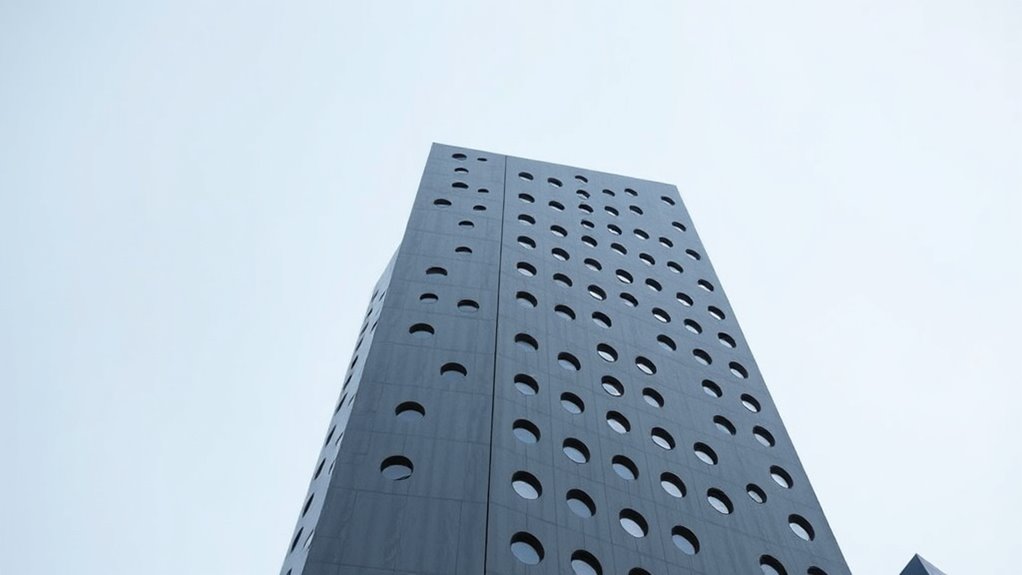
You can establish hierarchy by varying the sizes of geometric forms to guide the viewer’s eye. Layering and overlapping shapes create a sense of depth and importance, making key elements stand out. Use visual anchors and focus points to direct attention and reinforce the relationships among forms. Incorporating visual hierarchy principles helps organize content effectively and enhances viewer engagement. Additionally, understanding how geometric forms relate to natural patterns can improve the clarity and impact of your design.
Varying Geometric Sizes
Varying geometric sizes play a essential role in establishing hierarchical relationships within a design. Larger shapes naturally draw more attention, signaling importance or priority, while smaller shapes recede into the background. By intentionally adjusting size, you guide viewers’ focus, making key elements stand out. For example, a prominent circle or rectangle can serve as a focal point, while smaller forms support secondary information. Consistent scaling creates a visual flow, helping viewers interpret the hierarchy intuitively. Remember, size variation doesn’t have to be drastic; subtle differences can still communicate significance effectively. Use size strategically to balance your layout, emphasizing critical components without overwhelming the overall composition. Ultimately, varying sizes helps you craft a clear, logical visual order that directs viewer attention effortlessly.
Layering and Overlap
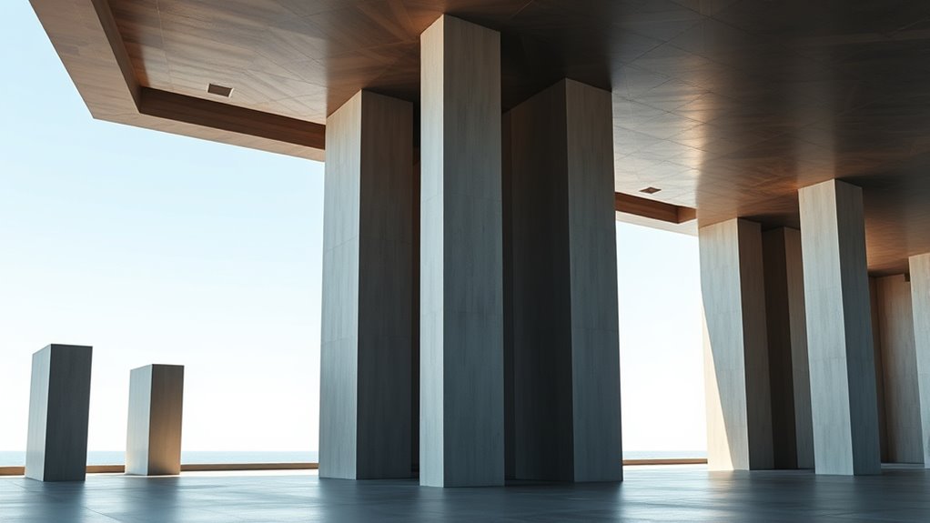
Layering and overlap are powerful tools for establishing hierarchy through geometric forms. When you position shapes so they partially cover one another, you create a visual sequence that guides the viewer’s eye. Overlapping elements suggest which objects are foreground or background, reinforcing their importance. For example, placing a larger shape behind a smaller one signals that the smaller shape is more prominent or closer. By adjusting the degree of overlap, you control the perceived depth and importance of each element. Keep in mind that consistent overlaps help maintain clarity, while cluttered overlaps can confuse. Use layering intentionally to lead your audience’s gaze and emphasize key parts of your design. This technique adds a sense of spatial relationship and hierarchy, making your composition more dynamic and engaging.
Visual Anchors and Focus
Visual anchors serve as focal points that immediately draw the viewer’s attention and establish a clear hierarchy within your composition. They guide the eye to important elements, making your message clearer. You can create anchors using size, shape, or contrast. For example, larger or uniquely shaped objects stand out, acting as natural focus points. To strengthen hierarchy, position these anchors strategically, like placing a bold shape near the top or center. Here’s a quick overview:
| Attribute | Effect | Example |
|---|---|---|
| Size | Draws attention quickly | Large circle in corner |
| Shape | Creates visual interest | Unique, irregular form |
| Contrast | Enhances prominence | Bright color against muted background |
Using these principles, you control focus and ensure your design communicates effectively.
Scaling Elements for Depth and Perspective
To create a sense of depth and perspective, you can vary the sizes of your elements to suggest their distance from the viewer. Using scale helps establish which parts of your design feel closer or farther away. Proportion also plays a key role in guiding the viewer’s eye and enhancing the overall spatial hierarchy.
Varying Element Sizes
Varying element sizes is a powerful technique to create depth and perspective in your design. By adjusting the size of objects, you guide viewers’ focus and suggest spatial relationships. Larger elements appear closer, drawing attention, while smaller ones recede, creating a sense of distance. To effectively use this method, consider the following:
| Large Elements | Medium Elements | Small Elements |
|---|---|---|
| dominate the scene | support focal points | add subtle details |
| appear closer | balance composition | imply background |
| attract immediate attention | lead eye smoothly | create depth illusion |
| establish hierarchy | guide viewer flow | enhance realism |
Use size variations intentionally to emphasize key parts and craft a dynamic, layered visual experience.
Depth Through Scale
Scaling elements is a direct way to enhance depth and create a sense of perspective within your design. By adjusting the size of objects relative to each other, you guide the viewer’s eye through the visual hierarchy, making some elements appear closer and others farther away. Larger elements tend to seem more prominent and nearer, while smaller ones recede into the background. This technique doesn’t require complex techniques or additional tools; it relies on your understanding of proportion and visual cues. When you use scale thoughtfully, you add layers of depth that make your design more dynamic and engaging. Remember, subtle adjustments in size can have a powerful impact on how your audience perceives spatial relationships, drawing attention exactly where you want it.
Perspective With Proportion
By adjusting the proportions of elements within your design, you can create a convincing sense of depth and perspective. Scaling objects correctly makes scenes feel more realistic and engaging, guiding viewers’ focus naturally. To evoke emotion and draw attention, consider these techniques:
- Shrink distant elements to suggest they are far away, creating a sense of vastness.
- Enlarge foreground objects to make them appear closer and more immediate.
- Vary proportions subtly to emphasize spatial relationships without overwhelming clarity.
- Use scale contrast to evoke feelings of importance, vulnerability, or excitement.
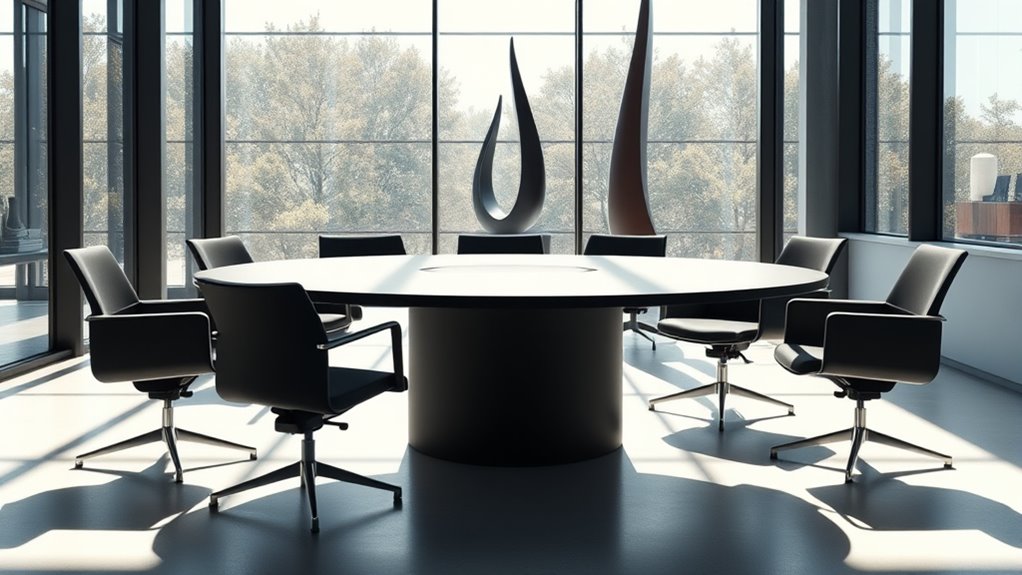
Balancing Visual Weight With Shape and Size
Balancing visual weight with shape and size is essential for creating a harmonious and engaging design. When you choose larger or more complex shapes, they naturally draw more attention, so you need to balance them with smaller or simpler elements. Using contrast in size helps direct focus and prevents any single part from overpowering the whole. Symmetrical shapes tend to feel stable, while asymmetrical ones create dynamic tension. You can also balance shapes by spacing; evenly distributed elements feel more balanced, whereas clustered items may seem heavier on one side. Keep in mind that visual weight isn’t solely about size—bold shapes or darker colors can carry more weight too. Striking the right balance ensures your design feels cohesive and guides viewers naturally through the content.
Guiding the Viewer’S Eye With Strategic Placement

Strategic placement is key to guiding your viewer’s eye smoothly through your design. When you position elements thoughtfully, you create a visual flow that directs attention effortlessly. Place your most important content where the eye naturally lands first, such as the top left or center. Use size and contrast to anchor key elements, making them stand out. Align items to create pathways that lead the viewer from one focal point to the next.
Consider these techniques to evoke emotion:
- Positioning a bold headline at eye level to grab immediate attention
- Placing supporting images along the natural reading path
- Creating visual anchors that evoke curiosity or excitement
- Using spacing to build a sense of rhythm and movement
Practical Tips for Applying Shape and Size in Design
Using shape and size effectively can dramatically enhance your design’s clarity and impact. To do this, prioritize contrast; make important elements larger or more distinct to draw attention. Use simple, bold shapes for focal points, and avoid cluttered or overly complex forms that distract viewers. Consistency is key—maintain a cohesive style for related elements to create harmony. Experiment with scale variations to establish hierarchy; larger items naturally command more focus. Also, consider negative space—giving elements room to breathe emphasizes their importance. Finally, test your design across different devices and sizes to ensure your shapes and sizes communicate clearly everywhere. Applying these tips helps guide viewers seamlessly through your content, making your visual hierarchy more effective and engaging.
Frequently Asked Questions
How Does Color Interact With Shape and Size in Hierarchy?
When you consider how color interacts with shape and size in hierarchy, you realize it guides the viewer’s eye effectively. Bright, bold colors draw attention to larger or more important shapes, creating focus points. Conversely, softer or muted colors recede, letting other elements stand out. You use color strategically to emphasize key shapes or sizes, helping viewers navigate your design effortlessly and understand the visual importance of each element.
What Are Common Mistakes When Using Shape and Size for Emphasis?
When using shape and size for emphasis, you might overdo it by making elements too large or oddly shaped, which can distract or confuse viewers. Avoid cluttering your design with too many different shapes or inconsistent sizes, as it weakens the hierarchy. Also, don’t forget that contrast is key; failing to create clear differences can make your focal points lose their impact. Keep it simple and intentional to guide viewers effectively.
How Can Shape and Size Influence User Experience and Usability?
Imagine you’re designing a checkout button. By making it larger and using a distinct shape, you guide users naturally to click it first, enhancing usability. Shape and size influence user experience by drawing attention and establishing priorities. When used thoughtfully, these elements make interfaces intuitive, reduce confusion, and improve navigation. Conversely, poor choices can clutter the design or mislead users, hindering their ability to complete tasks smoothly.
Are There Cultural Differences in Perceiving Shape and Size Hierarchies?
You might be surprised to learn that cultural differences influence how people perceive shape and size hierarchies. In some cultures, larger shapes or objects signify importance and authority, while others focus on symmetry or specific shapes as symbols of meaning. Your users’ cultural backgrounds can affect how they interpret visual cues, so you should consider these differences when designing interfaces to guarantee clarity and effectiveness across diverse audiences.
How Does Motion or Animation Affect Visual Hierarchy With Shape and Size?
Motion and animation profoundly impact visual hierarchy by guiding your attention to key elements. When shapes move or change size, you naturally focus on the most dynamic parts first, establishing importance. You might notice that animated elements stand out more than static ones, making it easier for your eyes to follow a sequence or prioritize information. This active use of motion helps create clear, engaging visual hierarchies that direct your focus effectively.
Conclusion
By mastering how shape and size influence visual hierarchy, you can guide viewers effortlessly through your design. Will your next project stand out or get lost without these techniques? Remember, strategic use of form and scale isn’t just about aesthetics—it’s about communication. When you balance these elements thoughtfully, you create designs that capture attention, convey meaning, and leave a lasting impression. So, are you ready to craft visuals that truly speak to your audience?