
Using grid systems helps you create organized, balanced layouts by providing a structured framework for placing elements. They guide your design with invisible lines, making alignment and consistency easier across different devices and screen sizes. You can choose from various grid types like column, modular, or baseline, depending on your project’s needs. To maximize effectiveness, explore how to implement grids using design tools and follow best practices for responsiveness. Keep exploring to learn more about making your layouts professional and adaptable.
Key Takeaways
- Define a clear grid structure (columns, rows, gutters) to guide element placement and ensure consistency.
- Utilize design tools’ built-in grid features to align and organize content precisely.
- Choose an appropriate grid type (column, modular, baseline, hierarchical) based on content needs.
- Apply responsive grid techniques using flexible measurements and media queries for adaptability.
- Keep grid complexity manageable, avoid excessive nesting, and test across devices for optimal layout organization.
Top picks for "grid system organize"
Open Amazon search results for this keyword.
As an affiliate, we earn on qualifying purchases.
Understanding the Fundamentals of Grid Systems
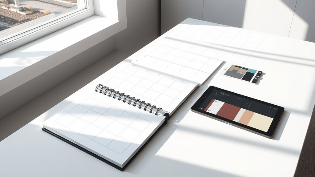
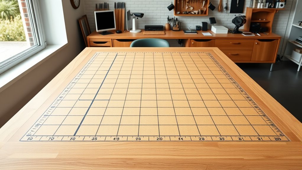
To effectively organize layouts, it’s essential to understand the fundamentals of grid systems. A grid system provides a structured framework that guides the placement of elements, ensuring consistency and balance. Think of it as a set of invisible lines that divide your design into rows and columns, making it easier to align content precisely. Grids help you create visual harmony, improve readability, and streamline your workflow. They are flexible, allowing you to adapt to different screen sizes and devices. When you understand how grids work, you gain control over your layout’s structure, making it easier to organize elements systematically. Additionally, integrating responsive design principles ensures your layouts remain functional across various devices. Recognizing the role of automation in business can also help in designing scalable and adaptable layout systems. Mastering these basics sets a strong foundation for creating clean, professional designs that are both functional and aesthetically pleasing. Incorporating design consistency through grid systems further enhances the overall cohesiveness of your project. Understanding visual hierarchy is also crucial, as it guides users’ attention to the most important elements first. Moreover, aligning your grid layout with user experience principles can significantly improve how users interact with your design.
Types of Grid Layouts and Their Applications
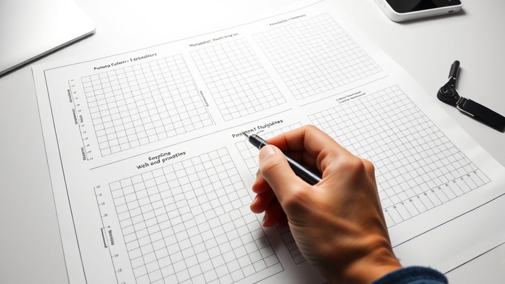
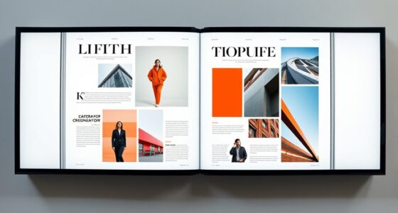
Different types of grid layouts serve specific design needs and help you achieve various visual effects. The most common is the column grid, which organizes content into vertical sections, perfect for newspapers or blogs. Modular grids break the layout into smaller, uniform blocks, making complex content easier to navigate—ideal for dashboards or product catalogs. The baseline grid aligns text and images along a consistent horizontal line, enhancing readability and creating harmony across pages. Color accuracy impacts the overall image quality and is vital for creating an immersive viewing experience. Hierarchical grids let you emphasize certain elements by varying sizes and positions, suitable for dynamic websites or promotional materials. grid systems can streamline the design process and improve consistency throughout your project. Incorporating cookie management principles can also enhance user experience by respecting privacy preferences and providing transparent options for cookie control. Understanding layout flexibility is essential for adapting grid systems to different content types and design goals. Additionally, selecting the appropriate grid type depends on the specific visual impact you aim to achieve.
Implementing Grids in Popular Design Tools

Implementing grids in popular design tools has become more accessible with features built directly into the software. Most programs, like Adobe XD, Figma, and Sketch, offer built-in grid systems that you can easily activate and customize. These tools allow you to set column and row counts, gutter widths, and margins, giving you precise control over your layout. You can toggle grids on and off as needed, making it simple to experiment with different arrangements. Additionally, many tools include snap-to-grid functionality, helping you align elements effortlessly. This integration streamlines your workflow, reducing the need for manual measurements and guesswork. Leveraging these built-in features helps ensure your layouts are consistent and well-structured, similar to how AI software engineering requires specialized skills to develop effective systems. By leveraging these built-in features, you can quickly create consistent, well-structured layouts that serve as a solid foundation for your designs.
Best Practices for Responsive Grid Design

Responsive grid design requires you to prioritize flexibility and adaptability from the outset. Use fluid measurements like percentages instead of fixed pixels to ensure layouts resize smoothly across devices. Keep your grid structure simple; overcomplicating can hinder responsiveness. Test your design on various screen sizes early and often, adjusting breakpoints as needed. Consider using flexible units such as fr in CSS Grid for proportional distribution. Maintain consistent spacing and alignment for visual harmony. Use media queries to tweak grid behavior at different breakpoints, ensuring content remains accessible. Here’s a quick overview:
| Best Practice | Description |
|---|---|
| Use fluid measurements | Ensures resizing across devices |
| Simplify grid structures | Facilitates responsiveness |
| Test early and often | Identifies issues promptly |
| Employ media queries | Adjusts layout at breakpoints |
| Keep spacing consistent | Maintains visual coherence |
Additionally, incorporating user experience principles into your grid design helps improve overall accessibility and engagement.
Common Mistakes to Avoid When Using Grids

When using grids, one common mistake is overcomplicating the layout by adding too many nested or overly complex structures, which can make the design harder to maintain and less adaptable. This often leads to confusion and inconsistent alignment. To avoid this, keep your grid simple and clear. A vacuum’s filtration efficiency is crucial in ensuring your system effectively captures dust and allergens, highlighting the importance of choosing models with reliable filtration. Overusing nested grids can clutter your layout and complicate adjustments. Ignoring the importance of whitespace reduces balance and readability. Stretching grid lines beyond their intended purpose hampers flexibility. Failing to test responsiveness can result in a layout that breaks on different devices. Additionally, understanding the regional legal resources available can help you better navigate legal requirements and avoid missteps. Incorporating essential oils into your design process can provide a calming influence, enhancing focus and creativity. Recognizing the self-centered tendencies associated with narcissists helps in designing boundaries that prevent manipulation. Staying mindful of these pitfalls helps you create clean, flexible, and user-friendly grid-based designs.
Frequently Asked Questions
How Do I Choose the Right Grid System for My Project?
When choosing the right grid system, you should consider your project’s content, purpose, and complexity. Think about whether your layout needs flexibility or strict alignment. If you’re designing a website with varied content, a responsive grid like CSS Grid or Flexbox works well. For simpler projects, a basic column grid might suffice. Test different options to see which one helps your content flow naturally and looks visually balanced.
What Are the Limitations of Using Grid Layouts?
When you consider grid layouts, you should be aware of their limitations. They can make your designs look too uniform or rigid, reducing creativity. Sometimes, grids don’t adapt well to unique content or complex layouts, causing frustration. Over-reliance on grids might also hinder responsiveness across devices, leading to awkward visual flow. Balancing grid use with flexibility guarantees your design remains engaging and user-friendly.
How Can I Integrate Grids With Other Design Frameworks?
Imagine your layout as a puzzle, with each piece fitting perfectly. To integrate grids with other design frameworks, you can overlay flexible grid systems like CSS Grid with frameworks like Flexbox for responsiveness. Use grids to structure content and frameworks to handle alignment and spacing. This synergy allows you to create dynamic, organized designs that adapt seamlessly, turning your layout into a harmonious visual story.
Are There Accessibility Considerations When Designing With Grids?
When designing with grids, you should consider accessibility to guarantee everyone can navigate your layout easily. Use sufficient contrast between text and background, avoid small clickable areas, and maintain consistent spacing. Make sure your grid is flexible for different screen sizes and assistive technologies. Incorporate semantic HTML and ARIA labels where needed, so screen readers can interpret your layout accurately, providing an inclusive experience for all users.
How Do I Adapt Grid Layouts for Different Cultural Design Preferences?
You might be surprised to learn that 65% of users prefer interfaces that reflect their cultural norms. When adapting grid layouts for different cultures, you should consider local reading directions, color symbolism, and visual hierarchy. Use flexible grid systems that can shift to accommodate left-to-right or right-to-left reading, and tailor spacing and alignment to cultural preferences. This approach guarantees your design feels intuitive and respectful across diverse audiences.
Conclusion
By mastering grid systems, you can create organized, visually appealing layouts that enhance user experience. Did you know that websites using grid-based designs see a 30% higher engagement rate? Embracing best practices guarantees your layouts are both functional and adaptable across devices. Keep experimenting with different grid types and tools to refine your skills. With these insights, you’ll build more effective, responsive designs that captivate your audience.