

The data-ink ratio, based on Tufte’s principle, encourages you to minimize unnecessary ink in visualizations to make core data stand out clearly. By removing decorative elements like heavy gridlines, borders, and redundant labels, you focus your audience’s attention on meaningful information. Higher ratios mean cleaner, more effective visuals. If you want to learn how to optimize your charts for clarity and impact, explore further to discover practical tips and examples.
Key Takeaways
- The data-ink ratio measures the proportion of ink used to represent data versus total ink in a visualization.
- Tufte’s principle advocates maximizing data-ink by minimizing decorative or redundant visual elements.
- A high data-ink ratio enhances clarity, focus, and efficient communication of essential information.
- Calculating the ratio involves comparing the ink for data elements to all ink in the visualization.
- Removing unnecessary features like gridlines, borders, or embellishments improves the visualization’s effectiveness.
Understanding the Concept of Data-Ink Ratio

The data-ink ratio is a key concept in data visualization that helps you create clearer and more effective charts. It emphasizes reducing unnecessary ink—like decorative elements or excessive labels—that don’t convey data. By focusing on the core data, your visualization improves in clarity and impact. Understanding this ratio also involves considering visualization aesthetics; clean, simple designs draw viewers’ attention to the actual data. Additionally, color psychology plays a role in enhancing understanding without clutter. Using meaningful colors wisely can highlight important trends or differences, aligning with the goal of maximizing data ink. Incorporating visual hierarchy ensures that viewers can easily differentiate between primary and secondary information, further sharpening your visualization’s effectiveness. Recognizing the importance of spiritual energy can inspire minimalistic yet impactful design choices that support viewer focus and comprehension, fostering a sense of clarity and purpose. Embracing simplicity not only improves communication but can also create a more calming viewing experience that resonates with viewers on a deeper level.
The Origins and Philosophy Behind Tufte’s Principle
Edward Tufte’s principles on data visualization stem from his deep commitment to honesty and clarity in presenting information. His philosophy emphasizes that effective visuals should prioritize data over decorative elements, aligning with strong design principles. Tufte believes visualization aesthetics should serve the message, not overshadow it. His approach advocates for simplicity, removing unnecessary ink or embellishments that distract from the data’s story. This idea reflects a broader belief that good design supports understanding and insight. Tufte’s origins as a statistician and artist shaped his view that honest, clear visuals foster trust and facilitate interpretation. His philosophy champions minimalism, insisting that every element in a visualization should have a purpose, reinforcing the core message without clutter or confusion. Additionally, disclosure policies ensure transparency about the use of data and relationships with third-party sources in visualizations. Moreover, adhering to the Data-Ink Ratio principle helps eliminate non-essential elements, further clarifying the presented data. Recognizing the importance of visual clarity is central to creating effective data representations that communicate insights effectively, especially when considering the impact of cybersecurity incidents on data integrity and trust. Furthermore, understanding how auditory processing can influence data presentation is essential in designing accessible visualizations for diverse audiences.
How to Calculate the Data-Ink Ratio in Your Visualizations

To calculate the data-ink ratio, start by identifying all the data elements in your visualization. Then, measure the total ink used for both the data and the non-data elements. Once you have these figures, you can determine the ratio to assess how efficiently your visualization presents information. A higher data-ink ratio indicates a clearer and more effective graphic, which aligns with Tufte’s design principles. Understanding the importance of data visualization helps in creating clear and impactful graphics.
Identify Data Elements
How can you accurately calculate the data-ink ratio in your visualizations? Begin by identifying all the data elements you want to communicate, such as points, bars, or lines. Focus on the parts of your chart that directly represent the information, rather than decorative elements or embellishments. This step is essential for maintaining strong chart aesthetics and ensuring your visual storytelling remains clear. By isolating these data elements, you can determine how much ink is truly necessary to convey your message. Removing unnecessary ink, like background grids or excessive labels, enhances the clarity of your chart. Accurate identification of data elements helps you optimize your visual design, making your chart both informative and visually appealing while adhering to Tufte’s principle of maximizing data-ink.
Measure Total Ink
What is the simplest way to measure the total ink in your visualization? Add up all the ink used for every element—lines, labels, axes, and background. This total represents your visualization’s ink footprint. To evaluate ink economy, compare this total to the amount of ink used solely for your data elements. The goal is to maximize visual aesthetics while minimizing unnecessary ink. By calculating the total ink, you gain insight into how much of your design contributes directly to data communication versus decorative or redundant elements. A lower total ink, relative to data ink, reflects better ink economy. This approach aligns with Tufte’s emphasis on visual efficiency and helps you identify areas where you can streamline your visualization, ensuring it remains clear, effective, and aligned with Tufte’s principle of optimizing the data-ink ratio. Additionally, understanding the effects of eye patches can inspire minimalistic design choices that focus on essential elements. Incorporating principles from Glycolic Acid benefits can also guide you toward clearer, more radiant visualizations by reducing clutter and enhancing clarity. Moreover, embracing creative practice can help you develop innovative ways to reduce excess ink without sacrificing informational integrity. Techniques like minimalist design encourage focusing only on critical data, further improving ink economy and overall effectiveness.
Examples of High and Low Data-Ink Ratios

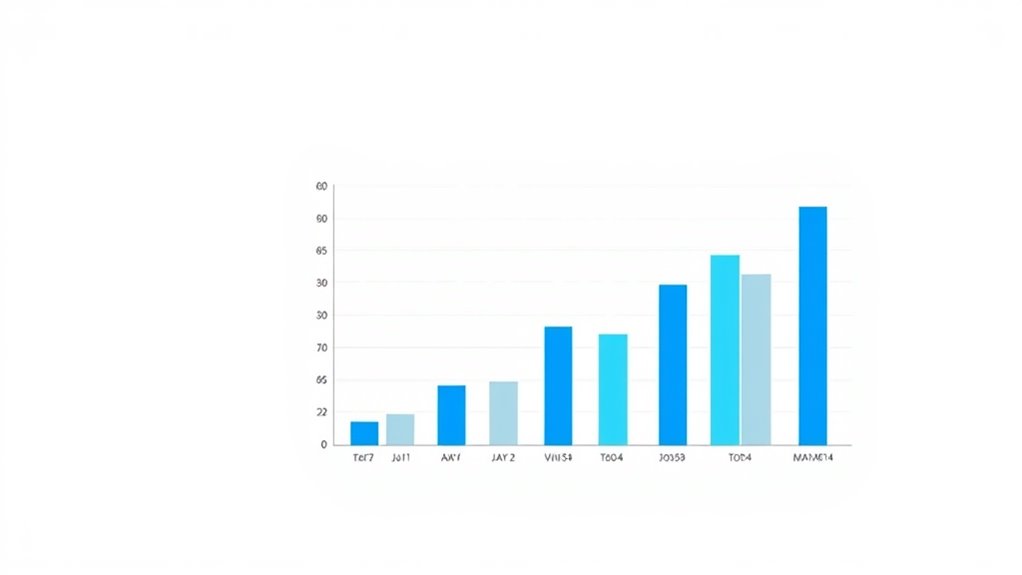
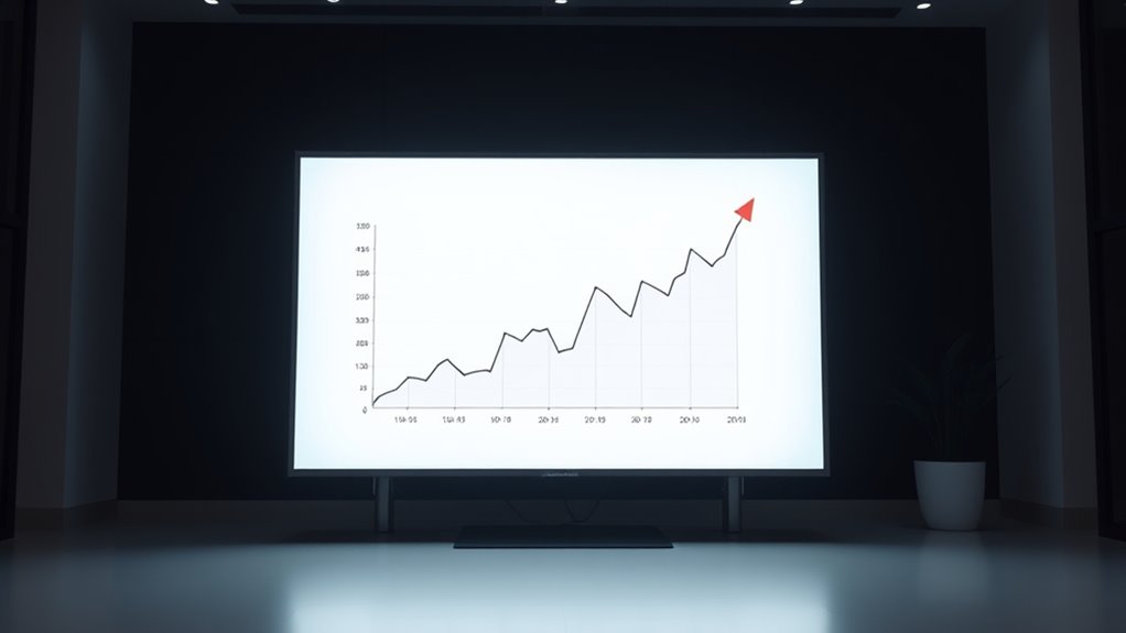
Have you ever noticed how some charts are cluttered with unnecessary decoration, while others focus solely on the data? High data-ink ratio charts maximize ink economy by removing chart clutter, leaving only essential information. For example, a simple line graph with clear axes and minimal gridlines demonstrates a high data-ink ratio, making trends easy to interpret. Conversely, low ratio charts are overloaded with 3D effects, excessive colors, or decorative elements that don’t add value. These visuals distract from the actual data, reducing clarity. A bar chart with thick borders, background images, or excessive labels exemplifies poor ink economy. By comparing these examples, you see how focusing on essential data and reducing non-essential ink enhances readability and insight. Additionally, understanding support hours for entertainment venues can help in planning visits to parks or attractions more efficiently. Developing digital literacy in children can further improve their ability to interpret data and visuals critically. Moreover, applying Tufte’s principles to visual design encourages clearer communication and better decision-making. Recognizing regional statistics can also guide viewers to better contextualize the information for specific audiences.
Common Pitfalls That Reduce Data-Ink Efficiency

One common pitfall that reduces data-ink efficiency is including unnecessary decorative elements, such as 3D effects, heavy gridlines, or background images, which do not add meaningful information. These additions increase visual complexity without improving understanding, distracting viewers from the core data. They also diminish the chart’s aesthetic appeal by cluttering the visual space. To avoid this, be cautious of:
- Excessive use of color or shading
- Overly ornate borders or frames
- Decorative icons that don’t clarify data
- Background images that compete with data points
Removing these elements streamlines your graphic, making it more effective and easier to interpret. Simplifying your visuals enhances data clarity, refocuses attention on the message, and maintains a clean, professional appearance. Additionally, being mindful of the visual hierarchy ensures that the most important data stands out without unnecessary embellishments. Recognizing the importance of aesthetic simplicity can also help in designing clearer, more effective data visualizations that resonate with viewers. Incorporating design principles from related fields like graphic design or textile arts can further improve visual efficiency and appeal. Furthermore, understanding regulatory requirements related to visual presentation can help ensure compliance and clarity in your graphics.
Practical Tips for Maximizing Data-Ink in Graphics

To maximize data-ink in your graphics, focus on simplifying your visual elements and emphasizing only what’s necessary to convey your message. Use strong color contrast to differentiate key data points from the background and avoid unnecessary decorative colors that don’t add meaning. When selecting fonts, opt for clear, legible typefaces and limit the number of font styles to reduce visual clutter. Keep labels and annotations concise, ensuring they enhance understanding without overwhelming the viewer. Remove gridlines, borders, and background patterns unless they serve a specific purpose. By streamlining your graphics with these tips, you direct attention to the essential data, making your visuals more effective and easier to interpret. Remember, less is often more when it comes to data-ink.
The Impact of Data-Ink Optimization on Data Interpretation
When you optimize the data-ink ratio, your visuals become clearer and easier to understand. Removing unnecessary elements reduces visual noise, helping viewers focus on the key information. This simplification directly improves how effectively data is communicated.
Clarity Through Simplification
Simplifying data visuals by removing unnecessary ink enhances clarity and makes interpretation easier. When you reduce visual clutter, your audience can focus on the key message without distraction. Embracing minimalist design ensures that every element serves a purpose, strengthening understanding. To achieve this, consider:
- Eliminating decorative or redundant lines
- Using clean, simple color schemes
- Limiting the number of data points or categories
- Highlighting essential data with contrast
These steps help prevent overwhelming viewers, making insights more accessible. Clear visuals with optimized data-ink promote quick comprehension and accurate analysis. By prioritizing simplicity, you guide your audience’s attention directly to the core information, enhancing overall communication. The goal is to create visuals that are both informative and effortless to interpret, embodying the essence of effective data presentation.
Reducing Visual Noise
Reducing visual noise involves carefully trimming unnecessary elements that distract from the main message. Visual clutter can obscure important data, making interpretation more difficult. By removing extraneous gridlines, background images, or decorative effects, you enhance chart aesthetics and focus attention on key insights. Simplifying your visualization minimizes cognitive load, allowing viewers to grasp trends and patterns quickly. This process emphasizes essential data-ink, ensuring that every element serves a purpose. When you cut down on visual noise, your chart becomes clearer and more effective. Clearer visuals lead to better understanding and quicker decision-making. Ultimately, reducing visual noise isn’t about stripping away beauty but about balancing aesthetics with clarity to communicate your data more powerfully.
Integrating the Data-Ink Ratio Into Your Design Workflow

Have you considered how to seamlessly incorporate the Data-Ink Ratio into your design process? To do this effectively, focus on simplifying visuals without sacrificing clarity. Use consistent color schemes to highlight key data points, avoiding unnecessary embellishments that add ink but no value. Implement clear annotation techniques that directly support understanding, rather than cluttering your charts. You can also:
- Remove non-essential decorative elements
- Prioritize data labels over decorative graphics
- Use minimal shading and textures
- Balance color contrast to emphasize important data
These steps help you maintain a clean, focused presentation. By integrating the Data-Ink Ratio early in your workflow, you ensure your visuals communicate effectively while remaining visually lean and impactful.
Frequently Asked Questions
How Does Reducing Data-Ink Affect Viewer Comprehension?
Reducing data-ink enhances viewer comprehension by embracing minimalism and simplicity. When you cut unnecessary visual elements, you make the core message clearer and easier to understand. Less clutter draws attention to important data points, helping viewers grasp insights quickly. You avoid overwhelming your audience, which improves their ability to interpret the information accurately. Ultimately, a cleaner, more streamlined visualization makes your data more accessible and impactful.
Can the Data-Ink Ratio Be Applied to Interactive Dashboards?
You can definitely apply the data-ink ratio to interactive dashboards, but you should be mindful of visual complexity and color emphasis. Simplifying visuals by reducing unnecessary ink helps users focus on key data, making dashboards clearer and more effective. Use color selectively to highlight important insights, avoiding clutter. This approach improves user comprehension and ensures that interactivity enhances rather than overwhelms the viewer.
What Tools Are Best for Assessing Data-Ink Ratio Automatically?
You can assess the data-ink ratio automatically using visualization tools and automation software. Tools like Tableau, Power BI, and QlikView offer features to analyze and optimize visualizations efficiently. Automation software such as Python scripts with libraries like Matplotlib or Seaborn can also evaluate ink usage and suggest improvements. These options help streamline the process, ensuring your dashboards are clear, concise, and focused on essential data.
How Does Cultural Context Influence Data-Ink Design Choices?
Imagine you’re a storyteller weaving a tapestry; cultural symbolism shapes your threads. When designing data visuals, your choices reflect cultural context, influencing how audiences interpret symbols, colors, and layouts. This impacts visual storytelling, guiding viewers’ understanding and emotional response. You adapt your design to resonate locally, ensuring clarity and engagement. Cultural nuances become your palette, making data more meaningful and accessible across diverse audiences.
Are There Industry-Specific Standards for Optimal Data-Ink Ratios?
You should know that industry-specific standards for ideal data-ink ratios exist through sector-specific guidelines and industry benchmarks. These standards help you balance clarity and simplicity, guaranteeing your visualizations are effective within your field. While general principles apply, adjusting your data-ink ratio according to sector norms ensures your visuals meet professional expectations and communicate data clearly, avoiding unnecessary clutter or oversimplification.
Conclusion
By focusing on maximizing your data-ink ratio, you clear away the clutter like a gardener pruning away overgrown branches, revealing a vibrant, focused visualization. When you strip away unnecessary elements, your data shines brighter, guiding your audience’s eye straight to the story you want to tell. Remember, a clean, intentional design isn’t just easier to read—it transforms your charts into powerful tools that communicate clarity and insight with every glance.