
To design dashboard UIs for data density, focus on understanding your users’ needs and prioritize key metrics for visual prominence. Use clear layouts like grids and modular designs to organize information efficiently, employing visual hierarchy through size, color, and spacing. Incorporate grouping and segmentation to reduce clutter, choose space-efficient chart types, and guarantee responsiveness across devices. Keep refining your approach to balance data richness with usability—further insights await those who continue exploring these strategies.
Key Takeaways
- Prioritize critical data using visual hierarchy and consistent color coding to guide user focus effectively.
- Utilize grid layouts, modular design, and space-saving techniques like collapsible panels for dense data organization.
- Incorporate interactive filters, hover details, and hierarchical segmentation to manage information complexity.
- Choose space-efficient chart types such as bar, line, or stacked charts to maximize clarity.
- Ensure responsive design with flexible grids and media queries for seamless usability across devices.
Top picks for "design dashboard data"
Open Amazon search results for this keyword.
As an affiliate, we earn on qualifying purchases.
Understanding Your Audience and Their Data Needs
To design an effective dashboard, you need to understand who your audience is and what data they require. Start by developing clear user personas that represent your typical users, considering their roles, goals, and technical skills. This helps you identify the specific data points they need to perform their tasks efficiently. Analyzing user workflows reveals how users interact with data and which information they prioritize at each step. By understanding these workflows, you ensure your dashboard presents relevant data in an accessible way, minimizing clutter and enhancing usability. Focusing on user personas and workflows allows you to tailor your data presentation, making your dashboard more intuitive and aligned with your audience’s needs. This foundational understanding is essential for effective data visualization.
Prioritizing Key Metrics for Visual Prominence
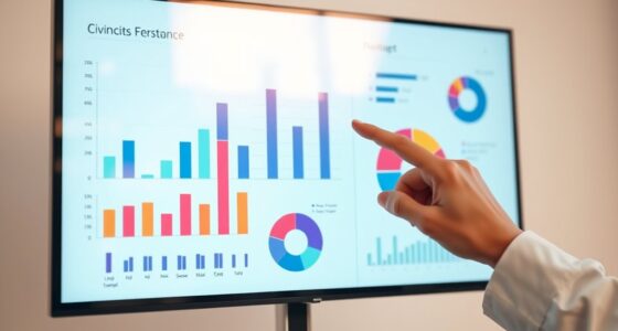
Prioritizing key metrics guarantees that your dashboard communicates the most critical information at a glance. To achieve this, establish a clear visual hierarchy by emphasizing data prominence. Use size, color, and placement strategically to draw attention to your most important metrics. Larger, bolder visuals naturally attract the eye first, signaling their importance. Bright or contrasting colors can highlight urgent or high-priority data, while less critical metrics recede into the background. Keep your layout simple: place key metrics at the top or center, where users’ eyes naturally fall. By intentionally designing for visual hierarchy, you ensure your dashboard directs focus effectively, making essential data immediately accessible without overwhelming users. Incorporating best anime movies can also make dashboards more engaging by illustrating complex data with relevant visuals, especially when emphasizing data visualization techniques. Additionally, understanding contrast ratio is vital for ensuring that important metrics stand out clearly against their backgrounds, further improving readability and user focus. Ensuring that your design adheres to accessibility standards also helps all users interpret critical data accurately.
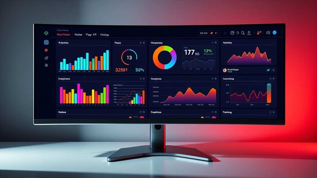
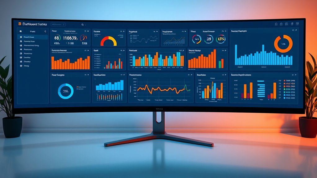
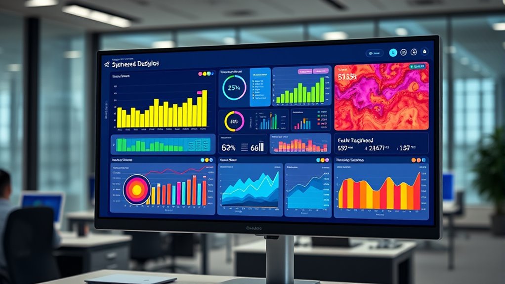
Choosing the Right Layouts for Dense Data Presentation
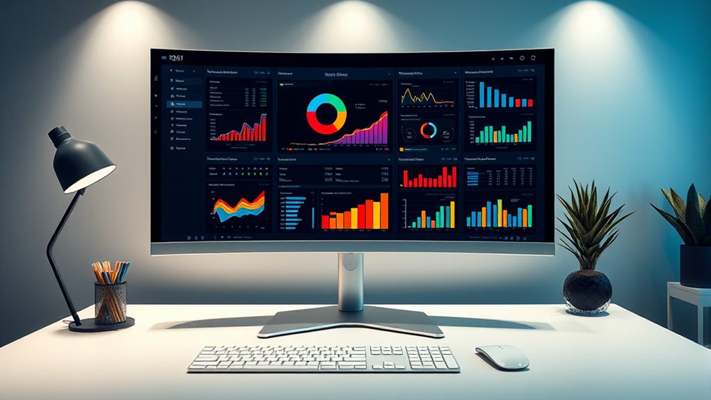
Selecting the right layout is vital for presenting dense data effectively. You need to maximize space efficiency while maintaining clarity, so users can interpret information quickly. Consider layouts that balance density with readability to guarantee your dashboard delivers insights without feeling cluttered. Incorporating cozy textiles and warm color palettes can also help create a comfortable and inviting environment for users reviewing complex data, reducing fatigue and enhancing focus. Additionally, implementing organization strategies can further optimize how data is visualized and accessed, making the interface more intuitive and efficient. For example, utilizing visual hierarchy techniques helps prioritize key information, guiding users naturally through the data. Embracing attention in your design process ensures that users remain engaged and can focus on critical information without distraction. Be mindful of potential security vulnerabilities in your design to protect sensitive information and maintain user trust.
Maximizing Space Efficiency
Choosing the right layout is essential when designing dashboards that need to display dense data effectively. To maximize space efficiency, focus on space saving techniques like collapsible panels and inline filters, which free up room for critical data. Compact visualization methods, such as sparklines, small multiples, and mini charts, enable you to show more information without cluttering the interface. Use grid-based layouts to organize data logically and prevent overlapping elements. Prioritize components that deliver maximum insight in minimal space, and consider grouping related metrics to reduce visual noise. Additionally, incorporating focal points can guide users’ attention to the most important information quickly. Implementing filtering technologies helps users customize views, reducing unnecessary clutter and enhancing data clarity. Applying visual hierarchy principles ensures that the most relevant data stands out and is easily digestible. Moreover, adopting AI-driven safety measures can assist in identifying potential issues or inconsistencies within dense data sets, further improving dashboard reliability. Including interactive elements can also facilitate quick data exploration and user engagement. By thoughtfully applying these techniques, you ensure your dashboard remains informative yet uncluttered, allowing users to digest dense data swiftly and accurately.
Balancing Clarity and Density
Finding the right layout for dense data can be challenging, as you need to balance clarity with information richness. Too much data risks creating visual clutter, making it hard to interpret key insights. To effectively prioritize data and reduce clutter, consider these strategies:
- Use hierarchical layouts to emphasize the most critical metrics first.
- Group related data to streamline visual flow and context.
- Incorporate whitespace to separate sections and improve readability.
- Opt for adaptive layouts that adjust based on user focus, maintaining clarity without sacrificing density.
- Incorporate visual hierarchy principles to guide users’ attention efficiently and enhance comprehension. Additionally, understanding store hours and their variations can help in designing dashboards that display operational timings effectively, ensuring users quickly grasp time-sensitive information. Considering tent camping locations can serve as an analogy for selecting the most suitable data presentation methods that match user needs and environmental constraints. Employing data visualization techniques can further improve how dense information is communicated, making complex datasets more accessible and understandable. Being aware of humor in divorce may also inspire creative ways to make dense dashboards more engaging and less overwhelming for users.
Selecting Appropriate Layouts
When presenting dense data, the layout you choose can considerably impact how easily users interpret information. Grid layouts are ideal for organizing complex data systematically, allowing users to scan and compare metrics efficiently. They provide a clear structure that maintains consistency across different sections of your dashboard. Modular design complements grid layouts by enabling flexibility; you can rearrange or update individual modules without disrupting the entire layout. This adaptability is essential for dashboards that require frequent updates or customization. Selecting the right layout involves balancing clarity with density, ensuring users can access all necessary data without feeling overwhelmed. By leveraging grid layouts and modular design principles, you create an intuitive, scalable interface that makes dense data accessible and manageable. In addition, understanding data-driven strategies can help optimize your dashboard’s effectiveness by informing layout choices based on measurable results. Incorporating visual hierarchy principles can further guide users’ attention to the most critical data points, enhancing overall comprehension and usability. Recognizing user behavior patterns can also inform layout optimization, ensuring that the presentation aligns with how users naturally scan and interpret information.
Utilizing Visual Hierarchy to Guide User Attention
To effectively guide user attention, you need to prioritize the most important data first. Use visual cues like size, color, and contrast to make key information stand out. This approach helps users quickly grasp critical insights without feeling overwhelmed. Incorporating visual hierarchy principles from juice recipe presentations can enhance clarity and focus. Additionally, consistently avoiding passive voice makes the instructions clearer and more direct. Emphasizing evidence-based strategies can further improve how users interpret complex dashboards and foster better decision-making.
Prioritize Key Data
Effective visual hierarchy guarantees that the most important data instantly captures users’ attention, guiding their focus through deliberate design choices. To achieve this, consider:
- Using data compression techniques to display essential information clearly without clutter.
- Applying font optimization to make key figures stand out with appropriate size and weight.
- Prioritizing high-contrast colors for critical data points, ensuring they catch the eye first.
- Minimizing less relevant details, so your dashboard emphasizes what matters most.
Use Visual Cues
Utilizing visual cues enhances the clarity of your dashboard by directing users’ attention to the most significant data points. Consistent iconography helps users quickly recognize categories and actions, reinforcing visual hierarchy. Use distinct icons for different data types, maintaining iconography consistency throughout the interface. Font hierarchy also plays a *vital* role; larger, bolder fonts draw attention to key metrics, while smaller fonts provide supporting details. Color contrast can emphasize important information without overwhelming the user. By strategically applying these visual cues, you guide users effortlessly through complex data, ensuring they focus on what matters most. Keep your visual hierarchy clear and consistent, and your dashboard will effectively communicate insights at a glance.
Implementing Consistent and Intuitive Color Schemes
Implementing consistent and intuitive color schemes is essential for guaranteeing users can quickly interpret data without confusion. When you prioritize color consistency, you strengthen understanding and reduce cognitive load. To achieve this, consider these key points:
- Use a unified palette to maintain palette harmony across all dashboard elements.
- Assign specific colors to categories or statuses for instant recognition.
- Limit the number of colors to avoid visual clutter and enhance clarity.
- Ensure high contrast between data points and backgrounds for readability.
Employing Interactive Elements to Manage Information Overload
Interactive elements like dynamic filters, expandable views, and hover-activated details help you keep your dashboard uncluttered. They give users control over the data they see, making complex information more manageable. By using these tools wisely, you can present dense data without overwhelming your audience.
Dynamic Data Filtering
How can you prevent a dashboard from becoming overwhelming as data volume grows? Dynamic data filtering allows you to do just that. By integrating interactive elements, you enable users to quickly narrow down information. Consider these strategies:
- Use filtering algorithms that prioritize relevant data based on user input.
- Implement data segmentation to organize large datasets into manageable groups.
- Offer multi-level filters for more precise control over data views.
- Enable real-time updates to reflect filter changes immediately.
These techniques help manage information overload, keeping dashboards clear and actionable. When designed effectively, they empower users to focus on essential insights without sifting through irrelevant data. Dynamic filtering transforms complex data into a user-friendly experience tailored to individual needs.
Expandable Data Views
As data volumes grow, dashboards can quickly become cluttered and difficult to navigate. To manage this, use expandable data views through progressive disclosure. This technique allows you to hide detailed information behind clickable elements, revealing more data only when needed. Data layering helps you organize complex datasets, showing high-level summaries initially and providing access to deeper insights on demand. Interactive elements, such as collapsible sections or expandable tables, enable users to control their view, reducing cognitive load. This approach keeps your dashboard clean, while still offering all-encompassing data access. By thoughtfully implementing expandable data views, you balance information density with usability, empowering users to explore data efficiently without feeling overwhelmed.
Hover-Activated Details
Hover-activated details offer a subtle way to manage information overload by revealing additional data only when users need it. By using tooltip design and hover animations, you can provide context without cluttering the dashboard. To optimize this feature, consider these tips:
- Keep tooltips concise yet informative, focusing on key data points.
- Use smooth hover animations to guide user attention seamlessly.
- Ensure tooltip placement doesn’t obscure other essential information.
- Test responsiveness across devices to maintain clarity.
Effective hover-activated details empower users to access deeper insights effortlessly, maintaining a clean interface while offering rich data on demand. Prioritize clarity in tooltip design and smooth hover effects to enhance user experience without overwhelming your dashboard.
Leveraging Data Grouping and Segmentation Techniques
To manage high data density effectively, leveraging data grouping and segmentation techniques becomes essential. Hierarchical segmentation allows you to organize data into nested levels, making complex information easier to navigate. By applying data stratification, you can classify data into meaningful layers based on criteria like categories, timeframes, or metrics. This approach helps users focus on relevant subsets without feeling overwhelmed. Grouping related data points reduces clutter and highlights patterns or trends. Segmentation also enables you to create collapsible sections, giving users control over how much detail they see at any moment. When you combine hierarchical segmentation with strategic data stratification, you improve clarity, facilitate faster insights, and ensure your dashboard remains informative yet manageable despite high data density.
Optimizing Chart Types for Clarity and Compactness
Choosing the right chart types can substantially enhance how users interpret complex data on your dashboard. Effective chart selection directly impacts clarity and space optimization, making dense data easier to digest. To maximize benefits:
- Use bar or column charts for clear comparisons without clutter.
- Opt for line charts when showing trends over time, saving space.
- Choose pie or donut charts sparingly, only for small data sets, to prevent overcrowding.
- Consider stacked or clustered charts to display multiple data series efficiently.
Ensuring Responsiveness and Scalability Across Devices
As users access dashboards across a variety of devices and screen sizes, ensuring your UI remains responsive and scalable becomes essential. Focus on device adaptability by designing layouts that adjust seamlessly to different screens. Incorporate grid flexibility to enable elements to resize, reorder, or hide based on available space. Use fluid grids and flexible images to maintain clarity without clutter. Implement media queries to tailor content and layout for smartphones, tablets, and desktops. Prioritize touch-friendly controls for smaller screens, while maintaining data density on larger displays. By emphasizing device adaptability and grid flexibility, you create a consistent, user-friendly experience that scales effortlessly, ensuring your dashboard remains effective regardless of the device used.
Testing and Iterating for Usability and Effectiveness

Effective testing and iteration are essential to ensuring your dashboard UI meets users’ needs and remains intuitive. You should regularly evaluate usability benchmarks and gather user feedback to identify friction points. Incorporate A/B testing to compare different layouts, interactions, or data visualizations, revealing what works best for your audience. Focus on analyzing key performance metrics to measure effectiveness and identify areas for improvement. Prioritize iterative cycles—test, analyze, refine—to enhance clarity, reduce clutter, and improve data accessibility. Keep refining your design based on real user interactions, ensuring your dashboard remains optimized for data density without sacrificing usability. These steps help create a UI that balances complexity with simplicity, maximizing user engagement and decision-making efficiency.
Frequently Asked Questions
How Can I Effectively Display Multiple Data Sources in a Single Dashboard?
To effectively display multiple data sources in a single dashboard, you should focus on multi-source integration and establish a clear visual hierarchy. Combine data thoughtfully, using consistent visual elements to unify sources. Prioritize key metrics with prominent placement, and group related data logically. This approach helps users quickly interpret information, reduces clutter, and guarantees the dashboard remains intuitive, making complex data easier to analyze at a glance.
What Are Best Practices for Annotating Dense Visualizations?
Think of dense visualizations as a bustling city skyline; annotations are your guiding signs. To guarantee labeling clarity, keep labels concise and consistent, avoiding clutter. Use hover tooltips to provide additional context without overwhelming the viewer. This way, users can explore data details as needed while maintaining a clean, accessible view. Effective annotation transforms complex visuals into a navigable cityscape, inviting exploration rather than confusion.
How Do I Balance Data Density With User Cognitive Load?
You should prioritize clear information hierarchy to guide users through dense data, helping them focus on key insights. Reduce visual clutter by using consistent colors, spacing, and minimal labels, so the interface isn’t overwhelming. Balance detail with simplicity, ensuring users can easily interpret the data without cognitive overload. Regularly test your design with users, adjusting elements to maintain clarity while maximizing the data presented effectively.
What Accessibility Considerations Should I Keep in Mind for Dense Dashboards?
When designing dense dashboards, you should prioritize accessibility by ensuring strong color contrast for readability, especially for users with visual impairments. Also, incorporate keyboard navigation so users can easily move through data without a mouse. Keep interactive elements focusable and clearly labeled, and avoid relying solely on color to convey information. These steps help make your dashboard more inclusive and usable for all users.
How Can Real-Time Data Updates Be Integrated Without Cluttering the UI?
You might think live updates would turn your dashboard into chaos, but clever strategies keep it sleek. Use live update strategies that only refresh what’s necessary, avoiding constant full-screen reloads. Incorporate clutter reduction techniques like subtle indicators or collapsible sections, so data flows seamlessly without overwhelming. This way, your dashboard stays informative yet tidy, letting users stay current without feeling buried under a flood of information.
Conclusion
Designing dashboards for dense data isn’t just about fitting more info—it’s about making it understandable at a glance. Trust the theory that simplicity with strategic emphasis truly enhances decision-making. By prioritizing key metrics, using clear visual hierarchy, and testing your design, you create a powerful tool. Remember, a well-crafted dashboard doesn’t overwhelm; it enlightens. Embrace these principles, and you’ll turn complex data into clear insights, empowering users to act confidently.