
RGB and CMYK are two essential color modes for digital and print work. RGB uses red, green, and blue light to produce vibrant colors on screens, while CMYK relies on ink layering for printing, resulting in a narrower color spectrum. Understanding their differences helps you select the right mode for your project, avoid color mismatches, and guarantee accurate results. If you want to master these concepts and get perfect colors, keep exploring further.
Key Takeaways
- RGB uses red, green, and blue light, ideal for digital screens, while CMYK employs cyan, magenta, yellow, and black inks for printing.
- RGB offers a broader, more vibrant color gamut, making colors appear brighter on screens; CMYK has a narrower range, limiting vibrancy in print.
- Use RGB for digital projects like websites and videos; choose CMYK for printed materials such as brochures and packaging.
- Color management and proofing are essential to ensure accurate color reproduction across devices and print outputs.
- Converting RGB images to CMYK may cause color shifts; proper profile management helps maintain color consistency.
Top picks for "cmyk color demystifi"
Open Amazon search results for this keyword.
As an affiliate, we earn on qualifying purchases.
Understanding the Basics of Color Modes
Understanding the basics of color modes is essential because they determine how colors are created and displayed in different mediums. When you work with digital screens, you’re using the RGB color mode, which combines red, green, and blue light to produce a wide spectrum of colors. This mode is ideal for devices that emit light directly, like monitors and smartphones. On the other hand, if you’re preparing images for printing, you’ll encounter the CMYK color mode—cyan, magenta, yellow, and black—designed for subtractive color mixing. Each mode operates differently, affecting how colors look and how accurately they can be reproduced. Knowing these differences helps you choose the right color mode for your project, ensuring your colors appear as intended across various platforms and media. Additionally, understanding color reproduction is crucial for maintaining color consistency between digital and printed materials. Recognizing the differences in color modes can also help prevent costly errors in production and improve overall visual quality. Moreover, being aware of how each mode interacts with printing processes can assist in achieving more predictable and faithful color results. Understanding color management techniques is also vital for ensuring seamless transitions between different media. In the context of digital workflows, understanding these modes can also optimize your design efficiency and output quality.
The Science Behind RGB and CMYK
The science behind RGB and CMYK reveals how these color modes produce and reproduce colors through different physical and chemical processes. RGB works by combining red, green, and blue light, which directly emit photons. When these lights mix, they create a broad spectrum of colors, including white when all three are at full intensity. CMYK, on the other hand, relies on subtractive color mixing. It uses cyan, magenta, yellow, and black inks that absorb specific wavelengths of light. When layered on paper, they subtract certain wavelengths, reflecting others back to your eyes. This process explains why colors appear different on screens versus printed materials. Understanding these underlying mechanisms helps clarify why each mode is suited to its respective medium and how they reproduce the vast range of colors we perceive. Additionally, advancements in AI-driven research are contributing to more accurate color matching and reproduction techniques across various industries.
How RGB Works for Digital Displays
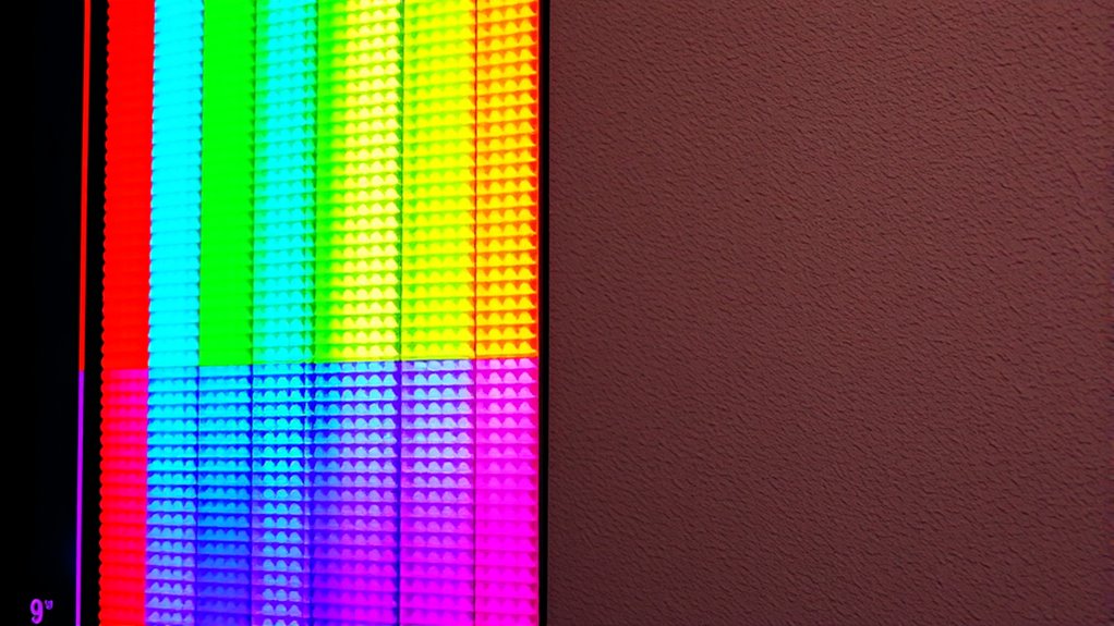
Digital displays bring RGB to life by directly emitting red, green, and blue light through tiny pixels. Each pixel combines these three colors at different intensities to produce a wide spectrum of hues. When you view a screen, your eyes blend the light from neighboring pixels, creating smooth gradations and vibrant images. The process relies on the additive color model, meaning that adding more light results in brighter colors. For example, full red, green, and blue lights combine to produce white. Your device’s graphics card controls the intensity of each color component for every pixel, ensuring accurate color reproduction. This real-time emission of light allows digital screens to display images, videos, and animations with vivid clarity and sharp detail, making RGB the ideal choice for electronic visual content.
The Printing Process and CMYK Color Model
When printing colors, the process relies on the CMYK color model, which combines four ink colors—cyan, magenta, yellow, and black—to produce a wide range of hues. During printing, your printer layers tiny dots of these inks onto paper, blending their colors to match the desired shade. This subtractive process absorbs light, so the more ink you add, the darker the resulting color. Black ink (K) is essential because it enhances depth and detail, and helps save on ink costs. The printer precisely controls how much of each ink is applied, creating smooth gradients and vibrant images. CMYK is specifically designed for physical media, ensuring colors appear accurately on printed surfaces. Proper color management is crucial to achieve consistent results across different print jobs, and understanding how color models work can significantly improve print quality. Additionally, mastering halftoning techniques allows for smoother color transitions and more detailed images in printed materials. Utilizing color profiles helps in maintaining color consistency across various devices and printers.
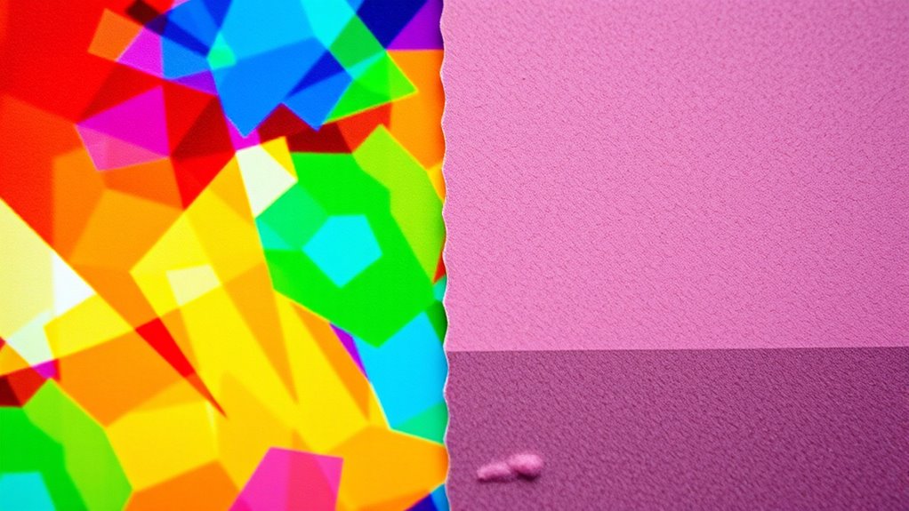
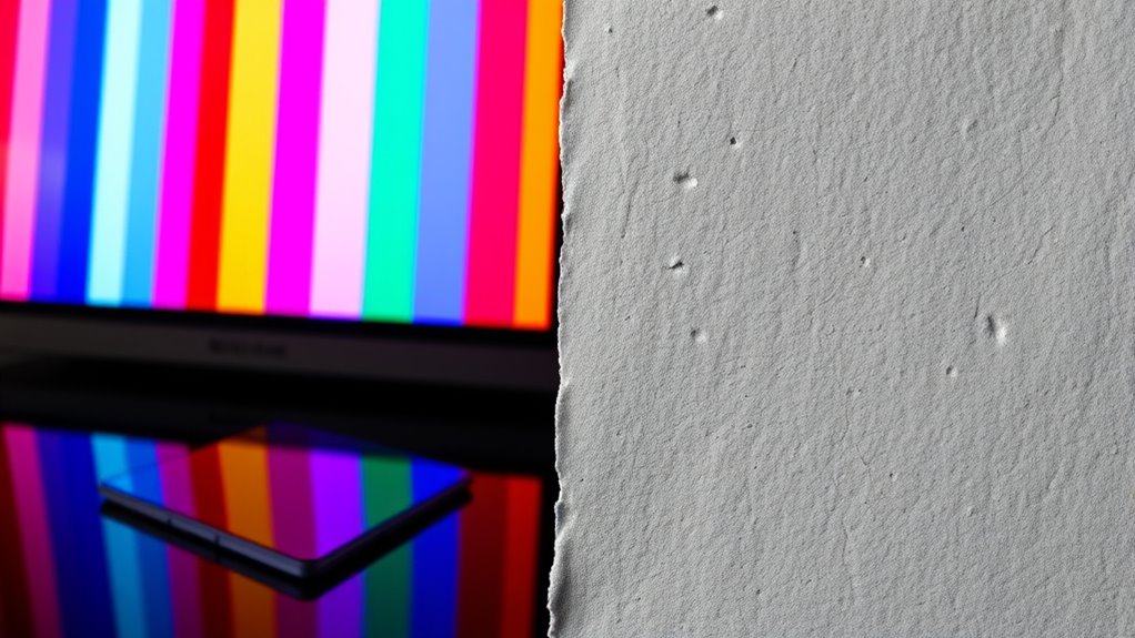
Visual Differences Between RGB and CMYK Colors
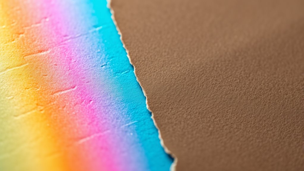
You’ll notice that RGB colors often appear brighter and more vibrant on screens, while CMYK colors may look duller in print. The color spectrum that each model covers also differs, affecting how accurately images are reproduced. Understanding these visual differences helps you choose the right color model for your project’s final appearance. Additionally, knowing the color gamut of each model ensures better color fidelity in your designs. Recognizing how color management impacts color consistency across devices further enhances your ability to produce accurate visual outputs. Moreover, the print color limitations of CMYK can influence the final look of printed materials, making it essential to consider when designing for both digital and physical formats. Being aware of device calibration techniques can also improve color accuracy across different mediums. Developing a solid understanding of cross-media color consistency can help ensure your colors look professional regardless of the output medium.
Color Brightness Variations
Have you ever noticed that colors look different depending on whether you’re viewing them on a screen or in print? This difference is partly due to how each color mode manages brightness. RGB colors on screens often appear brighter and more vibrant because they emit light directly. In contrast, CMYK colors in print tend to look duller and less intense, since they rely on reflected light. You might see a bright red on your monitor that appears muted when printed. This variation occurs because RGB combines red, green, and blue light at full intensity, creating a luminous effect. CMYK mixes cyan, magenta, yellow, and black inks, which absorb some light, reducing perceived brightness. Understanding these differences helps you predict how your colors will look across different media.
Spectrum Range Differences
The range of visible colors in RGB and CMYK modes varies considerably, affecting how vibrant or muted your images appear. RGB, being an additive color model, can produce bright, luminous colors by combining red, green, and blue light. In contrast, CMYK, a subtractive model, has a narrower color spectrum because it relies on ink absorption, limiting its vibrancy. You might notice that:
- RGB displays more saturated, eye-catching hues.
- CMYK often results in duller, more subdued tones.
- Some bright blues and greens in RGB are impossible to replicate in CMYK.
- Certain shades, like vivid oranges, are tricky to reproduce in print.
- The overall color gamut of RGB is larger than CMYK’s, restricting print color options.
Understanding these differences helps you anticipate how colors translate from screen to print.
Visual Accuracy in Prints
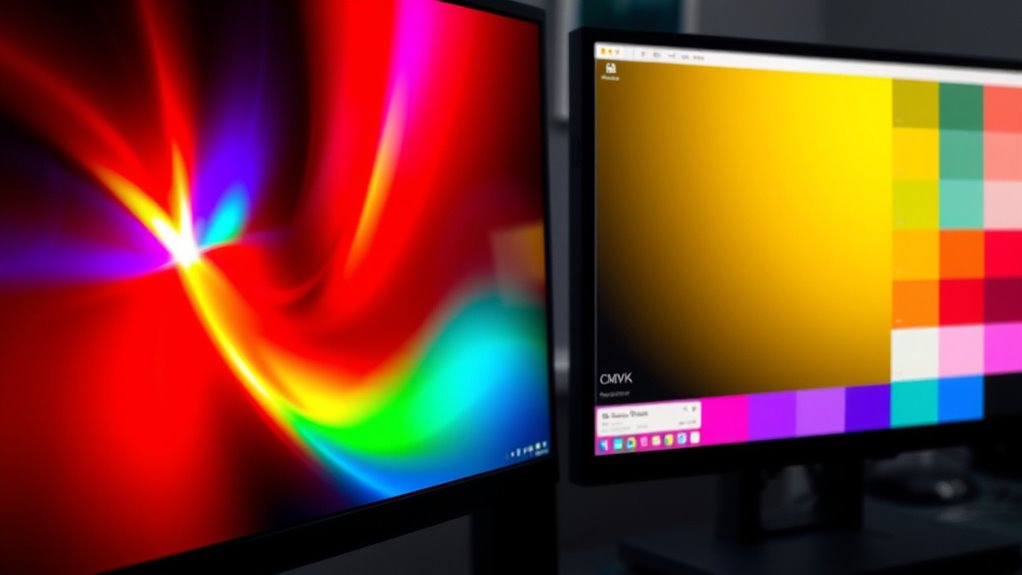
When converting digital images from RGB to CMYK for printing, color accuracy often becomes an issue. RGB displays a broader, more vibrant color range, so some colors may look duller or different once converted. You might notice bright reds or blues appearing muted or altered in print. CMYK’s color gamut is limited compared to RGB, meaning certain shades can’t be perfectly reproduced on paper. This discrepancy can lead to colors shifting, affecting the visual impact of your design. To minimize surprises, you should preview your colors in CMYK before printing and adjust hues accordingly. Understanding these differences helps you create more accurate proofs, ensuring your final print matches your expectations as closely as possible.
When to Use RGB for Your Projects
You should use RGB when your project is meant for digital displays, like websites or apps, because it’s optimized for screens. RGB offers a wider, more vibrant color range that makes images pop on electronic devices. If your work is primarily for web or screen-based use, sticking with RGB guarantees your colors appear as intended. Additionally, understanding Volkswagen Tuning concepts can help you customize digital graphics or branding elements to better match your vehicle’s aesthetic.
Digital Display Compatibility
Ever wonder which color mode is best for digital displays? RGB is your go-to choice because screens use red, green, and blue light to create colors. When designing for websites, social media, or digital ads, RGB ensures your colors appear vibrant and accurate. It’s optimized for devices like smartphones, tablets, monitors, and projectors that emit light directly. Use RGB when:
- Creating content for online platforms
- Designing digital banners and ads
- Developing apps and user interfaces
- Working on screen-based presentations
- Producing images meant for digital viewing only
RGB’s color range matches what screens can display, so your project will look lively and true to form. Choosing RGB for digital display projects guarantees your visuals look their best across all devices.
Vibrant Color Range
RGB’s wide color gamut makes it the ideal choice whenever your project demands vibrant, eye-catching visuals. This mode can display a broader spectrum of colors, making images pop with richness and depth. If you’re creating designs for digital screens, such as advertisements, social media graphics, or multimedia presentations, RGB guarantees your colors appear lively and true to life. Its ability to produce bright reds, electric blues, and vivid greens makes your visuals more engaging and appealing. Use RGB whenever color intensity and vibrancy are priorities, and your work will stand out on screens. Keep in mind, RGB is optimized for digital use, so for projects where vibrant display matters most, it’s the go-to color mode.
Web and Screen Use
Since digital displays are designed to showcase vibrant colors, RGB is the ideal choice whenever your project will be viewed primarily on screens, such as websites, social media, or multimedia presentations. RGB’s color model is optimized for digital devices, ensuring your visuals appear bright and accurate. Use RGB when:
- Creating web graphics and icons
- Designing social media content
- Developing multimedia presentations
- Building digital ads
- Producing videos or animations
RGB’s wide color gamut makes it perfect for screens, where vibrant, lively colors attract attention. Because screens emit light, RGB’s additive color mixing produces the brightest, most eye-catching results. When your project is intended for digital viewing, choosing RGB guarantees your colors will display as intended, providing a consistent, engaging experience for your audience.
When to Opt for CMYK in Printing
You should opt for CMYK when preparing designs specifically for professional printing, as it guarantees color accuracy and consistency on press. CMYK is the standard color mode used by most print shops because it aligns with the printing process itself. If you’re creating brochures, posters, or packaging, switching to CMYK ensures your colors will look as intended once printed. Using RGB for print can lead to unexpected color shifts, since RGB colors often fall outside the CMYK color gamut. Additionally, CMYK supports precise color control, which is indispensable for achieving brand consistency. When your project requires vibrant, true-to-life colors in physical form, selecting CMYK from the start helps avoid surprises and saves time during the final production stages.
Common Challenges in Color Conversion
Converting colors from RGB to CMYK often presents several challenges that can impact the final design. You might notice color shifts, where vibrant RGB hues appear duller or different once converted. This happens because CMYK has a narrower color gamut, limiting the range of reproducible colors. Additionally, you may encounter issues like:
Converting RGB to CMYK can cause color shifts and vibrancy loss due to limited color gamuts.
- Inconsistent color matching across different devices
- Loss of vibrancy in bright or neon shades
- Difficulties in accurately previewing print colors on screen
- Variations caused by different printer profiles and inks
- The need for manual adjustments to achieve desired results
These challenges require careful attention to detail and a good understanding of color management to ensure your final print closely matches your vision.
Tips for Accurate Color Representation
To make certain your colors look right, start by calibrating your devices regularly so they display accurate hues. Using proper color profiles helps maintain consistency across screens and printers, reducing surprises. Don’t forget to test your work with proofs before finalizing to catch any discrepancies early.
Calibrate Your Devices
Calibrating your devices is essential for achieving accurate color representation across screens and printers. Proper calibration ensures colors stay consistent, reflecting true tones and shades. To do this effectively:
- Regularly update your monitor’s firmware and calibration software
- Use a quality hardware calibration tool for precise adjustments
- Set your display’s brightness and contrast to ideal levels
- Keep your workspace lighting consistent to avoid color distortion
- Perform calibration in a neutral, controlled environment
Use Color Profiles
Using color profiles is indispensable for guaranteeing your digital and print outputs display consistent and accurate colors. When you embed the right color profile into your files, you communicate how colors should appear across different devices and mediums. This helps prevent unexpected shifts or dullness in your colors, keeping your design true to your intent. For digital work, sRGB is common, while CMYK profiles are essential for print projects. Always assign or embed the appropriate profile before saving or exporting your files. This ensures that whether you’re viewing on a screen or printing, colors stay true and predictable. Using color profiles minimizes surprises, saves time, and guarantees your final product matches your vision. For professional results, never skip this critical step.
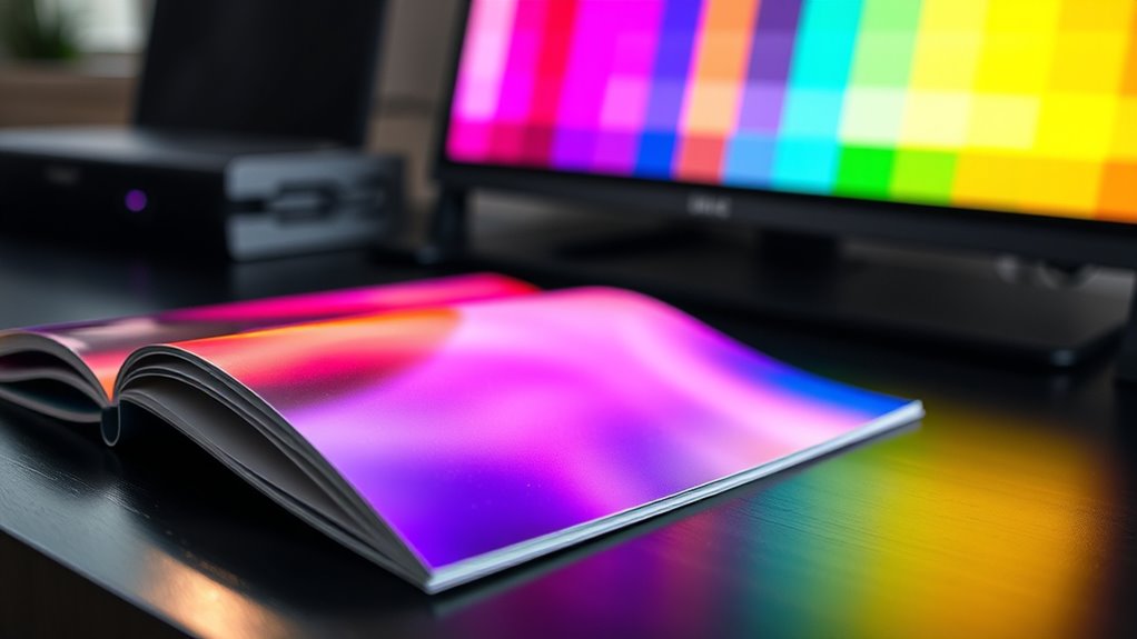
Test With Proofs
Testing your colors with proofs is essential for ensuring your digital designs translate accurately to print. By reviewing proofs, you can catch color discrepancies early and make necessary adjustments. Always use high-quality proofs that match your printing process to see true color representation. Consider soft proofs on your monitor to preview how colors will look in print, but remember they’re not perfect. When possible, request a physical proof from your printer to verify color fidelity. Pay attention to color consistency across different proofs, and compare them to your original design. Ultimately, communicate with your printer about color expectations and calibration. These steps help you avoid surprises, ensuring your final print matches your creative vision.
Choosing the Right Color Mode for Your Design

Choosing the right color mode is essential to guarantee your design looks its best in the final output. If you’re creating digital graphics, RGB is your best choice because it displays vibrant colors on screens. Use RGB for websites, social media, and digital presentations to ensure colors appear bright and accurate. On the other hand, if you’re designing for print, CMYK is the way to go. CMYK colors are optimized for printing presses and help prevent color discrepancies during production. Always consider your project’s final destination when selecting a color mode. Switching between modes later can cause color shifts, so select carefully from the start. Knowing where your design will be viewed or printed ensures your colors stay true and your work looks professional.
Frequently Asked Questions
How Do Color Profiles Affect RGB and CMYK Accuracy?
Color profiles play a vital role in ensuring your colors appear accurately across devices. They act as a map, guiding your software on how to display or print colors correctly. When you embed the right profile, RGB and CMYK colors match your intended look, reducing surprises in print or on screens. Without proper profiles, you risk color mismatches, making your images look different than expected.
Can Colors Look the Same in Both RGB and CMYK?
They say, “A picture is worth a thousand words,” but colors can’t always tell the same story across different formats. You might see colors look similar in RGB and CMYK, but they often aren’t exactly the same due to how each color mode processes colors. So, while they can appear close, subtle differences usually exist, especially in vivid or complex hues.
What Are the Best Software Options for Color Conversion?
When you need to convert colors between modes, Adobe Photoshop and Adobe Illustrator are your best options. They offer precise color management tools, allowing you to convert RGB to CMYK seamlessly. Also, CorelDRAW and Affinity Photo provide reliable alternatives with robust color conversion features. These programs let you preview colors accurately, ensuring your designs look consistent across print and digital media.
How Does Lighting Impact Perceived RGB and CMYK Colors?
Lighting substantially impacts how you perceive RGB and CMYK colors. In bright environments, colors appear more vibrant, especially RGB on screens, making images look lively. In dim or uneven lighting, colors seem dull or washed out, affecting your color judgment. For printed CMYK colors, proper lighting reveals true hues, while poor lighting can distort them. You should view colors under consistent, neutral lighting to accurately judge their appearance.
Are There Industry Standards for Color Matching Across Modes?
Like a maestro tuning an orchestra, you need standards to harmonize colors across modes. Industry standards such as Pantone guides, ISO color matching systems, and ICC profiles help you guarantee consistency whether you’re working in RGB or CMYK. These frameworks serve as your compass, aligning colors accurately across different devices and print processes, so your designs look consistent and professional regardless of the medium or mode you’re using.
Conclusion
Now that you understand the differences between RGB and CMYK, imagine your design coming to life—vivid and true to your vision. But will your colors stay consistent across screens and print? The choice you make can transform your project from stunning to disappointing. Stay sharp, ask questions, and consider your final medium carefully. Because in the world of color, the right mode could be the key to revealing perfection—are you ready to make the right call?