

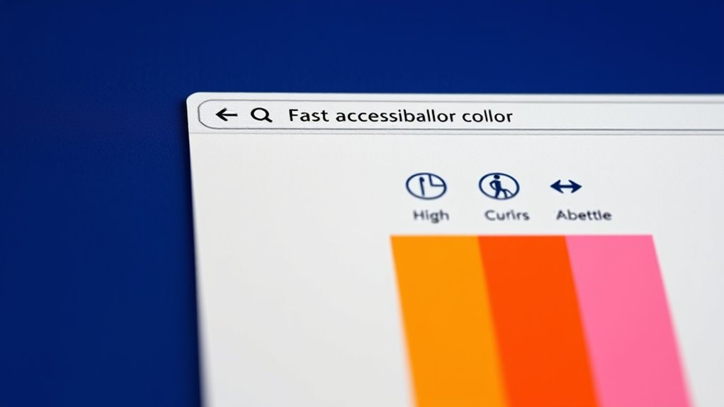
To guarantee color contrast accessibility, focus on choosing high-contrast color combinations, like dark text on a light background, and use tools like WebAIM’s Contrast Checker to verify that your colors meet WCAG standards. Avoid relying solely on color; add labels, icons, or patterns for clarity. Regularly test your design across devices and lighting conditions. Keep refining your choices to create inclusive, easy-to-read content—if you continue exploring, you’ll find practical tips to improve accessibility even further.
Key Takeaways
- Use contrast checker tools like WebAIM’s Contrast Checker to evaluate color pairings against WCAG standards.
- Aim for a minimum contrast ratio of 4.5:1 for normal text and 3:1 for large text to ensure readability.
- Select high-contrast color combinations, such as dark text on a light background, to improve visibility.
- Incorporate additional indicators like labels, icons, or patterns to supplement color cues.
- Regularly test and adjust colors across devices and lighting conditions to maintain consistent accessibility.
Understanding the Importance of Color Contrast in Web Accessibility

Have you ever struggled to read text on a website because the colors didn’t stand out enough? That’s a clear sign of poor color contrast, which can make content inaccessible to many users. When text and background colors don’t have enough contrast, people with visual impairments, including color blindness, may find it impossible to read or understand the content. Good color contrast helps users distinguish text from the background easily, reducing eye strain and improving overall readability. It also guarantees compliance with accessibility standards, demonstrating you value all users. Ignoring contrast can lead to frustration and exclusion, limiting your website’s reach. Unique and Wicked Planters and other innovative design elements can also influence how users perceive content based on visual clarity. Additionally, color contrast standards are essential for creating an inclusive digital environment. By understanding the importance of proper color contrast, you can create a more inclusive, user-friendly digital experience for everyone. Incorporating tools like contrast analyzers can help ensure your design meets these essential accessibility guidelines.
How to Measure and Evaluate Color Contrast Effectively
To guarantee your website meets accessibility standards, it’s essential to measure and evaluate color contrast accurately. Use contrast checker tools like WebAIM’s Contrast Checker or accessible color contrast analyzers. These tools compare your text and background colors against established guidelines, such as WCAG 2.1. When testing, input your color codes and review contrast ratios; aim for at least 4.5:1 for normal text and 3:1 for large text. Always verify on different devices and screens, as colors can appear differently. Regularly evaluate your color schemes during design updates or content changes to maintain compliance. Remember, measurement is an ongoing process that ensures your site remains accessible to all users, especially those with visual impairments. Accurate evaluation helps create a more inclusive online experience. Additionally, understanding paint sprayer technology can inform design choices in accessible visual elements.
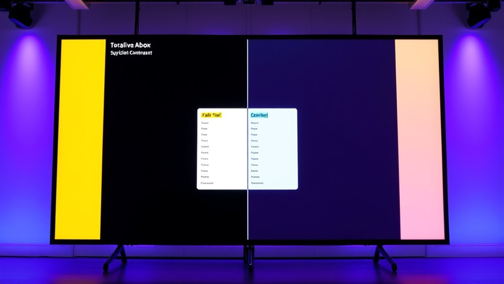
Best Practices for Choosing Accessible Color Combinations
Choosing accessible color combinations is essential for guaranteeing your website is inclusive to all users. To do this, select high-contrast pairings, such as dark text on a light background or vice versa. Stick to color combinations that meet WCAG contrast guidelines, aiming for a ratio of at least 4.5:1 for normal text. Avoid relying solely on color to convey information; use text labels, patterns, or icons alongside colors. Keep color schemes simple and consistent throughout your site to reduce confusion. Test your choices by viewing your site in different lighting conditions and on various devices. Remember, simplicity and clarity help users with visual impairments navigate your content comfortably. Prioritizing these best practices ensures your design remains accessible and user-friendly for everyone. Additionally, understanding Greek Sceptic principles can help you approach design with a critical eye towards inclusivity and usability. Incorporating color contrast guidelines from established standards can further enhance your site’s accessibility and ensure compliance. Regularly reviewing and updating your color schemes based on user feedback can also help maintain an inclusive experience for all visitors. Being aware of visual impairments when designing color schemes can help you create more inclusive digital environments. Moreover, utilizing accessible testing tools can assist in identifying potential contrast issues before launch.
Tools and Resources for Testing Color Accessibility
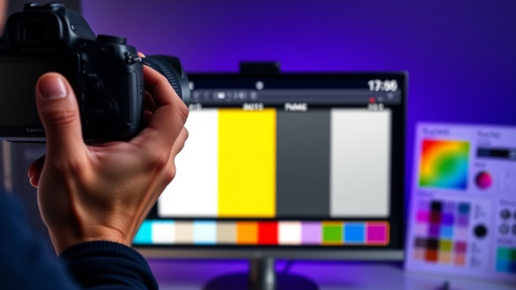
Using the right tools is essential for accurately evaluating your website’s color accessibility. They help identify contrast issues quickly and guarantee compliance with accessibility standards. You can start with browser extensions like the Color Contrast Analyzer or WAVE, which provide instant feedback on color contrast ratios. Online tools such as WebAIM’s Contrast Checker allow you to test specific color combinations easily. Additionally, color blindness simulators like Coblis help you see how your site appears to users with different vision impairments. These resources enable you to make informed adjustments, guaranteeing your content is accessible to all. Incorporating accessible color schemes ensures your site accommodates diverse visual needs and enhances overall user experience. To further improve your accessibility, consider testing with real users to gather valuable feedback on visual clarity and usability. Regularly updating your contrast testing methods helps maintain compliance as design elements evolve. Staying informed about color contrast standards ensures your website remains inclusive and compliant with evolving guidelines, while also considering the importance of eye patch benefits for overall skin health and appearance.
Implementing Adjustments to Enhance Readability and Inclusivity
After testing your website’s color contrast with reliable tools, the next step is implementing adjustments that improve readability and guarantee inclusivity. Start by refining your color choices to meet accessibility standards. Use high-contrast combinations for text and background, ensuring all users can read content easily. Consider font size, weight, and style to boost clarity. Incorporate accessible design elements like borders or shadows for important buttons and links. Below is a helpful guide:
| Element | Recommended Adjustment | Purpose |
|---|---|---|
| Text Color | Use high contrast with backgrounds | Improve readability |
| Background Colors | Opt for neutral or solid hues | Reduce visual noise |
| Buttons & Links | Add borders or shadows | Enhance visibility and accessibility |
| Font Styles | Choose clear, legible fonts | Increase comprehension |
Implementing these adjustments ensures your site is welcoming and accessible to all users. Remember that visual accessibility is a key component of inclusive web design. Additionally, understanding relationships and the nuances of personality can inform how you design for diverse user needs, fostering a more empathetic and inclusive digital environment. Recognizing contrast principles can further optimize your design for readability and user engagement.
Frequently Asked Questions
How Does Color Contrast Affect Users With Color Vision Deficiencies?
You need to understand that color contrast directly impacts users with color vision deficiencies. When contrast is low, they might struggle to distinguish between text and background, making content hard to read. By increasing contrast, you help these users access information more easily and navigate your site confidently. Good contrast ensures your content is inclusive, reducing visual barriers and creating a better experience for everyone, regardless of their vision abilities.
Are There Specific Standards or Guidelines for Color Contrast Accessibility?
Imagine your website as a vibrant painting; if colors clash or fade, viewers struggle to see the masterpiece. You need to follow specific standards like WCAG (Web Content Accessibility Guidelines), which set clear contrast ratio benchmarks—at least 4.5:1 for regular text and 3:1 for large text. These guidelines act as your compass, ensuring everyone, regardless of vision, can appreciate your content clearly and comfortably.
Can High Contrast Colors Negatively Impact Website Aesthetics?
High contrast colors can sometimes make your website look harsh or uninviting, which might detract from its overall aesthetic appeal. If you choose colors that are too stark or clash, visitors may find the design jarring. To balance accessibility and aesthetics, opt for high contrast that’s subtle yet effective, like soft darks and light shades. This way, you maintain readability without sacrificing visual harmony.
How Often Should Color Contrast Be Re-Evaluated During Website Updates?
You should re-evaluate your website’s color contrast whenever you make significant updates, such as changing layouts, adding new content, or updating branding. Regular checks, at least once every few months, help guarantee accessibility standards are maintained. Keep in mind that user feedback and accessibility tools can also guide you when adjustments are needed. Staying proactive ensures your site remains inclusive and easy to navigate for all users.
What Are Common Mistakes to Avoid When Implementing Color Contrast Adjustments?
Like walking a tightrope, you need to avoid common pitfalls when adjusting color contrast. Don’t rely solely on automatic tools; always double-check with real users or accessibility tools. Avoid choosing colors that clash or don’t meet contrast standards—think of it as mixing paint colors carefully. Don’t forget to take into account users with visual impairments, and test across devices. Staying mindful prevents your site from becoming a visual minefield.
Conclusion
By prioritizing proper color contrast, you create a website that’s as welcoming as a bright sunny day. You’ll make content easier to read, ensuring everyone can access and enjoy your site. Remember, testing and adjusting colors is just like fine-tuning an instrument—small changes make a big difference. Keep accessibility in mind, and your site will shine for all users, no matter their vision. Your effort transforms your site into an inclusive space that everyone can appreciate.