
To create responsive grids with CSS Grid, start by setting your container with `display: grid`. Use flexible units like `fr`, along with `auto-fill` or `auto-fit` combined with `minmax()` in `grid-template-columns`, so your layout adjusts smoothly to different screen sizes. Incorporate media queries to tweak the grid further on smaller or larger devices. Mastering these techniques helps you build adaptable, visually appealing layouts—keep exploring to unseal more design possibilities.
Key Takeaways
- Use `display: grid;` on the container to activate CSS Grid layout.
- Implement `grid-template-columns: repeat(auto-fit, minmax(150px, 1fr));` for adaptive, flexible columns.
- Utilize `fr` units to distribute remaining space proportionally across grid items.
- Incorporate media queries to adjust grid structure for different screen sizes and orientations.
- Maintain consistent gaps with `grid-gap` to ensure visual spacing across responsive layouts.
Understanding the Basics of CSS Grid

To understand CSS Grid, you need to grasp its fundamental concept: a two-dimensional layout system that allows you to create both rows and columns simultaneously. At the core is grid line nomenclature, which labels the lines between grid cells, making positioning precise and straightforward. You define the structure using properties like grid-template-rows and grid-template-columns, specifying sizes for each. Additionally, grid template areas let you assign named sections to parts of your layout, making it easier to visualize and organize content. By understanding how grid lines and areas work together, you gain control over your layout’s structure, enabling you to craft complex, responsive designs efficiently. This foundational knowledge sets the stage for more advanced grid techniques, and understanding how high refresh rates influence visual performance can be beneficial when designing interfaces that incorporate images or videos. Furthermore, considering environmental considerations ensures that your design choices promote sustainability and user comfort. Incorporating best practices in software quality assurance can help you maintain consistency and reliability in your CSS implementations, leading to a more robust design.
Setting Up a Simple Responsive Grid

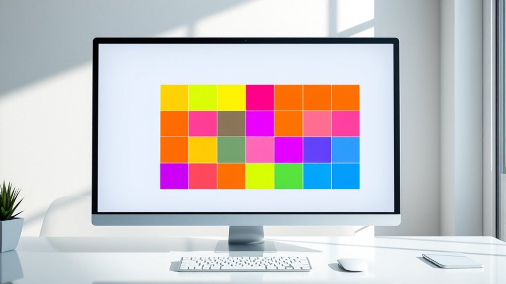
Now that you understand the basics of CSS Grid, setting up a simple responsive grid becomes straightforward. Start by defining a container with `display: grid;`. Use the `grid-template-columns` property to specify the number of columns, like `repeat(auto-fit, minmax(150px, 1fr))`, which makes the grid adapt to different screen sizes. Add a `grid-gap` to create space between items, ensuring the layout isn’t cramped. Imagine:
- Items lining up neatly, adjusting to the width of your screen
- Consistent spacing between each item
- A flexible structure that rearranges as you resize the browser window
- Incorporating responsive design principles ensures your grid works well on any device. Additionally, understanding how cookie categories impact user experience can help optimize your website layout for better engagement and performance. Utilizing CSS media queries can further enhance the responsiveness of your grid across various devices. Emphasizing adaptive layouts allows your design to provide optimal viewing experiences across a wide range of screen sizes and devices. Recognizing differing device capabilities can inform your layout choices to improve accessibility and usability.
Using Fr Units for Flexible Layouts
Using fr units in CSS Grid allows you to create flexible layouts that automatically adjust to available space. The fr unit advantage is its simplicity—each fr represents a portion of the remaining space, making it easy to distribute space evenly or proportionally. This approach enables a flexible grid design that adapts seamlessly as the viewport changes, ensuring your content remains balanced and visually appealing. Instead of fixed widths or heights, fr units respond dynamically, reducing the need for media queries or manual adjustments. By leveraging fr units, you can build grids that are inherently responsive, providing a smooth user experience across devices. Additionally, growing vehicle performance is known for their tuning upgrades, which can enhance your vehicle’s responsiveness similarly to how flexible grids improve layout consistency. When designing responsive layouts, considering Gold IRA options can also be beneficial for diversifying your investment portfolio while maintaining adaptability. Moreover, understanding how to optimize layout flexibility can further improve your website’s user experience, making your designs more intuitive and adaptable. Implementing these techniques ensures your layouts remain consistent across different screen sizes without sacrificing design integrity. This technique simplifies layout management while offering powerful control over how space is allocated within your grid.
Creating Auto-Filling and Auto-Fitting Grids
Building on the flexibility of fr units, you can create grids that automatically adjust the number of items displayed based on the available space. Using `auto-fill` and `auto-fit`, your grid dynamically adapts to container size, filling gaps seamlessly. When you specify `grid-template-columns: repeat(auto-fill, minmax(150px, 1fr));`, the grid populates with as many columns as fit, based on minimum and maximum sizes. The `grid gap` controls spacing between items, ensuring consistent gaps regardless of column count. You can also assign `grid line names` for easier placement and referencing of grid areas. Additionally, incorporating rustic decor elements can complement your grid layout by adding charm and character. Understanding responsive design principles helps optimize your layout for various devices and screen sizes, making your grid more adaptable and user-friendly. It is also essential to consider website performance metrics to ensure your grid layout loads efficiently and provides a smooth user experience. Imagine a layout where:
- Items fill the entire width, adjusting as the window resizes
- Gaps stay uniform, maintaining clean separation
- Grid lines are named to simplify item placement
Implementing Media Queries to Adapt Grid Layouts
Media queries enable you to modify your CSS grid layouts based on the device’s screen size or orientation, ensuring your design remains functional and visually appealing across all devices. By using media query strategies, you can target specific breakpoints where layout adjustments are necessary. Effective breakpoint management involves setting these thresholds to optimize readability and usability, whether on small smartphones or large desktops. You might change grid templates, adjust the number of columns, or modify spacing as the viewport size shifts. Incorporating responsive design principles within your CSS helps create flexible, adaptive grid systems that respond seamlessly to different devices. This approach helps maintain a consistent user experience and prevents layout issues caused by fixed designs, making your grid truly responsive across all screen sizes. Understanding media query techniques can further enhance your ability to craft layouts that adapt dynamically to user environments. Additionally, understanding market trends can guide you in designing layouts that meet evolving user expectations. Employing fluid grids can further enhance adaptability, ensuring your layout remains cohesive even on irregular or changing screen sizes.
Aligning Items Within CSS Grid
Aligning items within a CSS Grid allows you to control how content is positioned inside grid cells, ensuring your layout looks polished and organized. You can adjust vertical alignment and item distribution to achieve the desired visual effect. Imagine your grid as a collection of boxes where you decide:
Master CSS Grid alignment to create polished, balanced layouts with precise control over item positioning.
- How items align vertically, from top to bottom, like aligning books on a shelf.
- How they distribute horizontally, spacing evenly or clustering together.
- The overall flow, whether items are centered, stretched, or aligned to one side.
Using properties like `align-items`, `justify-content`, and `align-self`, you fine-tune the placement of individual items or entire rows and columns. This level of control helps create balanced, visually appealing grid layouts that adapt seamlessly to your design needs. Additionally, understanding content alignment within CSS Grid can improve your responsiveness and overall user experience. Recognizing the importance of layout consistency can help prevent layout issues caused by inconsistent item placement. Furthermore, implementing safe layout practices can help protect your layout integrity from malicious exploits.
Overlapping Grid Items and Layering Content

When designing complex layouts with CSS Grid, overlapping items and layering content become essential tools for creating depth and visual interest. By overlapping grid items, you can produce dynamic compositions where elements appear to stack or float over each other. Use the grid-area property or grid lines to precisely position overlapping items, controlling their placement and order. Layering content can be achieved with the z-index property, which determines the stacking order of overlapping elements. This technique allows you to highlight specific items or add visual layers that guide the viewer’s eye. Overlapping grid items and layering content enable you to craft more engaging, multidimensional layouts that break free from flat grid structures, adding sophistication and visual appeal to your designs. Additionally, understanding visual layering can help improve the overall clarity and aesthetic appeal of your responsive grid layouts. Recognizing how layering techniques influence user perception can further enhance the effectiveness of your design.
Enhancing Accessibility With Grid Structures
You can make your grid layouts more accessible by establishing a clear visual hierarchy, guiding users effortlessly through your content. Ensuring smooth keyboard navigation helps all users interact with your site without frustration. Additionally, designing with screen readers in mind guarantees that your content is understandable and easy to follow for everyone.
Clear Visual Hierarchy
Establishing a clear visual hierarchy is essential for making your grid structures more accessible, as it guides users’ attention and helps them understand content relationships. By emphasizing priority elements, you improve content prioritization and overall usability. To achieve this, consider arranging your grid with:
- Larger, bolder headings that immediately draw focus
- Strategic spacing to differentiate sections and guide flow
- Consistent alignment to create a cohesive, easy-to-follow layout
These techniques help users quickly identify key information, making your grid more intuitive. A well-defined visual hierarchy ensures that important content stands out, reducing confusion and enhancing accessibility. When you prioritize content effectively, your grid becomes a clear, user-friendly structure that communicates its message efficiently.
Keyboard Navigation Ease
Ensuring keyboard navigation is seamless within your CSS Grid layout is essential for making your website accessible to all users. You can improve this by implementing intuitive keyboard shortcuts that allow users to move efficiently between grid items. Focus management plays a key role; by carefully controlling which element receives focus, you prevent disorientation and guarantee a smooth navigation experience. Use logical tab order and avoid hidden or inaccessible elements that can disrupt flow. Structuring your grid with clear, predictable navigation paths helps users locate content quickly. When designing, test keyboard interactions thoroughly, adjusting focus indicators and shortcuts as needed. This approach guarantees that keyboard users can navigate your site comfortably, making your grid both functional and inclusive.
Screen Reader Compatibility
Implementing a well-structured CSS Grid not only benefits keyboard navigation but also considerably improves screen reader compatibility. Properly labeled grid items help screen readers identify content clearly, enhancing user understanding. Use screen reader labels to assign descriptive names to grid sections, ensuring users grasp the layout’s purpose. Additionally, managing keyboard focus effectively guides users through the grid, making navigation intuitive. Visualize a grid where each cell is like a labeled room, easily identified by a screen reader, or a pathway that guides a user smoothly from one section to another. Think of it as:
- Clear labels that tell users what each section contains
- Logical focus order that flows naturally
- Distinct roles and ARIA labels for each grid area
This combination creates an accessible, seamless experience for all users.
Tips for Optimizing Performance and Maintainability
To keep your CSS Grid layouts running smoothly as they grow in complexity, focus on writing clean, modular code and avoiding unnecessary calculations. Performance optimization starts with simplifying your grid definitions and limiting complex selectors. Use maintainability strategies like consistent naming conventions and commenting to make updates easier later. Break large grids into smaller, reusable components, reducing code duplication. Here’s a quick example:
| Tip | Benefit | Implementation |
|---|---|---|
| Use shorthand properties | Reduces code length | grid-template-columns: repeat(3, 1fr); |
| Avoid deep nesting | Improves rendering speed | Keep grid containers flat |
| Cache calculations | Speeds up rendering | Store computed values outside CSS |
These tips help you create efficient, manageable CSS Grid layouts.
Frequently Asked Questions
How Do CSS Grid and Flexbox Differ in Layout Design?
When you compare CSS Grid and Flexbox, you’ll see they differ in layout design. Flexbox is great for one-dimensional layouts, handling row or column alignment easily. CSS Grid, on the other hand, excels in two-dimensional grid alignment, offering extensive grid customization options. Use Flexbox for simple, linear arrangements, but choose CSS Grid when you need complex, multi-row and column layouts with precise control over positioning and spacing.
Can CSS Grid Be Used Alongside Other CSS Layout Techniques?
Think of your layout as a city with different neighborhoods. You can combine CSS Grid with techniques like Flexbox for grid layering or grid nesting, creating complex, adaptable designs. I once used nested grids for a portfolio site, seamlessly integrating with Flexbox for navigation. Yes, you can mix them, leveraging each method’s strengths to craft versatile, responsive layouts that adapt to your content needs and screen sizes.
What Are Common Pitfalls When Creating Responsive CSS Grids?
When creating responsive CSS grids, you should watch out for common pitfalls like improper handling of grid gaps, which can cause uneven spacing or layout issues. Overlapping items might occur if you don’t carefully define grid areas or item positions. To avoid these problems, test your grid across different screen sizes, and adjust gaps and item placements accordingly, ensuring a smooth, adaptable layout that maintains clarity and responsiveness.
How Do I Troubleshoot Grid Layout Issues Across Browsers?
Think of troubleshooting grid layout issues as gently guiding a ship through tricky waters. You should first check browser compatibility, as some browsers may not support all CSS Grid features fully. Use grid debugging tools like browser developer tools to inspect your layout and identify inconsistencies. Testing across multiple browsers helps you spot differences early, making it easier to adjust your code for a smooth, consistent experience everywhere.
Are There Accessibility Considerations Specific to CSS Grid?
When considering accessibility with CSS Grid, you should focus on keyboard navigation and color contrast. Guarantee your grid layout allows users to navigate logically with a keyboard, avoiding focus traps. Use sufficient color contrast to meet accessibility standards, helping users with visual impairments differentiate content easily. Testing your grid with assistive technologies ensures that all users can access and interact effectively. Prioritize these aspects for an inclusive, accessible design.
Conclusion
Mastering CSS Grid lets you craft flexible, responsive layouts that adapt seamlessly to any device. As the saying goes, “A stitch in time saves nine”—investing time now to understand grid fundamentals saves headaches later. With these techniques, you’ll create stunning, efficient designs that elevate user experience. Keep experimenting, stay curious, and remember that well-structured grids turn chaos into order, making your websites both beautiful and functional.