
Mastering negative space in graphic design means understanding how to intentionally use empty areas to enhance your visuals. Focus on recognizing how shapes interact and where the eye naturally rests. Balance positive and negative space to create harmony, while also exploring hidden imagery or messages embedded within the design. Use tools, practice, and analyze successful examples to sharpen your skills. Keep exploring these concepts further to reveal your full creative potential.
Key Takeaways
- Recognize and analyze shape relationships to identify opportunities for creative negative space usage.
- Balance positive and negative areas to create harmony, clarity, and visual impact.
- Use negative space to embed hidden images or messages that enhance storytelling and brand identity.
- Guide viewer attention by strategically framing focal points with negative space.
- Experiment with shape interactions and overlays to develop dual imagery and deepen visual engagement.

Japanese Design Motifs: 4,260 Illustrations of Japanese Crests
As an affiliate, we earn on qualifying purchases.
As an affiliate, we earn on qualifying purchases.
Understanding the Concept of Negative Space

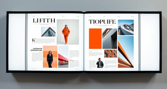
Have you ever noticed the empty areas around and between the main subjects in a piece of artwork? That’s negative space. It’s not just blank or unused; it’s an active part of the composition. Negative space helps define the main subjects and creates a balance that guides your eye. Think of it as the breathing room that makes the focal points stand out more effectively. Understanding negative space means recognizing that it isn’t just background—it’s a design element that shapes how viewers interpret the piece. By paying attention to these empty areas, you can enhance your designs, making them more dynamic and engaging. In outdoor environments, such as camping locations, negative space can be compared to the open natural areas that highlight the landscape’s features. Mastering negative space involves seeing it as an essential tool, not just empty filler, and learning how to use it intentionally.

Mr. Pen- House Plan, 3 pcs, Interior Design and Furniture Templates
3 Pc Architect Drawing And Interior Design Template Set (Scale: 1/4 Inch = 1 Ft): House Plan Template,…
As an affiliate, we earn on qualifying purchases.
As an affiliate, we earn on qualifying purchases.
The Psychological Impact of White Space in Design

White space makes your design easier to understand by clarifying the message. It also directs viewers’ attention to key elements and creates a sense of calm. Plus, the right amount of negative space can evoke strong emotional reactions that resonate with your audience. Incorporating interior design principles like layering textures and colors can further enhance the emotional impact of your layout. Additionally, incorporating ethical hacking principles such as thorough reconnaissance can also help ensure your design effectively communicates its intended message. Developing an awareness of Cultural Intelligence can help designers better understand diverse audience preferences and create more inclusive visuals. Recognizing the influence of sound healing science can also inspire calming auditory elements that deepen viewers’ engagement. Understanding the importance of balance and proportion in visual elements ensures harmonious and effective compositions.
Enhances Visual Clarity
When used effectively, negative space can markedly improve a design’s visual clarity by guiding your viewer’s attention and reducing clutter. White space acts as a visual pause, allowing important elements to stand out without overwhelming the eye. It helps distinguish different sections and creates a sense of order, making it easier for viewers to process information quickly. Clear, uncluttered designs prevent confusion and fatigue, encouraging viewers to engage longer. By balancing elements with ample negative space, you create a clean, organized layout that communicates your message more effectively. This simplicity enhances the overall readability and comprehension, ensuring your audience quickly grasps the key ideas. Ultimately, strategic use of negative space sharpens your design’s clarity, making your message more impactful. Staying informed about current events can also influence your design choices by providing context and relevance to your visuals in Indonesia. Additionally, understanding mental wellbeing can help designers create visuals that evoke positive emotional responses and connection. Incorporating predictive modeling in educational data mining can also inform the way you interpret audience reactions and preferences, leading to more effective designs. Recognizing the importance of visual hierarchy further ensures that viewers’ attention is directed to the most critical parts of your design first, enhancing overall communication. Furthermore, awareness of AI in education trends can inspire innovative visual concepts that resonate with contemporary audiences.
Guides Viewer Focus
Because of its psychological impact, white space naturally directs your attention to key elements within a design. When you use ample negative space around important components, your viewers instinctively focus on those areas. White space acts as a visual cue, guiding the eye toward what matters most, such as a call-to-action or a striking image. It reduces clutter, making the layout easier to process and less overwhelming. Effective use of negative space creates a clear hierarchy, emphasizing focal points without distractions. By strategically placing negative space, you create a clear structure that guides viewers effortlessly through the design. This intentional use of white space helps viewers navigate your design effortlessly, ensuring they notice the intended message first. Additionally, WWE Raw’s financial impact exemplifies how strategic presentation and emphasis can elevate the perceived importance of content, similar to how negative space emphasizes key design elements. Ultimately, thoughtful negative space mastery keeps your audience engaged by subtly guiding their focus exactly where you want it, similar to how interior design involves planned spatial arrangements to enhance functionality and aesthetics. Incorporating visual hierarchy principles ensures that the most important elements stand out through effective use of negative space. Recognizing how psychological impact influences viewer behavior is essential for creating compelling compositions.
Evokes Emotional Response
Have you ever noticed how certain designs evoke feelings of calm or excitement without explicit cues? White space influences emotions by creating a sense of openness or tension. A spacious layout can make your audience feel relaxed and comfortable, while crowded designs might generate urgency or anxiety. Effective use of negative space guides the viewer’s mood, shaping their overall experience. Here’s a quick look at how white space impacts emotions:
| White Space Effect | Emotional Response |
|---|---|
| Spaciousness | Calm, relaxed |
| Cluttered | Anxiety, stress |
| Balance | Confidence, clarity |
| Tension | Excitement, anticipation |
Utilizing eye patch benefits in design can also create visual relief, much like white space does in visual compositions.
![Stencil Stop Personalized Custom Stencils for Spray Painting - Customizable for Logos, Businesses, Images - 14 Mil Mylar Plastic [2 x 2 inches]](https://m.media-amazon.com/images/I/516SUFTfVhL._SL500_.jpg)
Stencil Stop Personalized Custom Stencils for Spray Painting – Customizable for Logos, Businesses, Images – 14 Mil Mylar Plastic [2 x 2 inches]
THOUSANDS OF USES: We make our stencils from thick, durable, and reusable 14 mil mylar plastic – the…
As an affiliate, we earn on qualifying purchases.
As an affiliate, we earn on qualifying purchases.
Techniques for Identifying Negative Space in Your Projects

To spot negative space effectively, start by recognizing visual cues like gaps or empty areas that define shapes. Analyzing how different elements relate to each other helps reveal hidden negative spaces. You can also get creative by experimenting with negative space to enhance your design’s overall impact.
Recognize Visual Cues
Recognizing visual cues is essential for identifying negative space effectively. By training your eye to spot subtle cues, you can better distinguish the background from the main subject. Look for areas where shapes seem to flow into one another or where gaps form naturally within the design. These cues often reveal negative space that enhances the overall composition. To sharpen your skills, focus on these key techniques:
- Observe how shapes interact and create gaps or overlaps.
- Identify areas where the eye naturally rests or is drawn away from the main elements.
- Pay attention to balance and symmetry, which often highlight negative space.
Mastering these cues allows you to control negative space intentionally, elevating your design’s clarity and visual impact.
Analyze Shape Relationships
Analyzing shape relationships is a powerful way to uncover negative space within your designs. By examining how different shapes interact, you can identify areas where space naturally forms around or between objects. Look at the silhouettes and consider how shapes connect or contrast. Notice the gaps or overlaps, as these often create hidden images or secondary forms. Pay attention to the balance between positive and negative areas; sometimes, negative space can be as prominent as the main shapes. Use overlays or transparency tools to see how shapes relate to each other. Breaking down complex designs into simpler parts helps reveal underlying spaces you might have missed. Developing this skill sharpens your eye for subtle negative space opportunities, elevating your overall design composition.
Use Negative Space Creatively
When you actively seek negative space in your designs, you can open creative possibilities that enhance visual interest. Recognizing negative space isn’t just about leaving empty areas; it’s about shaping them into meaningful elements. To use negative space creatively, try these techniques:
- Create Hidden Images: Use negative space to embed subtle shapes or messages that viewers discover upon closer inspection.
- Balance Composition: Adjust the size and placement of negative space to guide the viewer’s eye and establish harmony.
- Enhance Iconography: Design icons that cleverly incorporate negative space to communicate dual meanings or add visual intrigue.

Area, Volume & Perimeter Visual Learning Guides, Set/5-4-Panel, 11" x 17" Laminated Guides, Full-Color Graphic Overview, Write-On/Wipe-Off Activities
4-Panel, 11" x 17" laminated guides provide graphic overview of key, standards-based concepts
As an affiliate, we earn on qualifying purchases.
As an affiliate, we earn on qualifying purchases.
Balancing Positive and Negative Space for Visual Harmony

Achieving visual harmony involves carefully balancing positive and negative space within your design. When you allocate space thoughtfully, it guides the viewer’s eye smoothly across the composition. Too much positive space can feel cluttered or overwhelming, while excessive negative space might make the design appear empty or disconnected. Aim for a sense of equilibrium by adjusting the size, placement, and proportion of elements and the surrounding whitespace. Use negative space to frame your focal points, making sure they stand out without crowding the design. Incorporate consistent spacing to create rhythm and flow, helping your audience navigate the layout effortlessly. Ultimately, balancing positive and negative space ensures your design feels cohesive, professional, and visually pleasing.
Using Negative Space to Create Hidden Imagery and Messages

Using negative space creatively can add an extra layer of meaning to your designs by forming hidden imagery or messages. When you skillfully manipulate empty areas, you guide viewers to discover subtle visuals that enhance your message. To deepen your design, consider these tactics:
- Incorporate dual imagery where the negative space forms a secondary, meaningful shape or symbol.
- Embed hidden messages or initials within the negative space, encouraging viewers to look closer.
- Use negative space to suggest movement or emotion, adding an element of surprise or intrigue.
These techniques not only make your design more engaging but also invite viewers to interact with the visual narrative. Mastering this skill can elevate your work from simple visuals to thought-provoking, memorable pieces.
Common Mistakes to Avoid When Working With Negative Space

One common mistake is overcomplicating the negative space, which can confuse viewers rather than enhance your design. When negative space becomes cluttered or too busy, it distracts from the main message and diminishes clarity. Another mistake is neglecting balance; uneven use of space can make your design feel awkward. Additionally, avoid forcing negative space into shapes or messages where it doesn’t naturally fit, as this can appear forced or confusing. Finally, don’t ignore the importance of contrast. Without proper contrast between positive and negative space, your design can look flat or unclear. Here’s a quick overview:
| Mistake | Effect |
|---|---|
| Overcomplicating negative space | Confuses viewers |
| Neglecting balance | Creates awkward design |
| Forcing shapes into negative space | Looks forced or unclear |
| Ignoring contrast | Flat or lacks clarity |
| Cluttering negative space | Distracts from main message |
Tools and Software for Manipulating Negative Space
You can use vector graphic editors like Adobe Illustrator or Inkscape to precisely manipulate negative space in your designs. AI-powered design tools, such as Canva’s AI features or Adobe Sensei, help automate complex adjustments and improve accuracy. These tools make it easier to create clean, balanced compositions that effectively utilize negative space.
Vector Graphic Editors
Vector graphic editors are essential tools for manipulating negative space with precision and creativity. They allow you to create clean, scalable designs that highlight negative space effectively. With these tools, you can easily adjust shapes, paths, and layers to craft balanced compositions. To deepen your understanding, consider these features:
- Path editing tools – Enable you to refine shapes and seamlessly integrate positive and negative space.
- Layer management – Helps control overlapping elements and maintain clarity in complex designs.
- Boolean operations – Allow you to combine, subtract, or intersect shapes, shaping negative space precisely.
Mastering these features empowers you to craft compelling visuals that utilize negative space intentionally, elevating your design skills with accuracy and flexibility.
AI-Powered Design Tools
AI-powered design tools have revolutionized the way you manipulate negative space by automating complex tasks and providing intelligent suggestions. With features like automatic object detection and background removal, you can quickly isolate elements and experiment with different compositions. These tools analyze your design, offering real-time feedback on negative space balance and visual harmony. For example, AI can suggest ideal placements to improve flow or highlight overlooked areas needing adjustment. You no longer have to guess or rely solely on intuition; instead, you can leverage AI insights to refine your design intentionally. This technology accelerates your workflow, enhances creativity, and helps you achieve cleaner, more dynamic compositions. Embracing AI-powered tools empowers you to master negative space more efficiently and with greater precision.
Case Studies: Successful Use of Negative Space in Branding

Many successful brands have leveraged negative space to create memorable and impactful logos that stand out. You can see this in action with iconic examples that cleverly use empty space to add meaning or reveal hidden images. For instance:
Many brands use negative space creatively to make logos memorable and meaningful.
- FedEx: The arrow between the E and X symbolizes speed and precision, hidden in the negative space.
- Toblerone: The mountain within the bear’s shape hints at the Swiss Alps and Bern’s bear symbol.
- WWF: The panda’s black shapes form negative space to emphasize conservation and wildlife.
These brands demonstrate how negative space enhances storytelling, reinforces brand identity, and sparks curiosity. By studying their approaches, you gain insight into how strategic use of negative space elevates branding beyond simple visuals—making logos more memorable and meaningful.
Tips for Incorporating Negative Space in Logo Design

Incorporating negative space effectively requires a strategic approach that balances visual simplicity with clever hidden elements. First, identify the core message or symbol of your brand, then explore how negative space can subtly reinforce it. Use contrast carefully to ensure the hidden element is visible but not overpowering. Experiment with shapes and alignment to create dual images that engage viewers. Remember, minimalism often enhances impact, so avoid clutter. To guide your design process, consider this table:
| Step | Action | Tip |
|---|---|---|
| Concept Development | Brainstorm symbolic elements | Focus on clarity and relevance |
| Shape Exploration | Sketch multiple logo ideas | Play with negative space integration |
| Visual Hierarchy | Prioritize important elements | Keep negative space balanced and intentional |
| Refinement | Simplify and test designs | Ensure hidden elements are recognizable yet subtle |
This approach ensures your logo is memorable, clever, and visually balanced.
Practicing and Improving Your Negative Space Skills

To sharpen your negative space skills, consistent practice is essential. Regularly challenge yourself with new projects and analyze successful designs to identify effective negative space use. This helps you recognize patterns and develop your eye for balance. To deepen your understanding, consider these activities:
- Create multiple logo drafts, focusing solely on negative space integration.
- Study famous designs and dissect how negative space contributes to their impact.
- Experiment with contrasting shapes, testing how different arrangements influence visual perception.
Frequently Asked Questions
How Does Negative Space Influence Brand Perception?
Negative space greatly impacts how your brand is perceived because it directs attention and creates a sense of balance. When you effectively use negative space, your brand appears more sophisticated, clean, and memorable. It also helps to highlight key elements, making your message clearer. By paying attention to negative space, you influence how your audience perceives your brand’s professionalism and creativity, ultimately strengthening its identity and appeal.
Can Negative Space Be Used to Convey Complex Ideas?
Did you know that 70% of viewers process visual information faster than text? You can use negative space to convey complex ideas by highlighting key elements and creating visual metaphors. When you strategically design the space around your main subject, it guides viewers’ attention and suggests deeper meanings. So, yes, negative space isn’t just empty; it’s a powerful tool to communicate sophisticated concepts effortlessly.
What Are the Limitations of Negative Space in Design?
Negative space can be powerful, but it does have limitations. You might find it tricky to balance enough space so your message isn’t lost or too cluttered. Overusing it can make your design feel empty or incomplete. Also, relying too heavily on negative space might confuse viewers if they can’t easily grasp the idea you’re trying to communicate. Be mindful of these limits to create clear, effective designs.
How Does Negative Space Vary Across Different Cultures?
Imagine walking through a bustling market in Japan or a quiet village in Kenya; the spaces between objects tell different stories. Negative space varies across cultures—what feels open and balanced in Western design might seem cluttered or sacred elsewhere. You need to adapt your use of negative space, respecting cultural meanings, symbols, and aesthetics, to communicate effectively and create designs that resonate universally or locally.
Is Negative Space More Effective in Digital or Print Media?
You might find negative space more effective in digital media because it enhances clarity and focus on screens where users scroll and scan quickly. In print, negative space helps create a balanced, elegant look but can be limited by space constraints. Digital design benefits from ample negative space to improve readability and user experience, making it a powerful tool to guide viewers’ attention and communicate messages efficiently.
Conclusion
Think of negative space as the quiet pause in a conversation—it allows the main message to breathe and resonate. Mastering it is like learning to listen between the words, revealing hidden stories and creating harmony. As you refine your skills, you’ll craft designs that speak softly but leave a lasting impression. Embrace the silence in your work, for it’s where true creativity and meaning often dwell, waiting to be uncovered.