
Mastering Auto‑Layout in Figma helps you create flexible, responsive designs that adapt easily across devices. You’ll learn to set up containers with horizontal and vertical orientations, adjust spacing, alignment, and distribution, and nest layouts for complex structures. Properly managing overflow and constraints guarantees your designs stay organized and adaptable. Keep exploring these techniques, and you’ll discover how to build scalable components that streamline your workflow and elevate your designs.
Key Takeaways
- Understand foundational concepts like orientation, spacing, padding, and alignment to create flexible, responsive layouts.
- Use nested auto-layouts to build scalable, multi-level structures for complex components.
- Adjust spacing, alignment, and overflow controls to fine-tune layout organization and responsiveness.
- Design adaptable components with resizing options such as fixed, fill container, or hug contents.
- Regularly troubleshoot by verifying constraints, layer order, and content responsiveness to maintain layout effectiveness.
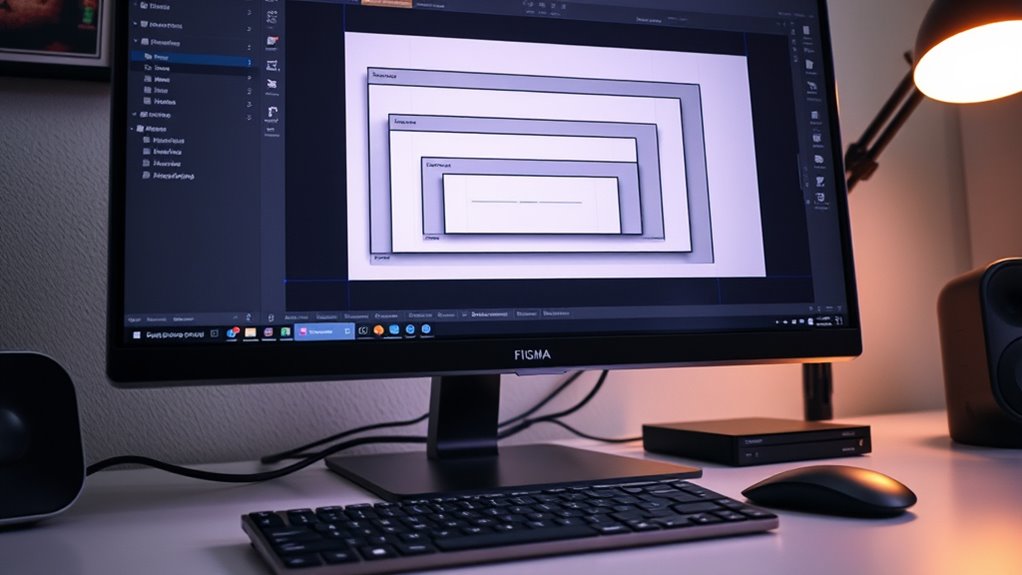
Understanding the Basics of Auto‑Layout in Figma
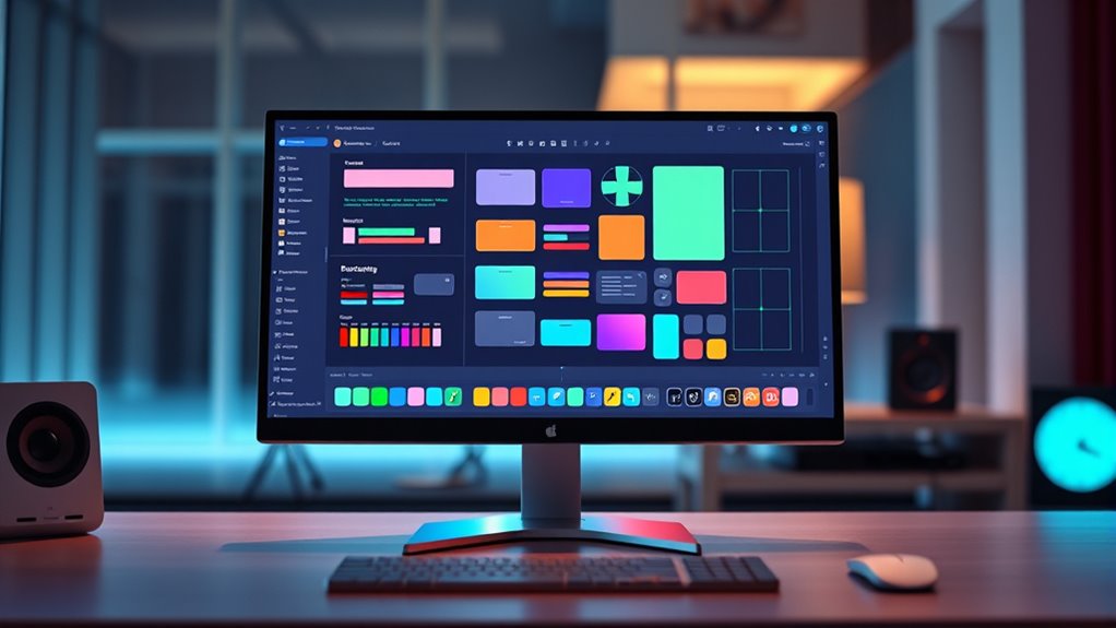
Auto‑Layout in Figma is a powerful feature that helps you create flexible and responsive designs effortlessly. It allows you to arrange objects automatically, so your layout adapts as you add, remove, or resize elements. When you enable Auto‑Layout, Figma treats your selected objects as a group that can be aligned, spaced, and resized uniformly. You can control the direction of your layout—horizontal or vertical—and set spacing between items with simple settings. Auto‑Layout also makes it easy to create components that adjust dynamically, saving you time and ensuring consistency. Additionally, understanding how contrast ratio impacts image quality can help you design more visually appealing and effective interfaces. By understanding these core principles, you gain the foundation needed to build more complex, adaptable designs that respond smoothly to different screen sizes and content changes. It’s also helpful to be aware of support hours for tools and resources, so you can troubleshoot issues efficiently when working on your projects.
Setting Up Auto‑Layout for Your Designs
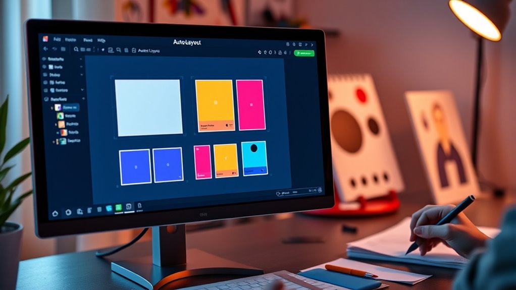
Setting up Auto‑Layout in your designs is straightforward and essential for creating flexible, responsive interfaces. To get started, select your frame or group, then click the Auto‑Layout button in the right sidebar. Adjust the direction—horizontal or vertical—based on your layout needs. You can also set padding around content and spacing between elements to control the overall look. Understanding how astrological signs influence perception can also help you design interfaces that appeal to different user personalities. Here are key steps to set up Auto‑Layout effectively: 1. Choose the container (frame or group) for your layout. 2. Set the orientation: horizontal or vertical. 3. Define padding to create space around your content. 4. Adjust spacing between items for consistent gaps. Incorporating space utilization techniques from home organization principles can also improve your design’s efficiency. Additionally, considering user-centered design principles ensures your layout remains functional and user-friendly. Mastering these steps ensures your designs adapt seamlessly across different screen sizes and responsive design principles enhance adaptability. Understanding Grocery Savings Strategies can also inspire you to optimize space and layout efficiency in your design work.
Adjusting Spacing, Alignment, and Distribution
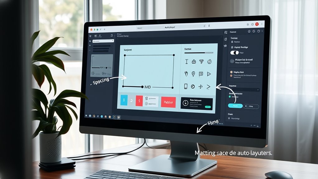
Once you’ve established your Auto‑Layout container, fine-tuning spacing, alignment, and distribution can dramatically improve your design’s clarity and balance. You can adjust spacing between items by changing the “Spacing” value, ensuring consistent gaps. To align content, use the “Alignment” options to position items vertically or horizontally, creating a cohesive look. Distribution controls how items spread within the container, whether evenly or based on specific constraints. For precise control, utilize padding to add space inside the container’s edges. Combining these adjustments helps you craft a clean, organized layout that guides the viewer’s eye naturally. Remember, small tweaks in spacing and alignment can make your design appear more polished and professional. Take your time fine-tuning these settings for ideal visual harmony. Additionally, considering the overall layout can help create a cozy bedroom atmosphere that feels inviting and well-balanced. Exploring Auto‑Layout principles can further enhance your understanding of how to optimize your designs for clarity and effectiveness, especially when integrating considerations like spacing and alignment for a harmonious result. Mastering these fundamental aspects of layout design allows you to create interfaces that are both aesthetically pleasing and highly functional. Incorporating sound recording techniques into your workflow can also improve the overall quality of your projects by ensuring clarity and fidelity.
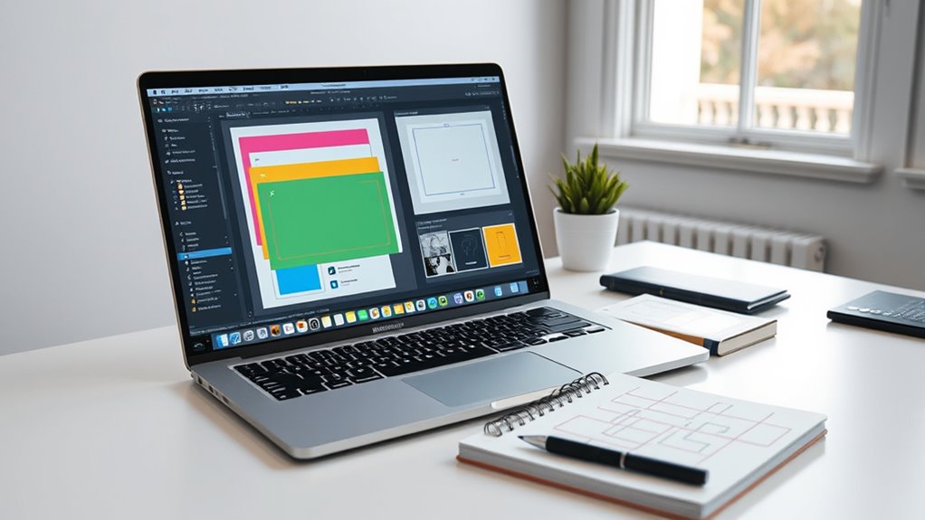
Nesting Auto‑Layouts for Complex Structures
Nesting auto‑layouts lets you build more complex and flexible designs. You’ll need to layer auto‑layouts effectively, manage overflow content, and create reusable structures. Mastering these techniques will make your designs more organized and adaptable. Incorporating visual cues can further enhance your understanding of structure relationships within nested layouts. Additionally, understanding symbolism and the significance of visual elements can help you design more intuitive interfaces. Exploring sound healing science concepts can also inspire innovative ways to approach visual harmony and balance in your design compositions. Being aware of potential pitfalls in adopting new payment technologies can help you anticipate challenges in integrating advanced features into your designs. Recognizing security considerations is also essential when designing interfaces that handle sensitive information, ensuring both usability and safety.
Layering Auto‑Layouts Effectively
To create complex layouts in Figma, layering auto‑layouts through nesting is essential. By nesting, you can combine different layout behaviors, creating flexible and organized structures. To do this effectively:
- Use separate auto‑layouts for distinct sections to maintain clarity.
- Vary direction and spacing settings within nested layers to achieve the desired flow.
- Keep nesting levels minimal to avoid complexity and performance issues.
- Regularly test your nested layouts to ensure responsiveness and alignment.
This approach allows you to build multi-layered designs that adapt seamlessly, making your interface more dynamic. Proper layering ensures each element maintains its structure and behavior, simplifying updates and adjustments down the line. Mastering nesting enhances your control over complex, professional layouts.
Managing Overflow Content
How can you effectively manage overflow content within complex layouts in Figma? The key is nesting auto‑layouts strategically. When content exceeds the size of a container, nesting auto‑layouts allows you to control how overflow is handled. You can set overflow behavior—clip, scroll, or auto—to determine whether excess content is hidden, scrollable, or expands the parent frame. By organizing elements into nested auto‑layouts, you maintain flexibility and keep your design tidy. This approach also helps in creating responsive designs that adapt smoothly to different content sizes. Additionally, using constraints within nested auto‑layouts ensures content aligns properly and responds predictably. Mastering nesting techniques allows you to build complex, scalable structures without sacrificing control over overflow behavior.
Creating Reusable Structures
Building reusable structures in Figma involves organizing your components with nested auto-layouts that can be easily adapted across different projects. This approach streamlines your workflow and guarantees consistency. To do this effectively, consider these key points:
- Break down complex sections into smaller, manageable auto-layout groups.
- Nest auto-layout frames to create flexible, multi-level structures.
- Use consistent spacing and alignment to maintain uniformity.
- Leverage components and variants within nested auto-layouts for maximum reusability.
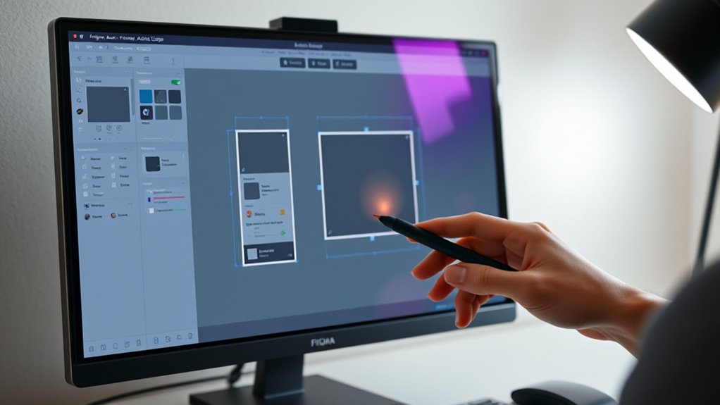
Best Practices for Responsive and Scalable Components
To create responsive and scalable components, you need to master flexible resizing techniques that adapt to different screen sizes. Maintaining consistent spacing strategies guarantees your design stays clean and predictable across various layouts. Using adaptive component structures helps you build versatile elements that scale smoothly without breaking your design system.
Flexible Resizing Techniques
Mastering flexible resizing in Figma guarantees your components adapt seamlessly across different screen sizes and layouts. To achieve this, leverage Figma’s auto-layout properties by adjusting resizing behaviors.
Here are key techniques:
- Set fixed or fill container for width and height to control how elements resize.
- Use “Hug contents” for components that need to adapt to their content size.
- Apply “Fill container” for elements that should stretch or shrink with the parent.
- Combine constraints with padding and spacing to maintain consistent layout regardless of size changes.
Consistent Spacing Strategies
Consistent spacing is essential for creating responsive and scalable components that look polished across various screen sizes. To achieve this, establish uniform margins and padding within your components, ensuring elements align neatly regardless of the layout’s size. Use Figma’s auto-layout properties to set fixed or proportional spacing between items, avoiding arbitrary gaps that can break visual harmony. Rely on consistent spacing tokens, like multiples of 8 or 4, to maintain a cohesive rhythm throughout your design system. Regularly check your spacing across different breakpoints to ensure uniformity. Remember, predictable spacing not only improves aesthetics but also enhances usability, making your components feel intentional and professional at any scale.
Adaptive Component Structures
Designing adaptive component structures is key to building responsive interfaces that work seamlessly across devices. To achieve this, you need to create flexible components that adjust automatically to different screen sizes. Consider these best practices:
- Use auto-layout frames to allow components to resize dynamically.
- Set constraints carefully to control how elements behave when scaled.
- Break down complex components into smaller, reusable parts for easier adaptation.
- Test your components across multiple frames and devices to guarantee consistency.
Troubleshooting Common Auto‑Layout Challenges
When working with Auto‑Layout in Figma, you might encounter issues like unexpected spacing, overlapping elements, or alignment problems. To fix spacing issues, check your padding and spacing settings—sometimes a small tweak makes a big difference. Overlapping elements often result from incorrect alignment or nested frames; ensure elements are properly grouped and aligned within their containers. If items aren’t aligning as expected, verify that constraints are set correctly—set to left, right, top, bottom, or center as needed. Also, review the order of layers, as stacking can affect layout. Remember to test your layout with different content sizes to ensure responsiveness. Troubleshooting involves systematically adjusting settings and understanding how Auto‑Layout properties interact, helping you create cleaner, more predictable designs.
Frequently Asked Questions
How Do I Switch Between Auto-Layout and Fixed Positioning?
To switch between auto-layout and fixed positioning in Figma, select your frame or element. If it’s set to auto-layout, you’ll see layout options in the right panel. To switch to fixed, click the “Remove auto-layout” button or uncheck auto-layout settings. Conversely, to enable auto-layout, click the “+” next to Auto Layout in the right panel. This way, you easily toggle between flexible and fixed positioning.
Can Auto-Layout Be Used With External Plugins in Figma?
You can definitely use auto-layout with external plugins in Figma. Many plugins are designed to work seamlessly with auto-layout frames, allowing you to automate tasks like resizing, spacing, or organizing components. Just guarantee the plugin supports auto-layout features and check its documentation. You might need to select your auto-layout frame first or follow specific plugin instructions to get the best results. This integration helps streamline your design process efficiently.
What Are the Limitations of Auto-Layout in Complex Designs?
Your curiosity about auto-layout’s limitations in complex designs is like trying to tame a wild beast. While it’s incredibly powerful, it struggles with highly nested or irregular structures, often requiring manual adjustments. Overly intricate layouts can cause performance issues or unpredictable behavior. You might find it challenging to perfectly align elements or maintain consistent spacing without extensive tweaks, making it less ideal for ultra-detailed or dynamic interfaces.
How Does Auto-Layout Affect Component Versioning?
Auto-layout impacts component versioning by making your components more adaptable but also more sensitive to changes. When you update an auto-layout component, variations can emerge if the layout settings differ, leading to inconsistencies across versions. You need to carefully manage spacing, alignment, and constraints to make certain your components stay consistent. This flexibility allows for easier updates, but it requires vigilance to maintain version control and design integrity.
Is There a Way to Animate Auto-Layout Adjustments?
You might wonder if you can animate auto-layout adjustments in Figma. While Figma doesn’t natively support direct animations of auto-layout changes, you can achieve smooth progressions by creating multiple frames that represent different states and then using prototype interactions to animate between them. Alternatively, third-party tools or plugins can help simulate animations, giving your designs a dynamic feel without complex coding.
Conclusion
Mastering Auto‑Layout in Figma empowers you to create flexible, responsive designs effortlessly. By understanding its basics, setting it up correctly, and nesting layouts, you can build scalable components that adapt seamlessly. Think of Auto‑Layout as a visual representation of ideas—like a well-organized blueprint—making your design process smoother and more efficient. Embrace these techniques to elevate your workflows and turn complex concepts into stunning, adaptable visuals with confidence.