
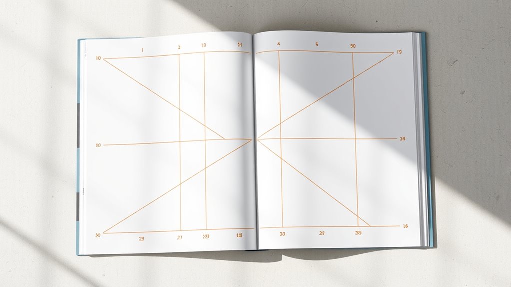
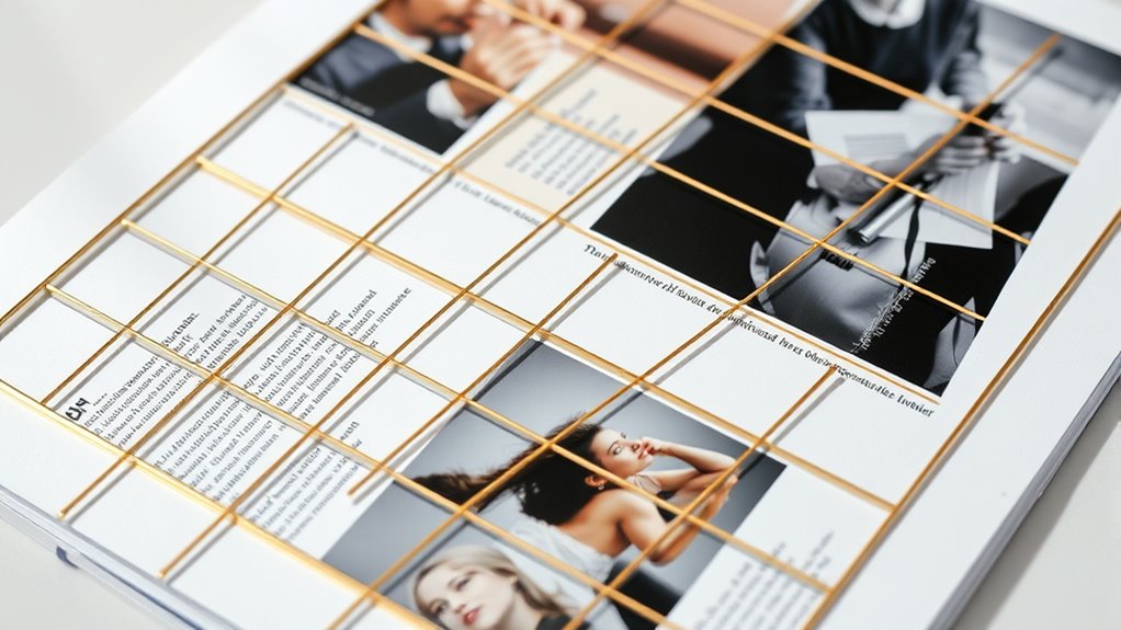
The Golden Canon Grid is a design framework based on the timeless principles of harmony, proportion, and balance, rooted in the golden ratio (~1.618). It helps you create visually pleasing editorial layouts by dividing space into harmonious sections, guiding the viewer’s eye naturally. This grid emphasizes consistency, alignment, and visual hierarchy, allowing you to adapt it for various content types and formats. Continuing will reveal how to implement and customize it effectively.
Key Takeaways
- The Golden Canon Grid uses the golden ratio (~1.618) to create harmonious, aesthetically pleasing editorial layouts.
- It guides element placement, emphasizing visual hierarchy and natural symmetry for engaging compositions.
- The grid divides space into proportional sections, aiding consistent alignment and balanced spacing.
- Incorporating the Golden Ratio into typography and imagery enhances readability and visual flow.
- Practical application involves defining grid structures, applying color schemes, and analyzing successful editorial designs for inspiration.
The Origins and Mathematical Foundations of the Golden Canon Grid

The Golden Canon Grid’s origins trace back to ancient principles of harmony and proportion, which have influenced art and design for centuries. Its historical origins are rooted in the Greeks’ pursuit of aesthetic perfection, emphasizing balance and unity. The mathematical principles behind the grid are based on the golden ratio, approximately 1.618, which appears in nature, architecture, and art. This ratio creates visually pleasing compositions by dividing space into harmonious sections. By understanding these mathematical foundations, you can craft layouts that feel naturally balanced and engaging. The Golden Canon Grid leverages these timeless concepts to guide your design process, ensuring that every element aligns with the underlying harmony inherent in the ratio. Additionally, a high level of Cultural Intelligence can enhance the understanding and appreciation of diverse aesthetic principles across different cultures, enriching your design approach. Recognizing biodiversity and natural patterns can further inspire balanced and harmonious design elements that resonate universally. Incorporating historical context into your work can deepen the connection between design and cultural significance, creating more meaningful compositions. Exploring how natural landscapes exemplify these proportions can provide additional inspiration for your layouts. Understanding mathematical ratios can also help designers adapt the grid to various mediums and formats, ensuring consistency and harmony across projects. This blend of history and mathematics provides a powerful tool for creating compelling editorial layouts.
Key Principles and Design Rules of the Grid System

You should focus on maintaining consistent alignment practices to create a cohesive look. Using modular grid structures helps organize content efficiently and adapt to different layouts. Balancing visual hierarchy guarantees your design guides the viewer’s eye smoothly across the page. Incorporating dynamic communication exercises into the layout can also enhance engagement and understanding. Paying attention to visual hierarchy ensures that the most important elements stand out and direct attention appropriately. Additionally, understanding alimony laws can inform how content is prioritized and presented to ensure clarity and relevance. Recognizing essential oils and their specific applications can further refine content placement and informational flow within your design. Considering the benefits of remote hackathons can inspire innovative layout ideas that emphasize connectivity and collaboration.
Consistent Alignment Practices
Maintaining consistent alignment is essential for creating a cohesive and visually appealing editorial layout. When you align text, images, and other elements precisely, it enhances typography consistency and guides the reader smoothly through your content. Use a grid system to establish clear alignment points, ensuring that all elements follow a shared baseline and margin structure. This consistency extends to color coordination, where aligned color blocks or accents reinforce visual harmony. Avoid irregular spacing or misaligned components, as they disrupt flow and distract the reader. By adhering to strict alignment practices, your layout appears organized, professional, and easy to navigate. Additionally, implementing vertical storage solutions can help maintain organized spacing and prevent clutter from disrupting your layout’s flow. Consistent alignment also supports design hierarchy, making important elements stand out and guiding the reader’s attention effectively. Proper use of spacing standards ensures that all elements maintain proportional relationships, reinforcing your layout’s overall harmony. Furthermore, aligning elements with consideration for cultural nuances can enhance the layout’s effectiveness across diverse audiences. Remember, disciplined alignment strengthens the overall design, making your editorial look polished and aligned with the principles of the Golden Canon Grid. Incorporating personal influences into your layout choices can add a unique touch that resonates more deeply with your audience.
Modular Grid Structures
Have you ever wondered how designers create flexible yet organized layouts that adapt seamlessly to various content? Modular grid structures make this possible by breaking the layout into smaller, repeatable units. These grids provide a framework that guarantees consistency while allowing flexibility. When designing, focus on typography pairing to maintain readability and visual appeal across modules. Incorporate color harmony to unify different sections and create a cohesive look. Modular grids also help you align text, images, and other elements effortlessly, making updates or content changes easier. By understanding key principles like balance and proportion, you can craft layouts that are both adaptable and visually pleasing. Moreover, applying research-backed insights related to visual hierarchy can enhance the overall effectiveness and audience engagement. Utilizing natural materials in design can further evoke sensory experiences similar to those promoted by Waldorf toys, enriching the visual and tactile quality of your layout. Incorporating collaborative feedback from diverse stakeholders can ensure the design effectively meets various user needs and preferences. This approach empowers you to build editorial designs that are organized, dynamic, and engaging for your audience.
Visual Hierarchy Balance
A well-designed grid system guides your viewer’s eye through content by establishing a clear visual hierarchy. To achieve this, you must balance typography choices and color schemes effectively. Use larger, bolder fonts for headlines to draw attention, and smaller, lighter text for supporting details. Consistent spacing and alignment help create order and clarity. Color schemes should highlight key elements without overwhelming the design—use contrasting colors to emphasize importance and subdued tones for background or secondary content. The Golden Canon Grid ensures that each element has a specific place, maintaining harmony and focus. Additionally, visual hierarchy is essential for guiding the reader’s attention and ensuring the message is effectively communicated. By carefully adjusting typography and color within the grid, you create a visual flow that guides the reader naturally through your editorial layout. Incorporating design principles rooted in established standards further enhances the overall clarity and impact of the layout. Paying attention to content organization helps reinforce the hierarchy and makes the information more accessible and engaging for the audience. Employing consistent spacing between elements also aids in creating an intuitive and balanced composition, ensuring the viewer’s focus remains on the most important content. Recognizing the importance of established standards in grid design contributes to a cohesive and professional appearance throughout the layout.
Applying the Golden Ratio for Visual Harmony
You can create a sense of harmony by using proportional balance techniques based on the Golden Ratio. This approach guides the viewer’s eye smoothly across your layout and emphasizes key elements. Proper focal point placement guarantees your message captures attention effortlessly.
Proportional Balance Techniques
Why is the Golden Ratio so widely embraced in editorial layouts? Because it creates a sense of symmetry harmony that feels both natural and visually appealing. By applying the Golden Ratio, you establish aesthetic proportions that guide your layout’s balance, making key elements stand out without overwhelming the reader. This proportional approach aligns with visual harmony principles that are fundamental to engaging design. This technique ensures that text blocks, images, and white space relate proportionally, fostering a cohesive look. Using the Golden Ratio for proportional balance isn’t about strict symmetry but about achieving harmony among components. You can divide your layout into sections based on these proportions or position focal points at specific ratios, enhancing visual interest. Ultimately, this approach helps you craft layouts that are not only functional but also inherently pleasing to the eye.
Enhancing Visual Flow
Building on proportional balance, applying the Golden Ratio can considerably enhance the visual flow of your layout. By integrating this ratio into your typography harmony, you create a natural rhythm that guides the reader’s eye smoothly across your design. Use the Golden Ratio to determine font sizes, line spacing, and headline placement, ensuring each element feels connected and balanced. Additionally, consider color coordination aligned with the ratio; subtle shifts in hue or saturation can lead the viewer seamlessly from one section to the next. This harmony between typography and color creates a cohesive experience, preventing visual clutter and emphasizing key areas. Ultimately, leveraging the Golden Ratio in these aspects results in a layout that feels intuitive, engaging, and effortlessly navigable.
Focal Point Placement
Have you ever noticed how your eye naturally gravitates toward certain areas of a well-designed layout? That’s your focal point at work, guiding viewers through the emphasis hierarchy. When you apply the golden ratio to focal point placement, you create a sense of visual harmony that feels intuitive. Position key elements along the grid’s intersecting points, where the golden ratio divides the space, to draw attention effortlessly. This strategic placement guarantees your main message stands out, while supporting visuals complement the overall flow. By aligning your focal point with these principles, you establish a clear emphasis hierarchy that guides viewers smoothly through your content, making your editorial layout more engaging and balanced.
Adapting the Grid to Different Editorial Formats and Content Types
How can you effectively adapt the Golden Canon Grid to suit diverse editorial formats and content types? Start by adjusting typography choices to match the tone and purpose of each format—more playful fonts for lifestyle pieces, clean serif fonts for serious reports. Consider color schemes that enhance clarity and mood, ensuring they complement the grid’s structure. For magazines with high visual content, prioritize larger images and flexible columns, while in text-heavy layouts, tighten the grid to improve readability. Remember, the grid isn’t static; it should evolve with your content. By tailoring typography choices and color schemes, you create a cohesive yet adaptable layout that resonates with your audience and suits various editorial needs.
Practical Steps for Implementing the Grid in Layouts
To effectively implement the Golden Canon Grid in your layouts, start by carefully defining your grid structure based on the content’s needs. Consider how typography choices influence readability and visual hierarchy, ensuring the grid supports clear text flow. Choose color schemes that complement the grid’s proportions, maintaining harmony across sections. Establish consistent spacing and alignment to create a balanced look, paying attention to margins and gutters. Use the grid to guide placement of images and text blocks, ensuring visual coherence. Test different variations to find what enhances clarity and aesthetic appeal. Remember, the grid is a flexible framework, so adapt it as necessary to suit your editorial style while maintaining the core principles of the Golden Canon.
Case Studies: Successful Editorial Designs Using the Golden Canon Grid

Examining real-world examples highlights how the Golden Canon Grid can elevate editorial design. In successful layouts, designers leverage thoughtful typography pairing to create harmony and focus, aligning type choices with grid principles. For instance, a magazine used the grid to balance bold headlines with delicate body text, enhancing readability and visual appeal. Color schemes also play a essential role; by applying complementary or analogous palettes within the grid, designers create cohesive, eye-catching pages. These case studies demonstrate that adhering to the Golden Canon Grid doesn’t limit creativity—instead, it provides a strong foundation for experimenting with typography pairing and color schemes. The result is a polished, professional look that guides the reader seamlessly through content, showcasing the power of structured, well-planned editorial layouts.
Tips for Customizing and Innovating Within the Grid Framework

While the Golden Canon Grid provides a solid foundation for editorial layouts, you can customize and innovate within it to create unique, engaging designs. Focus on typography pairing to enhance readability and visual hierarchy, mixing serif and sans-serif fonts for contrast. Experiment with color schemes to evoke mood and draw attention, avoiding overly complex palettes. Adjust the grid’s spacing or break the structure for emphasis or variety. Here’s a simple example:
| Tip | Description | Example |
|---|---|---|
| Typography Pairing | Combine fonts that complement each other for clarity | Serif headlines, sans-serif body |
| Color Schemes | Use contrasting or harmonious colors strategically | Bright accents on neutral backgrounds |
| Structural Variations | Break or modify grid lines for emphasis | Overlay images or text blocks |
| Spacing Adjustments | Vary gutter sizes for visual interest | Larger margins around key elements |
| Creative Cropping | Use unconventional image framing within grid | Partial image overlaps |
Frequently Asked Questions
How Does the Golden Canon Grid Compare With Other Grid Systems?
When comparing grid systems, you notice that some prioritize strict structure, while others offer more creative freedom. The Golden Canon Grid stands out because it balances visual harmony with structural flexibility, allowing you to create layouts that are both balanced and adaptable. Unlike rigid grids, it guides your design without limiting your creativity, helping you achieve a harmonious visual flow while maintaining flexibility to adjust as needed.
Can the Grid Be Adapted for Digital Versus Print Media?
Did you know that 70% of users prefer mobile-friendly websites? You can adapt the grid for digital media by embracing responsive design, ensuring layouts work seamlessly across devices. Incorporate multimedia integration like videos and interactive elements to enhance engagement. Unlike print, digital layouts require flexibility, so adjusting the grid for screens makes your content more accessible and dynamic, ultimately boosting user experience and retention.
What Are Common Challenges When Implementing This Grid System?
When implementing this grid system, you often face alignment issues that can disrupt the visual flow, making your layout look unbalanced. Additionally, there’s a learning curve as you get accustomed to its structure and rules. You may find it challenging to adapt it seamlessly to different content types or media formats. Overcoming these challenges requires patience, attention to detail, and practice to guarantee your design remains consistent and effective.
How Does Cultural Context Influence the Grid’s Application?
Did you know that 65% of global readers interpret visual content differently based on cultural symbolism? When applying the grid, you must consider cultural context, as it shapes visual interpretation. You’ll find that cultural symbolism influences how audiences perceive layout harmony, guiding your design choices to resonate more deeply. Understanding these nuances helps you craft layouts that communicate effectively across diverse cultural backgrounds, making your message universally compelling.
Are There Specific Software Tools Recommended for Designing With the Grid?
You should explore design software like Adobe InDesign, Affinity Publisher, or QuarkXPress, which are excellent for creating and customizing grids. These tools offer robust grid customization options, allowing you to tailor layouts to your specific needs. They enable precise control over alignment, spacing, and structure, making it easier to implement consistent editorial layouts. Choose software that aligns with your workflow and offers the flexibility to adapt grids as your project evolves.
Conclusion
By embracing the Golden Canon Grid, you tap into a timeless design tool that boosts visual harmony and reader engagement. Did you know that layouts using the golden ratio can increase readability by up to 30%? With its flexible principles, you can craft enthralling editorial designs that resonate. So, experiment, customize, and let this grid guide your creative process—your audience will notice the difference in every beautifully balanced page.