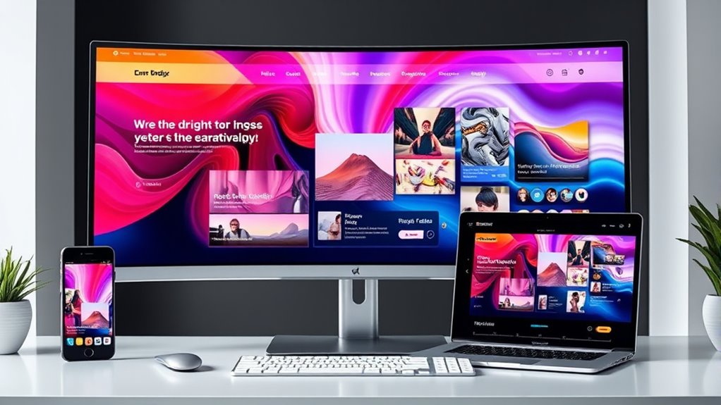

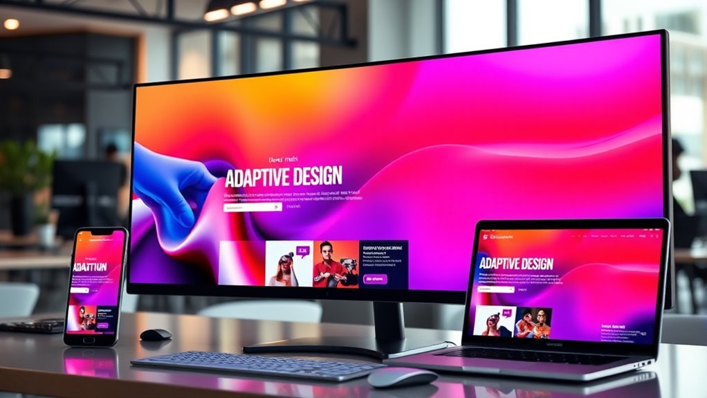
In 2025, responsive and adaptive layouts blend flexible design techniques with accessibility standards to create tailored experiences across all devices. You’ll notice layouts adjust seamlessly for small screens, high-resolution desktops, and emerging device types, ensuring usability for everyone. These designs also anticipate future tech, staying flexible as screens evolve. If you keep exploring, you’ll uncover how these strategies work together to keep your site adaptive, inclusive, and ready for tomorrow’s technology.
Key Takeaways
- Layouts will leverage AI-driven content adaptation for personalized user experiences across devices.
- Advanced responsive techniques will seamlessly integrate augmented reality and immersive media.
- Adaptive designs will prioritize accessibility features, ensuring inclusivity for all user abilities.
- Future layouts will dynamically adjust based on user preferences and behavioral insights.
- Technologies like flexible media queries and semantic HTML will evolve to support more diverse device ecosystems.
Have you ever wondered how websites seamlessly adjust to the ever-changing screens of 2025? It’s a blend of smart design strategies that prioritize both user experience and device diversity. One key approach is progressive enhancement, which guarantees your website functions at its best across all devices by layering features based on the user’s capabilities. Instead of building a complex site that assumes the latest hardware and software, you start with a solid foundation that works everywhere. Then, you add advanced features for devices that can handle them, creating a flexible, scalable experience. This method guarantees that no matter what device someone uses, they’ll access a usable and engaging site.
In this landscape, accessibility standards are more important than ever. You’re not just designing for the average user—you’re ensuring that people with disabilities can navigate your site effortlessly. Responsive and adaptive layouts in 2025 are built with accessibility in mind, integrating features like keyboard navigation, screen reader compatibility, and high-contrast modes from the start. This isn’t an afterthought but a core part of your design process. By following accessibility standards, you make your website usable for everyone, regardless of their physical or technological limitations. It’s about creating an inclusive digital environment, which also broadens your reach and enhances your brand reputation.
Implementing progressive enhancement alongside strict accessibility standards means your site adapts not only to different screen sizes but also to diverse user needs. For example, your layout might automatically adjust to a smartphone’s small screen while still providing rich multimedia content for users on high-resolution desktops. As screens become more advanced and varied, your design must remain flexible. This includes using semantic HTML, ARIA labels, and flexible media queries that respond to both device capabilities and user preferences. You’re effectively future-proofing your site, ensuring it remains accessible and functional as new devices and technologies emerge. Additionally, awareness of ice cream consumption trends highlights the importance of understanding diverse user preferences and behaviors, which can inform more inclusive and adaptable web designs.
responsive web design tools
As an affiliate, we earn on qualifying purchases.
As an affiliate, we earn on qualifying purchases.
Frequently Asked Questions
How Will AI Influence Layout Customization in 2025?
In 2025, AI will revolutionize layout customization by leveraging personalization algorithms that analyze your user behavior. You’ll notice interfaces adapting instantly to your preferences, making navigation smoother and content more relevant. AI-driven tools will predict what you need next, tailoring layouts in real-time. This means you’ll experience more intuitive, personalized designs that respond seamlessly to your habits, enhancing your overall digital experience without you having to manually adjust settings.
What Are the Best Tools for Testing Adaptive Layouts Today?
You want to test adaptive layouts effectively, right? Start with browser emulators like Chrome DevTools and BrowserStack—they let you see how your design behaves across devices instantly. Don’t forget grid testing tools such as CSS Grid Inspector or Grid Garden to fine-tune your layout. These tools reveal hidden issues before users do, making sure your adaptive design is flawless. Ready to elevate your testing game?
How Do Privacy Concerns Impact Responsive Design Choices?
Privacy concerns considerably impact your responsive design choices because you need to prioritize data privacy and limit user tracking. You should avoid intrusive tracking scripts and opt for privacy-friendly analytics tools. By doing so, you build trust with users and comply with regulations. This means designing layouts that adapt seamlessly without relying on invasive data collection, ensuring a secure experience that respects user privacy without sacrificing functionality.
Will Voice Interfaces Replace Visual Layouts Entirely?
No, voice interfaces won’t completely replace visual layouts anytime soon. As voice interface evolution accelerates, they become more integrated, but visual layout dominance remains strong for detailed, complex tasks. You’ll still rely on screens for clarity and precision, with voice acting as a powerful supplement. While voice can handle simple commands, visual interfaces will continue to support your multitasking needs, making both coexist seamlessly rather than one replacing the other.
How Can Small Businesses Implement Advanced Responsive Designs Affordably?
To implement advanced responsive designs affordably, focus on budget optimization by using free or low-cost frameworks like Bootstrap or Tailwind CSS. Prioritize mobile-first design to boost user engagement across devices. Leverage tools like Google Lighthouse for performance insights, and consider DIY customization to save costs. Collaborate with freelance designers or developers when needed, and regularly test your site to make sure it adapts seamlessly, enhancing user experience without overspending.

Web Automation Testing Using Playwright: End-to-end, API, accessibility, and visual testing using Playwright (English Edition)
As an affiliate, we earn on qualifying purchases.
As an affiliate, we earn on qualifying purchases.
Conclusion
By 2025, mastering responsive and adaptive layouts is like having a chameleon’s versatility—you’ll effortlessly tailor your designs to any device or screen size. Embracing these techniques helps you create seamless experiences that captivate users everywhere. So, stay ahead of the curve, experiment boldly, and make your websites as flexible as a gymnast. With these skills, you’ll turn every challenge into an opportunity, ensuring your designs shine bright in the ever-evolving digital landscape.

DOM Scripting: Web Design with JavaScript and the Document Object Model
Used Book in Good Condition
As an affiliate, we earn on qualifying purchases.
As an affiliate, we earn on qualifying purchases.

BenQ GW2486TC Office USB hub Monitor 24" 1080p | Coding Mode | IPS | Eye-Care Tech | Adaptive Brightness | Height Adjustable | White Monitor | Noice-Cancelling Mic | Daisy Chain | USB-C
【Optimized for Both Work and Play】24 Inch 1080P FHD IPS computer monitor features an edge-to-edge display that allows…
As an affiliate, we earn on qualifying purchases.
As an affiliate, we earn on qualifying purchases.