
To design accessible infographics, focus on high contrast between colors and incorporate textures or patterns alongside colors to aid users with visual impairments. Use clear, concise alt text for all images and icons, ensuring descriptions are meaningful. Organize your content logically with consistent headings and ample spacing, making navigation easy for keyboard users. Pay attention to layout principles that prevent clutter and improve readability. Keep exploring these strategies to create infographics that everyone can access and understand effortlessly.
Key Takeaways
- Use high contrast colors for backgrounds and text to ensure readability for all users.
- Incorporate descriptive alt text for images and icons to provide context for screen readers.
- Organize content with clear headings and logical flow to improve navigation and comprehension.
- Ensure keyboard accessibility with logical tab order and visible focus indicators for interactive elements.
- Apply ample spacing and simple fonts to prevent clutter and enhance overall visual clarity.

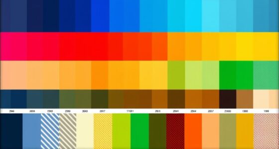
Creating accessible infographics is essential to guarantee your message reaches everyone, including people with visual, auditory, or cognitive impairments. When designing these visuals, paying attention to details like color contrast and keyboard navigation makes a significant difference. Color contrast is vital because it ensures that users with visual impairments or color blindness can distinguish between different elements of your infographic. You want to choose color combinations that provide enough contrast, such as dark text on a light background or vice versa. This simple step improves readability without relying solely on color to convey information. Remember, some users might not perceive color differences at all, so supplementing color cues with patterns, labels, or textual descriptions helps make your infographic universally understandable.
Keyboard navigation is another critical aspect. Many users with disabilities navigate digital content using keyboards instead of a mouse. If your infographic is part of an interactive webpage or accessible PDF, make sure all elements can be reached and activated via keyboard controls. This means logical tab orders, clear focus indicators, and accessible links or buttons embedded within the infographic. You don’t want users to get stuck or confused when trying to navigate through your content. Testing your infographic with keyboard navigation tools helps identify any barriers that could prevent users from accessing important information. This practice not only improves accessibility but also enhances overall usability.
In addition to color contrast and keyboard navigation, consider how your infographic’s layout supports accessibility. Organize information logically, with clear headings and a consistent flow that guides viewers naturally through the content. Use ample spacing to prevent clutter and ensure that each element stands out distinctly. When incorporating text, keep it concise and easy to read, avoiding overly complex fonts or small sizes that may hinder readability. Including alternative text descriptions for images and icons allows screen readers to accurately relay your message to users with visual impairments. These alt texts should be descriptive, explaining the purpose or content of each visual element. Ensuring that high contrast and clear layout principles are applied aligns with best practices in creating projector image quality and overall accessible design.

Klein Tools 65148HD KNECT Deep-Well and Shallow Impact Socket Set, 3/8-Inch Drive, SAE and Metric, 44-Piece Tool Set, Impact Driver, Swivel Adapter, Wrench Extensions, Removable Socket Organizer
44-PIECE DUAL-PROFILE SOCKET SET: Complete SAE (5/16-Inch to 3/4-Inch) and metric (8 mm to 19 mm) collection with…
As an affiliate, we earn on qualifying purchases.
As an affiliate, we earn on qualifying purchases.
Frequently Asked Questions
How Do I Choose the Best Color Contrasts for Accessibility?
To choose the best color contrasts for accessibility, you should focus on color pairing that meets contrast guidelines like the WCAG standards. Use tools like contrast checkers to guarantee your text and background have a high enough contrast ratio, ideally 4.5:1 for normal text. Avoid color combinations that can be confusing or hard to read, and prioritize clear, distinct contrasts to make your infographic accessible to everyone.
What Tools Can Help Create Accessible Infographics?
You can use tools like Canva or Adobe Express, which offer accessible infographic templates, making it easier to create inclusive designs. Accessibility plugins like WAVE or Axe help identify issues with color contrast, alt text, and layout. These tools streamline your workflow, ensuring your infographics meet accessibility standards. Combining templates with plugins allows you to craft visuals that are both engaging and usable for everyone.
How Can I Test if My Infographic Is Accessible?
You can test your infographic’s accessibility by using screen readers to verify all info, including interactive elements, is clear and navigable. Check the visual hierarchy to confirm it guides viewers logically, aiding comprehension. Additionally, ask users with disabilities to review it, or utilize accessibility testing tools like WAVE or Axe. These steps help you identify and fix issues, making sure your infographic is inclusive and effective for everyone.
Are There Specific Font Sizes Recommended for Readability?
For ideal readability, you should use a minimum font size of 16 pixels or 12 points for your infographic. Larger font sizes improve accessibility, especially for users with visual impairments or reading difficulties. Avoid using overly small fonts, and make certain there’s enough contrast between text and background. Test your font sizes across devices to confirm your infographic remains clear and easy to read for everyone.
How Do I Ensure Infographics Are Mobile-Friendly and Accessible?
Did you know over 50% of web traffic comes from mobile devices? To make your infographics mobile-friendly and accessible, prioritize large, touch-friendly elements and clear layout. Use simple gesture accessibility, ensuring users can navigate easily with touchscreens. Avoid small buttons or dense information, and test on different devices. This way, your infographic remains engaging, easy to interact with, and inclusive for all users.
screen reader alt text generator
As an affiliate, we earn on qualifying purchases.
As an affiliate, we earn on qualifying purchases.
Conclusion
By mastering textures, adding descriptive alt text, and choosing thoughtful layouts, you can create infographics that uncover information for everyone—no matter their abilities. When you make accessibility a priority, you’re not just designing visuals; you’re transforming how millions experience knowledge. Your infographics can become a beacon of inclusion in a sea of ordinary visuals—so powerful that they could change the way the world sees and understands information forever. Don’t just create—innovate for accessibility.

Hable One Portable Braille Keyboard for Visually Impaired – Wireless Braille Typing Device for Smartphones and Tablets – Compact Braille Machine for Easier, Faster, and More Accurate Typing
Broad Smartphone & Tablet Compatibility: Connects easily to your iPhone and Android smartphones and tablets, allowing you to…
As an affiliate, we earn on qualifying purchases.
As an affiliate, we earn on qualifying purchases.

Handicap Accessible Icon Stencil 39" Template for VIPs and Guests Establish Exits and Entrances 3MM Thick One Piece Template Made in The USA with Long Lasting Materials by Marketing Holders
39" Handicap Accessible Icon Stencil
As an affiliate, we earn on qualifying purchases.
As an affiliate, we earn on qualifying purchases.