
To design accessible forms, you should use clear labels linked to each input with the `for` attribute, making sure they are descriptive and visible. Provide helpful hints and error messages with `aria-describedby`, and mark invalid fields using `aria-invalid` for screen readers. Use ARIA roles and keyboard navigation to guarantee everyone can easily complete the form. If you keep exploring, you’ll discover practical ways to improve accessibility and user experience even more.
Key Takeaways
- Use explicit labels linked via `for` and `id`, or `aria-label`, to clearly identify form fields.
- Associate error messages and hints with inputs using `aria-describedby` for context.
- Mark required fields with `aria-required` and indicate validation status with `aria-invalid`.
- Provide immediate, accessible feedback on errors to guide users in correcting input.
- Ensure all labels, errors, and hints are perceivable and navigable via keyboard and assistive technologies.
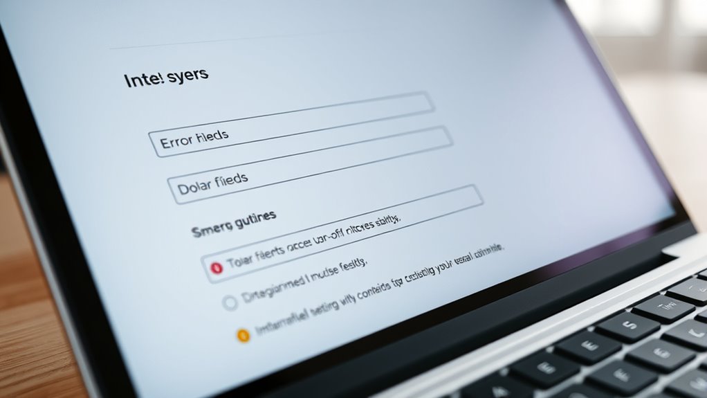
Creating accessible forms is essential to guarantee everyone can complete your online tasks without barriers. When designing these forms, you need to ensure that all users, regardless of their abilities, can understand and interact with your content effectively. One key aspect is employing ARIA roles, which help communicate the purpose of various form elements to assistive technologies. By assigning appropriate roles, such as `aria-required` for mandatory fields or `aria-describedby` for hints and error messages, you clarify the form’s structure. This makes it easier for screen readers to interpret and convey the information accurately to users.
Ensuring accessible forms with ARIA roles improves usability for all users.
Equally important is considering keyboard navigation. Many users rely on keyboards rather than mice, so your form must be fully navigable using the Tab key, Enter, and arrow keys. Properly structuring your HTML ensures that users can move smoothly from one input field to the next without confusion or frustration. Use logical tab order and avoid placing focus on hidden or non-interactive elements. When users navigate through your form, they should receive clear focus indicators, so they always know which element they’re interacting with.
Labels are fundamental for accessibility. Each input needs a descriptive label, linked explicitly via the `for` attribute matching the input’s `id`. This connection helps screen readers identify what information is expected, reducing user errors and confusion. If labels aren’t visible or are insufficient, consider including aria-labels or aria-labelledby attributes to supplement them, ensuring every element is clearly identified.
Providing real-time feedback, such as error messages and hints, is also crucial. When a user enters invalid data or misses a required field, your form should immediately announce the issue. Use ARIA attributes like `aria-invalid` to mark problematic fields and associate error messages with inputs using `aria-describedby`. This setup allows assistive technologies to inform users about what went wrong and how to fix it, streamlining the completion process. Hints and instructions should be straightforward and accessible, guiding users without overwhelming or confusing them.
Additionally, understanding how glycolic acid benefits skin can inform users about skincare routines that promote healthy skin. When you focus on ARIA roles and keyboard navigation, you’re making your forms more inclusive, ensuring that everyone, regardless of how they interact with your website, can complete their tasks efficiently. Remember, designing accessible forms isn’t just about compliance — it’s about respecting all users’ needs and providing a seamless digital experience.

RAINFLOW 1700+ Arts & Crafts Supplies - Craft Kit,Supplies & Materials Set for School,Classroom,Family, Party, DIY, Art Creation, Holiday Decoration
1700+ Piece Craft Supplies Kit: This arts and crafts supplies set includes 100 pipe cleaners, 150 pom poms,...
As an affiliate, we earn on qualifying purchases.
Frequently Asked Questions
How Can I Test My Forms for Accessibility?
To test your forms for accessibility, start by traversing them with a keyboard to ensure all fields are reachable and labeled properly. Use a screen reader to verify that labels, errors, and hints are announced clearly and logically. Check that error messages are descriptive and focus automatically on issues. This approach helps you identify and fix barriers, making your forms more inclusive and user-friendly for everyone.
What Tools Are Recommended for Accessible Form Design?
If you want to guarantee your forms are accessible, use tools like WAVE, Axe, and Lighthouse—they help identify issues with assistive technology compatibility and color contrast. Visualize a user with a screen reader or color blindness steering through your form smoothly because these tools highlight problematic areas. By testing early and often, you create inclusive forms that everyone can use, regardless of their abilities or assistive technology.
How Do I Ensure Mobile Accessibility in Forms?
To guarantee mobile accessibility in forms, focus on mobile navigation by making sure users can easily move between fields. Use appropriately sized touch targets—at least 48×48 pixels—to prevent accidental taps. Keep forms simple and prioritize clear labels and instructions, so users can easily complete them on smaller screens. Test your forms on various devices to identify and fix any issues with responsiveness or touch interactions.
Are There Specific Accessibility Standards to Follow?
Yes, you should follow accessibility standards like WCAG 2.1 to guarantee your forms are usable for everyone. Focus on maintaining adequate color contrast so users with visual impairments can read labels and instructions. Also, make certain that your forms support keyboard navigation, allowing users to move through fields easily without a mouse. These standards help create inclusive, accessible forms that improve user experience for all users.
How Should I Handle Dynamic or Interactive Form Elements?
Think of dynamic form elements as dancers on a stage—you need to guide them clearly. You should use ARIA attributes like aria-expanded and aria-pressed to communicate state changes, ensuring screen readers understand. Additionally, support keyboard navigation so users can move through interactive elements seamlessly. Regularly update ARIA live regions to announce changes, and test thoroughly to make sure everyone can interact with your form effortlessly.

Arts & Crafts Supplies Kits & Materials Set for Kids, Toddler - Carl & Kay
ALL INCLUSIVE CRAFT KIT: Looking for a fun one-stop, ready-for-anything craft supply bundle that covers all the basics?...
As an affiliate, we earn on qualifying purchases.
Conclusion
By mastering accessible forms, you’re transforming your website into a fortress of inclusivity where every user, regardless of ability, can navigate effortlessly. Imagine a world where labels glow brightly, errors shout helpful advice like megaphones, and hints act as guiding stars in a dark night. With these simple yet powerful practices, you’re not just designing forms—you’re building bridges that connect everyone, turning your site into an unstoppable, welcoming universe of seamless access for all.

Goody King Arts and Crafts Supplies for Kids - 1170Pcs+ Craft Art Supply Kit for Toddlers Kids Craft Supplies & Materials Age 4 5 6 7 8 9 - Christmas D.I.Y. Crafting School Supplies
ARTISTRY AND CREATIVITY :Best Science Kits for Kids age 6-8 ever in the market and your kids can...
As an affiliate, we earn on qualifying purchases.
ARTISTRO 36 Acrylic Paint Markers - Paint Pens for Drawing - For Fabric, Rock, Glass, Wood, Molds - Arts & Crafts Gift for Adults, Teens, Kids, Classroom Must Haves & School Supplies
BRUSH + FINE DUAL TIP: Our acrylic paint markers come with 2 tips for 2x the fun. The...
As an affiliate, we earn on qualifying purchases.