Psychedelic packaging is making a strong comeback with groovy, distorted lettering that grabs your attention instantly. Vibrant, contrasting colors and fluid fonts create a lively, sense of movement, stimulating your visual senses. The bold designs evoke emotions like excitement or nostalgia, encouraging you to explore further. By combining striking colors with warped typography, brands aim to stand out and spark curiosity. Keep exploring, and you’ll uncover how this eye-catching style continues to shape modern packaging trends.
Key Takeaways
- Psychedelic packaging features groovy, distorted lettering that creates a vibrant, swirling visual effect to attract consumer attention.
- Bold, warped fonts mimic movement, enhancing the surreal and trippy aesthetic of modern psychedelic product designs.
- Strategic use of contrasting and complementary colors amplifies visual impact and evokes emotional responses.
- These design elements stimulate curiosity and engagement, encouraging closer examination and product recall.
- The resurgence of psychedelic packaging leverages bold typography and vivid colors to stand out in competitive markets.
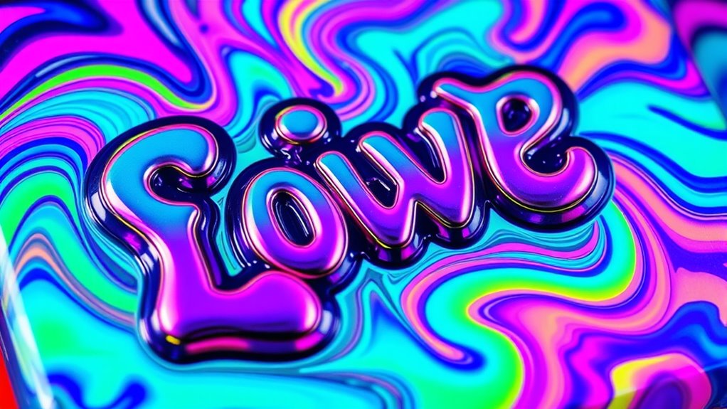
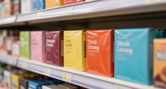
Psychedelic packaging has emerged as a bold marketing strategy that captures attention and evokes curiosity. When you first see packaging that features groovy and distorted lettering, it’s impossible not to be drawn in. These designs are more than just eye-catching—they’re a carefully crafted blend of color theory and typography styles that work together to create a sense of vibrancy and movement. The use of vivid, contrasting colors, often arranged with complementary or analogous schemes, heightens visual impact and stimulates your senses. Color theory plays a pivotal role here, guiding designers to evoke specific emotions or moods. Bright, neon hues might suggest energy and excitement, while softer pastel shades can evoke a sense of nostalgia or calm. The strategic placement of colors not only grabs your attention but also guides your eye across the packaging, emphasizing key elements like brand names or product descriptions. Color placement is a crucial element that enhances visual storytelling and brand recognition.
Typography styles in psychedelic packaging are equally essential. You’ll notice that the fonts used are often distorted, warped, or exaggerated, mimicking the swirling, fluid effects associated with the psychedelic era. These groovy and distorted fonts are crafted to appear as if they’re moving or melting, which amplifies the overall visual impact. The choice of typography isn’t arbitrary; it’s designed to complement the vibrant color schemes and reinforce the theme’s trippy, surreal vibe. You might see bold, chunky lettering intertwined with fine, intricate script styles, creating a layered, textured look. Such combinations evoke a sense of chaos and harmony at once, making the packaging feel alive and dynamic. The typography styles often break conventional rules—letters may bend, stretch, or even appear to ripple—enhancing the feeling of distortion and otherworldliness.
When you’re browsing products with psychedelic packaging, you’re experiencing a visual journey. It’s not just about the product inside but also about the way the packaging challenges norms and invites you to explore further. The marriage of color theory and typography styles in groovy, distorted lettering doesn’t just serve aesthetic purposes; it’s a strategic move to evoke emotion, spark curiosity, and make the product memorable. This approach taps into the subconscious, creating a sense of wonder and intrigue that compels you to pick up the item, examine it more closely, and remember it long after you’ve moved on. Psychedelic packaging, with its bold use of color and innovative typography, continues to make a striking comeback, proving that when it comes to visual marketing, pushing boundaries always pays off.
psychedelic packaging design templates
As an affiliate, we earn on qualifying purchases.
As an affiliate, we earn on qualifying purchases.
Frequently Asked Questions
How Has Digital Design Influenced Psychedelic Packaging Trends?
Digital design has profoundly influenced psychedelic packaging trends by enabling you to create intricate digital art that captures vibrant, vintage revival aesthetics. You can experiment with bold colors, swirling patterns, and distorted lettering more easily than ever. This technology allows for detailed customization and rapid production, helping you blend classic psychedelic elements with modern innovation. As a result, packaging becomes more eye-catching and expressive, appealing to both nostalgic and contemporary audiences.
Are Traditional Psychedelic Fonts Still Popular in Modern Branding?
Yes, traditional psychedelic fonts remain popular in modern branding, fueled by a vintage revival that appeals to nostalgia and authenticity. You’ll notice brands embracing these fonts to evoke cultural symbolism from the 60s and 70s, creating a strong visual identity. Their bold, distorted styles capture attention and convey a sense of free spirit, making them ideal for products seeking to connect with retro aesthetics while standing out in today’s competitive market.
What Materials Are Commonly Used for Psychedelic Packaging Today?
Imagine your product wrapped in a kaleidoscope—that’s what neon color schemes and holographic finishes do today. You’ll find materials like glossy paper, holographic films, and vibrant plastics that catch every glint and shimmer, making your packaging pop with psychedelic energy. These materials create a mesmerizing effect, drawing customers in like a siren’s call, turning ordinary packaging into a visual adventure that captures the spirit of retro psychedelia.
How Does Psychedelic Packaging Impact Consumer Perception?
Psychedelic packaging grabs your attention through vibrant colors and bold designs, markedly impacting your visual perception. It makes products stand out on shelves and creates a memorable impression. This style also enhances brand recognition by associating your favorite brands with unique, eye-catching visuals. As a consumer, you’re more likely to remember and choose products with psychedelic packaging because it evokes curiosity and excitement, strengthening your overall brand connection.
Can Psychedelic Lettering Be Customized for Small Brands?
Like a painter with a blank canvas, you can customize psychedelic lettering for small brands through handcrafted typography, making your packaging truly unique. This approach aligns perfectly with niche branding strategies, helping you stand out in a crowded market. By tailoring distorted and vibrant designs, you create an eye-catching identity that resonates with your audience, proving that even small brands can harness bold, psychedelic styles to make a memorable impression.

Pacon Reusable Self-Adhesive Vinyl Letters & Numbers Puffy Font 2" Black
Removable, repositionable and reusable self-adhesive letters
As an affiliate, we earn on qualifying purchases.
As an affiliate, we earn on qualifying purchases.
Conclusion
Immerse yourself in the daring dance of distorted, dreamy lettering and let your designs dazzle with a dash of nostalgia. Psychedelic packaging pulses with personality, perfectly blending boldness and beauty. By embracing the bold, distorted lettering, you bring back a bygone era’s essence, energizing your packaging with excitement. So, seize the style, stir the spirit, and showcase your creativity with captivating, chaotic characters that command attention and charm consumers. Let your labels live vividly and leave lasting impressions.
Colored Half Sheet Self Adhesive Shipping Labels, Neon Green 8-1/2" x 5-1/2" Address Labels for Laser & Inkjet Printers, Packaging, Shipping and Crafting(50 Labels)
Vibrant Color-Coding & Superior Print Quality :Engineered for laser and inkjet printers, our smudge-resistant matte sheets ensure crisp,…
As an affiliate, we earn on qualifying purchases.
As an affiliate, we earn on qualifying purchases.

50Pcs Groovy Boho Aesthetics Stickers, Hippie Aesthetic Water Bottle Stickers, Vinyl Waterproof PVC Material for Laptops Decals Phone Computer Car Party Favors
Premium Quality Material: Made from high-quality, waterproof PVC material that provides sun protection and long-lasting durability. Each sticker…
As an affiliate, we earn on qualifying purchases.
As an affiliate, we earn on qualifying purchases.