The psychology of typography shapes reveals how your font choices influence emotions and perceptions subconsciously. Geometric shapes evoke stability and professionalism, while organic forms feel warm and inviting. Serif fonts suggest tradition and trustworthiness, whereas sans-serifs appear modern and approachable. Curved shapes convey softness, and angular lines communicate strength or assertiveness. Understanding these shape cues helps you craft designs that evoke the desired feelings—continue exploring to learn how cultural meanings and visual cues shape perception even further.
Key Takeaways
- Geometric shapes in typography evoke stability and professionalism, while organic and rounded shapes suggest warmth and approachability.
- Serif fonts convey tradition and reliability; sans-serif fonts communicate modernity and innovation, influencing emotional perceptions.
- Shape features like curves and angles affect perceptions of trustworthiness, strength, or friendliness in brand identity.
- Cultural symbolism of shapes impacts how typography is interpreted, with different regions associating specific forms with particular meanings.
- Recognizing shape psychology helps in selecting typefaces that align emotional tone and reinforce desired messages effectively.
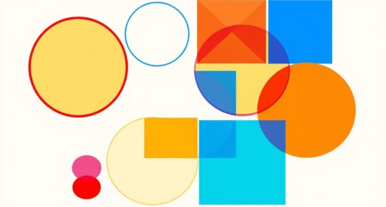
The Emotional Impact of Geometric Versus Organic Shapes
When you encounter geometric and organic shapes in typography, they evoke distinct emotional responses. Geometric shapes, with their clean lines and precise angles, foster feelings of stability, order, and professionalism. They enhance the aesthetic appeal by creating a sense of structure and clarity, making designs feel modern and reliable. Organic shapes, on the other hand, with their flowing curves and irregular forms, evoke warmth, friendliness, and creativity. They add a touch of authenticity and natural beauty, making the typography feel approachable and lively. Your emotional resonance with each shape depends on the context and message you want to convey. Recognizing these differences helps you select fonts that align with your intended tone, strengthening the overall aesthetic appeal of your design. Additionally, understanding the role of AI in design can help creators better tailor their typographic choices to audience preferences and emotional impact, especially as AI tools can analyze typography’s influence on perception. Incorporating insights from Personality Traits can further refine design choices to match target audience personalities and enhance engagement.
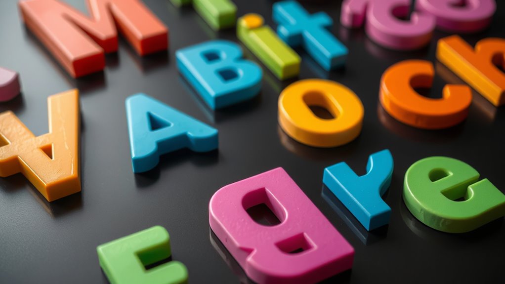
How Serif and Sans-Serif Fonts Convey Different Personalities
Serif fonts often communicate tradition and formality, making them ideal for established brands or serious content. In contrast, sans-serif fonts feel more modern and approachable, perfect for casual or innovative messages. Understanding these differences helps you choose fonts that align with your desired personality and improve readability. Additionally, selecting the appropriate font also involves considering content authenticity, ensuring your typography supports genuine and trustworthy communication. Using the right font can influence audience perception, how users perceive your brand’s trustworthiness, and professionalism, which are all crucial for building credibility and connection with your audience. Recognizing the Personality traits conveyed by different font styles enables creators to craft visual identities that resonate more effectively with their target audiences.
Tradition vs. Modernity
The choice between serif and sans-serif fonts instantly communicates whether a design feels rooted in tradition or embraces modernity. Serif fonts, with their calligraphic elegance, evoke a sense of history, craftsmanship, and timelessness. They suggest reliability and a connection to classical aesthetics, often used in formal or authoritative contexts. Sans-serif fonts, on the other hand, embody minimalist aesthetics, signaling modernity, simplicity, and forward-thinking. They feel clean, fresh, and approachable, making them ideal for contemporary designs. When you choose serif fonts, you align your message with tradition and sophistication. Opting for sans-serif conveys innovation and clarity. Understanding this distinction helps you craft visual personalities that resonate with your audience’s expectations—whether rooted in heritage or driven by progress. Additionally, font choices can influence perceptions of readability and accessibility, impacting how effectively your message is communicated to diverse audiences. Recognizing the typography’s psychological impact can enhance your overall design strategy and audience engagement. Furthermore, awareness of cultural perceptions of fonts allows designers to tailor their choices to specific audiences, ensuring the intended emotional response is achieved. Considering font psychology can also help in creating branding that aligns with desired brand values and audience perceptions.
Formality vs. Playfulness
Fonts shape personalities, and choosing between serif and sans-serif styles is key to expressing formality or playfulness. Serif fonts often embody formal elegance, conveying professionalism, tradition, and authority. They create a sense of stability, making them ideal for serious or sophisticated contexts. Sans-serif fonts, on the other hand, invite playful experimentation and evoke a modern, casual vibe. They appear approachable and flexible, perfect for brands or messages that want to feel lively and innovative. Your choice influences how audiences perceive your message’s personality. When aiming for a refined, traditional tone, serif fonts are your go-to. For a more relaxed, creative feel, sans-serif fonts foster a sense of playfulness. Understanding font psychology reveals how different typefaces can influence viewer perceptions and emotional responses. Being aware of how font styles align with psychological perceptions allows designers to craft more effective visual communication.
Readability and Clarity
Have you ever noticed how some text feels easier to read than others? It’s often about readability and clarity. When choosing fonts, consider font size—larger sizes improve legibility, especially for longer texts. Contrast also matters; high color contrast between text and background makes words pop, reducing eye strain. Serif fonts, with their small decorative strokes, can enhance readability in print, guiding your eye smoothly across lines. Sans-serif fonts, with clean lines, work well on screens, offering clarity at smaller sizes. Both font type and visual elements like font size and color contrast influence how easily you grasp information. Clear, well-contrasted text conveys professionalism and trust, helping your message come across effortlessly. Additionally, understanding font technology can help you select the best fonts for different devices and contexts. For example, some fonts are optimized for digital screens, improving font rendering and overall readability. Ultimately, good readability guarantees your audience stays engaged and absorbs your content effectively.
The Influence of Letter Curves and Angles on Perceived Trustworthiness
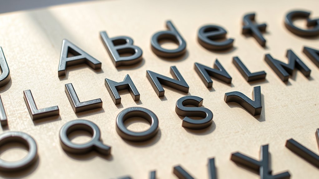
While both curves and angles in letterforms critically influence how we perceive a piece of text, they also play an essential role in shaping perceived trustworthiness. Letter curves tend to evoke feelings of warmth, friendliness, and approachability, which can enhance your trust in the message. Rounded shapes in characters suggest softness and stability, making your audience more likely to see the text as reliable. Conversely, sharp angles and rigid lines often convey strength and authority but may also seem cold or uninviting. When designing or choosing fonts, you should consider how these elements influence perception. Smooth, rounded letters foster a sense of trust, while angular forms might be perceived as more aggressive or distant. Additionally, crochet styles for locs demonstrate how diverse visual elements can be personalized to evoke specific perceptions, emphasizing the importance of shape in visual communication. Understanding the psychology of typography helps designers create fonts that communicate sincerity and dependability effectively. Being aware of the visual cues in typography enables more intentional and impactful design choices. Incorporating typographic features such as stroke contrast and letter spacing can further enhance the perception of trustworthiness. For example, the use of letterform consistency can reinforce stability and reliability in a design. Ultimately, balancing these features helps communicate sincerity and dependability effectively.
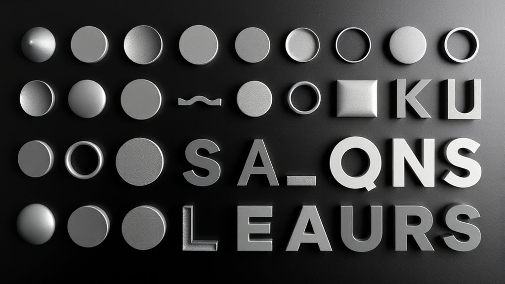
Shape Psychology in Brand Identity and Logo Design
Shape psychology plays a crucial role in shaping brand identity and logo design, as the forms you choose can evoke specific emotions and associations in your audience. By leveraging shape symbolism, you create visual cues that communicate your brand’s core values. Consider these key points:
- Typography innovation allows you to craft unique shapes that stand out and reinforce your brand’s personality.
- Shape symbolism helps in conveying trust, strength, or friendliness through simple geometric forms.
- Thoughtfully designed shapes can enhance recognition, making your logo memorable and impactful.
Using these principles, you influence how your audience perceives your brand at first glance. The strategic use of shape psychology in logo design creates a visual language that aligns your brand’s message with the emotional responses you want to evoke.
The Role of Typography Shapes in Readability and Comprehension

The shapes of your typography directly affect how easily readers can understand your message. Clear and legible fonts guide the eye smoothly, enhancing overall comprehension. Additionally, the visual hierarchy created by shape variations helps prioritize information and improves readability. Proper typography design ensures that all visual elements remain effective and reliable over time. Moreover, understanding how font shapes influence perception can lead to more engaging and accessible communication.
Shape Clarity and Legibility
Clear and easily recognizable typography shapes are essential for ensuring readability and comprehension. When shapes are distinct, your eyes can quickly identify each letter, reducing effort and confusion. To enhance shape clarity and legibility, consider these factors:
- Adjust letter spacing to prevent characters from blending or appearing too crowded.
- Choose an appropriate font size that balances readability without overwhelming the page.
- Use simple, clean shapes that avoid excessive ornamentation, ensuring each letter remains clear at various distances.
Visual Hierarchy Influence
Have you ever noticed how certain typographic shapes naturally guide your eye through text, creating a visual hierarchy that enhances understanding? This effect relies heavily on color symbolism and spatial organization. Bold, larger shapes draw attention first, signaling importance, while softer, smaller forms guide you to supporting details. Color symbolism plays a role too—bright or contrasting colors highlight key areas, making them stand out. Spatial organization ensures that your eye moves smoothly from headings to subheadings, then to body text, establishing a clear flow. Typography shapes, thus, act as visual cues, helping you navigate information efficiently. By understanding how these shapes influence perception, you can design text that improves readability and comprehension, making complex information more accessible.
Cultural Interpretations of Typography Forms
How do different cultures interpret typography forms, and why do these meanings vary across regions? Cultural symbolism and historical associations shape how shapes are perceived worldwide. For example:
- Curved fonts may symbolize friendliness in Western cultures but can evoke softness or spirituality in Eastern regions.
- Sharp, angular typefaces might be linked to strength or aggression in some societies, while in others, they suggest modernity and innovation.
- Traditional calligraphy styles carry deep historical associations that influence contemporary design choices, reflecting cultural identity or heritage.
These variations happen because symbols evolve within cultural contexts, and the meaning of shapes adapts over time. Your understanding of these differences helps you craft designs that resonate authentically across diverse audiences.
Applying Shape Psychology to Enhance Visual Communication
Understanding the cultural meanings behind typography forms can considerably boost your ability to communicate visually. By applying shape psychology, you can leverage typography symbolism to evoke specific emotions and perceptions. For example, rounded shapes often convey friendliness and approachability, while angular forms suggest strength and professionalism. Recognizing how shape perception influences viewer reactions allows you to choose fonts that align with your message’s intent. When selecting typefaces, consider how their shapes symbolize qualities relevant to your brand or content. Using this insight, you can craft designs that resonate on a subconscious level, making your visual communication more effective. Ultimately, understanding typography symbolism and shape perception helps you create compelling, meaningful visuals that engage your audience and reinforce your message.
Frequently Asked Questions
How Do Cultural Differences Influence Shape Perception in Typography?
You should consider how cultural symbolism influences your visual interpretation of typography shapes. Different cultures associate specific shapes with particular meanings, affecting how you perceive fonts. For example, curved lines might evoke warmth in one culture but softness in another. When designing, keep in mind that cultural differences shape your understanding of typography, and being aware of these variations helps you create visuals that resonate universally, respecting diverse cultural symbolism.
Can Shape Psychology Affect User Engagement on Digital Platforms?
Imagine the power of shape recognition influencing your experience on digital platforms. When you notice certain shapes, they immediately catch your eye, guiding your focus. This visual hierarchy shapes your engagement, making you more likely to interact with specific content. Yes, psychology of shapes can profoundly impact user engagement—subtly steering your attention and enhancing your overall experience, all through the strategic use of visual cues and shape recognition.
Are Certain Shapes Universally Associated With Specific Emotions?
You might notice that certain shapes evoke specific emotions, but these associations aren’t universal. Your perception bias influences how you interpret shapes, leading to varied emotional resonance across cultures. For example, sharp angles might feel aggressive to some, while others see them as modern. Recognizing that shapes can carry different emotional meanings helps you understand that responses aren’t fixed, but shaped by personal and cultural experiences.
How Does Typography Shape Impact Accessibility for Diverse Audiences?
Have you ever wondered how typography shape affects accessibility? Your choice of font influences legibility, making it easier or harder for diverse audiences to read. Clear, simple shapes reduce cognitive load, ensuring information is quickly understood. By selecting inclusive typography, you make your content accessible to people with visual impairments or cognitive differences. Isn’t it essential to prioritize font legibility and shape to reach everyone effectively?
What Role Do Historical Design Trends Play in Shape Perception Today?
You see that historical design trends influence how you perceive typography shapes today. As typography evolves, it carries design nostalgia that shapes your preferences and expectations. These trends impact your perception of readability and style, blending past influences with contemporary needs. By understanding this evolution, you can better appreciate how historical design choices continue to inform modern typography, connecting past and present in your visual experience.
Conclusion
By mastering the psychology of typography shapes, you hold the power to turn plain text into an unstoppable force of emotion and persuasion. Your choices can instantly make your brand irresistible or completely forgettable—no pressure! When you harness the emotional weight of geometric and organic forms, serif and sans-serif personalities, and cultural cues, you’ll craft designs that captivate, trust, and dominate. Get ready to transform your communication into an unforgettable visual masterpiece!